As a huge anime fan, I’ve always been struck by how effectively it uses color to convey emotion. It’s amazing how a show can make you feel what a character is going through before they even speak, just through the colors on screen. Sometimes it’s part of the story itself – maybe characters have auras or their emotions are shown as measurable energy. Other times, it’s just the clever use of color palettes, lighting, and how vibrant or muted things look to signal feelings like stress, happiness, sadness, or relief. The shows I’m thinking of really talk through their colors, creating a powerful and immersive experience.
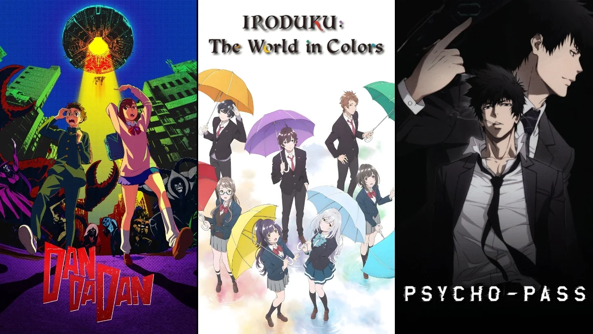
‘Iroduku: The World in Colors’ (2018)
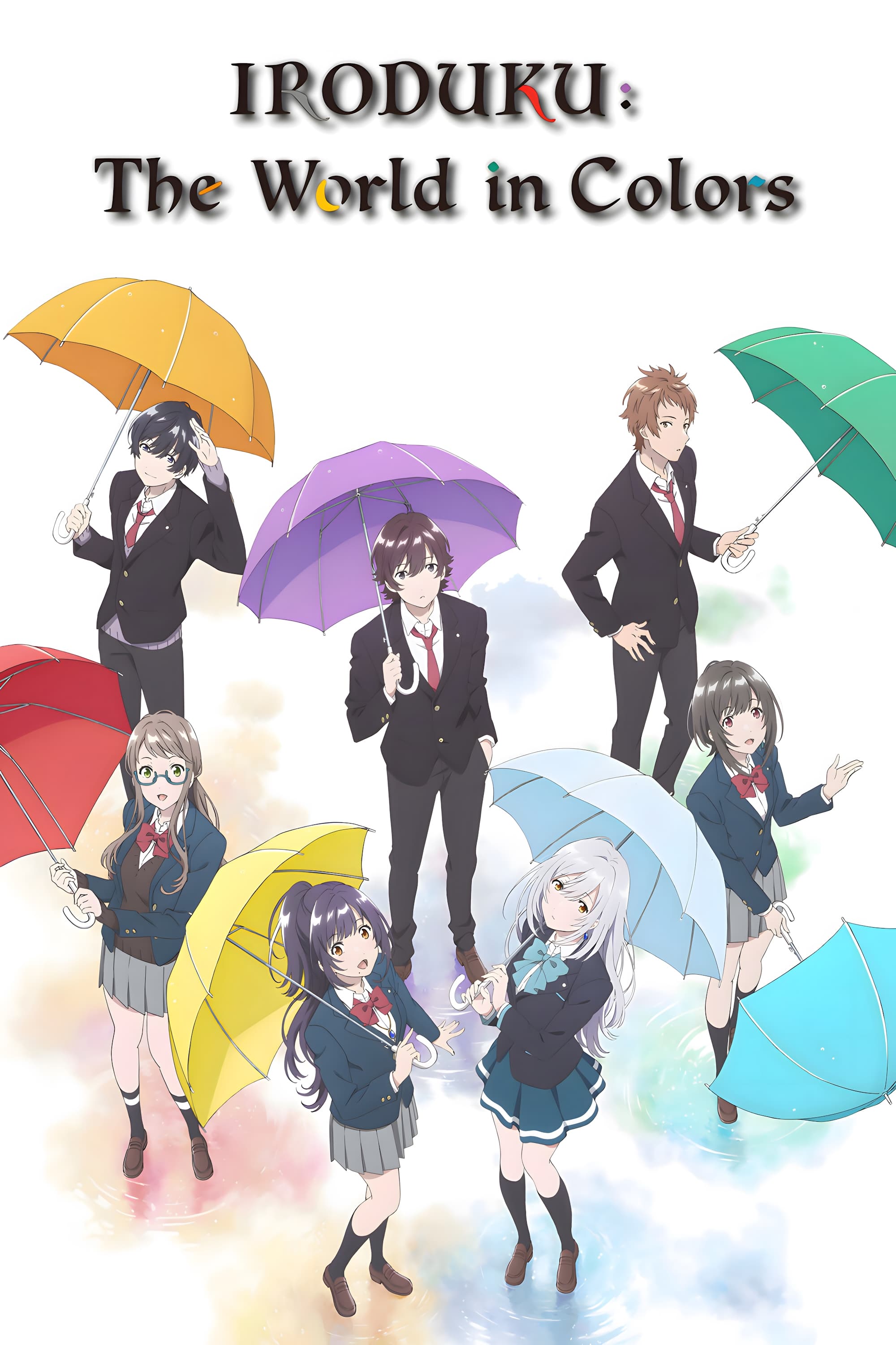
Set in a futuristic Nagasaki, the story links Hitomi’s inability to feel emotions to her perception of color – the world literally reflects what she can and can’t feel. The series treats her loss of color as a real challenge to overcome, not just a symbolic idea, making each restored color feel like a tangible step forward. Created by P.A. Works, the show uses art, photography, and heartfelt connections to visually ‘revive’ the world as Hitomi’s relationships grow. Pay attention to how scenes shift between dull colors and vibrant ones – these changes reflect her developing sense of connection and belonging.
‘Psycho-Pass’ (2012–2013)
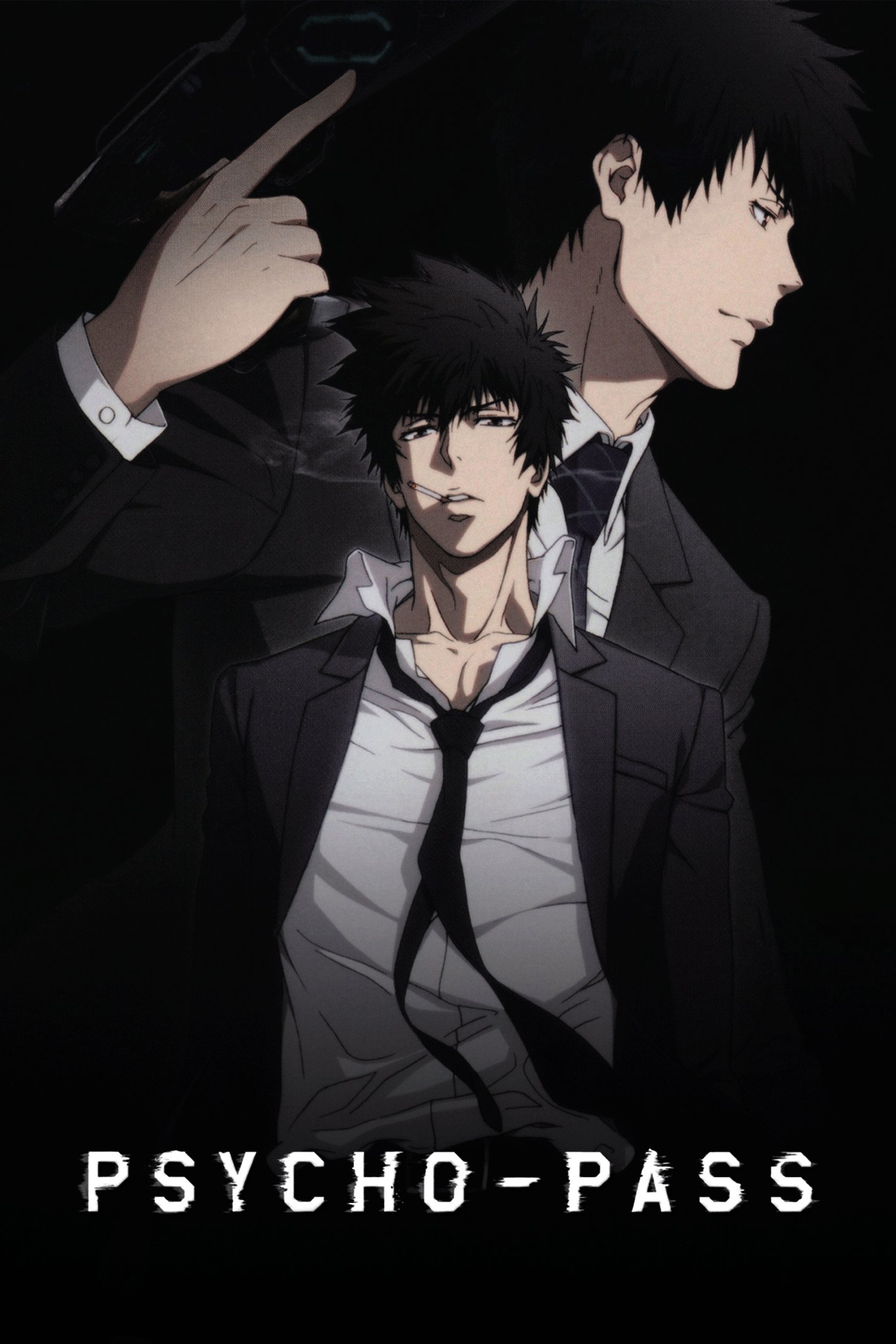
In this series, people’s mental well-being is represented as quantifiable data, visualized through color. A person’s ‘Hue’ – essentially their mental stability – can change under pressure, and this is tracked by society. These readings directly influence law enforcement decisions, meaning a person’s mental health status isn’t just a personal matter—it impacts how they’re treated by the authorities. Produced by Production I.G., the show creates suspense by portraying emotional shifts as something visible and with real-world consequences. As you watch, notice how the environment presents ‘normal’ as orderly and clean, while mental instability is shown as something like a visible stain.
‘The Colors Within’ (2024)
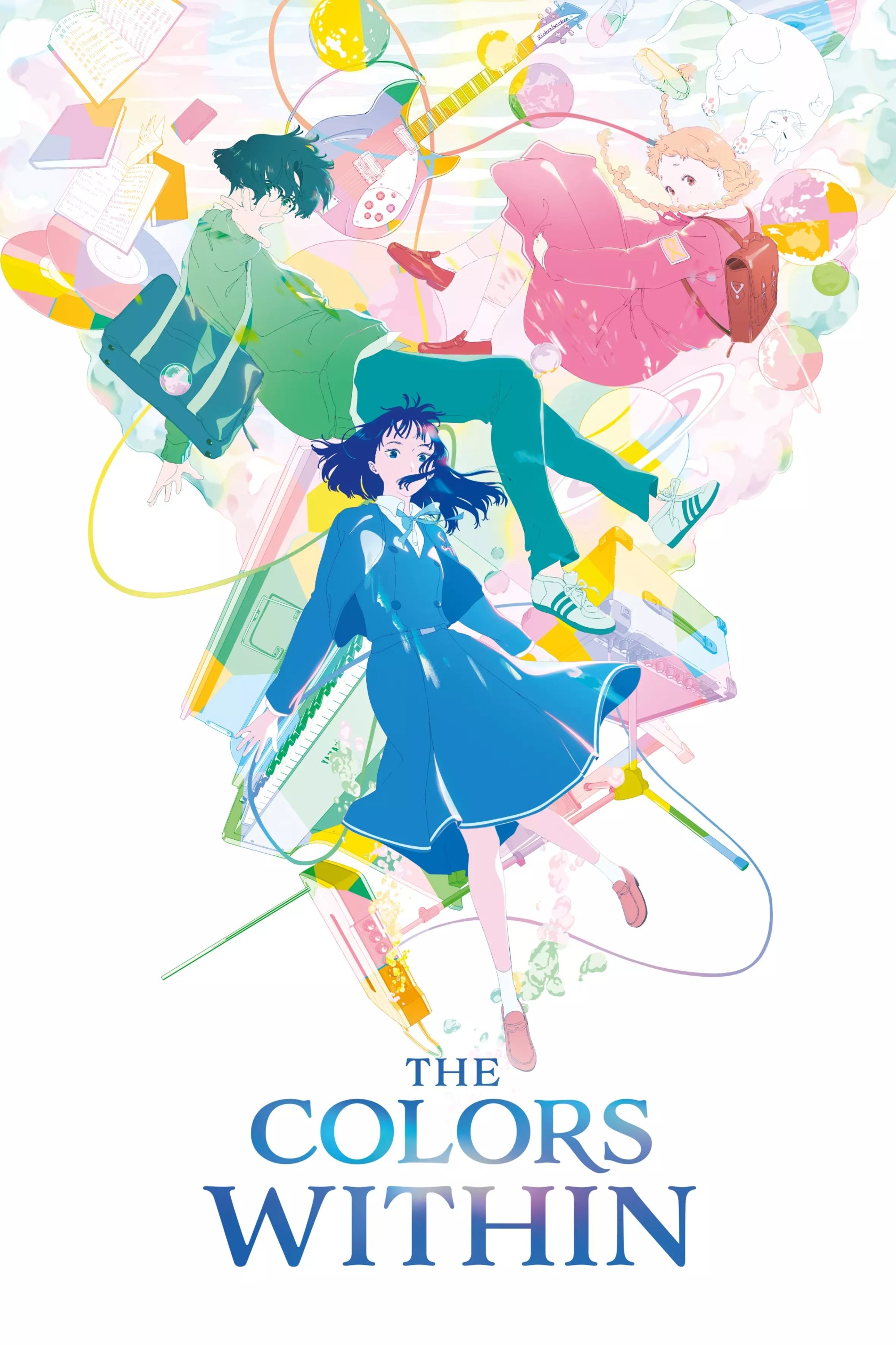
The movie beautifully brings to life the idea of seeing people’s emotions as colors. The main character, Totsuko, literally experiences people this way – their ‘color’ reflects what she senses inside them. This unique ability, a form of synesthesia, influences who she connects with, making color a guide to relationships, not just something pretty to look at. Created by Science Saru and directed by Naoko Yamada, the film also connects these emotional colors to music, making mood and harmony feel deeply linked. If you’re looking for an anime that vividly portrays color as a way characters experience and communicate emotions, this is a standout example.
‘Puella Magi Madoka Magica’ (2011)
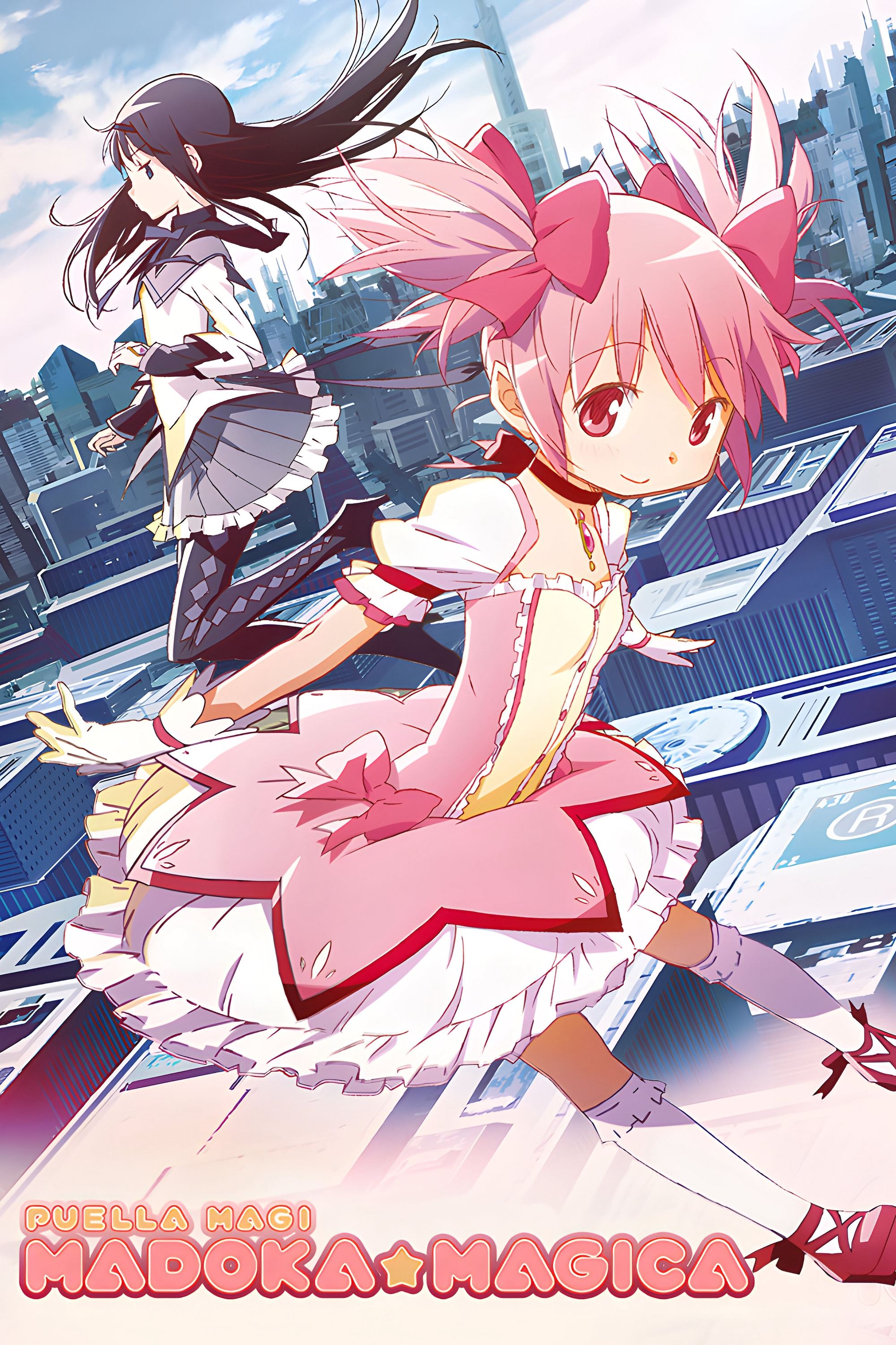
This show features magical girls whose powers are directly tied to their emotional state. The more they use their powers, and the more despair they feel, the more visibly corrupted their source of power becomes. It’s a system where emotional pain isn’t just felt internally – it builds up and has a clear breaking point. Created by the animation studio Shaft, the series visually represents hope and despair as a kind of resource, with key objects changing in appearance as the characters struggle with their feelings. Essentially, the show portrays emotional breakdown as something that can be seen and worsens over time, ultimately leading to a specific outcome.
‘Horimiya’ (2021)
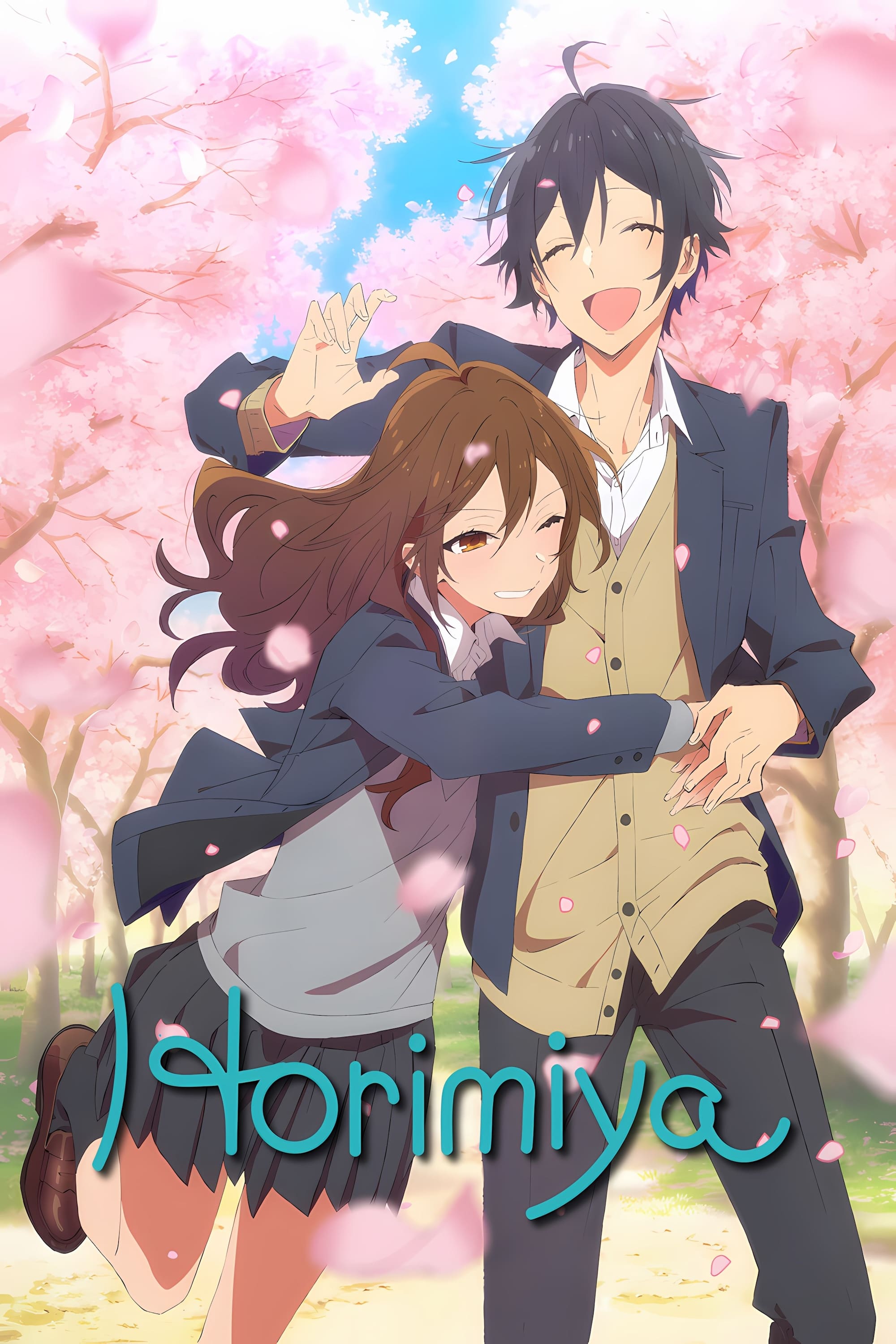
The show frequently uses color to represent each character’s emotional state, employing coordinated color schemes to indicate changes in their comfort level, vulnerability, or the overall tension of a scene. Since the story focuses on everyday school life, these color cues are often understated, allowing viewers to easily understand who feels secure, who feels threatened, and when a situation becomes emotionally charged. Created by CloverWorks, the show relies on consistent visuals and subtle color symbolism – rather than flashy effects – to make these emotional states clear within complex social interactions. If you enjoy shows where color subtly enhances storytelling in a realistic setting, this is a good choice.
‘Dandadan’ (2024)
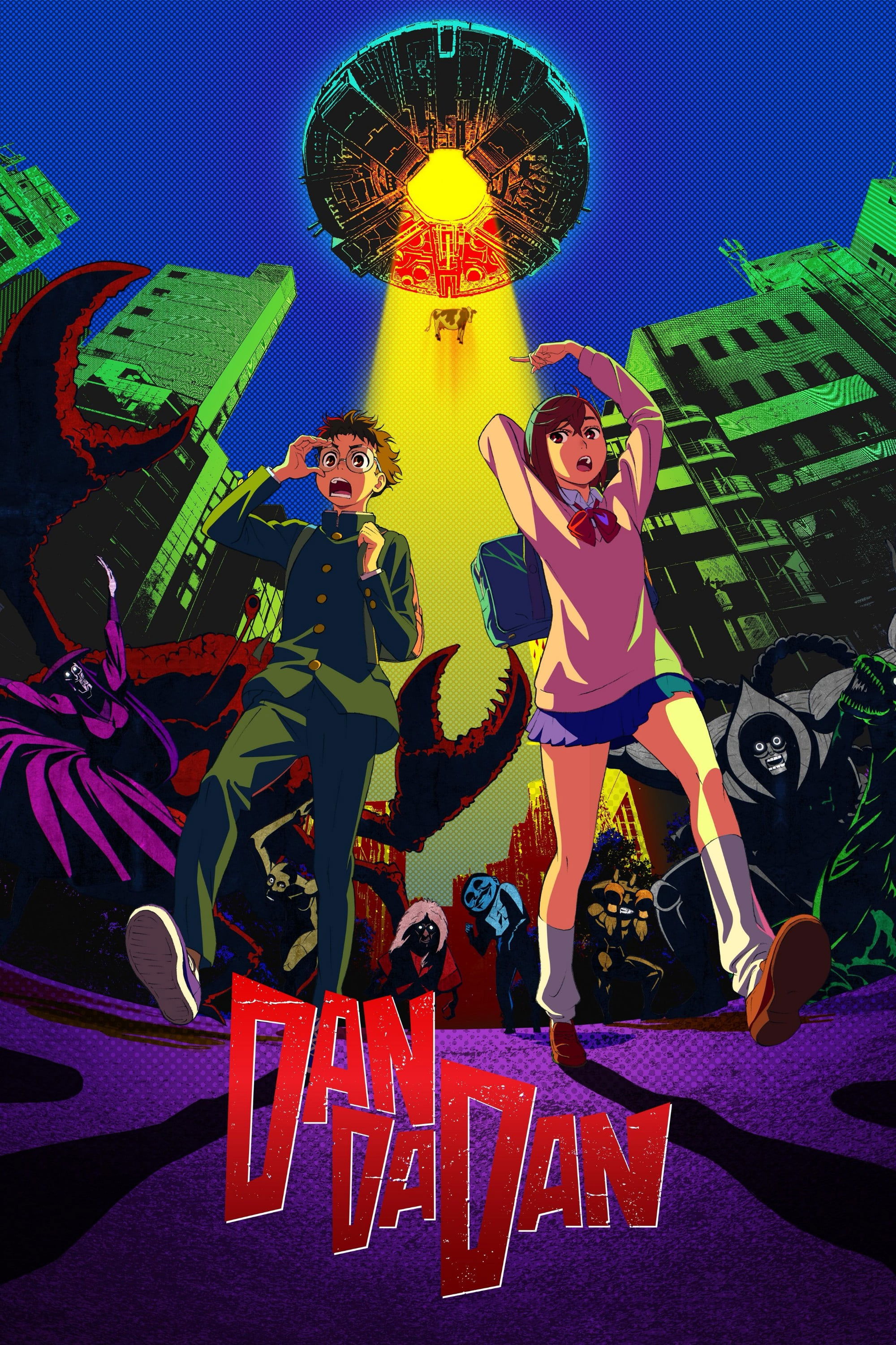
As a movie buff, I’m really struck by how this show uses color. It’s amazing how it instantly shows when things shift from everyday life to something totally bizarre and supernatural. The creators at Science Saru clearly wanted a really unstable feel, and the color choices really deliver – they can go from funny to terrifying in a heartbeat. Honestly, the colors act like a warning system, letting you know just how much danger the characters are in. If you love seeing color used to amp up the emotional rollercoaster in an action-horror story, this is a fantastic example.
‘Anohana: The Flower We Saw That Day’ (2011)

As someone who loves a good story, I was really struck by how this series uses color and mood to show what the characters are feeling, not just what they’re saying. Because it’s all about dealing with loss and things left unsaid, the show creates a visual language for their emotional state. When characters connect, the scenes feel brighter and more expansive, but when they pull away into their own guilt or sadness, everything feels heavier and closed off. A-1 Pictures did an amazing job using the setting to show this distance, even in quiet moments. If you pay attention to how scenes feel visually – especially the difference between group scenes and when characters are alone – it really adds another layer to the experience.
‘March Comes in Like a Lion’ (2016–2018)
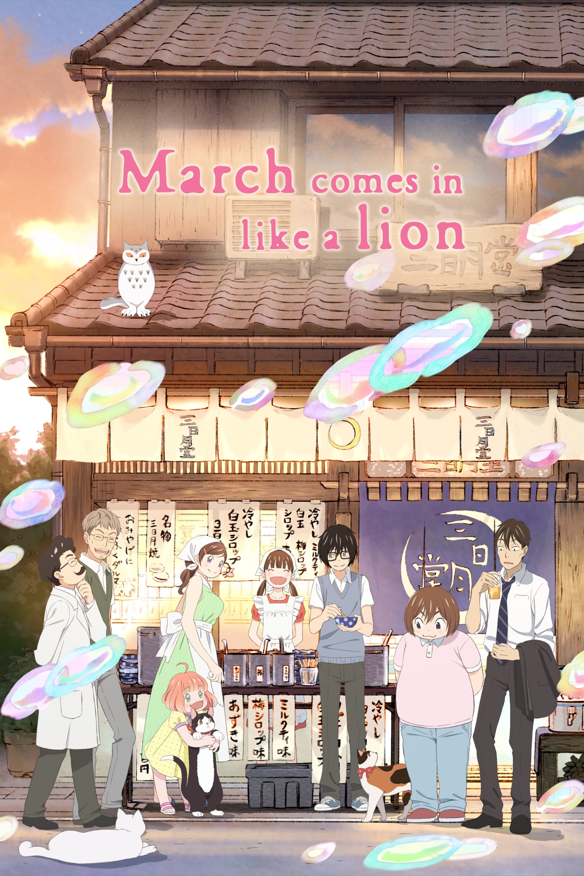
This show portrays feelings of loneliness and connection as visible environments, using a delicate, watercolor-inspired style to make emotions feel tangible. It doesn’t rely on one trick; instead, it creates unique visual settings – like home, school, and competition venues – each with its own distinct emotional atmosphere. The animation style, produced by Shaft, features gentle textures and carefully chosen colors to show changes in Rei’s emotional state, from feeling numb to being supported. Paying attention to the colors is key to understanding how Rei’s world changes depending on whether he’s struggling or receiving care.
‘Mob Psycho 100’ (2016–2022)
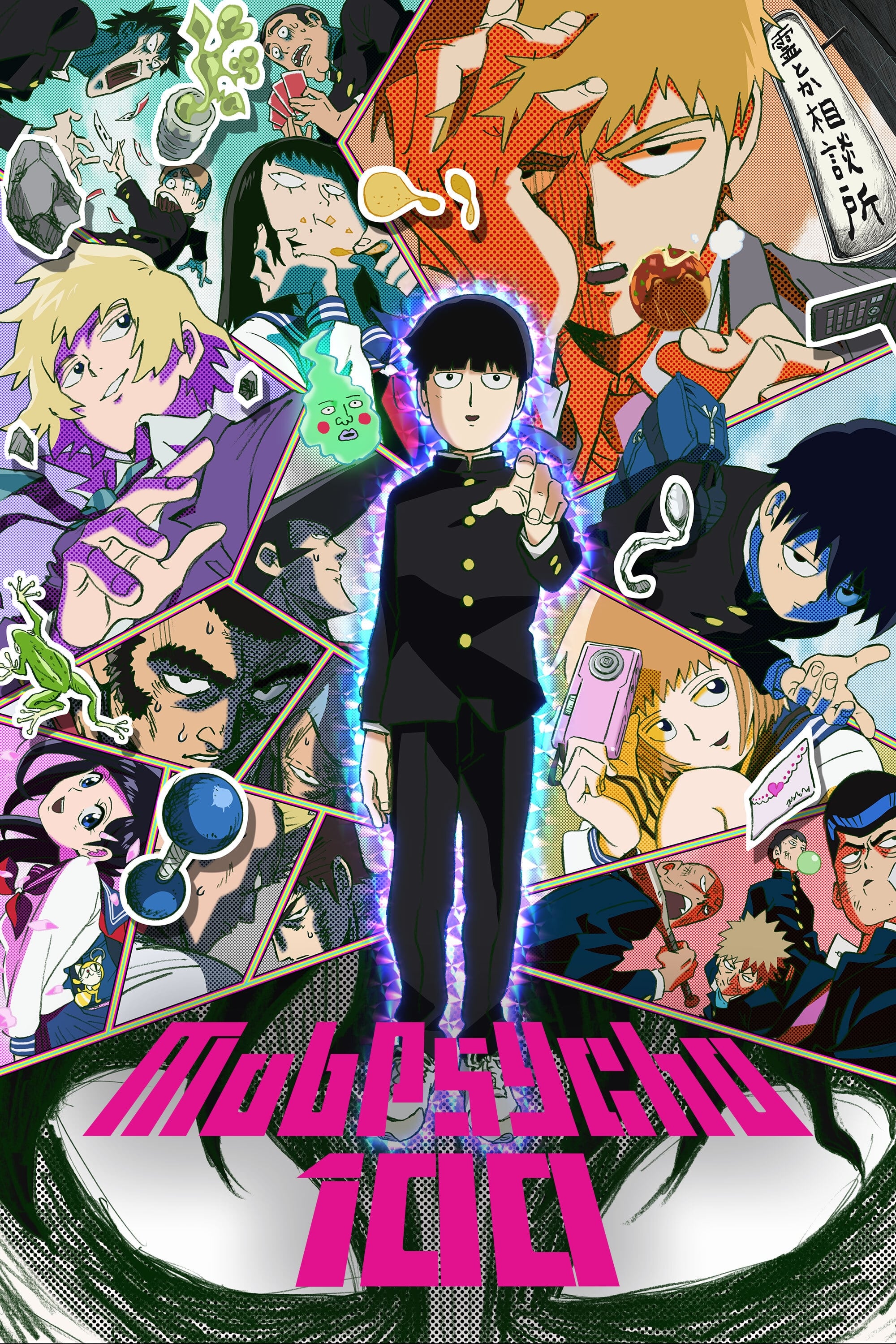
This show doesn’t just show emotions – it makes them explode onto the screen with sudden, powerful color changes, letting you clearly see when a character is overwhelmed. Created by Bones, the series visually connects a character’s inner turmoil with dramatic shifts in the scene’s appearance, making emotional control visible. It also uses different art styles and textures during moments of intense psychic power, clearly distinguishing between calm and overwhelming feelings. If you’re looking for a show where emotions feel like a visual spectacle, this is a great choice.
‘Ping Pong the Animation’ (2014)
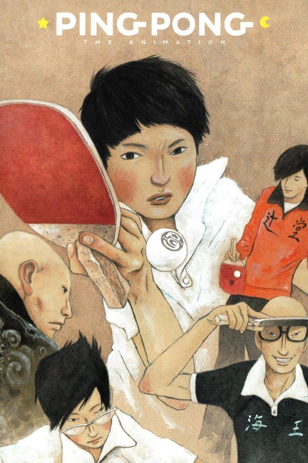
This version of the story relies heavily on striking visuals to show what characters are feeling—things like fear, ambition, or inner turmoil—rather than just telling you. Created by Tatsunoko Production and director Masaaki Yuasa, it emphasizes how movement, setting, and color can reveal a character’s emotions just as effectively as their words. This makes each match feel deeply personal and emotionally charged, as the visual style changes to reflect what the characters are thinking and feeling. If you enjoy seeing color used to represent a character’s emotional journey, you’ll especially appreciate this adaptation.
‘The Tatami Galaxy’ (2010)
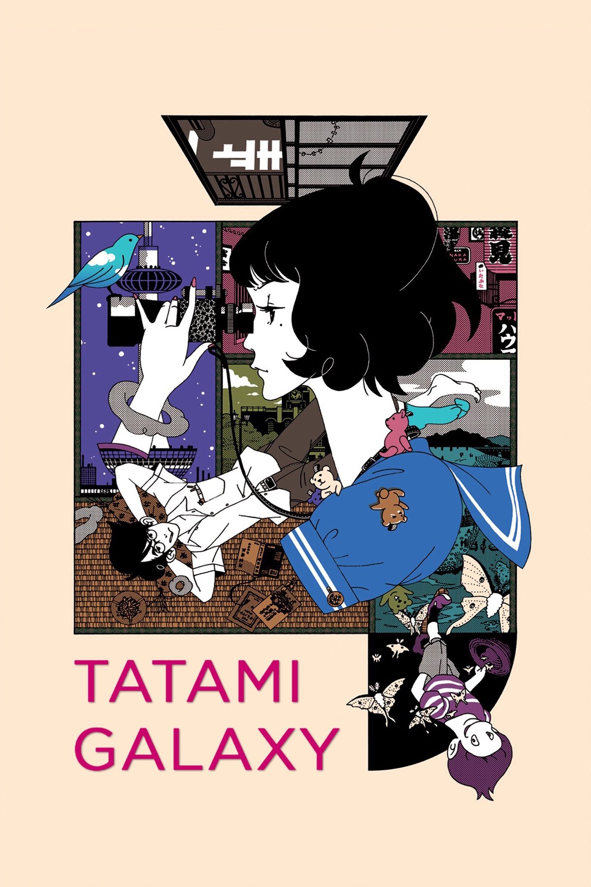
This series stands out with its striking use of color and unique visual style, which perfectly reflect the main character’s troubled thoughts and recurring regrets. Created by the acclaimed studio Madhouse and director Masaaki Yuasa, the show presents a fluid and dynamic world where visuals shift to match the character’s anxiety, fixations, and attempts to rationalize their actions. The story frequently revisits past decisions, and color is cleverly used to show how the same events can feel drastically different depending on perspective. If you’re looking for a show where the visuals powerfully convey feelings of indecision and yearning, this is a must-see.
‘Mononoke’ (2007)
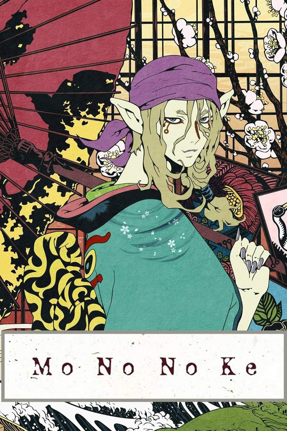
This creepy and mysterious series uses vibrant, psychedelic visuals to create a world where emotional turmoil feels built into the very surroundings. Created by Toei Animation, each story unfolds like a deep dive into a character’s mind, and the increasingly chaotic imagery reflects the surfacing of painful truths. The show emphasizes that understanding the root of a problem is key to solving it, and the visuals powerfully convey how emotions drive the danger. If you enjoy striking colors that hint at hidden trauma, this is a perfect choice.
‘Bocchi the Rock!’ (2022)
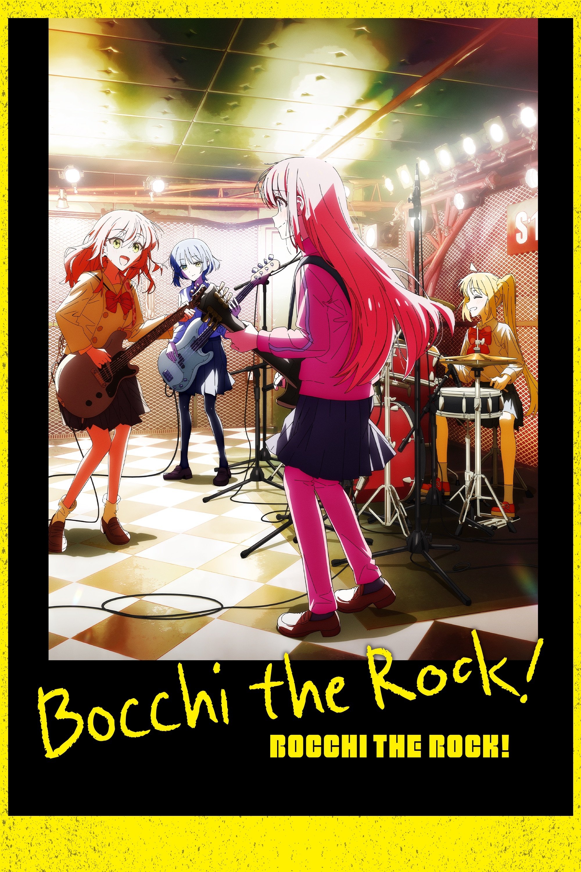
The show cleverly uses color to show what Bocchi is feeling, even when she’s trying to hide it. Normal scenes and moments of anxiety share a consistent color scheme, allowing viewers to easily follow her emotional journey. Created by CloverWorks, the series realistically portrays band life while also using sudden changes in visuals to represent Bocchi’s social anxiety. This makes color both funny and insightful, as the world around her noticeably shifts when she’s panicking. It’s a great example of how color can effectively communicate inner turmoil without needing a lot of explanation.
‘Keep Your Hands Off Eizouken!’ (2020)
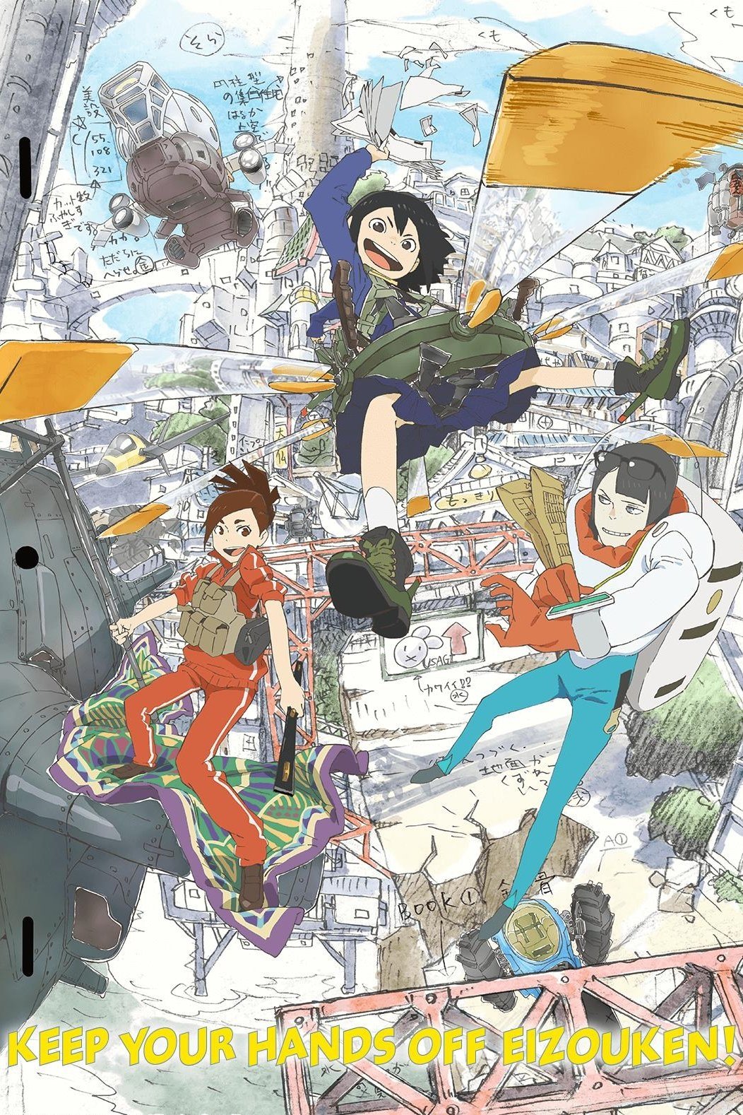
This anime skillfully switches between normal life and fantastical dream worlds, using vibrant colors and unique designs to signal when a character’s imagination takes over. Created by Science Saru, the show portrays visualization as a powerful emotional experience, making ideas feel dynamic and full of life in contrast to everyday school scenes. This visual approach lets you understand a character’s feelings and motivations simply by looking at the world around them, rather than relying on what they say. If you’re looking for an anime where color directly represents creativity, this is a clear and effective example.
‘Your Name.’ (2016)
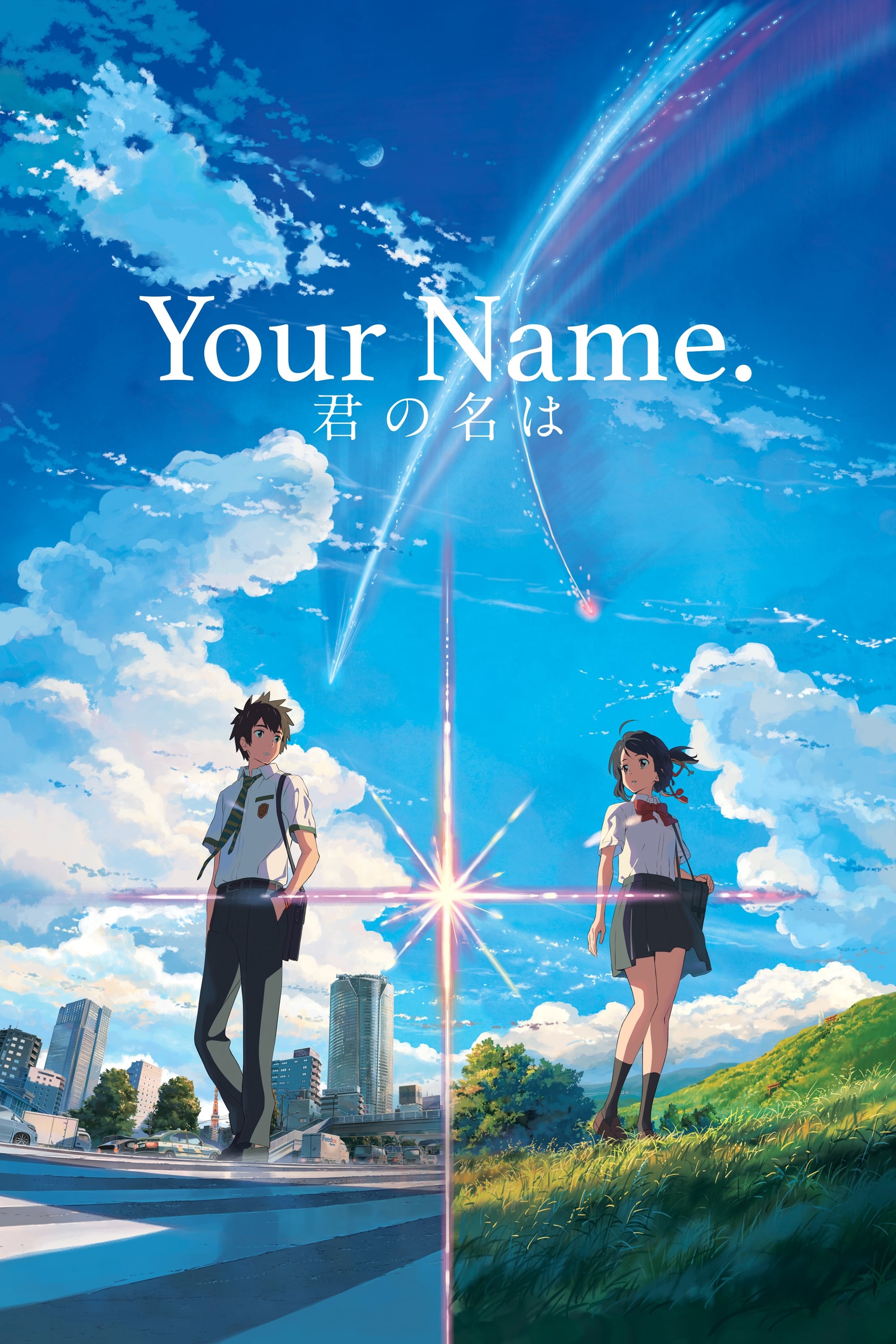
The film’s use of color is deeply connected to the characters’ emotions – everyday life, longing, wonder, and moments of crisis each have a distinct look and feel. The contrast between city and rural settings further emphasizes these feelings, visually representing shifts in connection and isolation. Director Makoto Shinkai is known for using color to build atmosphere and tension subtly, without over-explaining. If you’re paying attention to the emotional impact of the colors, notice how important scenes use specific shades to create a particular mood.
‘A Silent Voice: The Movie’ (2016)
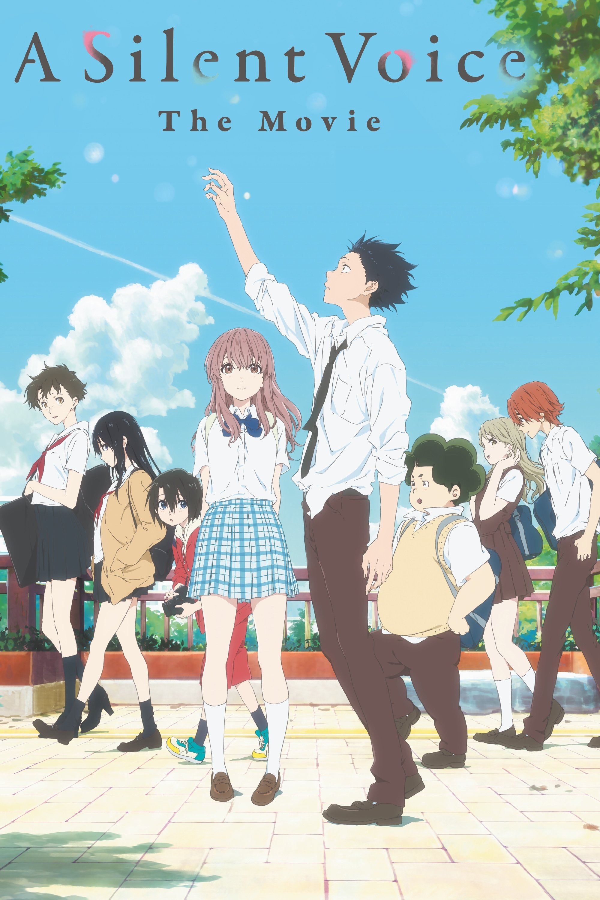
The film effectively conveys emotion through careful choices in color and visual effects, which subtly depict feelings of sadness, embarrassment, and growing vulnerability. Since the story focuses on characters struggling to communicate, the visuals often show what they can’t say with words. Created by Kyoto Animation and directed by Naoko Yamada, the film demonstrates how color can be used skillfully to enhance emotional storytelling. Those interested in the intentional use of color to evoke feeling will find the discussions about the film’s visuals particularly insightful.
‘Violet Evergarden’ (2018)
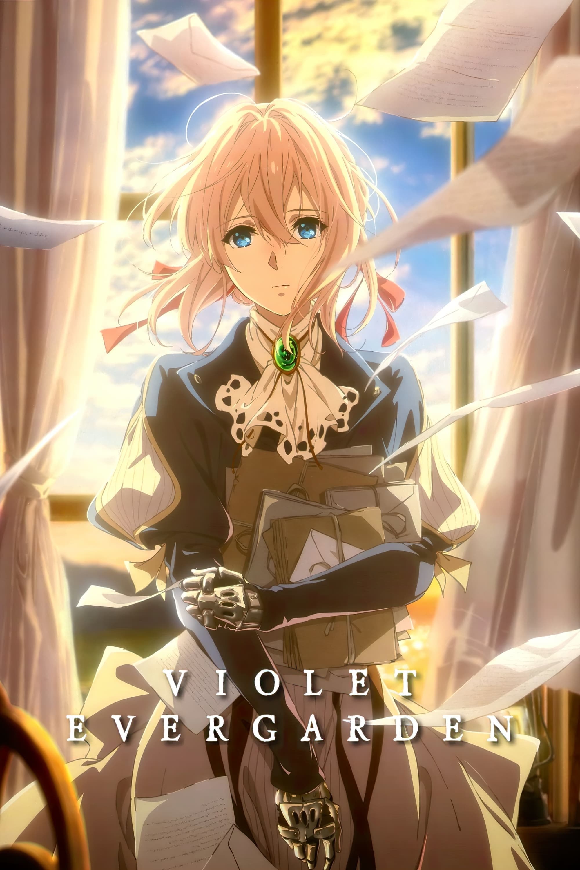
The show uses color thoughtfully to reflect the emotions Violet experiences in each assignment, often changing the visual style to reveal the true meaning behind letters. Created by Kyoto Animation, it portrays understanding feelings as a gradual process, and the animation visually signals moments of tenderness, sadness, or quiet heartbreak. This makes the world feel alive and connected to the characters’ emotional journeys – the colors become softer or more intense as deeper feelings are revealed. If you’re looking for a show that uses color to represent emotional growth, this is a great fit.
‘Liz and the Blue Bird’ (2018)
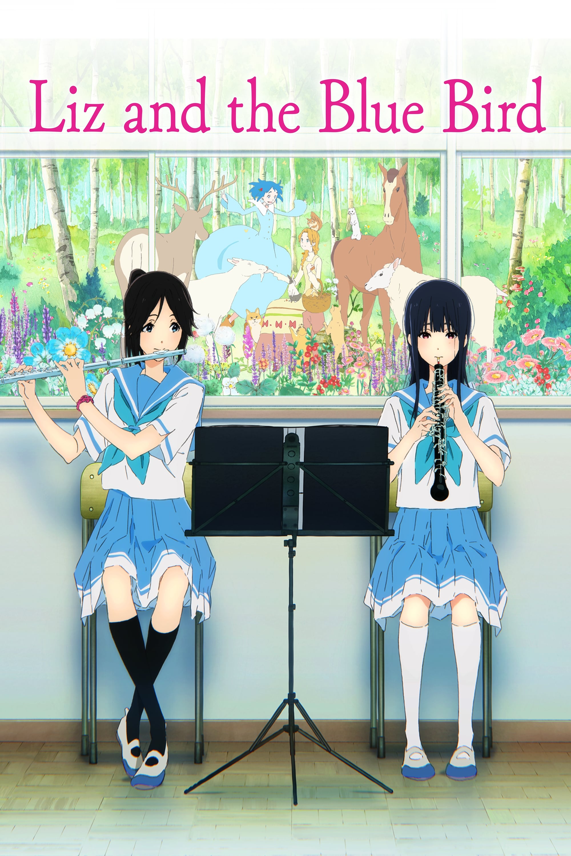
The film cleverly uses different visual styles – realistic scenes of school life mixed with dreamy, watercolor-like animation – to show the difference between what’s actually happening and what the characters are feeling inside. Because the story centers on a complicated friendship, the film’s colors subtly convey awkwardness and affection without relying on characters constantly explaining their feelings. Made by Kyoto Animation, the film is built on small changes in color, lighting, and how close or far away the camera feels, to powerfully express emotions. If you appreciate how color can hint at uncertainty and intimacy in quiet moments, this film is a great example.
‘The Tale of the Princess Kaguya’ (2013)
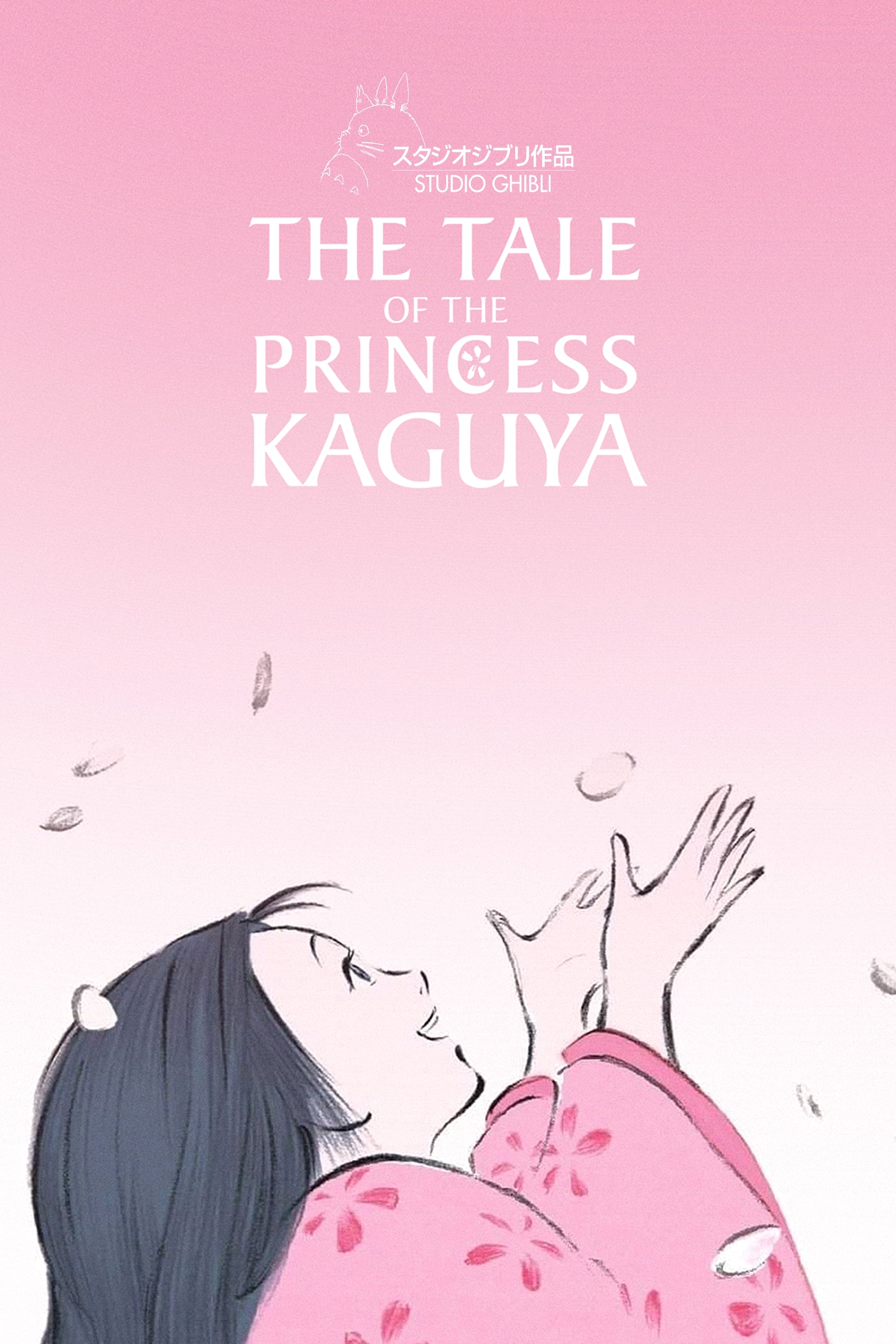
The film’s beautiful art style, reminiscent of ink wash painting and watercolor, makes the world feel alive and responsive to the characters’ emotions. Calm scenes are depicted with soft brushstrokes, while moments of tension use bolder, more forceful lines. Director Isao Takahata and Studio Ghibli cleverly use this visual approach to tell the story, rather than just decorate it. The way a scene looks – peaceful, stressful, or chaotic – directly reflects what’s happening. If you’re looking for an anime where the artwork truly expresses emotion, this is a standout example.
‘Colorful’ (2010)
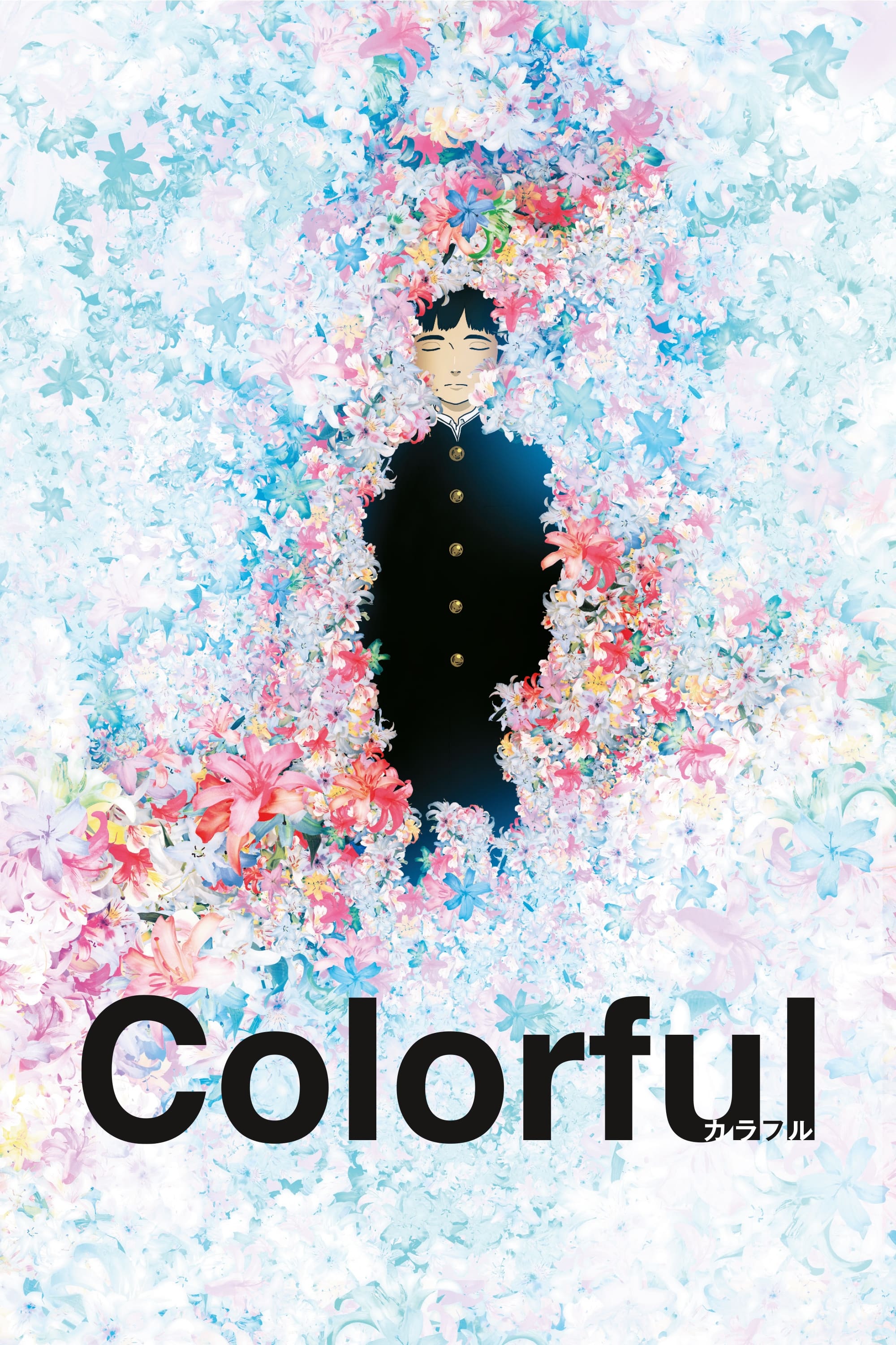
The film’s colors are intentionally subtle and sometimes muted, reflecting the characters’ emotional states. This visual style helps you feel when things are bleak versus when hope returns. Directed by Keiichi Hara and produced by Sunrise, the story focuses on a character getting a second chance, and genuine emotion is key to their journey. The color palette is closely linked to their recovery, visually showing whether they’re overwhelmed or finding clarity. If you appreciate how color can represent emotional healing, this film is a good choice.
Out of these anime, which one had the most memorable use of color? Let us know in the comments!
Read More
- Invincible Season 4 Gender Swaps Tech Jacket As Fans Question Major Comic Change
- Silver Rate Forecast
- Gold Rate Forecast
- Building Agents That Learn and Improve Themselves
- 15 Films That Were Shot Entirely on Phones
- 22 Films Where the White Protagonist Is Canonically the Sidekick to a Black Lead
- 20 Movies Where the Black Villain Was Secretly the Most Popular Character
- Celebs Who Narrowly Escaped The 9/11 Attacks
- 18 TV Series Filming Rehearsals as Bonus Content
- Games That Faced Bans in Countries Over Political Themes
2025-12-15 08:47