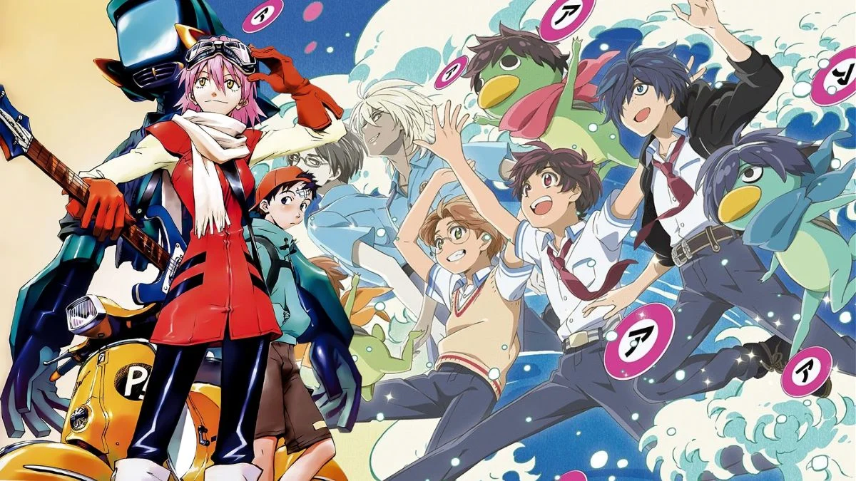
As a huge anime fan, I’ve always noticed how much storytelling happens outside of what characters say or do in big action scenes. It’s amazing how directors and artists use details in the backgrounds – things like graffiti, for example – to hint at what’s coming or just make the world feel richer. These little visual clues really encourage you to look at everything on screen, because often there’s a hidden meaning tucked away. I’ve been thinking about shows that do this particularly well, and I wanted to share a few that really enhance the story through their background art.
‘FLCL’ (2000–2001)
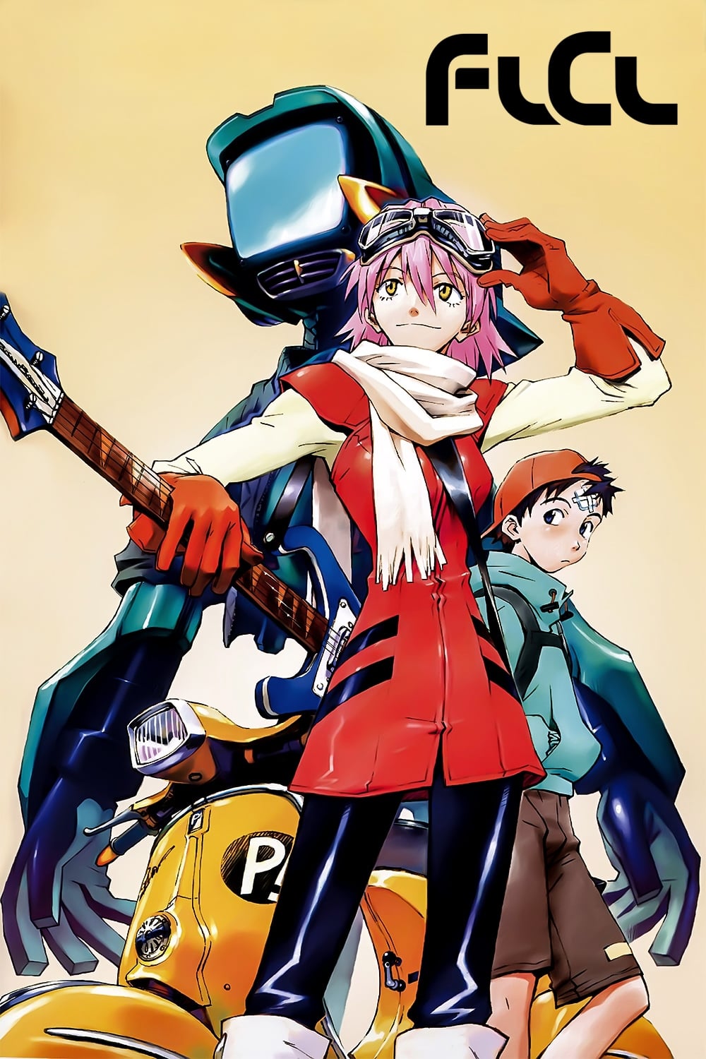
This animated series portrays a confusing world through crumbling cityscapes and handwritten notes, mirroring the main character’s inner turmoil. The phrase “Never Knows Best” is repeatedly scrawled on walls, becoming a key theme. This graffiti is linked to the character Mamimi and her smoking, representing the uncertainty and lack of direction many teenagers feel. It appears throughout the show, constantly reminding viewers of the stuck feeling that permeates the town of Mabase.
‘Durarara!!’ (2010)
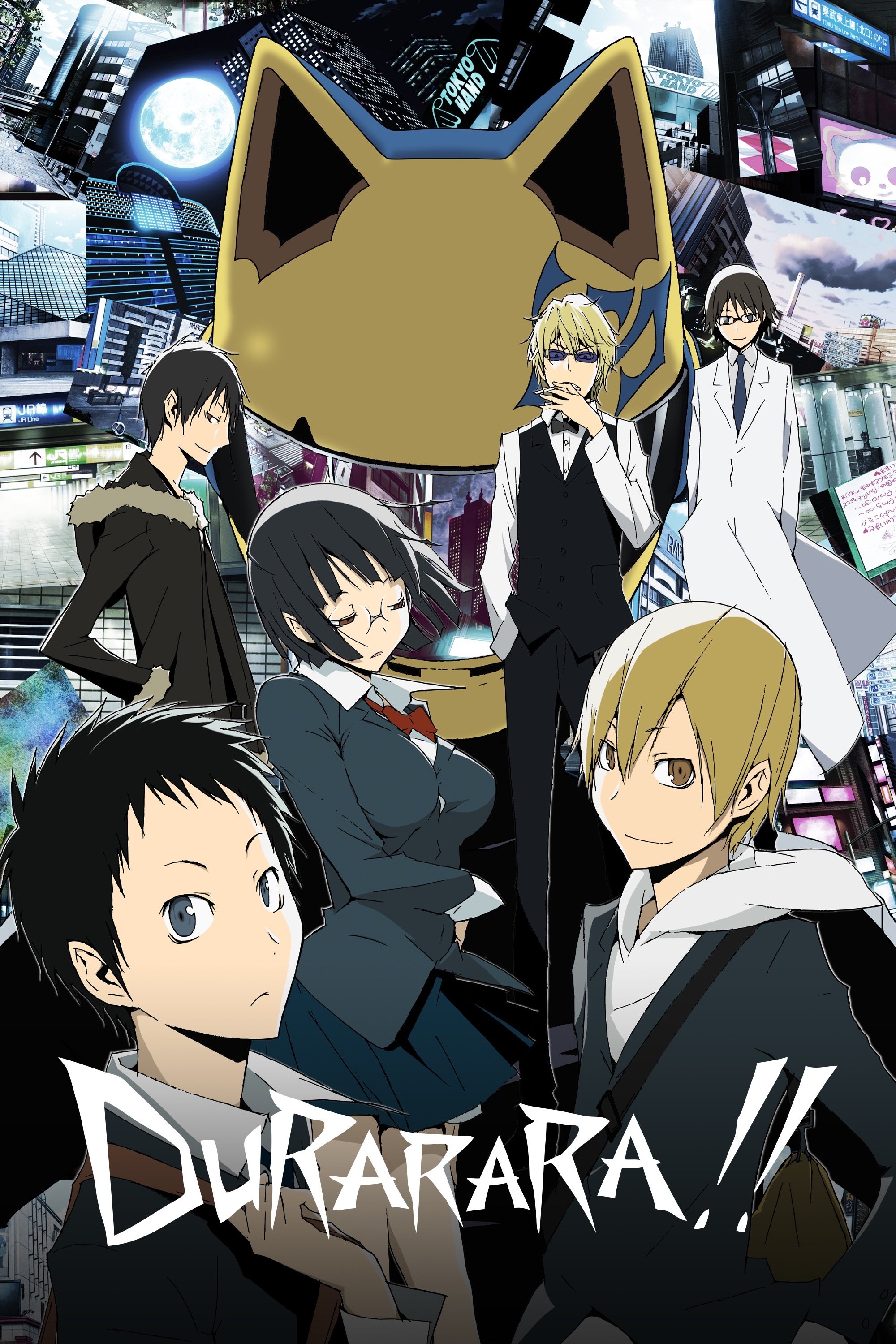
In this series, Ikebukuro isn’t just a setting—it feels like a character itself, full of secret gangs and local myths. The Dollars, one of these groups, operates through an online network that leaves its mark on the city with tags and stickers on things like vending machines and lampposts. These subtle signs hint at the Dollars’ growing power even before the characters understand how big the organization is. As the series progresses, viewers can actually follow the Dollars’ rise by noticing how often these symbols appear in the background.
‘Puella Magi Madoka Magica’ (2011)
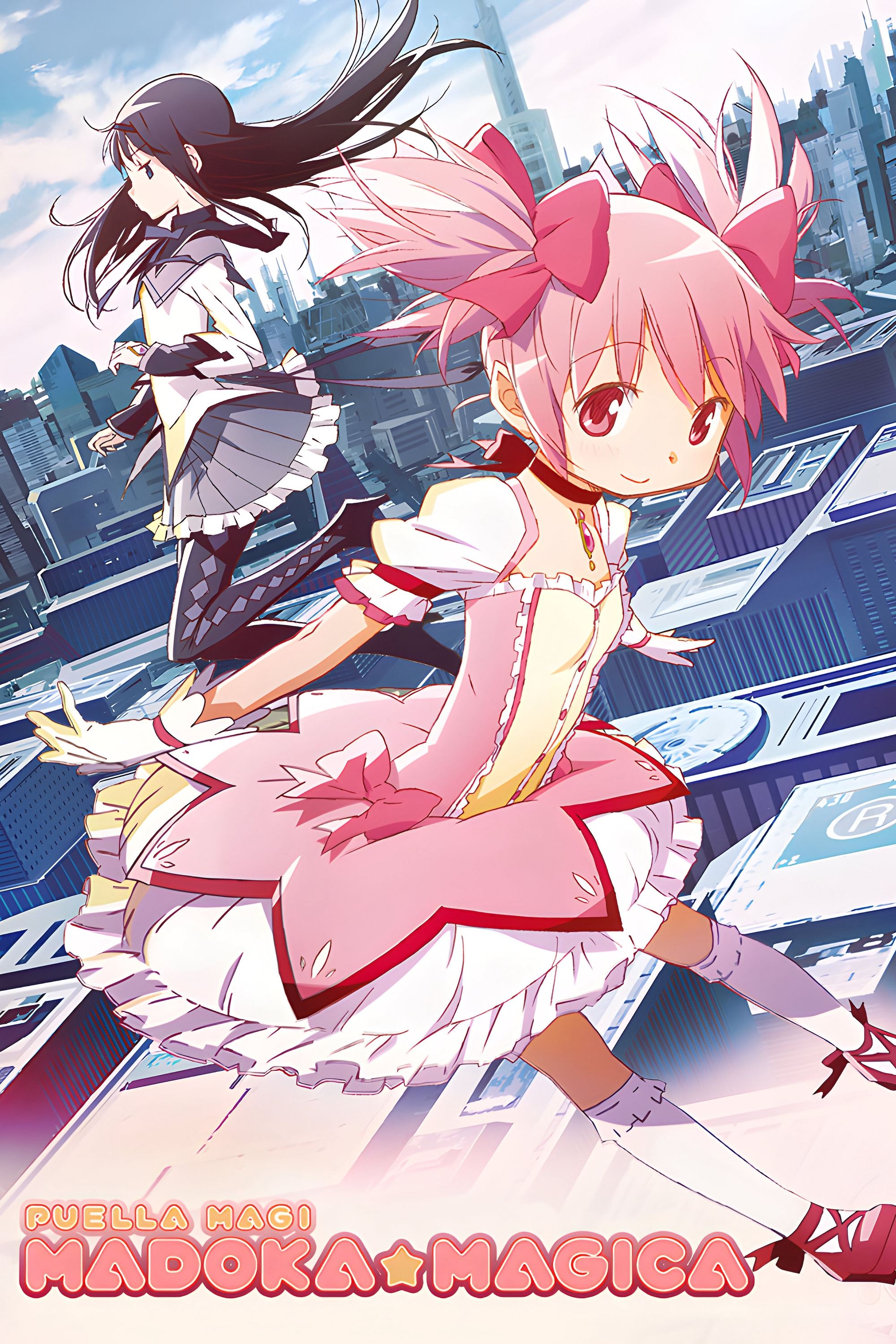
The witches in this series create incredibly strange and dreamlike labyrinths, filled with puzzling symbols and writing. The animation studio, Shaft, cleverly hid secret messages within the backgrounds using ancient runic alphabets. These runes, often found on walls or floating around, hint at upcoming tragedies before they happen. Fans who are able to translate these hidden messages get a sneak peek into the witches’ true origins and the dark side of the magical girl world.
‘Kill la Kill’ (2013)
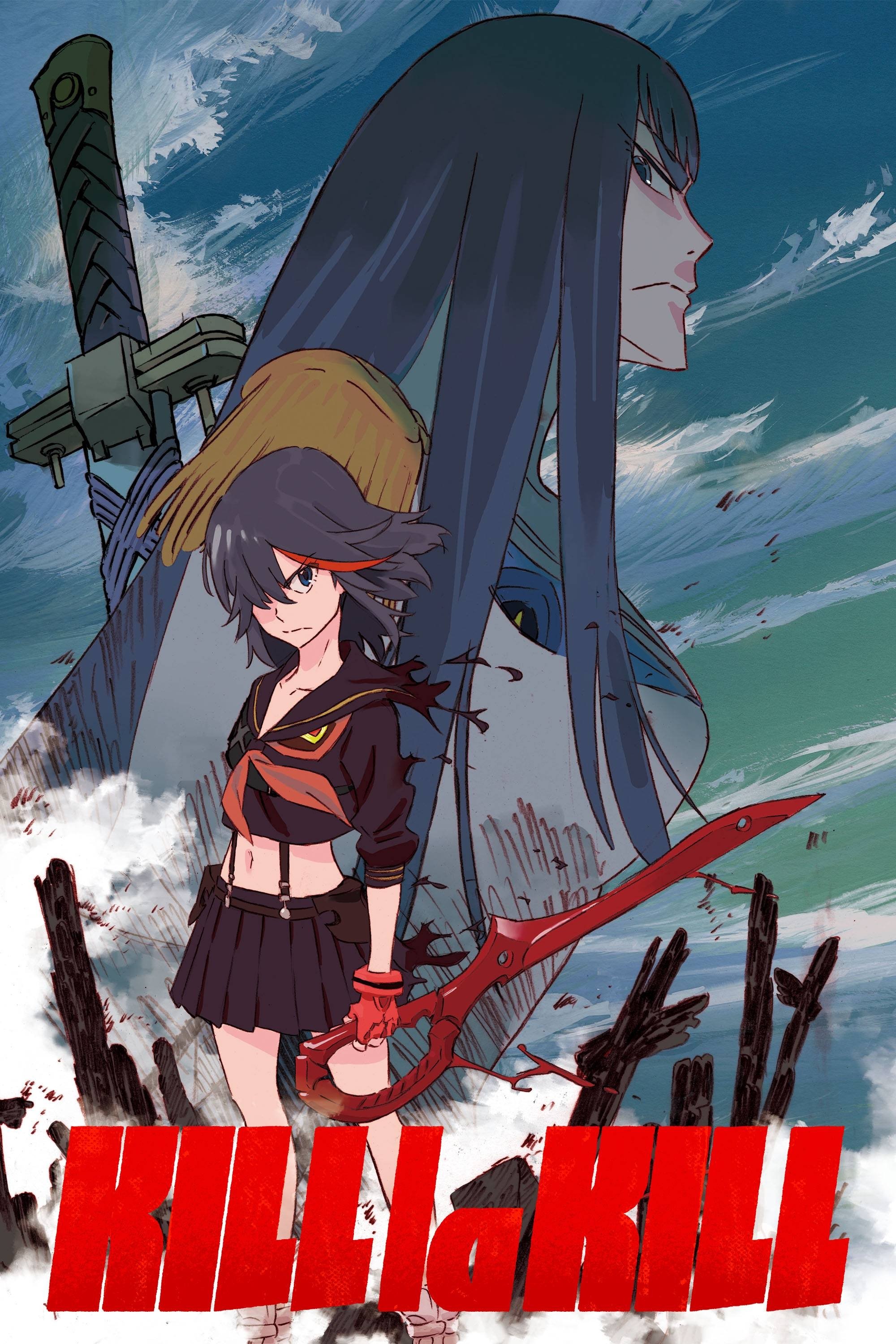
Large, red text bursts onto the screen and becomes part of the scenery. This bold typography feels like a physical element within the world, with characters occasionally moving around or standing near it. The oversized Japanese characters identify places and attacks, adding to the show’s intense and energetic feel. This creative approach turns basic explanations into striking visual designs that fill the screen.
‘Psycho-Pass’ (2012–2013)
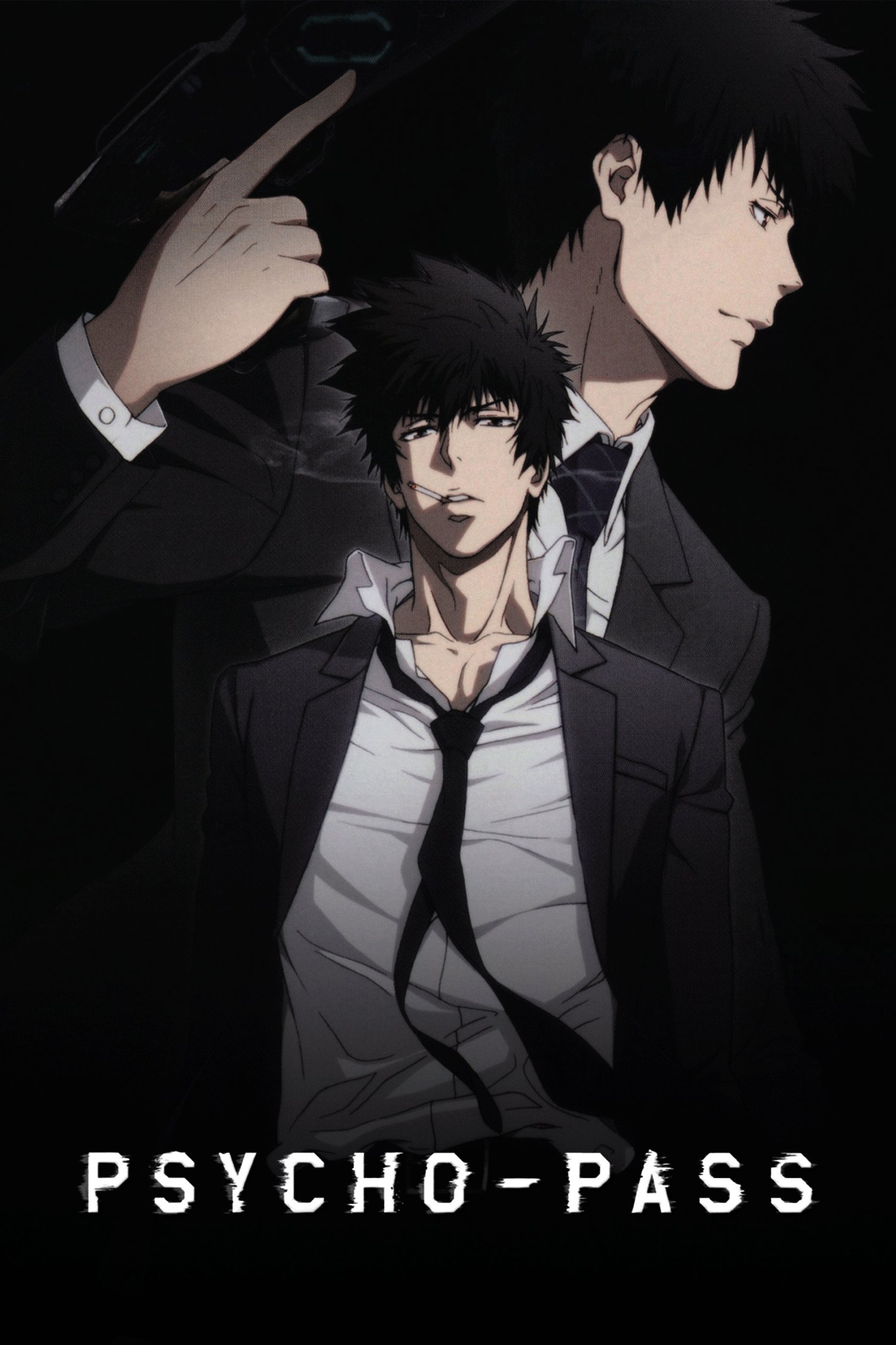
This cyberpunk series takes place in a future where the real world is covered with digital layers – things like holographic tags and graffiti. These aren’t just decorations; they often show how likely people are to commit crimes, or display messages from those rebelling against the government. This constant digital noise emphasizes how heavily monitored everyone is and how impossible it is to avoid being judged by the Sibyl System. The show visually highlights the difference between the poor, rundown areas and the sleek, modern districts.
‘Akira’ (1988)
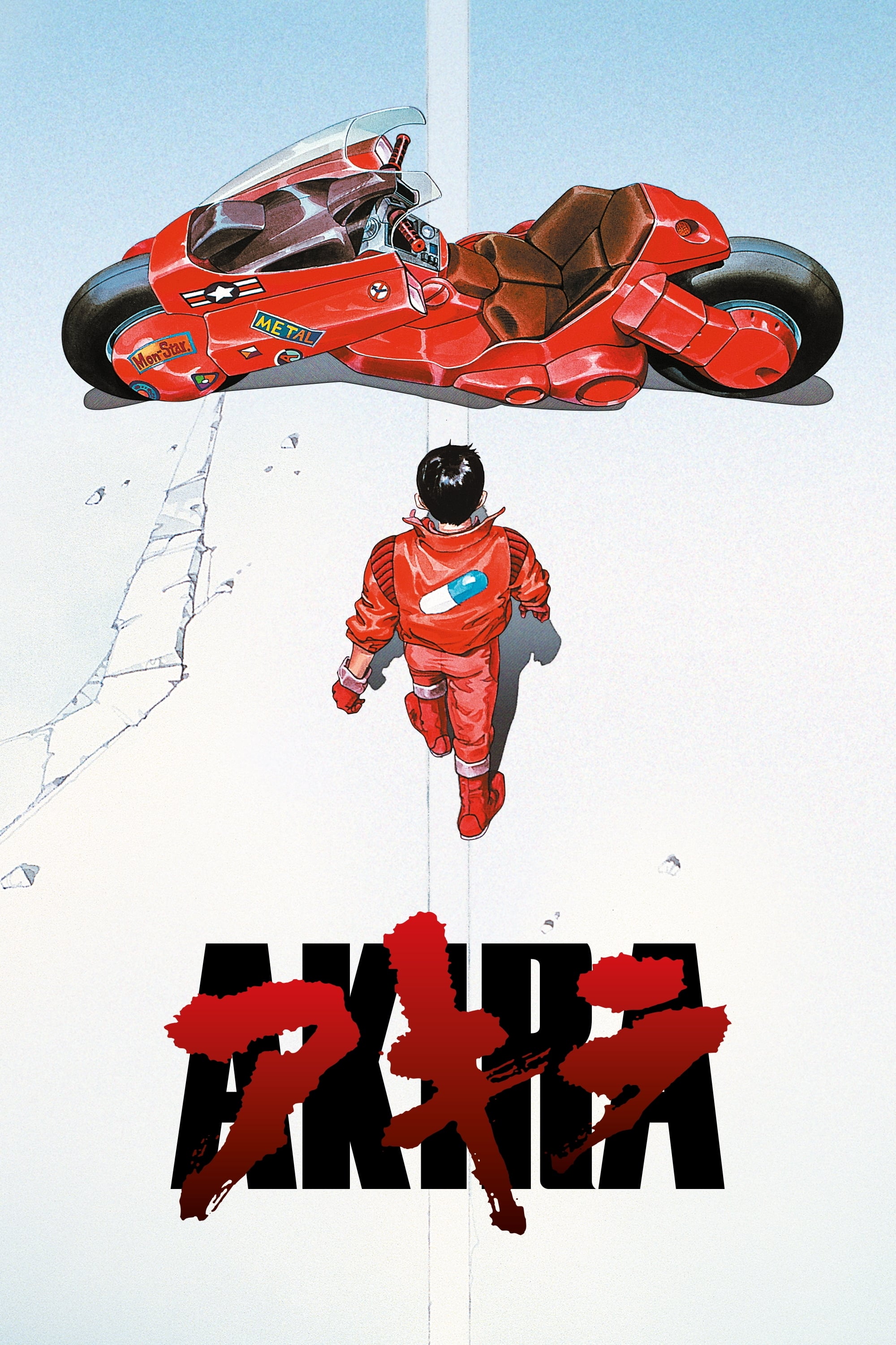
Neo-Tokyo is shown as a huge city, marked by the damage from riots and fights between biker gangs. Protest posters and political graffiti cover the walls, giving us clues about why the city is so unstable. These details tell us about the city’s past without long explanations. The unique markings used by the rival groups, the Capsules and the Clowns, show where each controls territory and suggest their conflict is growing.
‘Soul Eater’ (2008–2009)
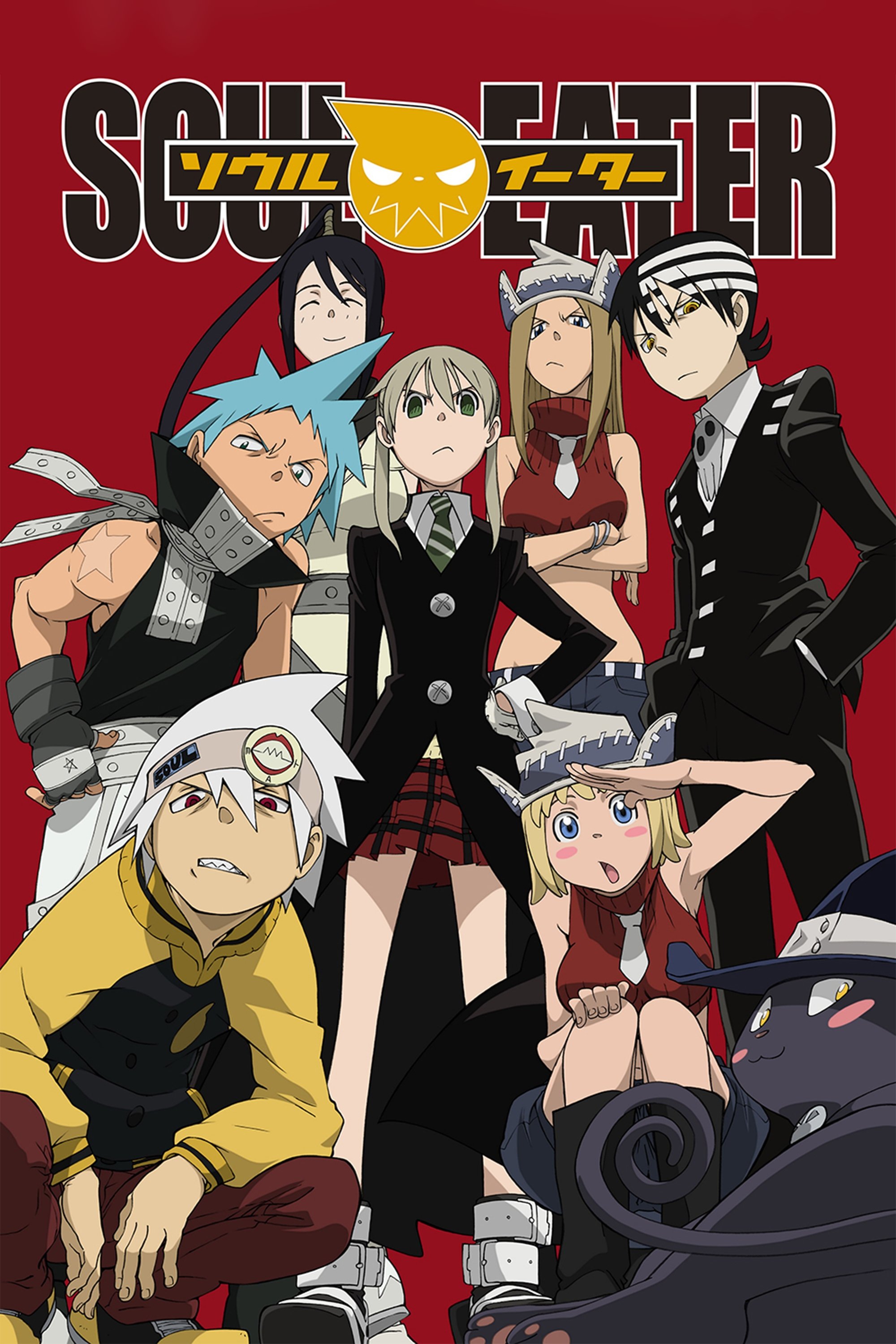
Okay, let me tell you about the visuals in Death City. The whole place is drenched in a Halloween vibe, but it’s not just decorations – everything seems to have a face or a soul! It’s seriously unsettling, and brilliantly done. The backgrounds aren’t static either; the walls and even the moon will change expressions to match what’s happening on screen, or how a character is feeling. They’ve covered the alleyways with graffiti that really adds to the weird, spooky atmosphere of the school. What I really loved is how consistent the art style is – it constantly reminds you that this world isn’t just a backdrop, it’s alive and reacting to everything. It’s a really clever touch.
‘Fire Force’ (2019)
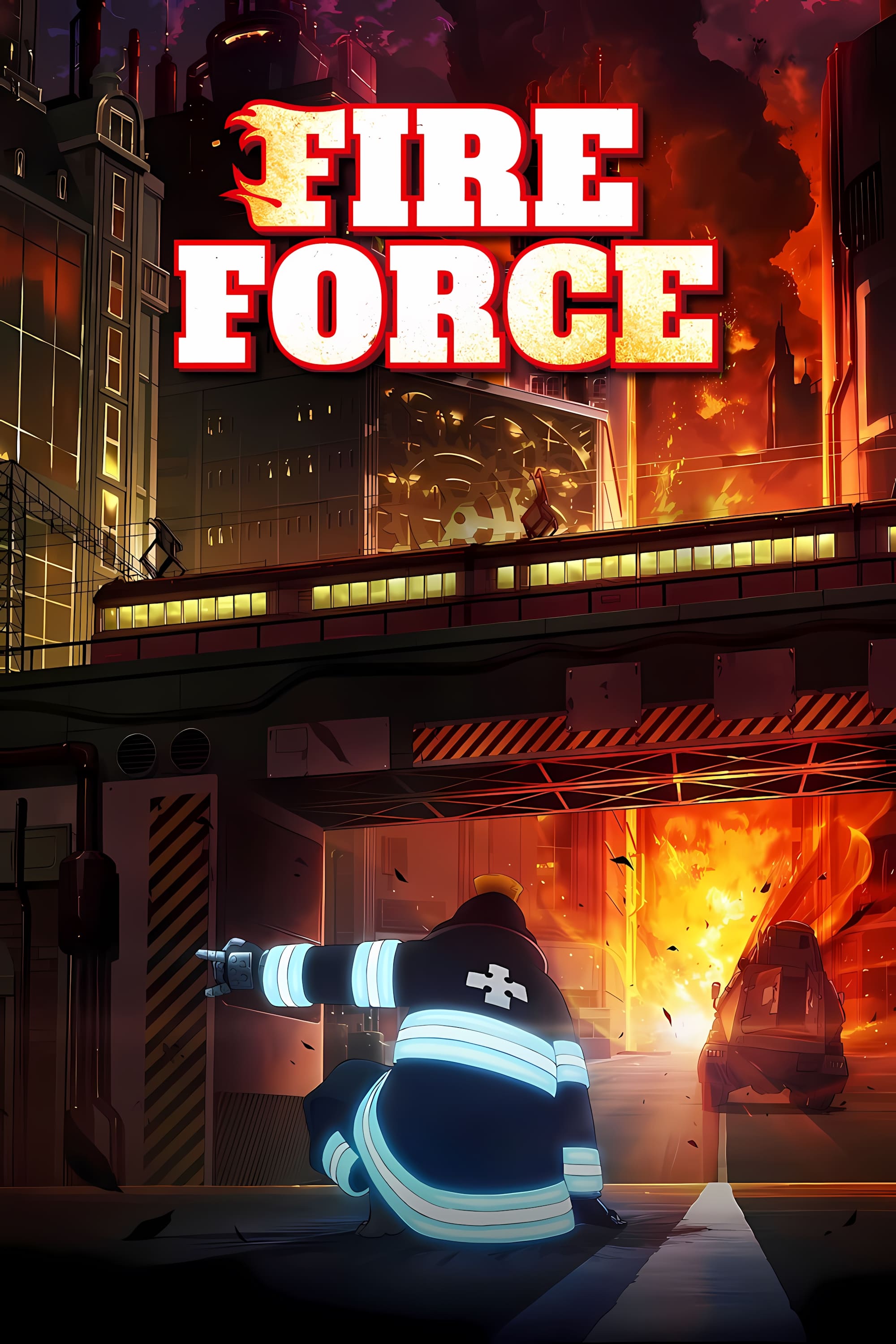
The city of Tokyo is falling apart, but you still see symbols of the Holy Sol Temple and fire departments everywhere. Old posters and faded signs in the subway tell the story of a past disaster, hinting at lost technology and the strict religious beliefs that now govern society. The difference between the pristine religious symbols and the dirty streets shows the huge gap between the rich and the poor.
‘Cowboy Bebop’ (1998–1999)
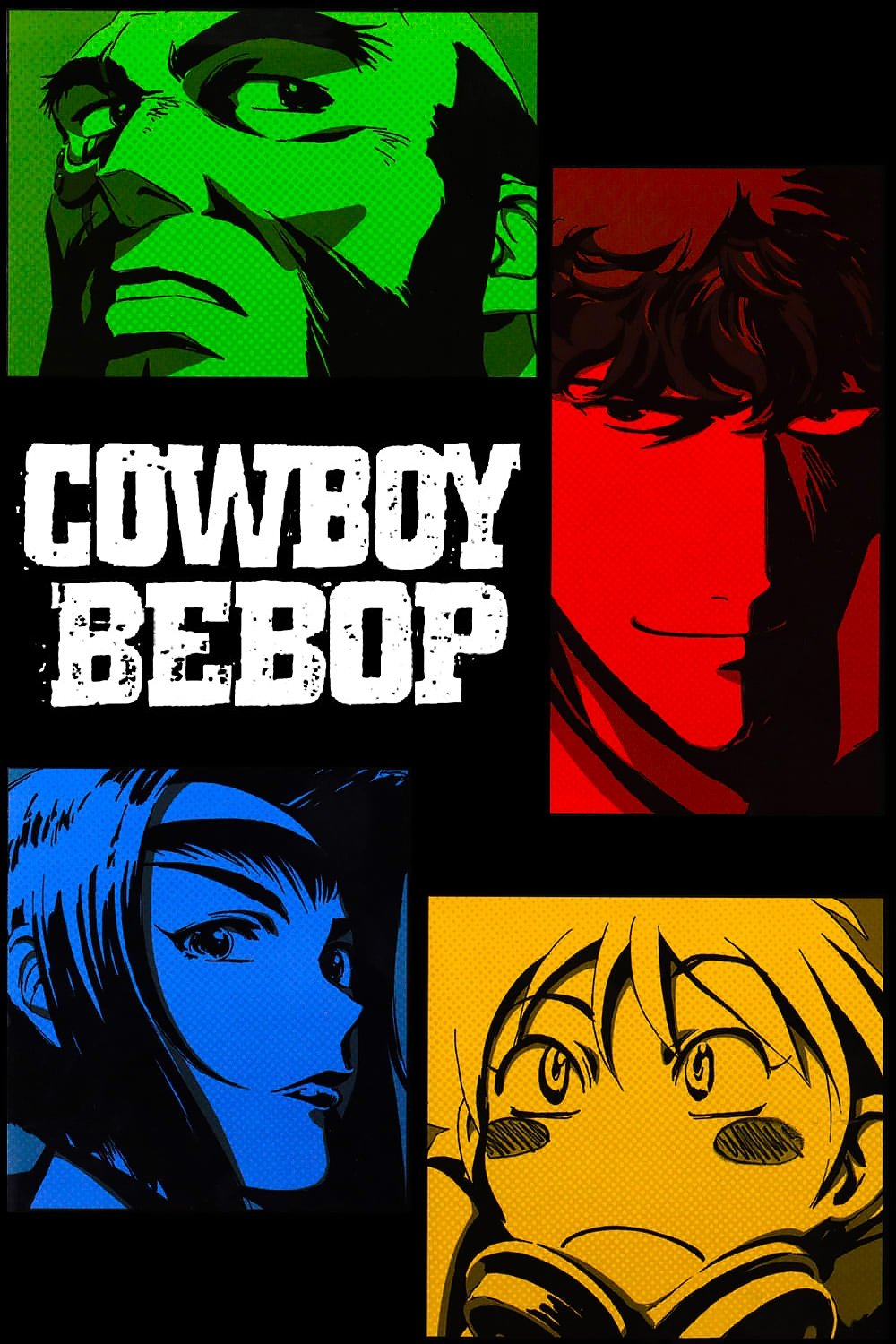
The planets and space stations the crew visits are filled with vibrant street art that reflects the diverse cultures of the solar system. You see advertisements and notes written in many languages, highlighting how people from different backgrounds have come together. These details create a rich and believable world, hinting at a long history of travel and cultural exchange. The worn-down look of the environments, with peeling posters and graffiti, adds to the sense of realism.
‘Samurai Champloo’ (2004–2005)
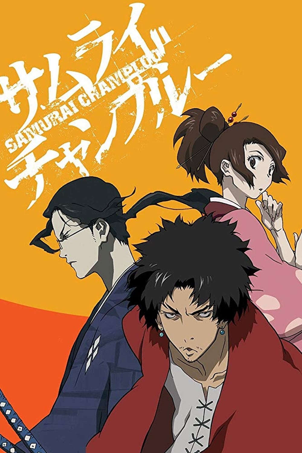
The show creatively mixes historical Japan with modern hip-hop, using its visuals and music to connect the two. You’ll see things like graffiti art appearing in traditional scenes, which playfully blends the old and the new. This artistic choice highlights the show’s unique style and adds a touch of rebellion to the historical setting.
‘Cyberpunk: Edgerunners’ (2022)
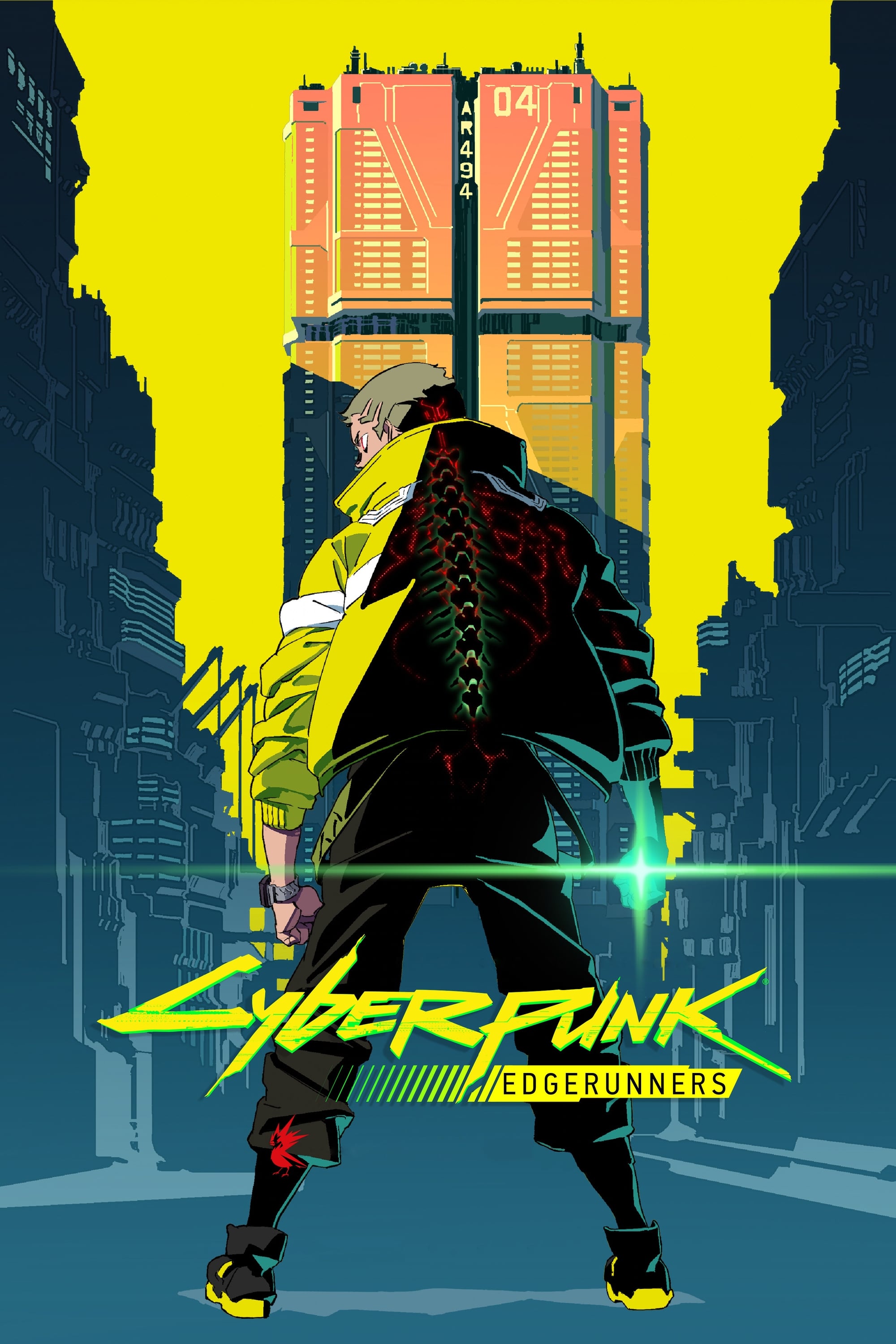
Night City is a visually overwhelming place, filled with bright neon lights and a constant flood of digital information. The city’s art – from slang-filled warnings to gang tags – reflects how dangerous different areas are. Fans of the original game will also find hidden references in the graffiti and ads. This constant visual chaos is meant to represent the fractured mental state of characters struggling with cyberpsychosis.
‘Great Pretender’ (2020)
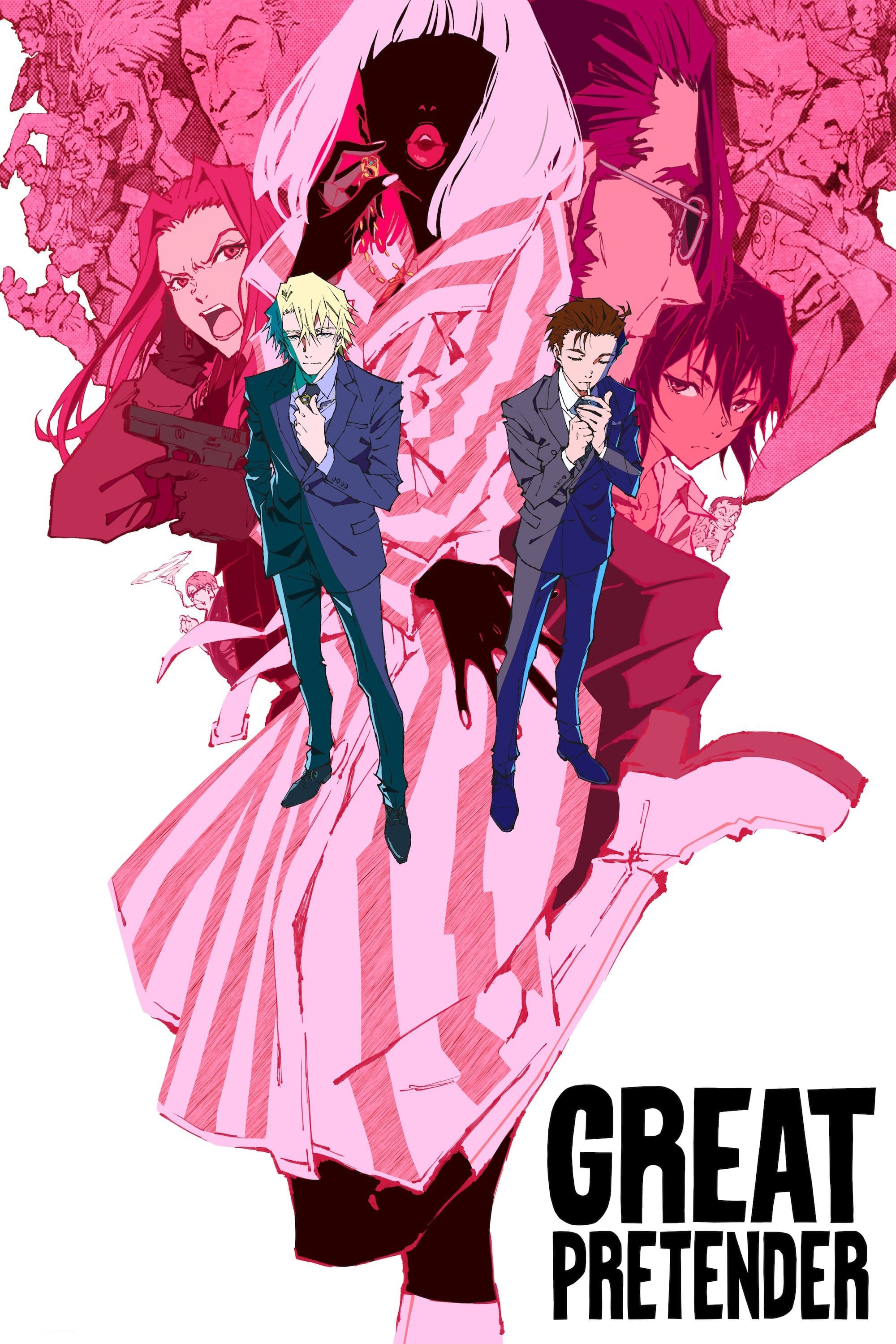
This series features bright, pop-art-inspired backgrounds that cleverly conceal details within their colors. The locations are shown as stylized posters and street signs, subtly foreshadowing the next step in the heist. The art style is so strong that even dirty city scenes look intentionally painted. Paying close attention to the backgrounds often reveals clues about how the cons are being planned.
‘Banana Fish’ (2018)
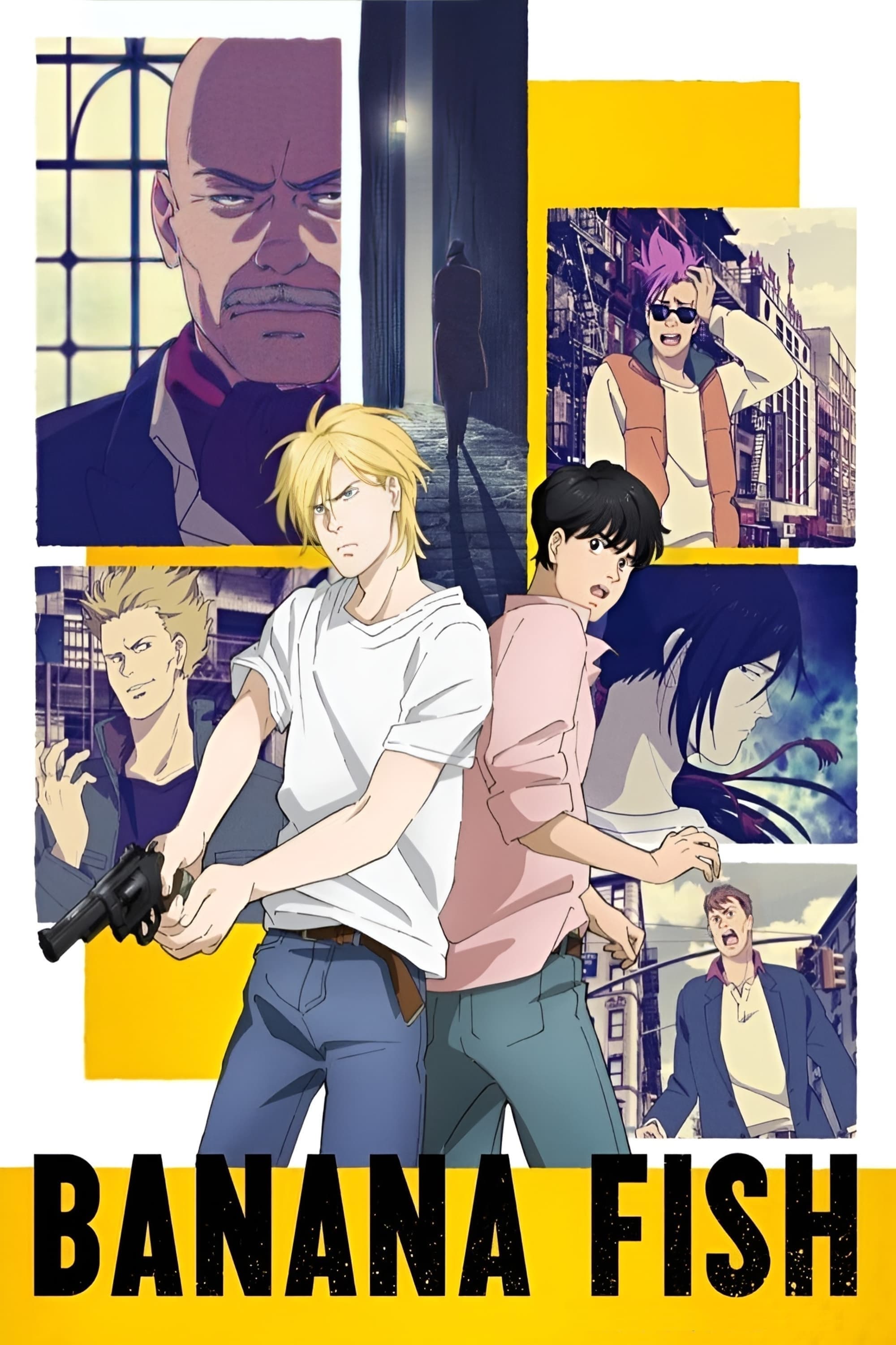
The story paints a raw picture of New York City, complete with authentic street art and gang markings that define different areas. These locations and the graffiti itself highlight Ash Lynx’s connection to the city and constantly remind us of the violence that shapes the characters’ lives. This harsh backdrop makes the quieter, more emotional moments between characters even more impactful.
‘Air Gear’ (2006)
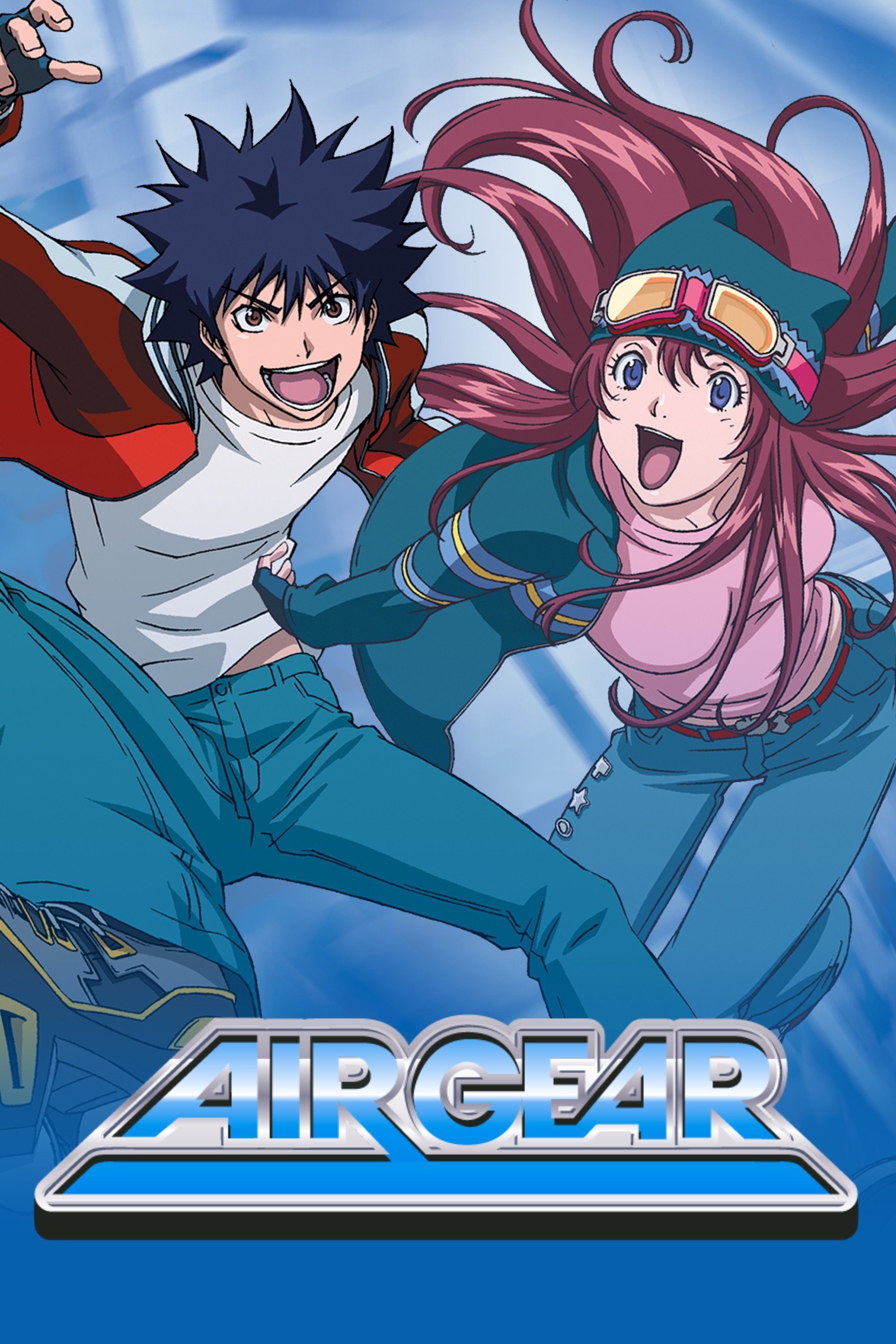
Graffiti and team symbols play a key role in the story. Riders use stickers to mark their territory and challenge rivals. The artwork showcases distinct team logos that show which groups are powerful and who leads them. Characters often interact with these markings to start fights or form partnerships. Each tag’s design gives clues about the team’s fighting style and beliefs.
‘Tokyo Revengers’ (2021)
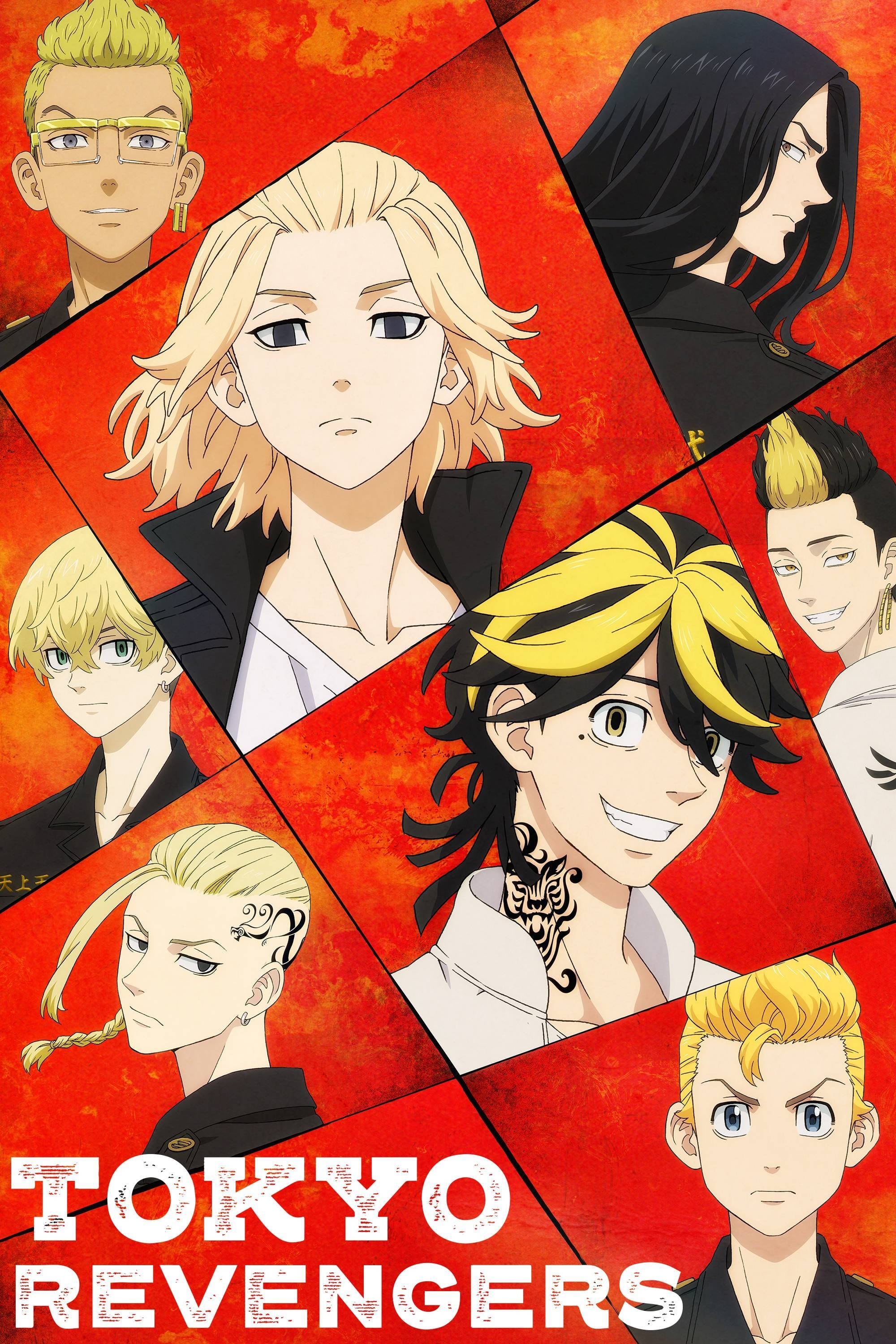
The show visually portrays the rebellious youth culture through clothing and gang symbols displayed on walls in their hangouts. These markings, often found at shrines and warehouses, show the changing balance of power between Toman and other gangs, and reflect changes to the timeline caused by the main character. Whether or not a specific piece of graffiti is present can even reveal which timeline the character is currently in.
‘Eureka Seven’ (2005–2006)
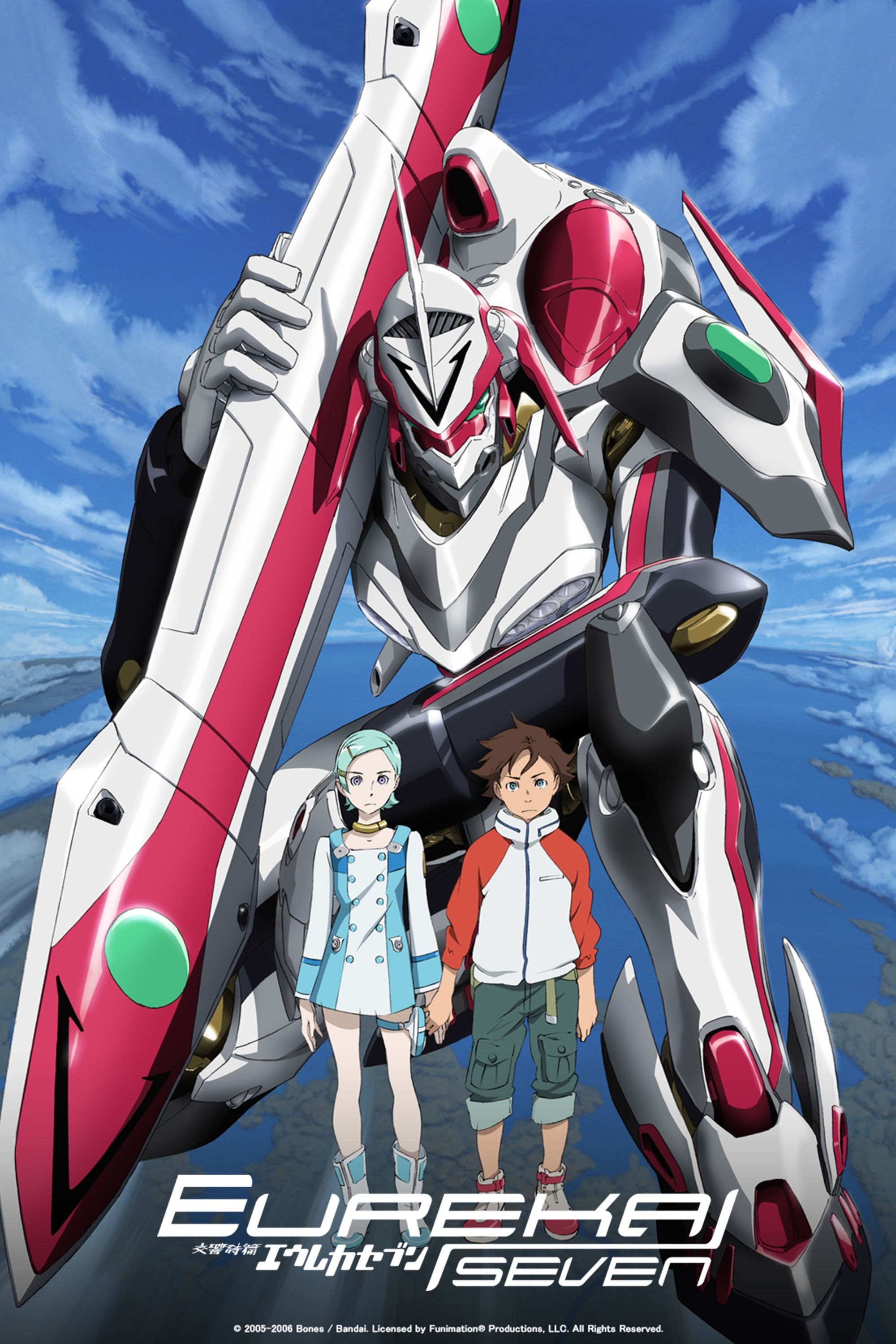
The Gekkostate group champions rebellion worldwide through their unique magazine and artistic style. Their striking graphic designs appear everywhere – on screens and walls in cities – becoming a signal for those who want to escape the harsh military rule. These widespread symbols demonstrate the group’s significant influence, especially among young people.
‘Neon Genesis Evangelion’ (1995–1996)
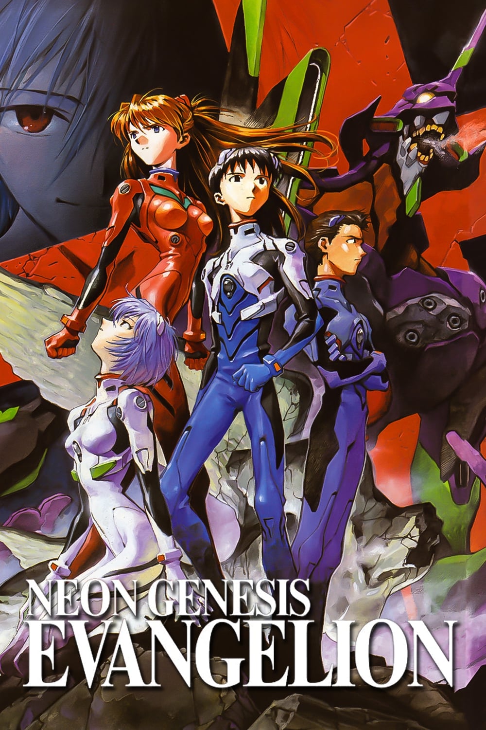
Tokyo-3 feels constantly on edge, with emergency alerts and NERV logos everywhere. The artwork often features religious symbols and complex diagrams, subtly hinting at the deeper, spiritual forces at play in the Human Instrumentality Project. This unsettling imagery stands out against the clean, modern setting and suggests the characters are all struggling with their own inner turmoil.
‘Serial Experiments Lain’ (1998)
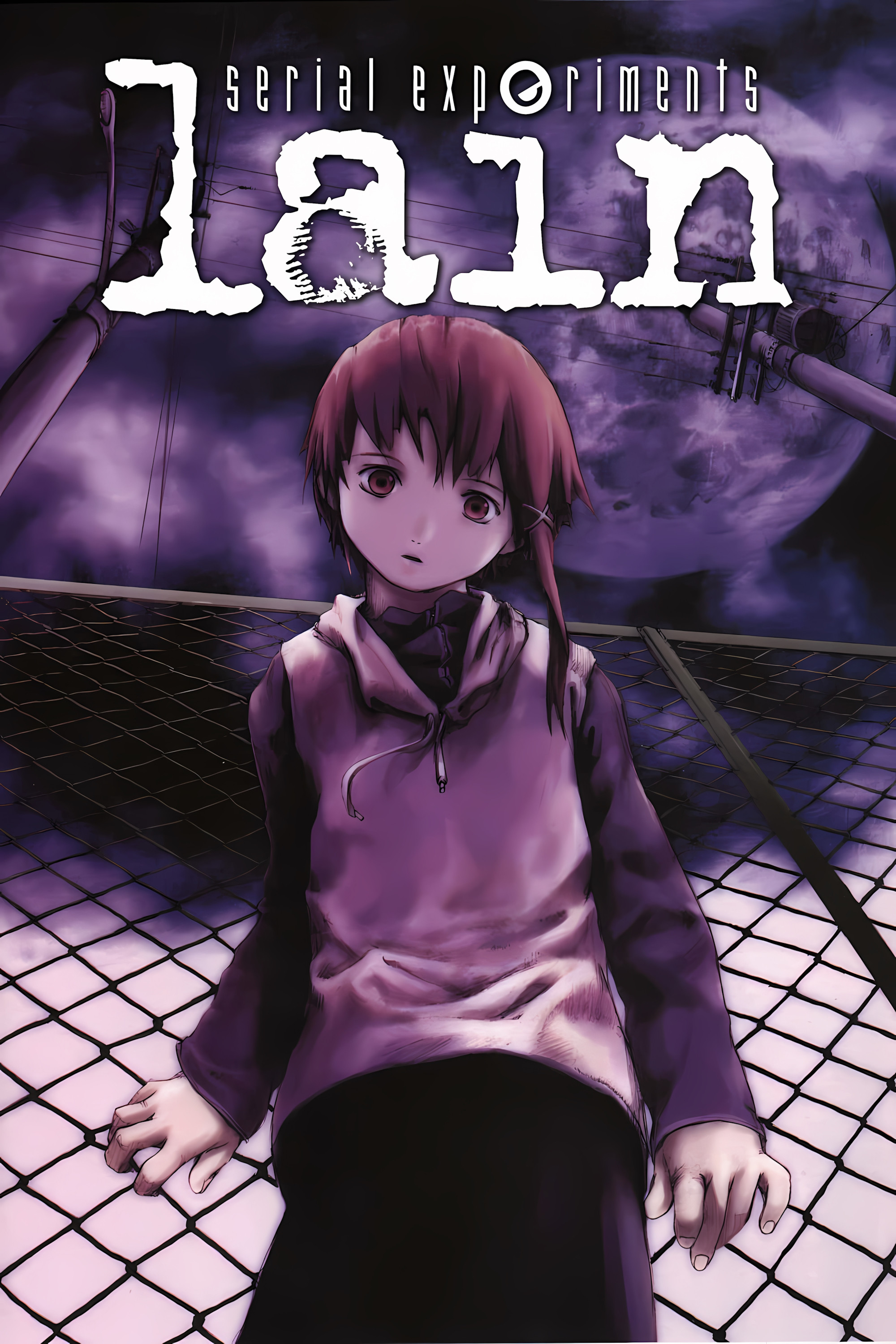
The line between the real world and the digital one becomes increasingly unclear, shown through shadowy images and the appearance of digital text. The backgrounds are filled with red marks and static, resembling damaged files or graffiti. These strange visuals happen more and more as Lain struggles to stay grounded in reality. Throughout the series, questions about life and existence are posed, prompting viewers to think deeply about the story they’re watching.
‘Ghost in the Shell: Stand Alone Complex’ (2002–2003)
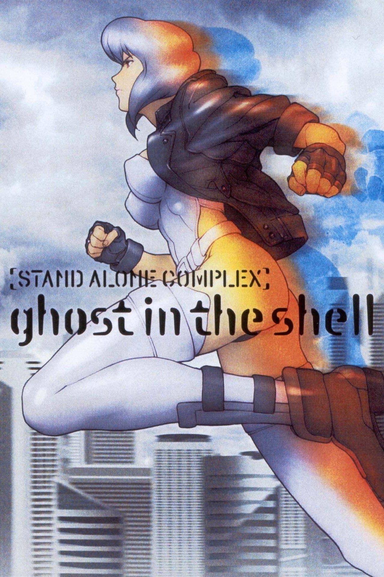
The movie’s detailed world is brought to life through constantly updating news feeds and futuristic ads. Digital tags and hacking messages pop up in the characters’ augmented reality views, offering clues about the story’s refugee crisis and corporate spying. To fully understand the plot, viewers need to pay attention to everything happening on screen, not just the main action.
‘Ergo Proxy’ (2006)
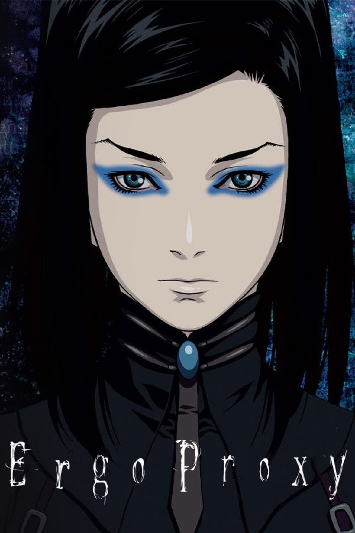
Romdeau, a city enclosed by a dome, is filled with official, controlling messages. Outside the city, in the harsh wasteland, you find the desperate writings of those who’ve been banished. Throughout the world, references to classic philosophy and literature echo the personal journey of the main character, Re-l Mayer. Even the robots, infected with a special virus, sometimes leave clues suggesting they are becoming aware. All these details work together to highlight the story’s themes of finding meaning in life and what it means to have a soul.
‘Devilman Crybaby’ (2018)
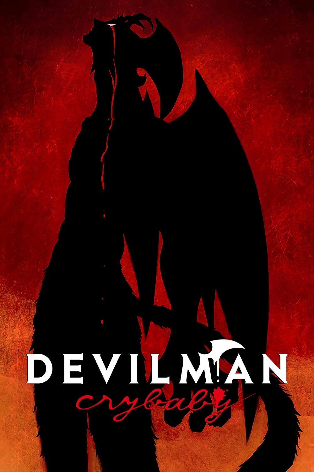
Director Masaaki Yuasa cleverly uses the changing backgrounds to show how evil is infecting people. As demons take control, the art shifts from normal city scenes to violent graffiti and chaotic signs. This visual change, from clean streets to destroyed buildings, quietly tells the story of the world’s downfall, and subtly hints at the heartbreaking end of Akira and Ryo’s friendship.
‘Sarazanmai’ (2019)
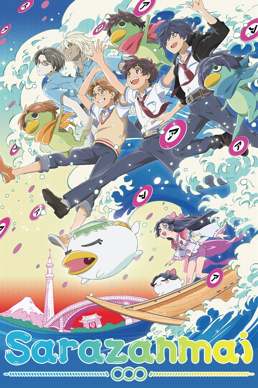
As a film buff, I was really struck by how Asakusa was brought to life in this movie. They used incredibly detailed, almost photographic backgrounds, but then layered these cool, stylized ‘a’ shapes over everything. What I found really clever was how the writing on signs and boxes wasn’t just random – it actually changed to hint at what the characters were keeping secret from each other! And it wasn’t just English – certain Japanese characters, or kanji, kept popping up, subtly reinforcing the movie’s ideas about relationships and longing. You genuinely have to look at the details – the writing on the boxes, especially – to fully grasp what’s going on emotionally in each scene. It’s a brilliant way to add layers of meaning.
‘Revolutionary Girl Utena’ (1997)
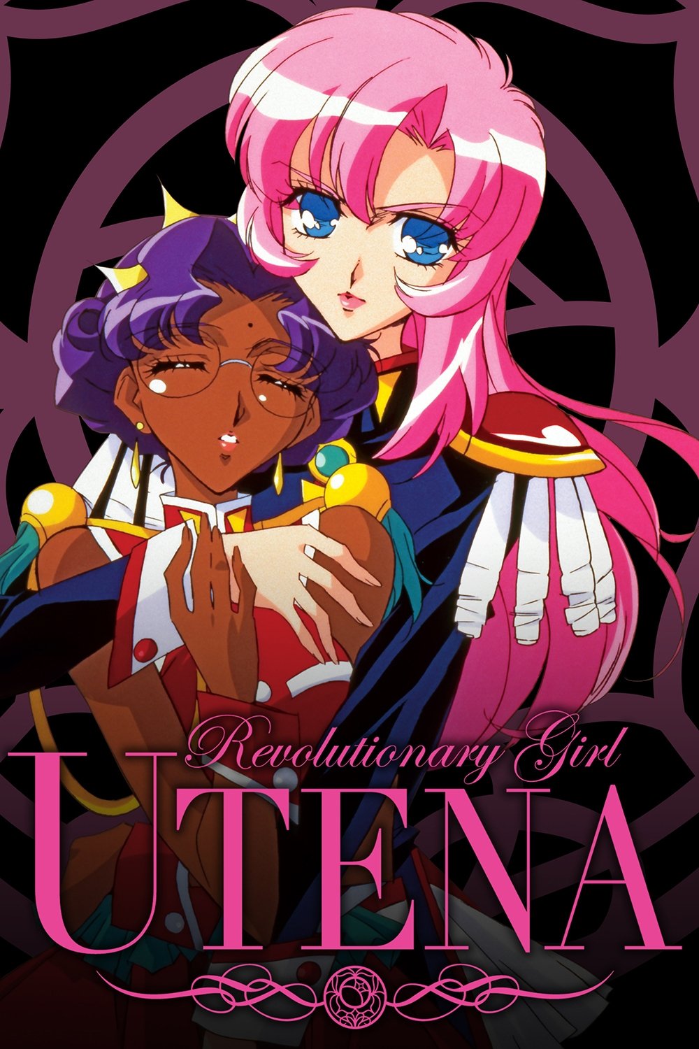
Ohtori Academy’s strange and dreamlike design features roses and mysterious figures who comment on the action like a traditional Greek chorus. The school’s decorations, like crests and statues, often reflect what the dueling students are feeling. Even the layout of the academy seems to shift and change to emphasize the story’s themes. These details are more about creating a mood and meaning than making logical sense.
‘Mob Psycho 100’ (2016)
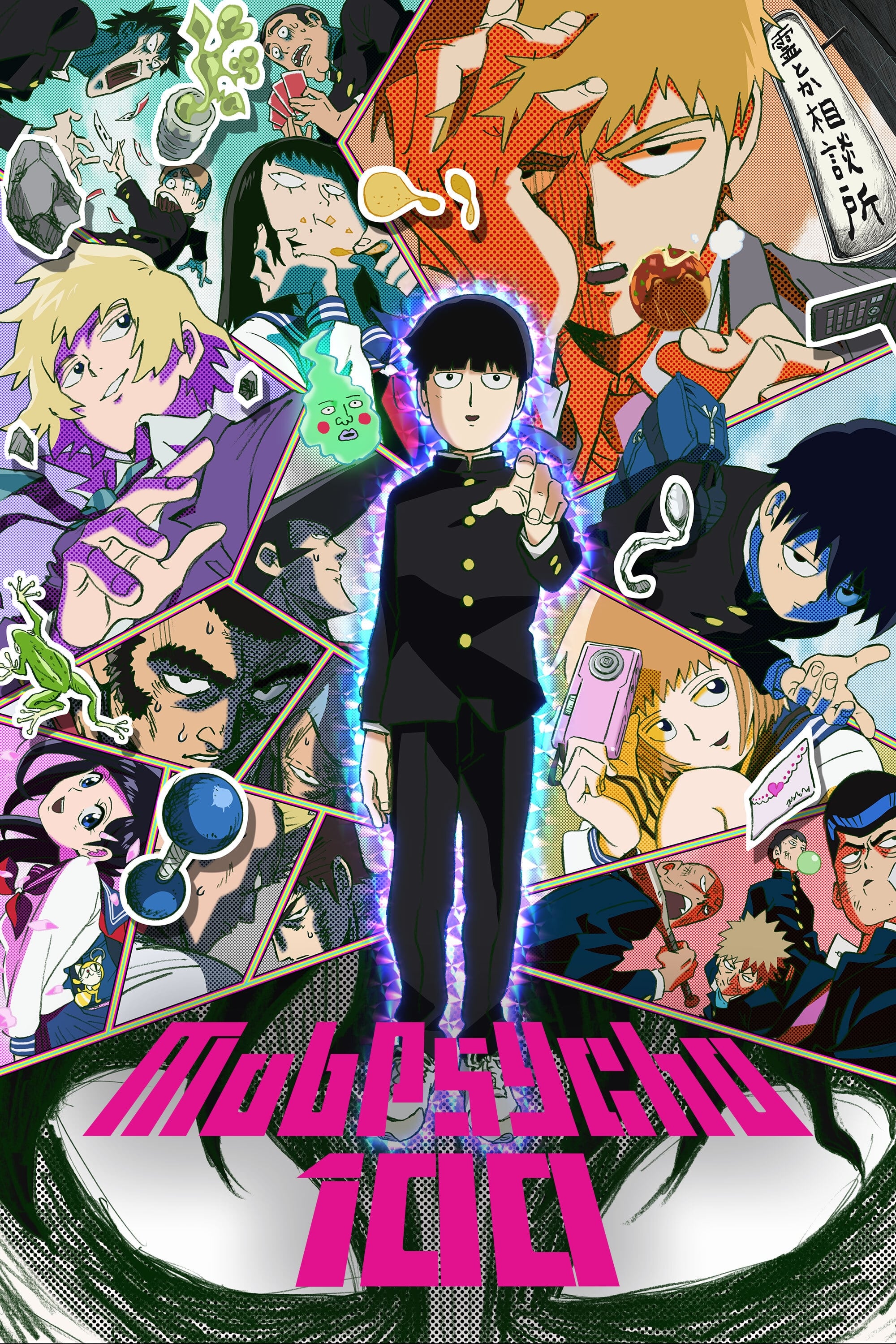
As a total animation fan, one of the things I love about ‘Mob Psycho 100’ is how the world itself feels alive. It’s packed with little details – posters referencing other shows by the same creator, background jokes about the characters – that you can spot if you’re paying attention. But it’s more than just Easter eggs. When Mob’s powers start to surge, the visuals go crazy! Everything warps and the lines become really sharp and intense. It’s a brilliant way to show how much emotional pressure he’s under and it really drives the story forward, visually telegraphing when things are about to explode.
‘JoJo’s Bizarre Adventure’ (2012–Present)
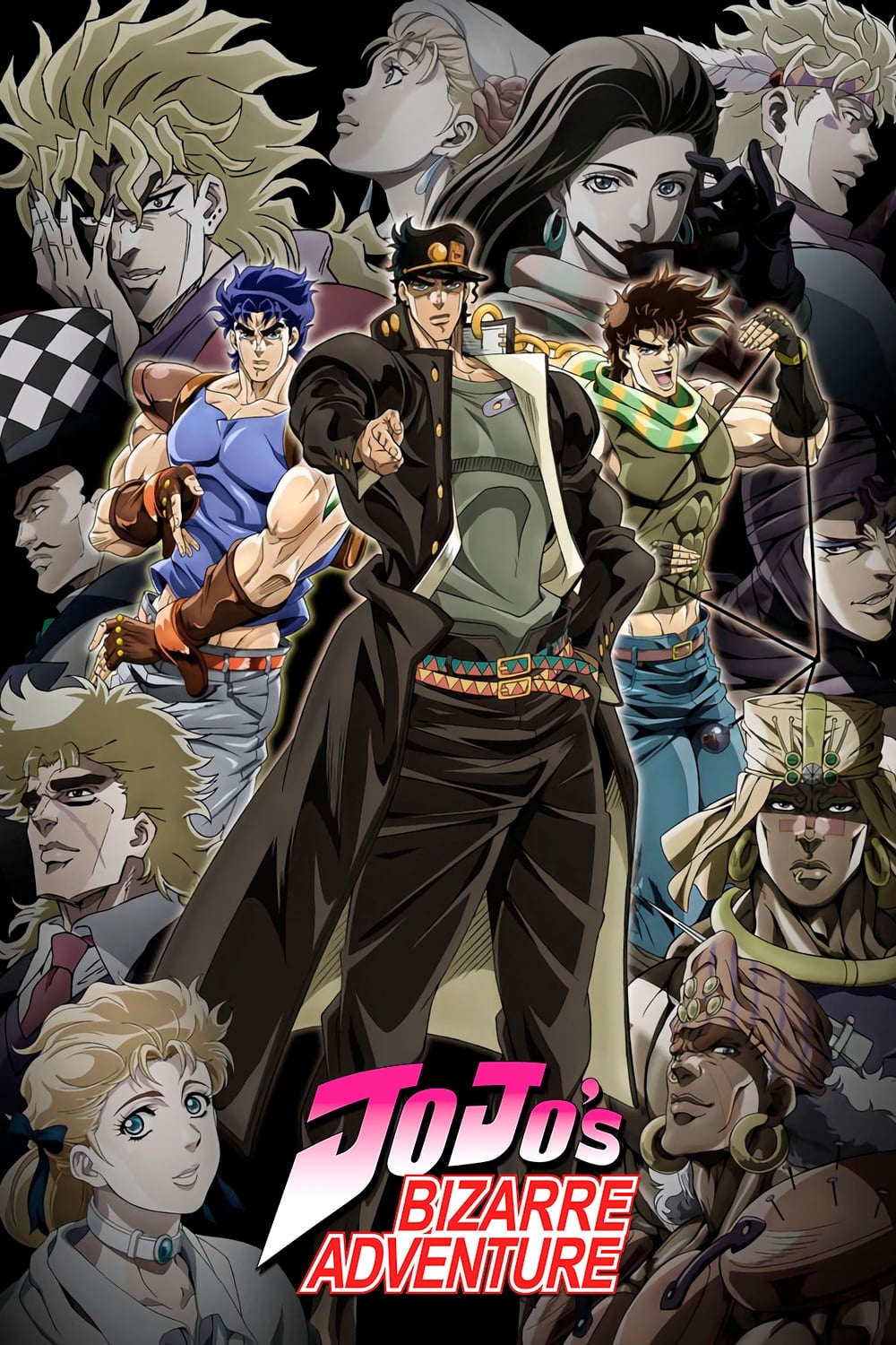
This anime is well-known for how it blends sound effects with the visuals. Large Japanese characters often appear in the background or on objects, highlighting key moments. This technique successfully captures the look and feel of manga in animated form. The show’s distinctive, booming sound text has become a signature element, immediately warning viewers of approaching threats.
‘Promare’ (2019)
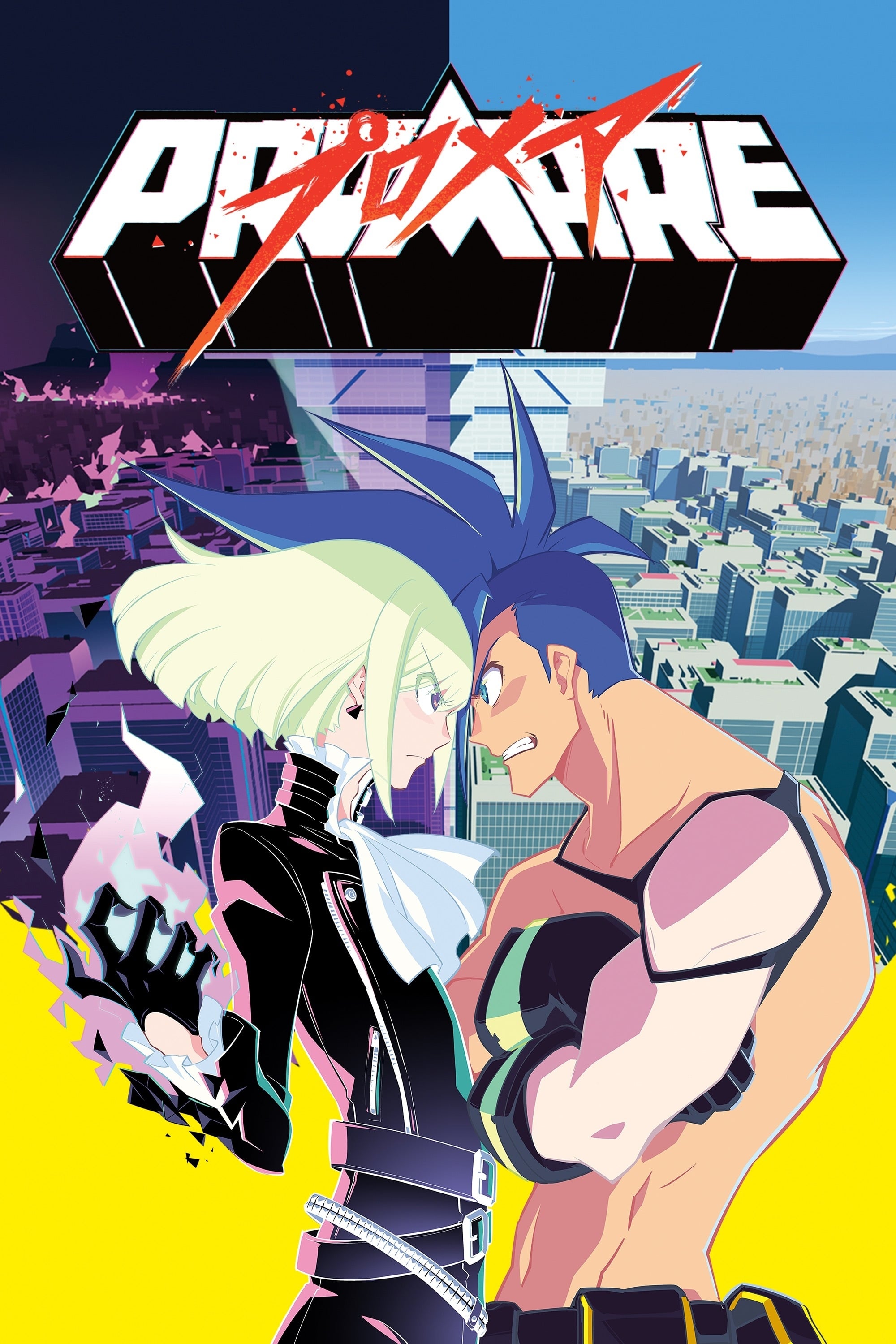
Promepolis has a unique visual style defined by geometric shapes and bright neon colors. The city’s buildings incorporate text and holographic displays with a sharp, flat design. Subtle propaganda posters hint at the controlling, fascist nature of the government. The overall effect is a deliberately artificial and intensely graphic world that feels carefully controlled.
‘Dead Leaves’ (2004)
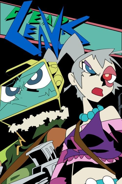
The film’s lunar prison looks like a constantly moving comic book, drawn with a raw, sketchy style. Almost every surface is covered in graffiti, creating a visually busy and overwhelming experience. This chaotic artwork mirrors the confused state of the main characters, who are struggling with memory loss. The scribbles themselves often include jokes and edgy drawings, fitting the animation’s mature themes.
‘Redline’ (2009)
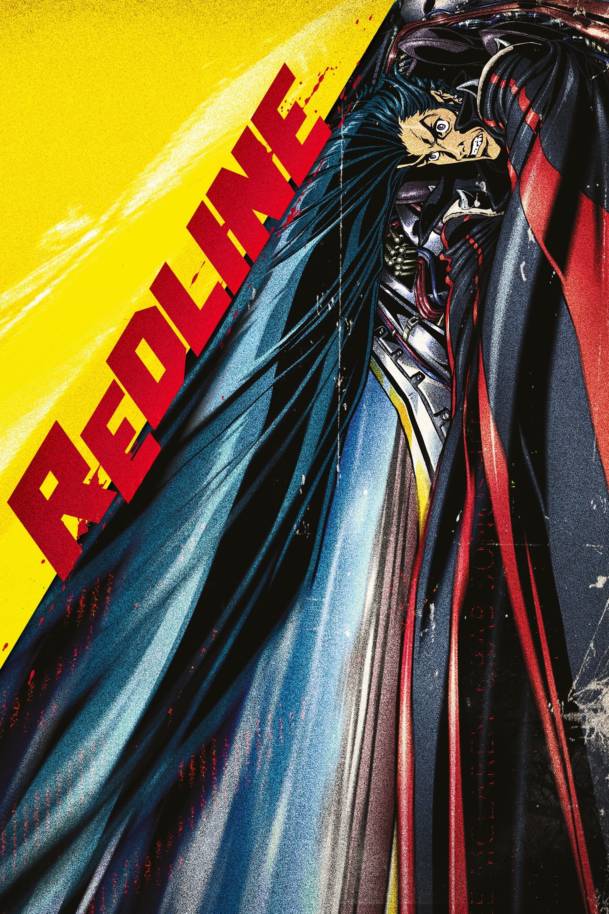
The racetrack is covered in alien ads and messages from fans. The animation includes lots of small details, like dirt and grease, to make the racing world feel real. The crowded scenes and busy environments create a sense of incredible speed and size. The screen is filled with details that help build a convincing science fiction setting.
‘Tekkonkinkreet’ (2006)
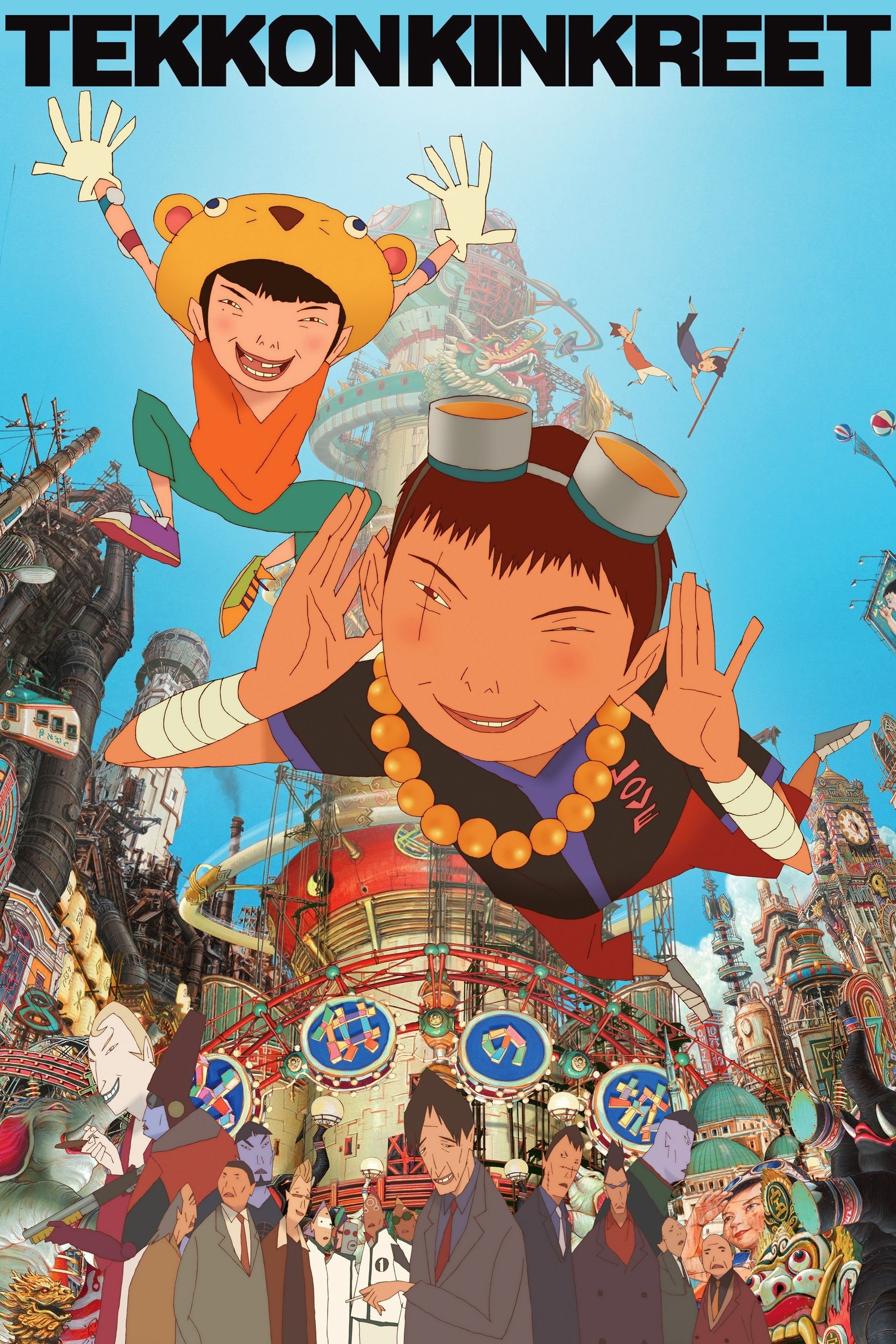
Treasure Town is a vibrant, bustling place that feels realistically worn and old. The artwork is full of tiny details – you can see rust, cracks, and peeling paint on all the buildings. It’s a unique mix of old Japan and modern city life, reflected in the signs and buildings. This detailed and busy look of the town actually represents the complicated relationship between the two main characters, who are orphans.
‘Dorohedoro’ (2020)
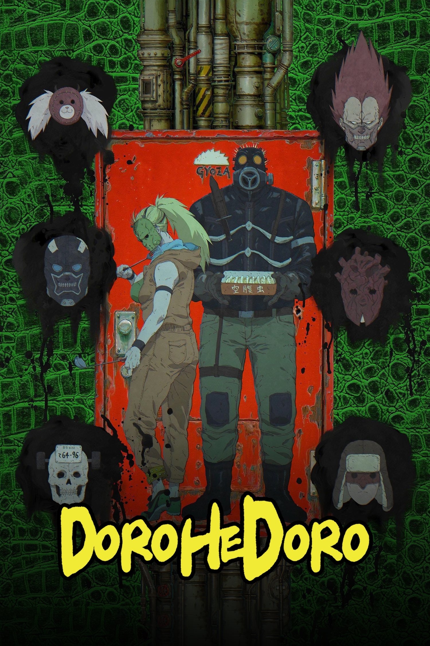
The Hole is a bleak, dirty city where magic users practice their abilities on vulnerable people. Everything looks and feels grimy, from the rough textures of the buildings to the visible dirt in the streets. Missing person posters and warnings about dangerous sorcerers are everywhere, covering the alleyways. The graffiti and general decay create a sense of hopelessness that the city’s inhabitants have come to expect.
‘Paranoia Agent’ (2004)
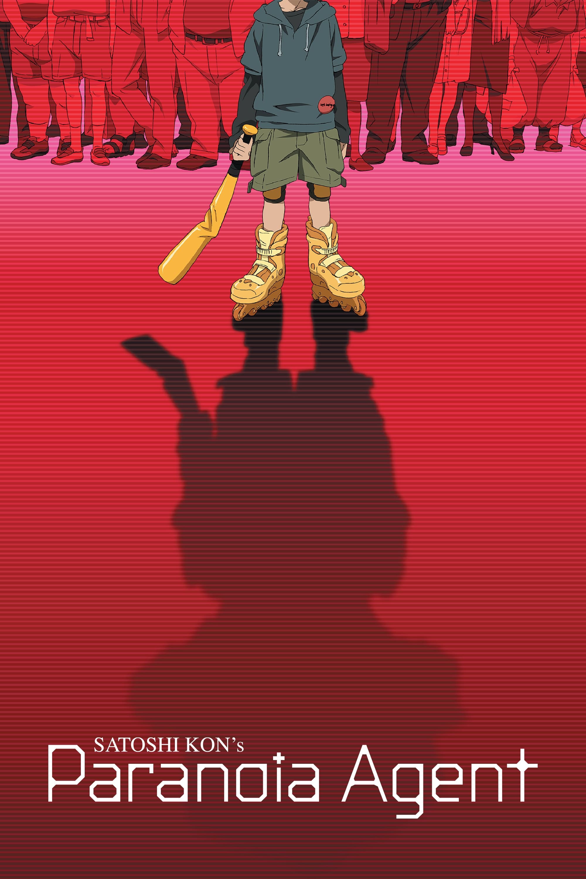
The adorable mascot Maromi is featured on posters and products all over the city. However, as panic over Shonen Bat grows, images of Maromi start to appear warped and everywhere you look. This contrast between the character’s sweet design and the story’s disturbing themes is emphasized by these details in the environment. The artwork subtly shows how society is falling apart due to everyone trying to escape their problems.
‘Paprika’ (2006)
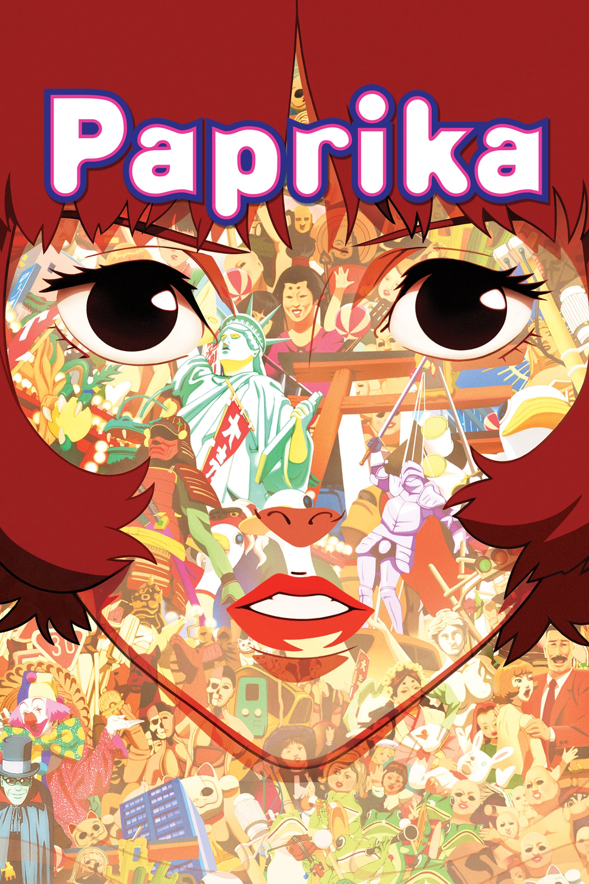
A bizarre procession from the dream world spills into the city, pulling objects and words with it. Signs and advertisements awaken and join the strange, dreamlike march. Text often becomes jumbled or takes on a threatening tone as the line between dreams and reality blurs. Director Satoshi Kon employs these images to illustrate a character’s struggle with losing control of their own thoughts and feelings.
‘Space Dandy’ (2014)
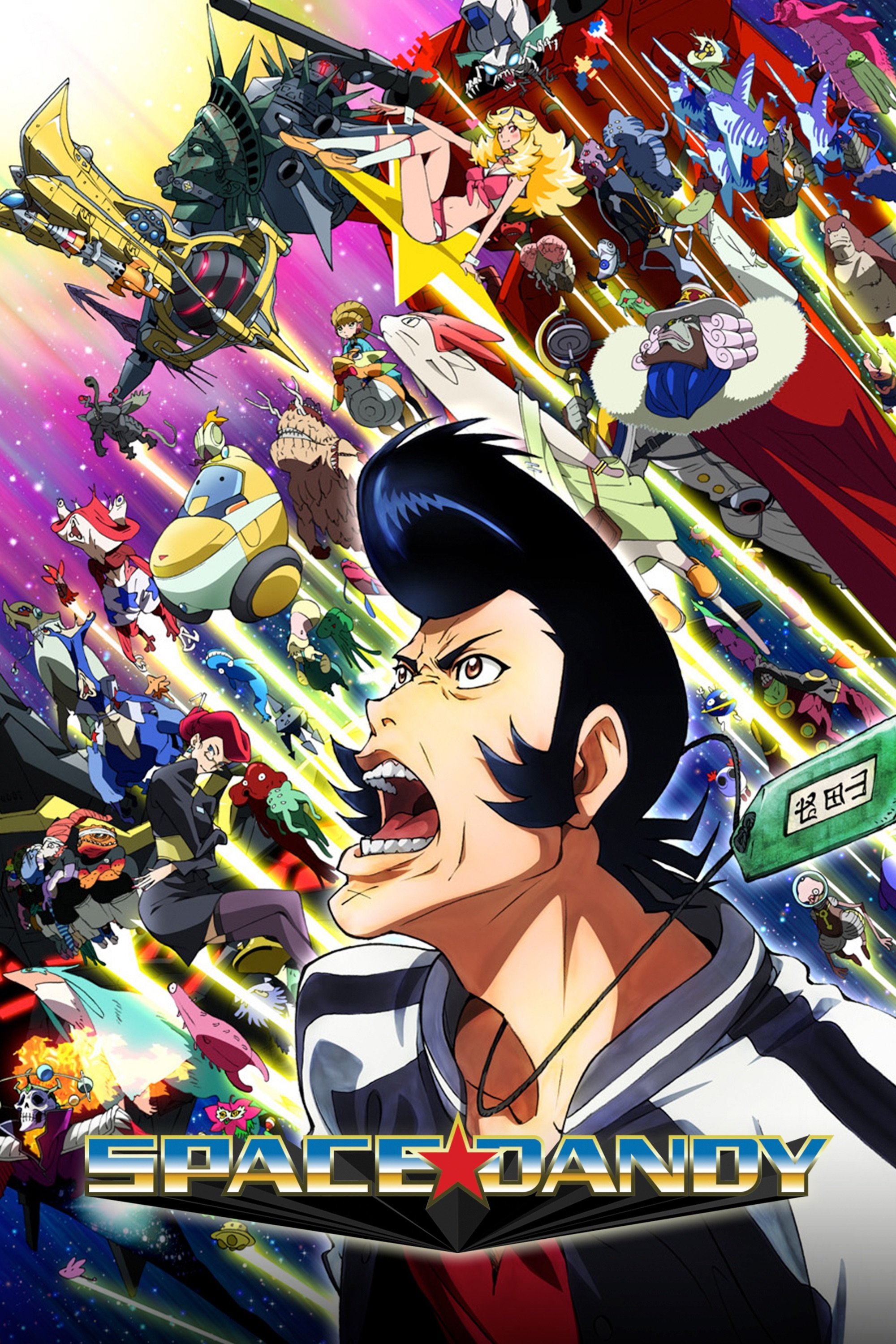
Each alien planet in Space Dandy has its own unique language and writing system, visible on walls and signs. Guest artists designed these details to give each episode a special feel and quickly show us what life is like on each new world. This variety of visuals helps create the impression of a huge and diverse universe.
‘Michiko & Hatchin’ (2008–2009)

The game’s South American setting feels authentic thanks to details like Portuguese signs and vibrant street art found in the favelas. Political posters and religious symbols add to the cultural richness and help root the story in a specific place. The locations feel lived-in, with peeling paint and colorful murals showing both hardship and energy, which makes the overall road trip story more believable.
‘Black Lagoon’ (2006)
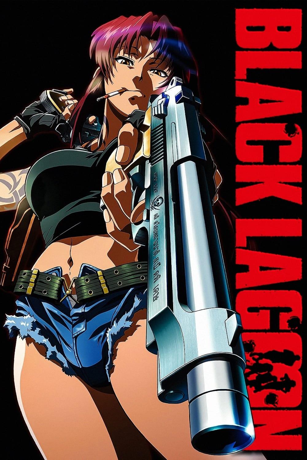
Roanapur is a dangerous city, visually marked by bright neon lights and the damage of constant gunfire. Different areas are controlled by powerful groups like the Russian mafia and the Triads, and you can tell which group controls an area by the language used on signs. These signs also often feature references to western movies, guns, and other action-packed imagery, contributing to the city’s gritty and lawless atmosphere.
‘Darker Than Black’ (2007)
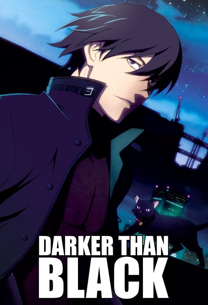
The sudden appearance of Hell’s Gate in Tokyo dramatically alters the night sky and the city’s landscape. You can often see the high wall surrounding the area, along with the surveillance technology keeping watch. Interestingly, the artificial stars in the sky reflect the lives of those involved – known as Contractors – and viewers can actually witness their deaths by observing the stars. The clean, modern facilities of the Syndicate stand in stark contrast to the rundown, decaying areas near the wall.
‘K’ (2012)
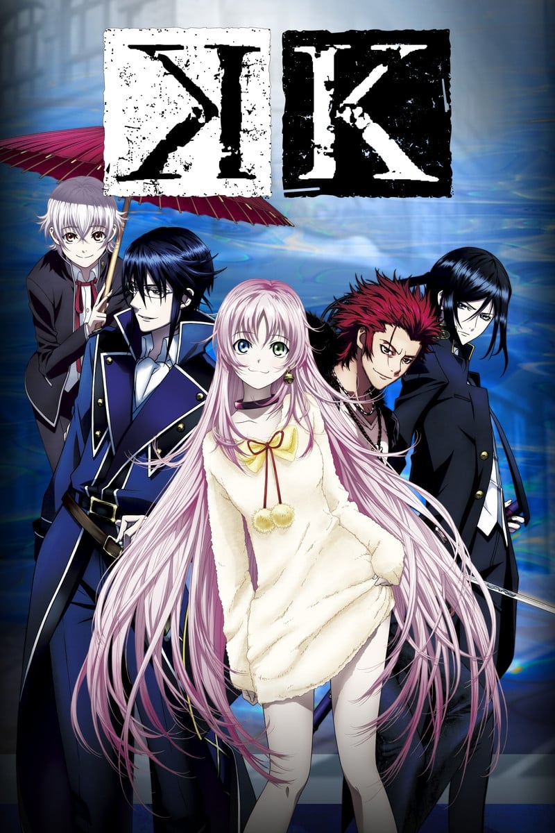
The game has a unique look created with strong filters and lighting, which really brings its modern fantasy world to life. Team symbols, like the Homra’s flame, are displayed as projections or markings within their areas, clearly showing where it’s safe and where battles will take place. The use of color also helps players understand the different groups and who is allied with whom.
‘Bungo Stray Dogs’ (2016–Present)
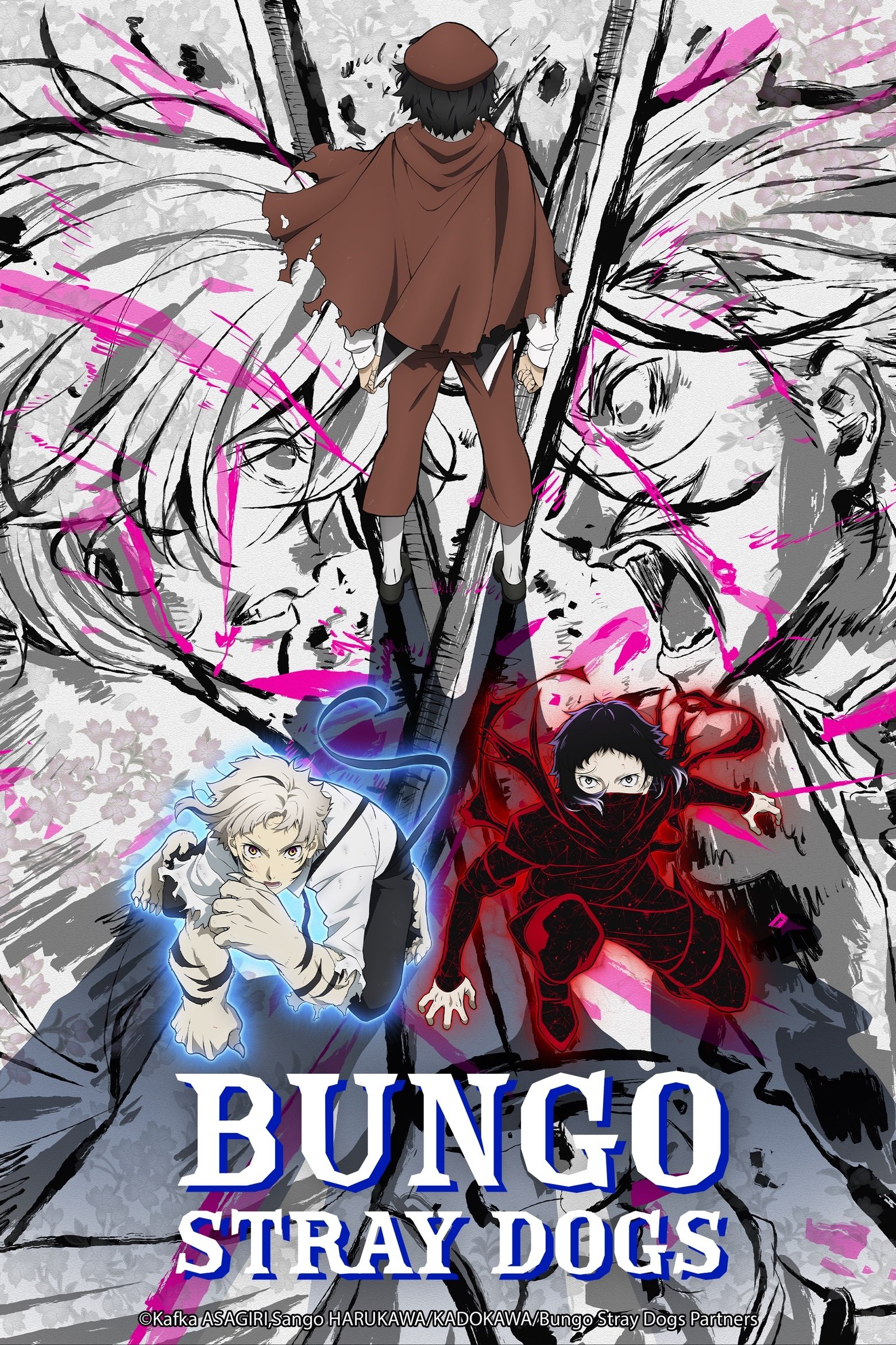
The Port Mafia and Armed Detective Agency are visually different, and this is clear in the design of their headquarters. The city of Yokohama itself often includes hidden details in its scenery, like references to famous books or hints about what characters can do. The mafia’s bases look dark and intimidating, while the detective agency’s office feels bright and welcoming. You’ll often see signs of recent battles – like warning tape and police barricades – throughout the city.
‘Akudama Drive’ (2020)
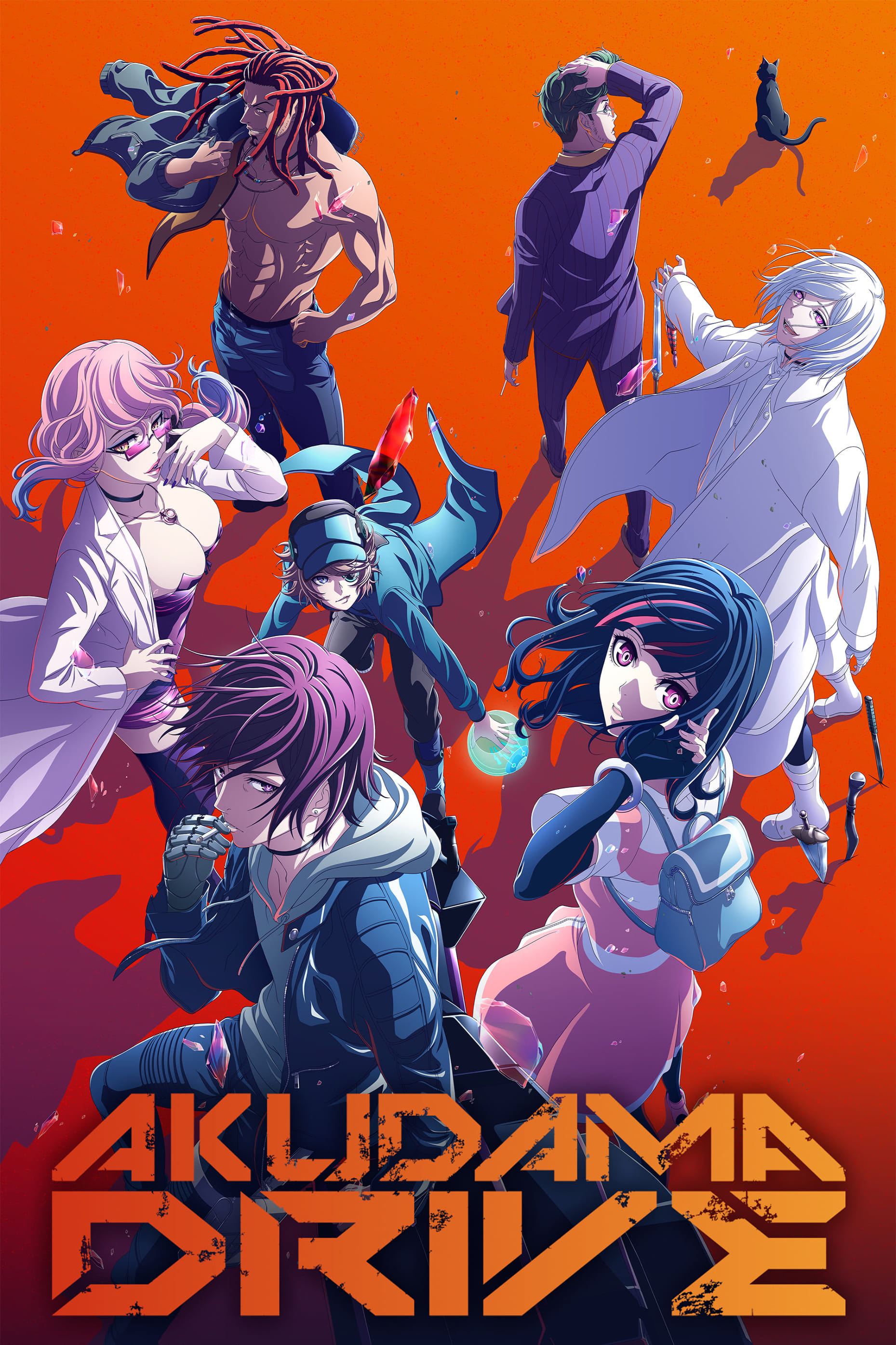
Neon lights and shimmering holograms define the cyberpunk landscape of Kansai. Ads and official notices are everywhere, constantly reminding people of the harsh rules of this society. Symbols of the government’s enforcement division are prominently displayed to frighten and control the population. This overwhelming visual experience is a commentary on excessive consumerism and the power of the state.
‘Zom 100: Bucket List of the Dead’ (2023)

Instead of the typical dark and gruesome imagery, this zombie apocalypse is shown with vibrant neon colors. The main character’s bucket list items are cleverly woven into the scenes as visual elements. This bright, graffiti-inspired style surprisingly turns the horror into a feeling of liberation and sets the series apart from other zombie stories.
‘Gintama’ (2006–2018)
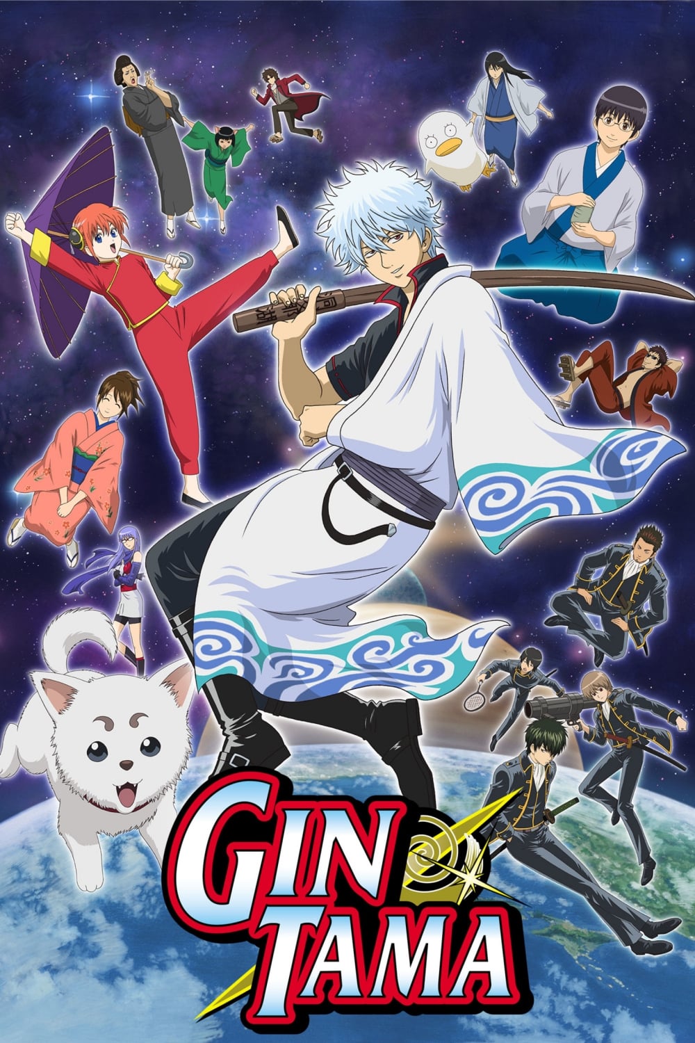
This show takes place in historical Japan, but with a twist: aliens have arrived! This leads to a funny combination of old temples and futuristic technology. The creators also add jokes in the background – often through signs that make puns or even jokingly complain about the show’s limited budget. These hidden gags are a key part of the humor and encourage viewers to pay close attention. The show constantly emphasizes how strange and unexpected the world is through these clashing visuals.
‘Assassination Classroom’ (2015–2016)
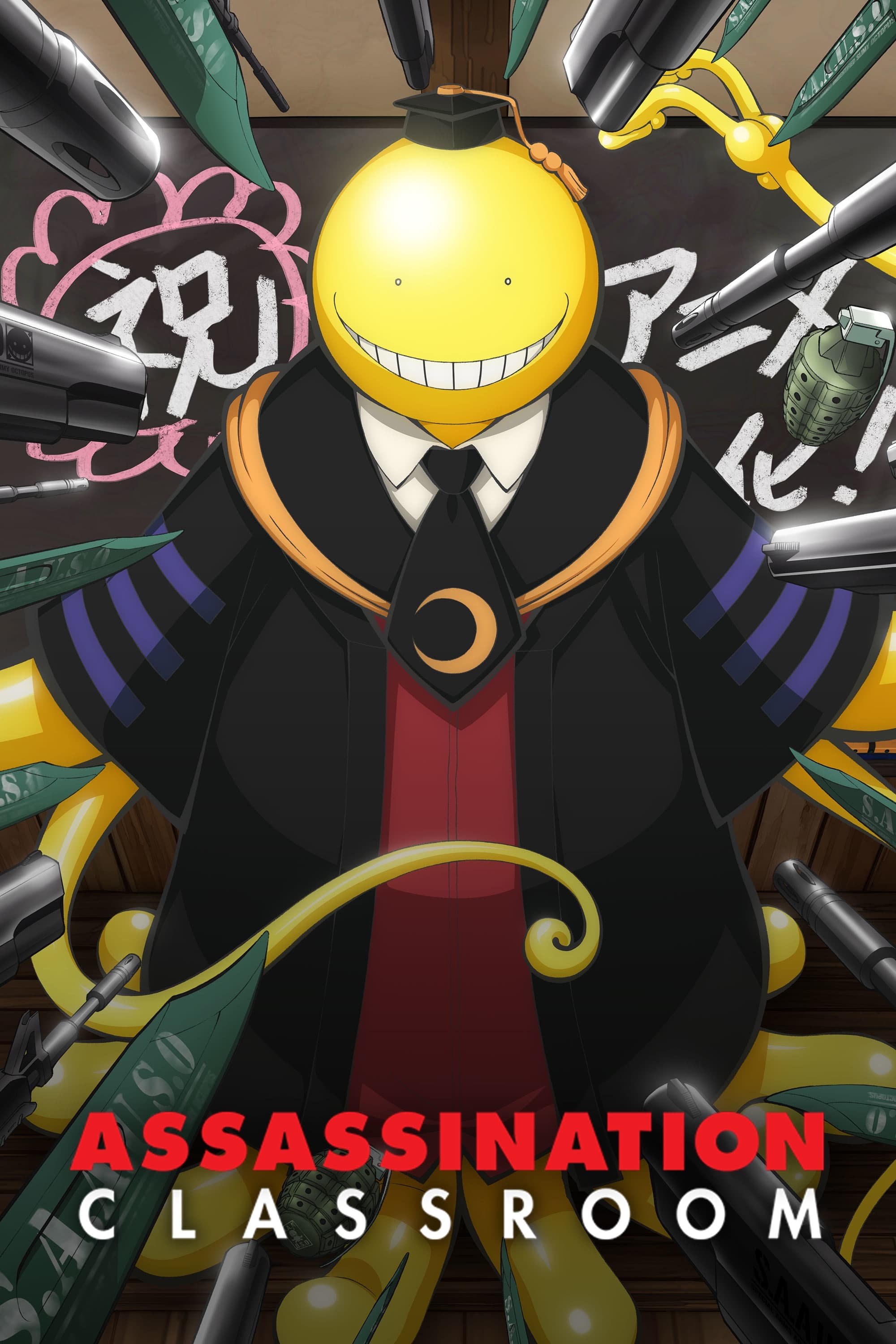
The classroom is usually a mess, showing signs of constant attacks – like bullet holes and burn marks – that everyone just seems to accept. As a running joke, Koro-sensei often blends into the background, camouflaged by the scenery. These details highlight how strangely normal this chaotic life has become for the students.
‘The Tatami Galaxy’ (2010)
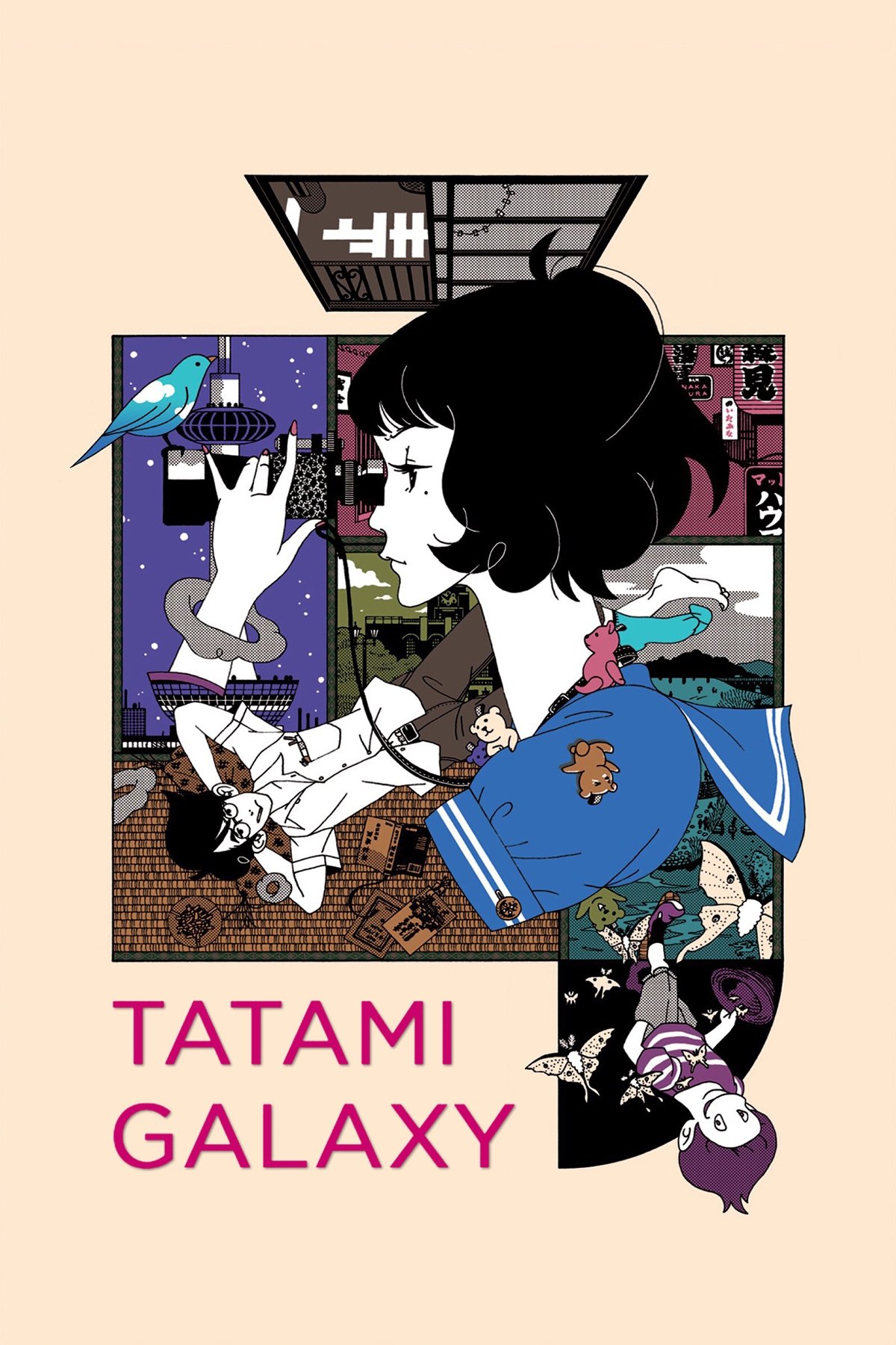
The quick dialogue is paired with a flurry of visual details in the scenes. Words and signs flash by quickly, mirroring the main character’s chaotic thinking. The unique backgrounds are intentionally distorted to emphasize the story’s repeating nature. To understand the different timelines, viewers need to carefully watch for changes in the visuals.
‘Sonny Boy’ (2021)
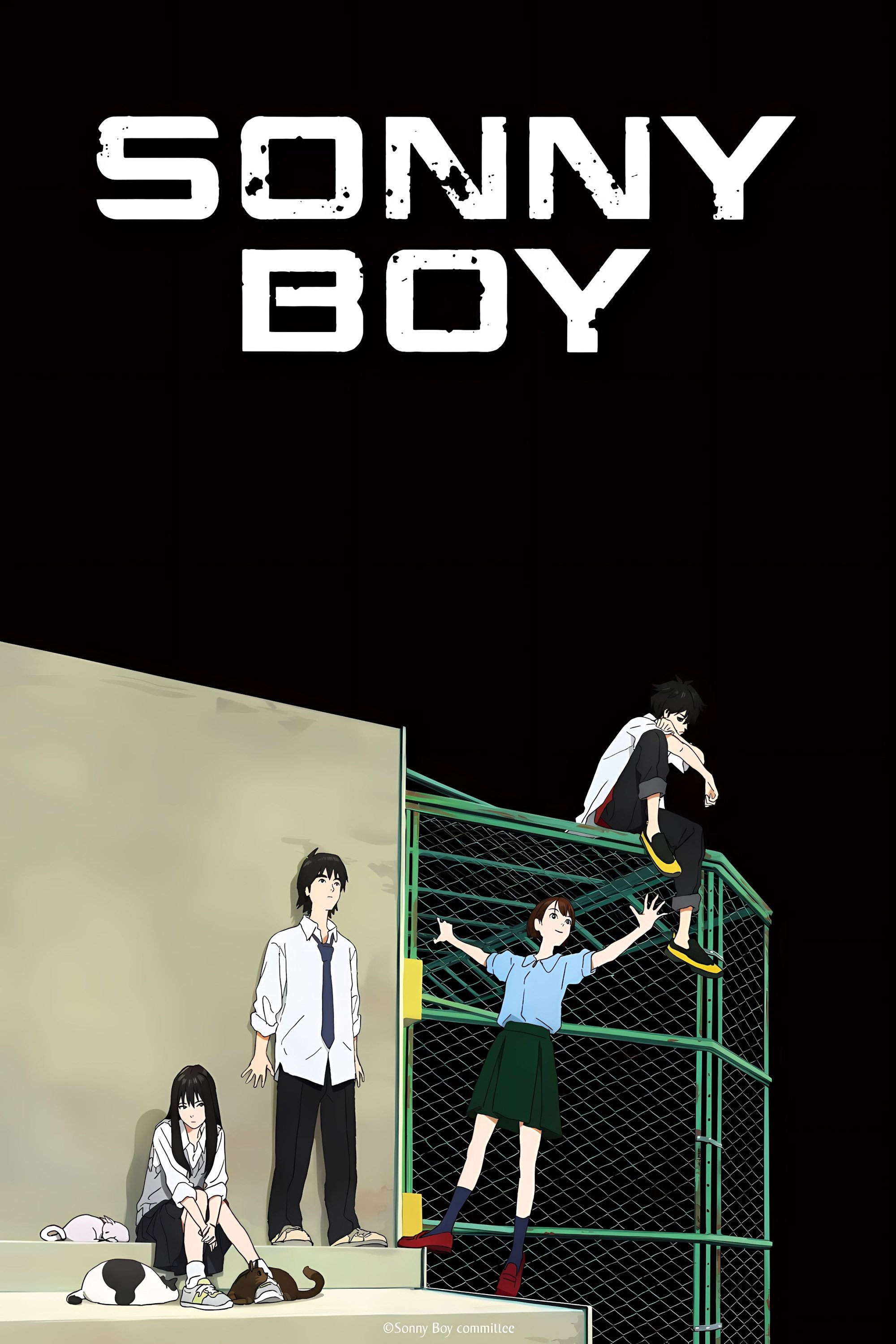
This strange series takes place in dreamlike worlds governed by hidden rules, suggested through the artwork. Instead of relying on dialogue or typical visuals, the story unfolds through bizarre landscapes and odd occurrences. Instead of graffiti, the environments are marked by impossible shapes that offer clues about these dimensions. The simple art style draws your attention to these subtle changes in the surroundings.
‘Wonder Egg Priority’ (2021)
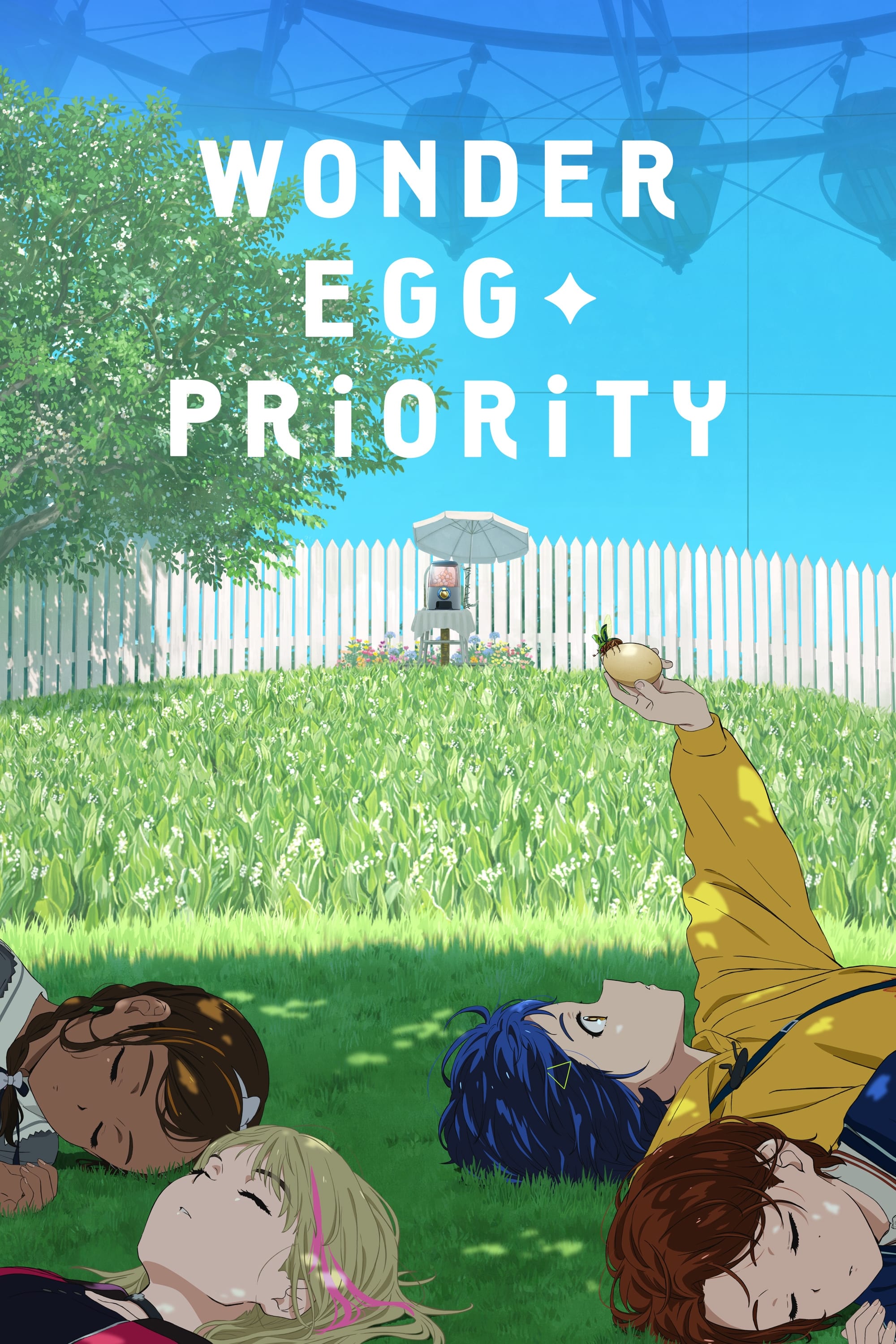
This series features dream worlds built from the painful experiences of those who have died, appearing as monsters and unsettling landscapes. Hidden messages – often written on blackboards or walls – reveal the reasons behind each character’s suicide, helping to solve the mystery of the weekly ‘Wonder Killer.’ Despite the dream worlds’ vibrant colors, these dark clues are often easy to overlook.
‘Panty & Stocking with Garterbelt’ (2010)
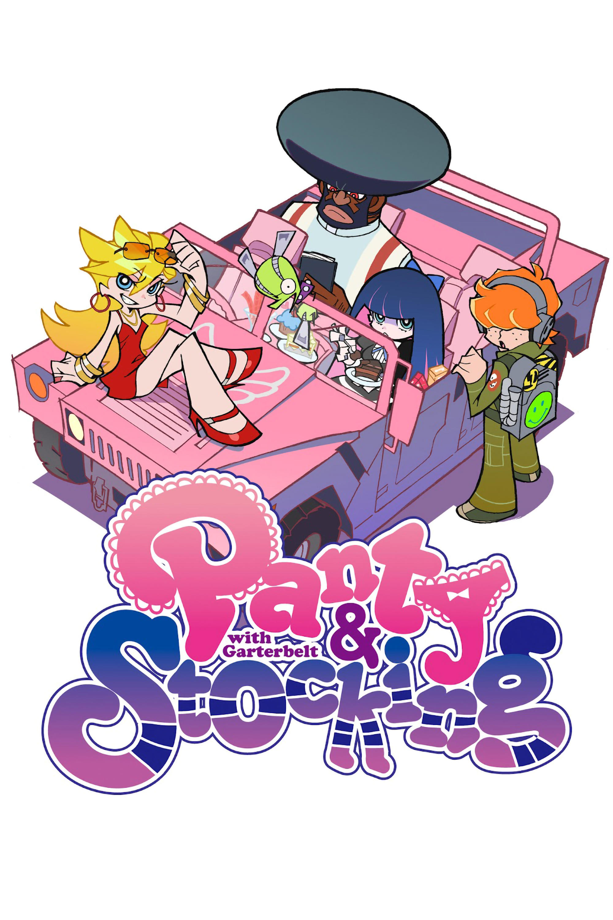
Okay, so visually, this show definitely looks like a typical American cartoon – bright colors, bold lines. But don’t let that fool you! The creators clearly aren’t aiming for a young audience. They’ve crammed the backgrounds with jokes and references that are…well, let’s just say they’re not for kids. Seriously, look closely at the graffiti in Daten City – it’s full of insults aimed right at the characters! This stylistic choice, with those thick outlines and flat colors, really makes everything pop, but it also contributes to a really edgy, irreverent, and frankly, pretty raunchy vibe. It’s a show that rewards repeat viewings, just to catch all the hidden gags.
Share your favorite hidden anime details and what you spotted in these series in the comments.
Read More
- 20 Movies Where the Black Villain Was Secretly the Most Popular Character
- Celebs Who Narrowly Escaped The 9/11 Attacks
- Top 20 Dinosaur Movies, Ranked
- 25 “Woke” Films That Used Black Trauma to Humanize White Leads
- The 10 Most Underrated Jim Carrey Movies, Ranked (From Least to Most Underrated)
- Transformers Under the Microscope: What Graph Neural Networks Reveal
- 22 Films Where the White Protagonist Is Canonically the Sidekick to a Black Lead
- Gold Rate Forecast
- The Best Directors of 2025
- Trading on Thin Air: AI Agents Conquer Crypto Volatility
2025-12-15 21:21