Right, let’s talk about the market. Because honestly, who isn’t feeling a bit… conflicted? The latest AAII survey – February 2026, for the record – shows about 35% are optimistically squinting at the future, 37% are bracing for impact, and the remaining 28% are just… there. Neutral. Which, let’s be honest, is often the most terrifying position. It’s like being a hostage who’s accepted their fate. So, if you’re wobbling between ‘buy’ and ‘panic sell,’ you’re in excellent company. But data, darling, data. What does it actually say about where we’re headed? Well, history has good news and bad news. Mostly bad, if we’re being brutally honest, which, naturally, we are.
Stock Market Indicators Are Basically Flashing Red Flags (and I’m Not Talking About a Race)
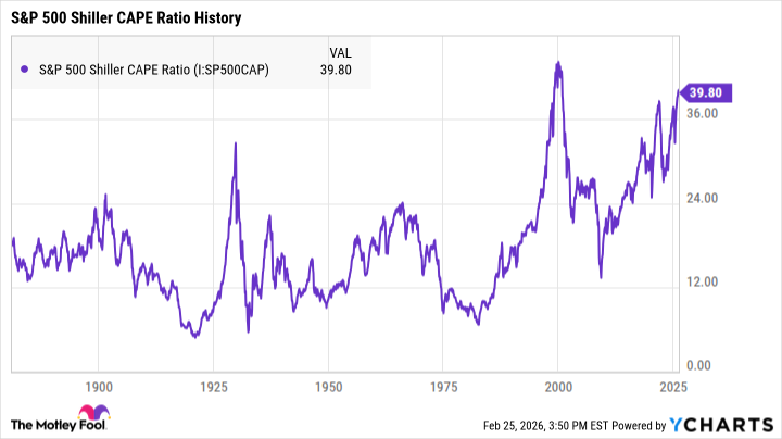
Let’s rip off the bandage first, shall we? Multiple indicators, the ones that have a knack for predicting downturns, are currently doing a rather dramatic interpretive dance of doom. It’s not subtle. The S&P 500 Shiller CAPE ratio, for example, is at nearly a record high. Which, in layman’s terms, means things are… inflated. It measures average inflation-adjusted earnings over a decade. A long-term valuation tool, basically. Historically, higher CAPE ratios suggest prices could fall. The long-term average is around 17. It peaked in 1999 at 44, just before the dot-com bubble decided to pop. As of right now? Nearing 40. Second-highest ever. It’s like watching a slow-motion car crash. You know it’s coming, you just can’t look away.
Then there’s the Buffett indicator. Warren Buffett, bless his shrewd little heart, popularized this one. It measures the ratio between the total value of U.S. stocks and U.S. GDP. A simple idea, really. The higher the figure, the more overvalued things are. He used it to predict the dot-com bubble. In a 2001 Fortune interview, he explained it like this:
“For me, the message of that chart is this: If the percentage relationship falls to the 70% or 80% area, buying stocks is likely to work very well for you. If the ratio approaches 200% as it did in 1999 and a part of 2000 you are playing with fire.”
Currently? Around 219%. So, we’re not exactly sitting here calmly knitting, are we? More like… frantically searching for a fire extinguisher. And hoping it works.
The Good News (Because I’m Not a Total Sadist)
Look, no indicator is infallible. And even if a pullback is coming, predicting the exact moment is a fool’s errand. Honestly, the market could have months – even years – of growth left. And if you bail now, you risk missing out on some serious gains. It’s a gamble, isn’t it? Everything is. And I’m terrible at poker. But here’s the slightly less terrifying bit: the market’s long-term potential usually outweighs any short-term volatility. It’s a slow burn, not an instant explosion. Usually.
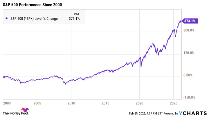
History has shown us, time and again, that the market can survive even catastrophic economic events. And it usually recovers faster than anyone expects. The average S&P 500 bear market since 1929 has lasted just 286 days – roughly nine months. The average bull market, though? Nearly three years. So, the key is patience. And a strong stomach. The most effective strategy? Invest in quality stocks and hold them for years. Ignore the daily noise. It’s easier said than done, I know. But a solid portfolio, filled with healthy companies, can set you up for long-term success. No matter what the market throws at you. And trust me, it will throw things.
Read More
- Gold Rate Forecast
- Top 15 Insanely Popular Android Games
- 2025 Crypto Wallets: Secure, Smart, and Surprisingly Simple!
- Did Alan Cumming Reveal Comic-Accurate Costume for AVENGERS: DOOMSDAY?
- Why Nio Stock Skyrocketed Today
- ELESTRALS AWAKENED Blends Mythology and POKÉMON (Exclusive Look)
- EUR UAH PREDICTION
- Core Scientific’s Merger Meltdown: A Gogolian Tale
- 4 Reasons to Buy Interactive Brokers Stock Like There’s No Tomorrow
- New ‘Donkey Kong’ Movie Reportedly in the Works with Possible Release Date
2026-02-28 17:02