Author: Denis Avetisyan
This review examines the rapid progress and remaining challenges in teaching artificial intelligence to understand and interpret data visualizations.
A comprehensive survey of Multimodal Large Language Models for chart understanding, covering evolution, limitations, and cognitive enhancement strategies.
Despite advances in artificial intelligence, seamlessly integrating visual and textual information remains a significant challenge for chart comprehension. This survey, ‘Multimodal Information Fusion for Chart Understanding: A Survey of MLLMs — Evolution, Limitations, and Cognitive Enhancement’, systematically examines the rapidly evolving landscape of Multimodal Large Language Models (MLLMs) applied to this task, charting their progress, current limitations, and potential for cognitive enhancement. Our analysis reveals a critical need for improved visual reasoning, robust information fusion techniques, and methodologies capable of addressing the complexities of non-canonical chart types. How can we move beyond current MLLM capabilities to create truly intelligent systems capable of deriving meaningful insights from diverse data visualizations?
Illuminating Data: The Foundation of Insightful Communication
The core of impactful knowledge transfer lies in the ability to reshape intricate data into formats readily understood by diverse audiences. Raw information, regardless of its inherent value, remains inert without effective translation; simply presenting numbers or statistics often fails to convey meaningful insights. This transformation requires a deliberate focus on clarity and accessibility, moving beyond technical jargon and embracing visual or narrative structures that resonate with non-expert perspectives. Consequently, the success of any data-driven initiative depends not merely on the collection of information, but on the skill with which that information is communicated, ensuring its potential is unlocked and readily absorbed by those who need it most.
Data visualization serves as a pivotal conduit between raw information and actionable knowledge. By transforming numerical datasets and statistical analyses into readily interpretable charts, graphs, and maps, complex trends and patterns become immediately apparent. This rapid insight extraction isn’t merely about aesthetic presentation; it fundamentally alters the speed and efficacy of decision-making processes. Instead of laborious manual analysis, stakeholders can quickly grasp key performance indicators, identify anomalies, and formulate strategies based on visually compelling evidence. The power lies in leveraging the human brain’s inherent capacity for visual processing, allowing it to discern meaning from data with far greater efficiency than through textual reports or spreadsheets alone. Consequently, data visualization is no longer a supplementary tool but an essential component of effective communication and informed governance across diverse fields.
The potential of even the most rigorously collected and analyzed data diminishes significantly without effective visual communication. Raw numbers and statistical summaries, while precise, often fail to convey meaningful patterns or relationships to those lacking specialized expertise. This inaccessibility isn’t merely a matter of presentation; it represents a fundamental barrier to understanding, hindering informed discussions and delaying crucial decisions. Data visualization, therefore, acts as a key that unlocks these insights, transforming abstract information into readily digestible formats like charts, graphs, and maps. By leveraging the human brain’s innate capacity for visual processing, complex trends become apparent, outliers are quickly identified, and narratives emerge that would otherwise remain hidden within the data itself. Consequently, clear visualization isn’t simply about aesthetics; it’s about maximizing the impact and accessibility of knowledge.
Canonical Charts: The Bedrock of Data Display
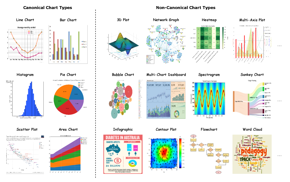
Bar charts, line plots, and histograms continue to be the most frequently utilized data visualization methods due to their inherent ease of construction and universal recognition. These chart types require minimal cognitive load for interpretation, as most individuals have been exposed to them throughout their education and professional lives. Their simplicity stems from representing data along clearly defined axes and employing easily understood visual cues; bar height directly corresponds to magnitude, lines depict trends over continuous variables, and histograms illustrate the distribution of a single variable. This broad familiarity minimizes the learning curve for data consumers, enabling quick and accurate extraction of insights without requiring specialized training in data visualization principles.
Canonical chart types, including bar charts, line plots, and histograms, are particularly effective for visualizing data relationships within a constrained dimensionality. These charts facilitate direct comparison of discrete values – as seen in bar charts – or demonstrate trends and changes over a single continuous variable, typical of line plots. While capable of representing multiple series, their clarity diminishes with increasing complexity; effectively communicating relationships beyond two to three dimensions generally requires alternative visualization techniques. The strength of these charts lies in their ability to present a focused view of the data, highlighting specific comparisons or trends without the cognitive load associated with more complex, multi-dimensional displays.
The prevalence of standard chart types – bar charts, line graphs, and histograms – facilitates rapid data assimilation due to established visual literacy. A large percentage of the population has been exposed to these formats through education, professional training, and media consumption, creating a shared understanding of their visual cues and underlying data representation. This common baseline allows viewers to quickly bypass the need to decipher novel visualization techniques and focus directly on the information presented, improving comprehension speed and reducing cognitive load. Consequently, these charts serve as a foundational element for data communication, enabling efficient transfer of insights across diverse audiences and supporting informed decision-making.
Beyond Convention: Exploring Advanced Data Visualizations
The increasing complexity of modern datasets frequently necessitates the use of non-canonical chart types to effectively communicate underlying patterns. While traditional charts like bar graphs and line plots are suitable for displaying simple relationships, datasets with numerous variables, interdependencies, or hierarchical structures often require more specialized visualizations. Examples include flowcharts for illustrating processes, radar plots for comparing multiple attributes across different entities, and tree diagrams for representing hierarchical data. These chart types facilitate the identification of trends and relationships that would be difficult or impossible to discern using standard visualization methods.
Non-canonical chart types facilitate the consolidated presentation of complex data by representing multiple variables within a single visualization. Unlike standard charts focused on two or three dimensions, these advanced methods-including network diagrams, sunburst charts, and Sankey diagrams-can simultaneously display numerous data points and their interrelationships. This capability extends to representing hierarchical data, where parent-child relationships are visually encoded to illustrate organizational structures or compositional breakdowns. The simultaneous representation of variables, relationships, and hierarchies allows for a holistic understanding of the dataset, enabling the identification of patterns and correlations that would be difficult to discern from separate, simpler visualizations.
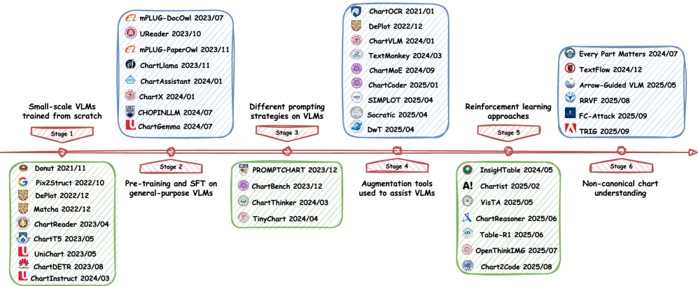
This survey synthesizes a substantial body of research concerning the application of Multimodal Large Language Models (MLLMs) to chart understanding. The included works span diverse methodologies, including those focused on chart type recognition, data extraction, relationship identification, and question answering based on chart content. Coverage extends to datasets employing a variety of chart formats – encompassing both canonical types like bar and line graphs, and non-canonical visualizations such as flowcharts, tree diagrams, and radar plots – and explores models trained on both synthetic and real-world chart images. The survey demonstrates a growing trend in utilizing visual prompting and reasoning techniques to enhance MLLM performance on complex chart-based tasks, highlighting both established approaches and emerging innovations in the field.
Non-canonical charts, while demanding a higher degree of cognitive effort for interpretation, facilitate the discovery of data insights not readily apparent in standard visualizations. The increased complexity inherent in chart types like flowcharts, radar plots, and tree diagrams allows for the simultaneous representation of multiple variables and intricate relationships. Evaluations of Multimodal Large Language Model (MLLM) performance on these charts suggest that successful reasoning-specifically, the ability to accurately extract information and draw conclusions-correlates with what is termed “System 2” thinking, characterized by deliberate analysis and complex problem-solving as opposed to intuitive, automatic processing.
The pursuit of truly intelligent systems, as explored in this survey of Multimodal Large Language Models, demands more than simply scaling up existing architectures. It requires a fundamental shift towards models capable of genuine visual reasoning and robust information fusion. Geoffrey Hinton once stated, “The key is to build systems that can learn multiple levels of abstraction.” This sentiment perfectly encapsulates the challenge presented by chart understanding; MLLMs must not only see the chart but also decipher its underlying structure and meaning, a task demanding hierarchical processing and contextual awareness. The paper’s focus on addressing limitations in non-canonical charts reveals that elegance in design – in this case, algorithmic architecture – is not merely aesthetic, but a sign of deep understanding and a pathway towards creating systems that function with harmony and efficiency.
The Road Ahead
The pursuit of chart understanding via Multimodal Large Language Models has revealed, predictably, that simply scaling model size does not equate to genuine comprehension. The current landscape suggests a field enamored with mimicking human performance without first deeply considering how humans actually reason about visual data. A good interface is invisible to the user, yet felt; similarly, true chart understanding should not require explicitly teaching a model the anatomy of a bar graph. The emphasis must shift from pattern recognition to the development of genuinely robust information fusion techniques.
The limitations exposed regarding non-canonical charts are particularly telling. The reliance on standardized visual encodings feels almost… quaint. Data, by its nature, resists neat categorization. Future work should prioritize models capable of inductive reasoning, able to extrapolate understanding from familiar charts to novel, even deliberately obfuscated, visualizations. Every change should be justified by beauty and clarity.
Ultimately, the path forward demands a degree of intellectual humility. The goal isn’t merely to build machines that answer questions about charts, but to create systems that can articulate why certain visualizations are effective – or, crucially, misleading. Until that level of meta-cognition is achieved, the field remains, despite its impressive progress, a beautiful, sophisticated exercise in applied pattern matching.
Original article: https://arxiv.org/pdf/2602.10138.pdf
Contact the author: https://www.linkedin.com/in/avetisyan/
See also:
- 2025 Crypto Wallets: Secure, Smart, and Surprisingly Simple!
- Gold Rate Forecast
- Monster Hunter Stories 3: Twisted Reflection launches on March 13, 2026 for PS5, Xbox Series, Switch 2, and PC
- Here Are the Best TV Shows to Stream this Weekend on Paramount+, Including ‘48 Hours’
- 🚨 Kiyosaki’s Doomsday Dance: Bitcoin, Bubbles, and the End of Fake Money? 🚨
- ‘The Substance’ Is HBO Max’s Most-Watched Movie of the Week: Here Are the Remaining Top 10 Movies
- First Details of the ‘Avengers: Doomsday’ Teaser Leak Online
- The 10 Most Beautiful Women in the World for 2026, According to the Golden Ratio
- The 11 Elden Ring: Nightreign DLC features that would surprise and delight the biggest FromSoftware fans
- 20 Films Where the Opening Credits Play Over a Single Continuous Shot
2026-02-12 23:47