Author: Denis Avetisyan
Researchers introduce ChartComplete, a comprehensive resource designed to push the boundaries of AI’s ability to interpret a wider range of chart types.
This work presents ChartComplete, a taxonomy-based dataset containing 30 diverse chart types and employing novel visual feature extraction techniques to address limitations in current chart understanding benchmarks.
Despite recent advances in chart understanding driven by multimodal large language models, existing benchmark datasets remain limited in the diversity of chart types they assess. To address this gap, we introduce ChartComplete: A Taxonomy-based Inclusive Chart Dataset, a novel resource comprising thirty distinct chart types grounded in established visualization taxonomy. This dataset-a collection of classified chart images provided without learning signals-is designed to facilitate more comprehensive evaluation and advancement of chart understanding systems. Will this broadened benchmark enable AI to truly master visual data interpretation across the full spectrum of chart designs?
The Imperative of Visual Reasoning
Despite remarkable progress in artificial intelligence, machines consistently falter when tasked with interpreting charts and graphs in the way a human does. This isn’t simply a matter of optical character recognition; it requires nuanced visual reasoning – the ability to synthesize information from multiple visual elements, understand relationships between data points, and extrapolate meaning beyond the explicitly presented data. Current AI systems often rely on identifying patterns and correlations, but struggle with abstract concepts like trends, anomalies, or comparative analysis that demand a deeper understanding of the chart’s underlying message. This limitation stems from a difficulty in bridging the gap between raw visual data and the higher-level cognitive processes necessary to derive meaningful insights, hindering their ability to answer even seemingly simple questions about the presented information.
Current chart understanding systems often falter when confronted with the sheer variety present in real-world visualizations. These systems, typically trained on limited, curated datasets, exhibit a fragility when exposed to variations in chart type – from simple bar graphs to complex scatter plots and network diagrams – or inconsistencies in visual encoding, such as unconventional color schemes or axis scales. Furthermore, they struggle with noisy data, incomplete information, or the presence of extraneous visual elements common in practical applications. This lack of robustness stems from an inability to generalize learned patterns beyond the specific examples encountered during training, hindering their performance on diverse and often imperfect datasets encountered outside of controlled laboratory settings. Consequently, widespread adoption of automated chart interpretation remains a significant challenge, as these systems often require extensive customization or human intervention to achieve acceptable levels of accuracy.
The inability of machines to reliably interpret charts introduces significant limitations to automated data analysis and, consequently, data-driven decision-making. Without accurate chart understanding, systems cannot confidently extract key trends, identify outliers, or synthesize information for effective reporting. This impacts a broad range of applications, from business intelligence and financial forecasting to scientific research and public health monitoring, where automated insights are increasingly expected. The resulting inaccuracies or incomplete analyses can lead to flawed strategies, missed opportunities, and potentially costly errors, underscoring the critical need for advancements in visual reasoning capabilities within artificial intelligence.
A significant impediment to progress in machine understanding of charts lies in the absence of a universally accepted and rigorously tested benchmark for chart question answering. Current evaluation methods often focus on limited chart types or simplified questions, failing to capture the complexity and diversity found in real-world data visualizations. A truly comprehensive benchmark must encompass a broad spectrum of chart formats – from basic bar graphs to intricate statistical plots – and pose questions requiring not just data retrieval, but also comparative reasoning, trend analysis, and the ability to extrapolate insights. Such a benchmark would serve as a crucial tool for researchers, enabling standardized evaluation of new approaches and accelerating the development of more robust and adaptable chart understanding systems, ultimately fostering greater confidence in automated data-driven decision-making.
ChartComplete: A Dataset for Rigorous Chart Question Answering
ChartComplete is a newly developed dataset intended to enhance the performance of Chart Question Answering (ChartQA) models by improving their robustness and generalization capabilities. The dataset encompasses 30 distinct chart types, representing a broader range of visual data than previously available for this task. This diversity is crucial for training models that can accurately interpret and respond to questions about a wider variety of charts encountered in real-world applications, moving beyond limitations inherent in datasets focused on fewer chart types. The intention is to create models less susceptible to overfitting on specific chart formats and more capable of handling unseen chart types effectively.
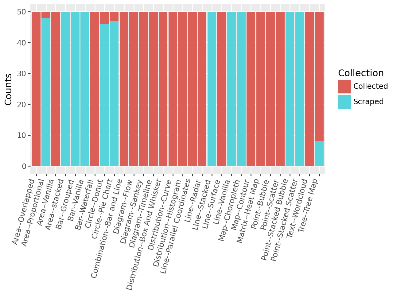
ChartComplete comprises a total of 1500 chart images, with 50 instances per chart type included in the dataset. This represents a substantial increase in scale compared to currently available chart question answering (ChartQA) datasets. Prior datasets typically contain fewer than 500 total images, limiting the ability of models to generalize across diverse chart appearances and data distributions. The expanded size of ChartComplete is intended to facilitate the training of more robust and accurate ChartQA models capable of handling a wider range of real-world chart variations and improving performance on unseen chart types.
The ChartComplete dataset prioritizes realistic data representation by sourcing charts from Statista (12,635 charts scraped) and Our World in Data (4,113 charts scraped). These resources provide a large volume of publicly available charts representing a diverse range of topics and data visualizations, thereby mirroring the distributions encountered in real-world chart Question Answering (ChartQA) scenarios. Utilizing data from established and reputable sources helps to ensure the dataset’s reliability and relevance for training and evaluating ChartQA models on practical applications.
The ChartComplete dataset construction utilized a hybrid approach to data collection, combining automated web scraping with manual curation. Eighteen chart types were sourced exclusively through manual collection, ensuring high data quality and complex chart representation not readily available via scraping. Conversely, eight chart types were obtained purely through automated scraping of online resources. A further four chart types benefited from a combined methodology, leveraging scraping for initial data acquisition followed by manual review and refinement to address inconsistencies or inaccuracies. This mixed approach aimed to maximize both the scale and reliability of the dataset, reflecting a balance between efficiency and data integrity.
Visual Feature Extraction and Dimensionality Reduction
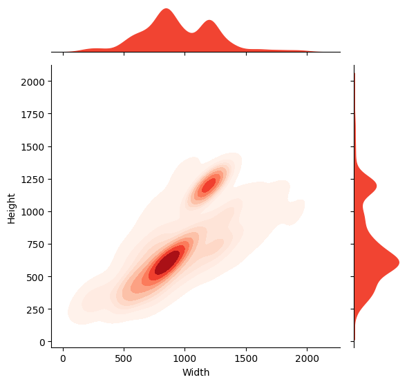
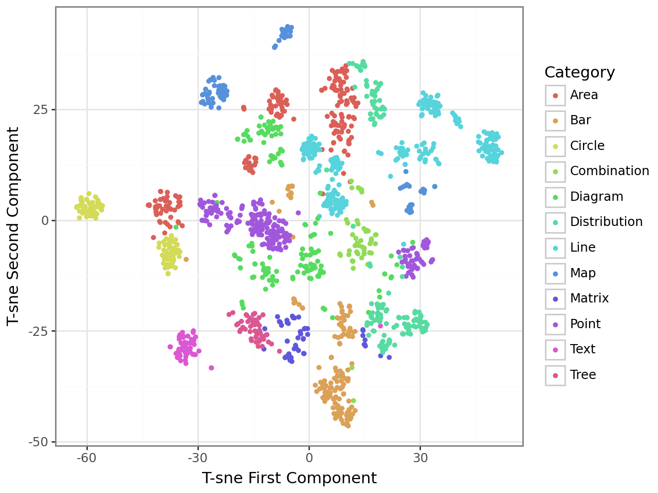
Google’s Vision Transformer (ViT) is utilized to generate high-dimensional feature vectors representing each chart image within the dataset. ViT’s architecture, based on the transformer model originally developed for natural language processing, processes chart images as sequences of image patches. This allows the model to capture both local details and global relationships within the chart’s visual structure. The resulting feature vectors encapsulate semantic information about the chart, including the types of visual elements present (e.g., bars, lines, pie slices), their arrangement, and potentially the data they represent. These rich image features serve as the foundation for downstream tasks such as chart similarity comparison and classification, enabling a machine learning approach to understanding chart content beyond simple pixel-level analysis.
T-distributed stochastic neighbor embedding (T-SNE) is utilized as a dimensionality reduction technique to map the high-dimensional feature vectors – generated by the Google ViT model – into a two- or three-dimensional space for visualization. This process preserves the local structure of the data, meaning charts with similar feature representations remain close to each other in the reduced space. Consequently, visual patterns emerge that reveal relationships between different chart types; for example, bar charts and column charts may cluster together, indicating their visual and semantic similarity, while line charts and scatter plots form distinct groups. The resulting scatter plots allow for qualitative assessment of the dataset’s structure and identification of potential groupings or outliers based on visual feature similarity.
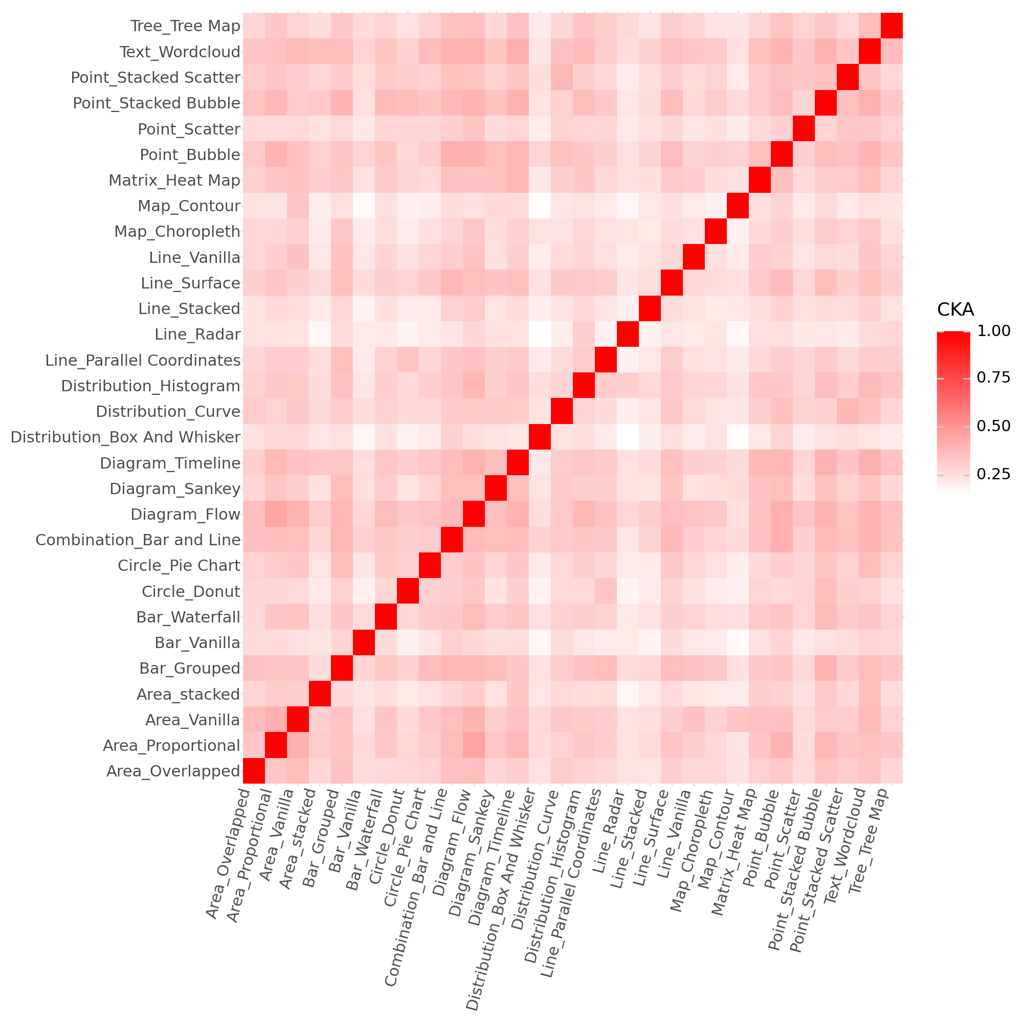
Centered Kernel Alignment (CKA) is a technique used to quantify the similarity between two sets of feature representations, specifically by measuring the alignment of their respective kernel matrices. CKA calculates the centered kernel alignment, a value between 0 and 1, where higher values indicate greater similarity. The process involves centering the kernel matrices – obtained from applying a kernel function (e.g., Gaussian RBF) to the feature representations – and then calculating their cross-covariance, normalized by the product of their individual variances. This normalization ensures that the metric is insensitive to the scale of the features and focuses on the alignment of their directions. Formally, CKA between feature sets X and Y is defined as \frac{ \sum_{i,j} K_{X}(i,j)K_{Y}(i,j) }{ \sqrt{ \sum_{i,j} K_{X}(i,j)^2 } \sqrt{ \sum_{i,j} K_{Y}(i,j)^2 } } , where K represents the centered kernel matrix.
FAISS (Facebook AI Similarity Search) is a library designed for efficient similarity search and clustering of dense vectors. It enables rapid identification of charts with similar visual characteristics by indexing the image feature vectors extracted by models like Google ViT. The system utilizes optimized algorithms and data structures, including product quantization and inverted file indexes, to perform approximate nearest neighbor search with high throughput and low latency, even on datasets containing millions of vectors. This allows for the quick retrieval of charts visually comparable to a given query chart, facilitating tasks like chart categorization, anomaly detection, and visual data mining.
Towards Generalized Visual Reasoning Systems
ChartComplete significantly elevates the standard for chart question answering evaluations by moving beyond simple recognition to demand a deeper understanding of data relationships. Existing benchmarks often rely on charts with readily available answers, but ChartComplete introduces a level of complexity requiring models to synthesize information and perform reasoning – similar to how a human analyst would interpret data. This is achieved through a carefully constructed dataset where questions necessitate combining multiple visual elements and potentially external knowledge, creating a more realistic and challenging testing ground. By pushing the boundaries of what chart QA systems can achieve, ChartComplete facilitates the development of genuinely intelligent tools capable of extracting meaningful insights from complex visualizations and ultimately supports more robust and reliable automated data analysis.
ChartComplete builds upon the foundational work of FigureQA, a pioneering dataset in visual question answering focused on charts and diagrams. While FigureQA successfully demonstrated the potential of this research area, ChartComplete significantly expands its scope and complexity. The new dataset doesn’t merely increase the number of examples; it introduces more intricate chart types, requires deeper reasoning to connect visual elements with corresponding questions, and demands a greater understanding of the underlying data. This scaling up of both size and sophistication allows for a more robust evaluation of advanced models, pushing the boundaries of what’s achievable in automated chart comprehension and ultimately enabling more insightful data analysis.
The ChartComplete dataset is released with a permissive CC BY License, deliberately designed to maximize its impact on the research community. This open access approach enables any researcher to freely utilize, modify, and distribute the dataset, fostering collaborative innovation in chart question answering. By removing barriers to entry, the creators anticipate a surge in novel methodologies and accelerated progress toward more robust and intelligent data analysis systems. The licensing choice directly supports reproducibility, allows for wider evaluation of existing models, and ultimately, promises to expedite the development of tools capable of extracting meaningful insights from complex visual data across diverse fields.
The development of this comprehensive chart question answering dataset signals a significant leap toward genuinely intelligent data analysis tools. Beyond simply retrieving information, these advancements promise systems capable of interpreting complex visualizations and autonomously generating actionable insights. This capability extends far beyond academic research, holding immense potential for applications in business intelligence, financial modeling, scientific discovery, and public health monitoring. By automating the process of extracting meaning from data, these tools can empower decision-makers with timely, evidence-based information, ultimately accelerating progress across numerous fields and fostering a future where data insights are readily accessible to all.
The creation of ChartComplete demonstrates a commitment to foundational correctness within the field of visual reasoning. The dataset’s expansive taxonomy, encompassing thirty distinct chart types, isn’t merely about increasing quantity; it’s about establishing a provably comprehensive foundation for AI chart understanding. As Robert Tarjan aptly stated, “Programmers often spend more time understanding what others have done than actually writing new code.” This sentiment perfectly aligns with the need for datasets like ChartComplete, which aim to provide a clear, well-defined basis for future research, reducing ambiguity and fostering algorithms built on solid, mathematically sound principles rather than ad-hoc solutions. The focus on inclusivity and diversity in chart representation is a direct pursuit of minimizing abstraction leaks inherent in limited benchmarks.
The Path Forward
The creation of ChartComplete, while a necessary step, does not resolve the fundamental issue plaguing visual reasoning systems. The proliferation of chart types addresses a superficial diversity; true understanding demands a shift from pattern recognition to logical deduction. A system can be trained to classify thirty chart variants, but that does not guarantee comprehension of the underlying data’s semantics. The elegance of a solution is not measured by its accuracy on a benchmark, but by its adherence to mathematical principles.
Future work must prioritize the development of algorithms capable of interpreting charts, not merely identifying them. Centered Kernel Alignment, as a metric, offers a path toward evaluating feature extraction, but it remains a proxy for genuine understanding. The field needs formal methods-provable algorithms-that can extract data, discern relationships, and validate conclusions drawn from visual representations. Simplicity, in this context, does not mean brevity of code; it means non-contradiction and logical completeness.
Ultimately, the goal should not be to create systems that mimic human chart reading, but to surpass it. Humans are prone to perceptual biases and cognitive shortcuts. An ideal system would operate with perfect objectivity, deriving truth from data with unwavering consistency. This requires a commitment to mathematical rigor and a rejection of purely empirical approaches.
Original article: https://arxiv.org/pdf/2601.10462.pdf
Contact the author: https://www.linkedin.com/in/avetisyan/
See also:
- From Bids to Best Policies: Smarter Auto-Bidding with Generative AI
- 20 Movies Where the Black Villain Was Secretly the Most Popular Character
- When AI Teams Cheat: Lessons from Human Collusion
- 25 “Woke” Films That Used Black Trauma to Humanize White Leads
- Silver Rate Forecast
- Top 10 Coolest Things About Invincible (Mark Grayson)
- 22 Films Where the White Protagonist Is Canonically the Sidekick to a Black Lead
- Top 20 Dinosaur Movies, Ranked
- Unmasking falsehoods: A New Approach to AI Truthfulness
- Gold Rate Forecast
2026-01-18 15:55