Movie directors frequently use how they arrange images on screen to influence how viewers feel about a story’s stability. Using balanced, symmetrical shots can create feelings of calm and order, but it can also build tension and a sense of being trapped. Achieving this effect requires careful planning of where actors stand and precise camera angles to keep everything visually balanced. The films that follow show examples of how this visual balance can make a story more psychologically powerful.
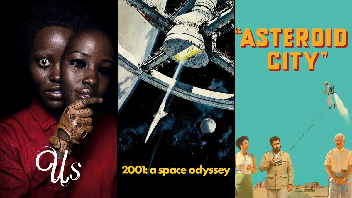
‘2001: A Space Odyssey’ (1968)
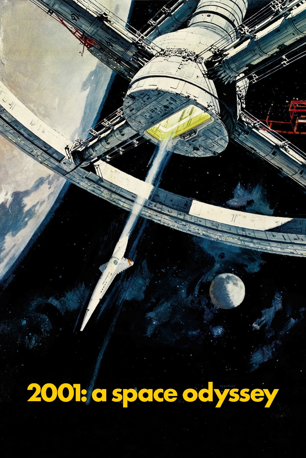
Stanley Kubrick uses a precise visual style, with everything lined up to create a sense of coldness and emptiness in his depiction of space travel. The ship’s interiors are designed to highlight how technology controls everything, rather than human feelings. The computer, HAL 9000, is often placed directly in the center of the screen, giving it a fixed, unwavering stare. This careful framing emphasizes HAL’s cold, logical nature. The overall symmetry also creates a feeling of discomfort when considering the immense scale of space.
‘The Grand Budapest Hotel’ (2014)
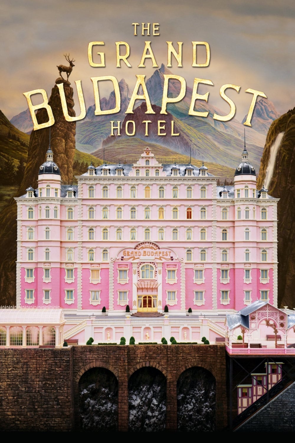
Wes Anderson’s distinctive style, particularly his use of centered framing, gives the story a fairytale-like quality. The perfectly symmetrical shots make the hotel feel like a dollhouse, with characters moving in a precise, almost artificial way. This playful visual approach contrasts with the film’s serious themes of war and grief. The neat, orderly images suggest the main character is trying to hold onto control as their world falls apart. Each scene feels like a carefully crafted painting meant to stir up feelings of nostalgia.
‘The Shining’ (1980)
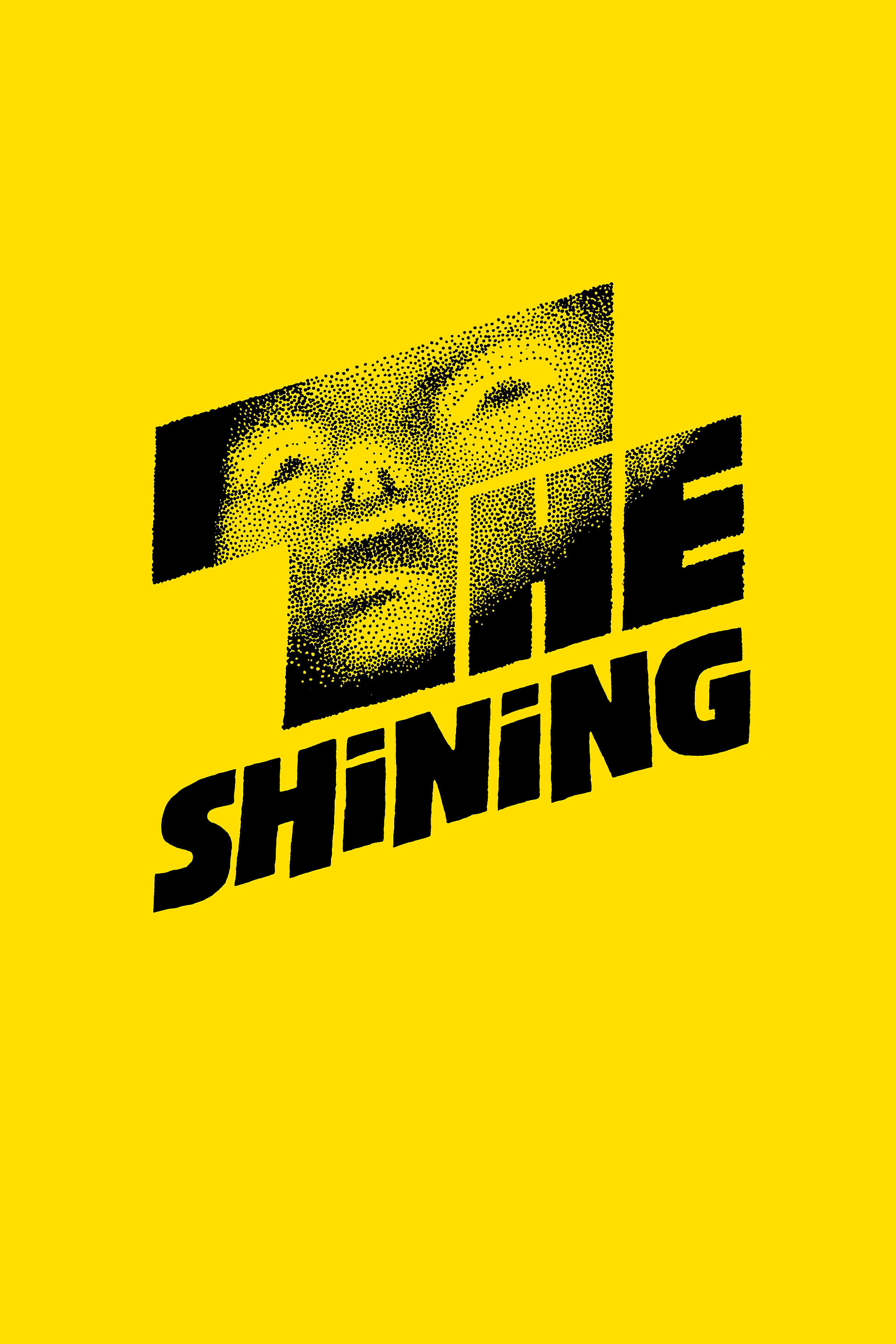
The Overlook Hotel’s symmetrical design creates a hidden sense of being trapped for those watching. The long, repeating hallways and carpet patterns pull your eye toward a distant point, implying there’s no way out. The director also focuses on pairs of identical twins, reinforcing the eerie, haunted atmosphere. By consistently centering Jack Torrance in each shot, Kubrick emphasizes his loneliness and descent into madness. This careful balance and symmetry make the hotel’s unsettling, supernatural aspects feel powerfully real and inescapable.
‘Parasite’ (2019)
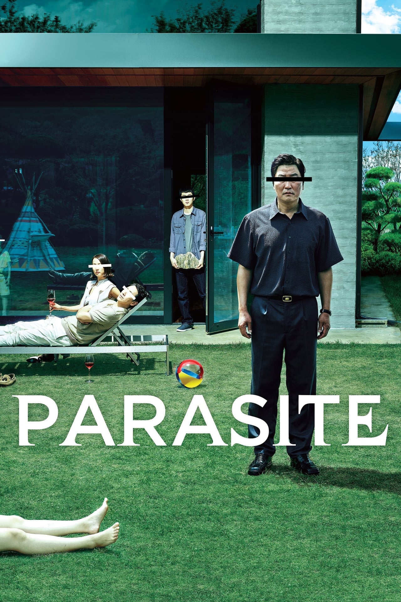
Bong Joon-ho skillfully uses visual elements like lines and symmetry to highlight the stark differences in social status between the two families in the film. The Park family’s home is filmed to appear perfectly ordered and balanced, while the Kim family is often shown in messy, cramped spaces that contrast with this neatness. These visual choices emphasize the film’s themes of class conflict and the Kims’ attempts to enter the Parks’ world. As the story becomes more chaotic, the initial symmetry in the film begins to fall apart.
‘Midsommar’ (2019)
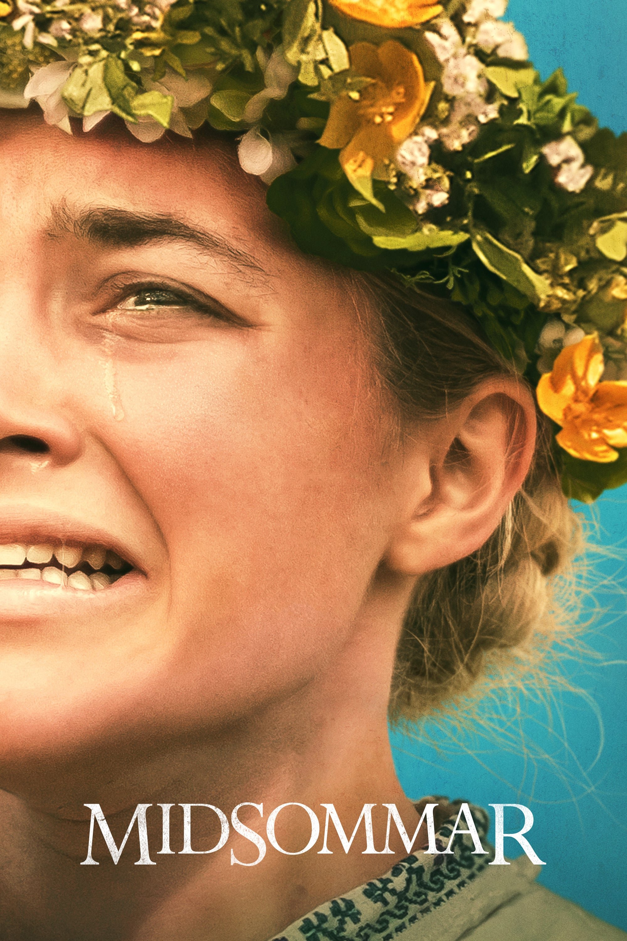
The seemingly cheerful and spacious settings of the Hårga commune hide the disturbing truth about their practices. Director Ari Aster uses careful arrangements of people and objects – like tables – to represent the cult’s shared consciousness. This symmetry hints that those who come from outside have little control over their destinies. The film also uses flowers and building designs to subtly show how the main character is being prepared for a particular purpose. This beauty actually makes the horror more shocking and deeply unsettling.
‘Hero’ (2002)

Zhang Yimou’s films powerfully use color and balanced compositions to reveal multiple sides of a single story. The grand palaces and carefully arranged armies visually demonstrate the Qin Empire’s strength. Action scenes are beautifully choreographed, appearing more like elegant dances than rough fights. The way shots are framed emphasizes how small individuals are in comparison to the larger, unified nation. Every visual detail reinforces the film’s themes of sacrifice and the importance of maintaining order.
‘Moonrise Kingdom’ (2012)
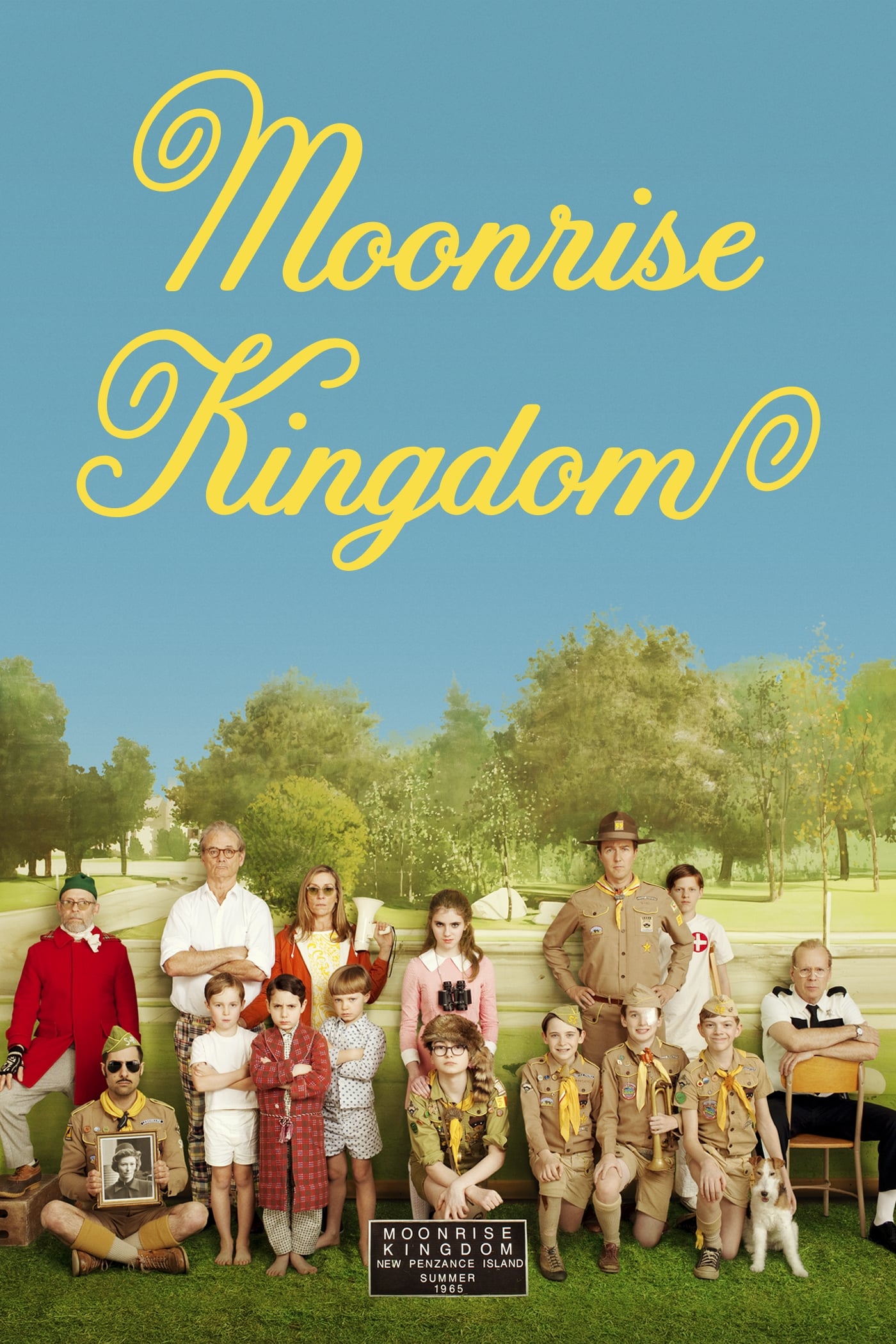
This film’s balanced and orderly visuals mirror how its young characters see the world – simple and straightforward. Director Wes Anderson uses careful framing to bring structure to the messy feelings of first love and tell a clear story. Whether shooting inside or in the wild, everything is presented with the same precise style, creating a dreamlike quality. This approach lets us experience the story as a child would – full of adventure and focused on what matters. The visual harmony also gently eases the impact of the family’s underlying problems.
‘The Killing of a Sacred Deer’ (2017)
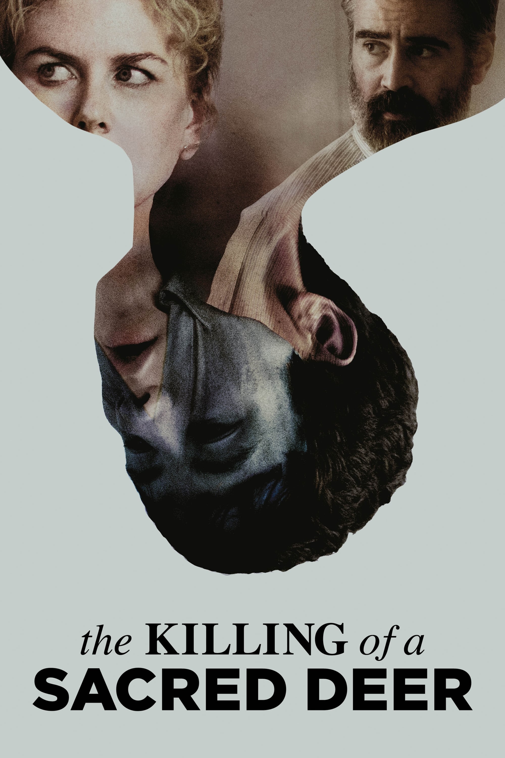
Yorgos Lanthimos’s films create distance from the characters’ pain through precise, wide-angle shots. He films locations like hospitals and homes with a stiff, almost clinical feel. This balanced style of filming emphasizes the characters’ helplessness in the face of fate. The camera frequently focuses on subjects directly in the center of the frame, making the audience experience the awkward silences alongside them. Ultimately, this visual approach highlights the inescapable nature of the curse.
‘Mad Max: Fury Road’ (2015)
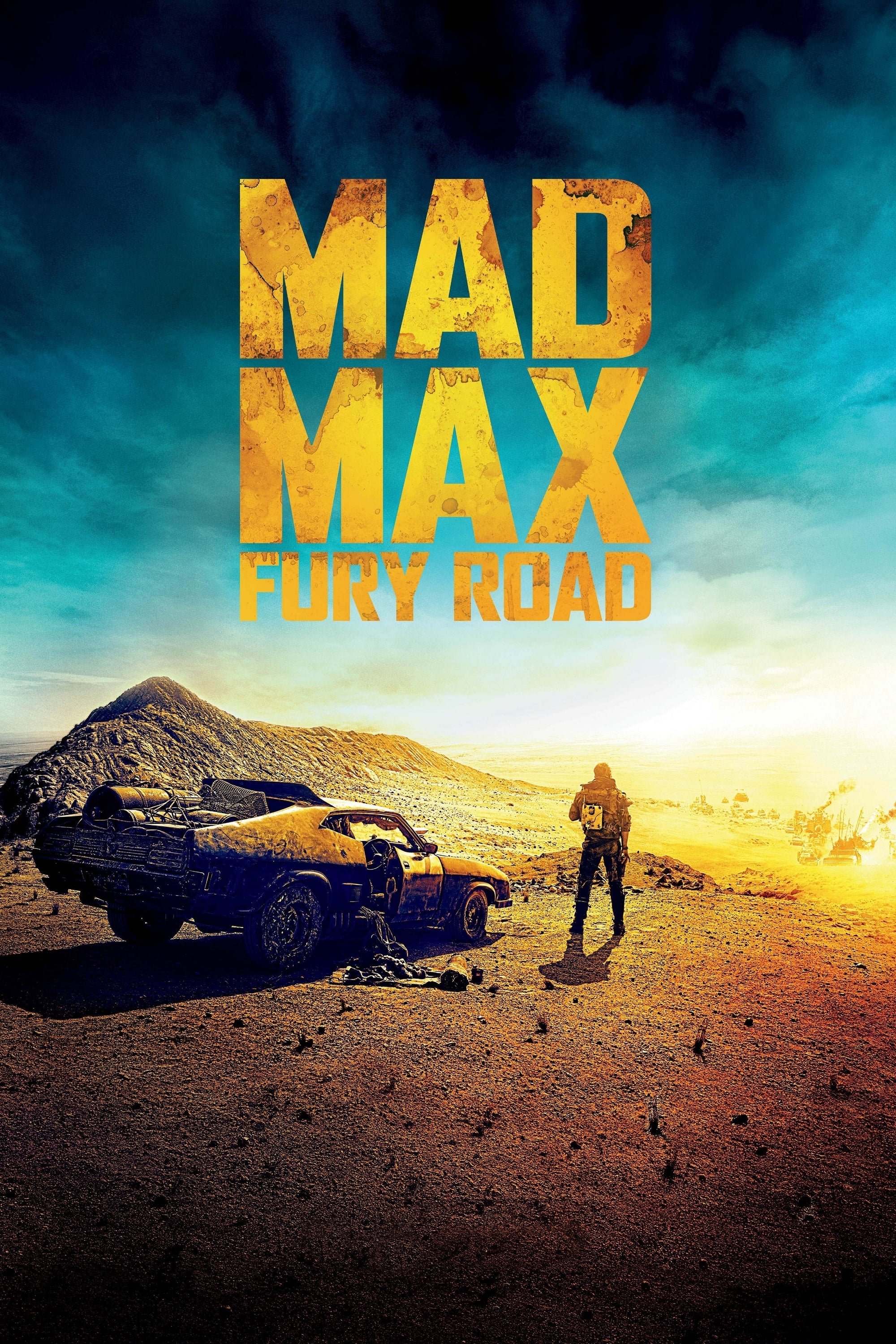
George Miller carefully focuses the camera on the action, making it easier to follow the fast-paced chase scenes. This allows for quick cuts and editing without losing track of where everything is happening. The balanced composition of the vehicles and the desert landscape give the film a legendary, almost mythical feel. By often centering characters in the frame, Miller highlights their intense determination to survive. This clear visual style makes the impressive stunts feel more realistic and powerful.
‘Us’ (2019)
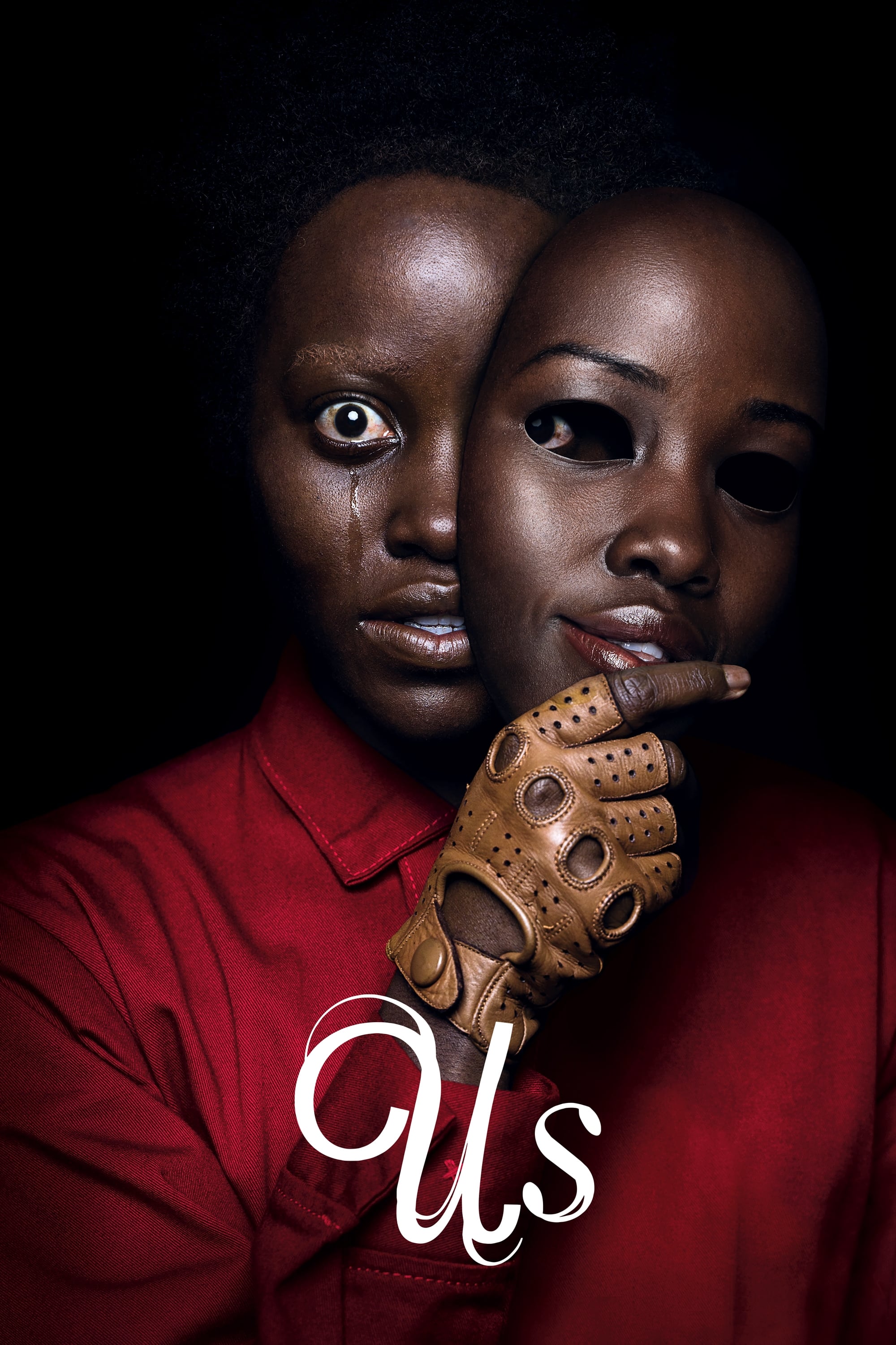
Jordan Peele skillfully uses visual symmetry in his films to emphasize the idea of duality and ‘doppelgängers,’ or doubles. He frequently employs reflections – in mirrors and glass – to suggest a hidden world beneath the surface. Even the fight scenes are choreographed so the opponents mirror each other, visually representing them as two sides of the same coin. The way the underground tunnels are filmed creates a focused, tunnel-like effect that reflects the obsessive nature of the villains. This careful balance challenges viewers to question who the real monster truly is.
‘A Clockwork Orange’ (1971)
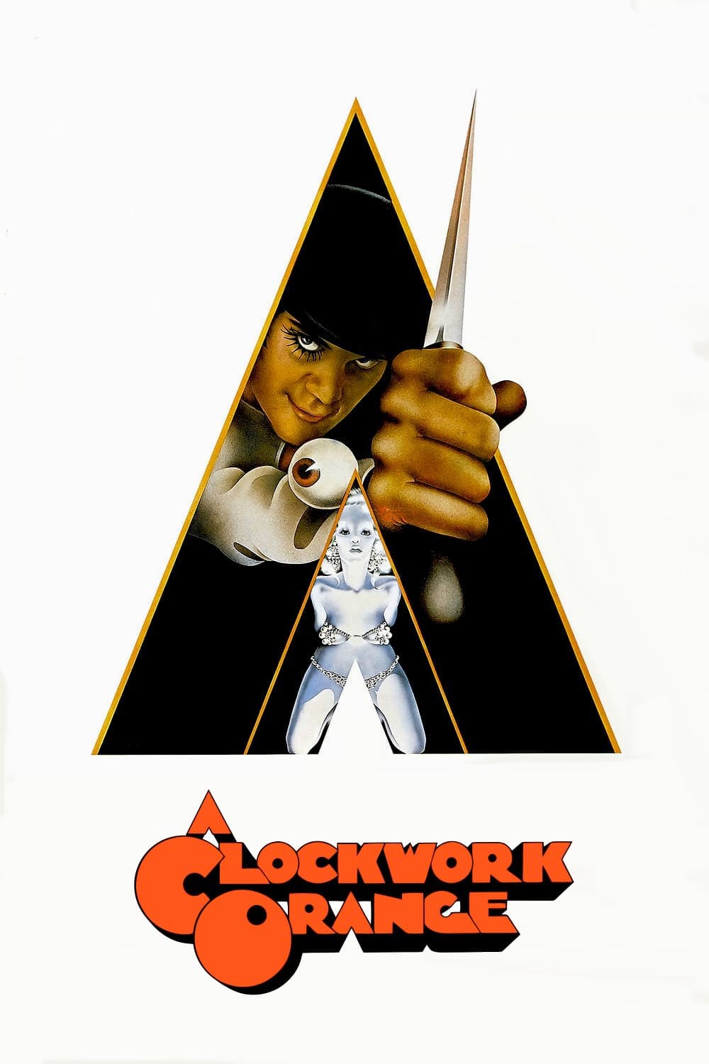
The film’s carefully centered shots draw the viewer into the on-screen violence, almost making them a participant. Alex DeLarge is often shown staring directly at the camera, creating an unsettling feeling. The film’s futuristic buildings are designed with perfect symmetry, mirroring the controlling and orderly nature of the society it depicts. This stark, precise visual style is intentionally contrasted with Alex’s unpredictable and violent actions, creating a disturbing tension between beauty and brutality.
‘Black Swan’ (2010)
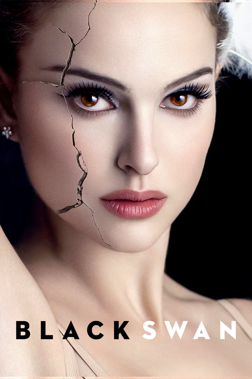
In Darren Aronofsky’s film, mirrors and balanced camera shots reveal the ballerina’s troubled mind. Seeing the main character doubled on screen shows her inner struggle between her innocent and dark sides. The camera frequently focuses on her face while the world around her seems to spin, making the audience feel her disorientation and growing instability. As her mental state worsens and she becomes fixated on perfection, the film’s carefully constructed symmetry falls apart, reflecting her complete loss of control.
‘Blade Runner 2049’ (2017)
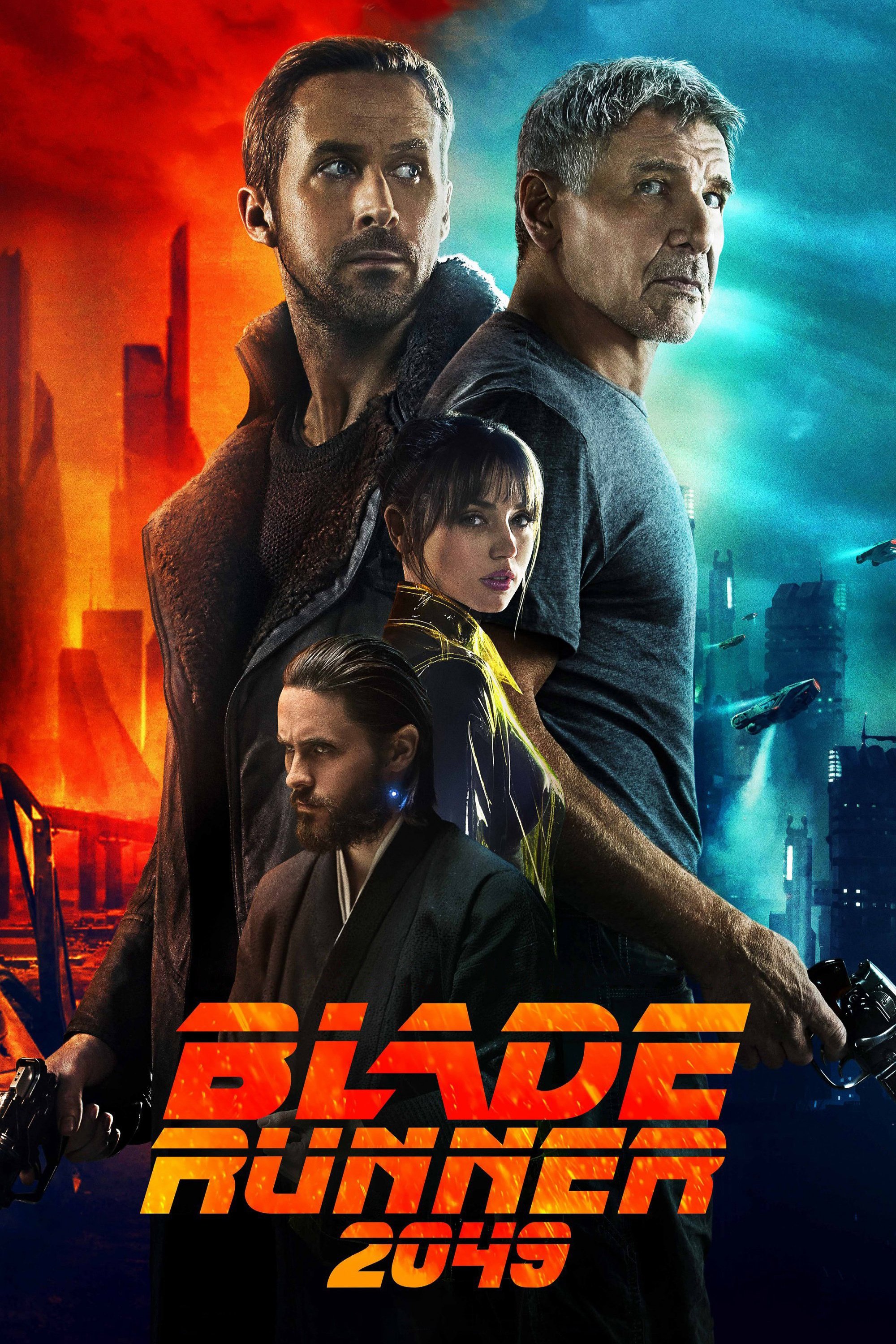
As a film buff, one of the things that really struck me about Blade Runner 2049 is how the visuals tell the story. The future Los Angeles is built with this really stark, symmetrical architecture, and it’s not just cool to look at – it makes you feel how alone K is. Roger Deakins, the cinematographer, is a master at using light and shapes to make the characters seem small and lost within these huge, perfectly ordered spaces. It really feels like nature has vanished, replaced by this cold, artificial world. K is often placed right in the middle of these massive, empty scenes, which just underlines his isolation as a replicant. But it’s not just bleakness; the precise, balanced way everything is composed gives the film a surprisingly thoughtful and almost spiritual feel.
‘The Royal Tenenbaums’ (2001)
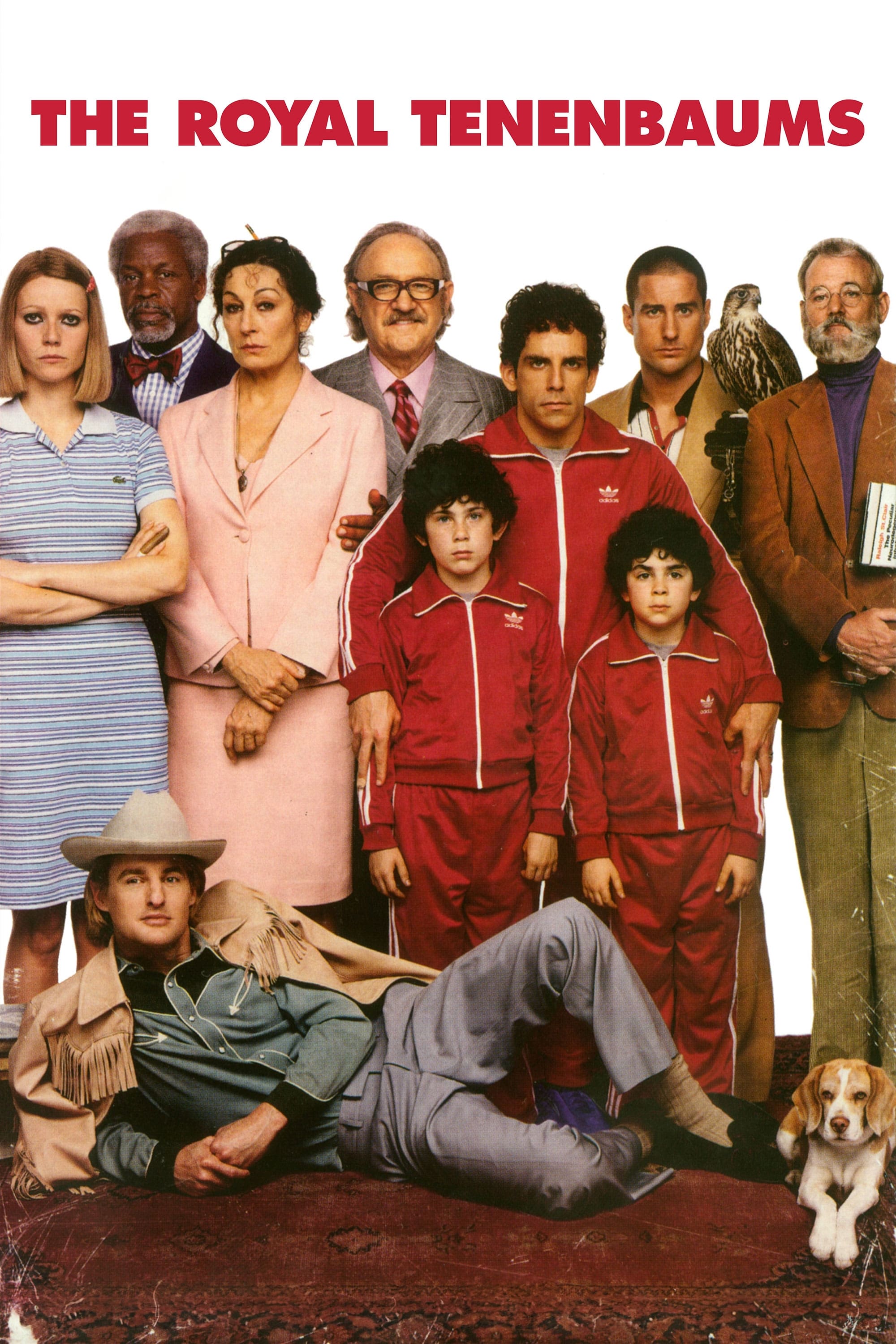
The movie first shows us its characters in carefully arranged scenes, almost like pictures in a museum or old storybook. This technique immediately presents the family as symbols of their past achievements. The stillness of these images reflects how stuck they are in their own lives. Director Wes Anderson uses this style to create a bittersweet mood, blending humor with sadness. Despite their emotional distance, the way the scenes are composed keeps the quirky family connected.
‘Hereditary’ (2018)

The film begins with a shot that seamlessly moves from a dollhouse to a real bedroom, immediately making the viewer question what is real. Director Ari Aster uses this technique to hint that the family is powerless to change what happens to them. The house itself feels unsettlingly perfect and artificial, and the characters are often shown framed by doorways and windows, making them appear like trapped figures. This visual style builds a sense of growing fear and suggests they are being controlled by something beyond their understanding.
‘Lawrence of Arabia’ (1962)
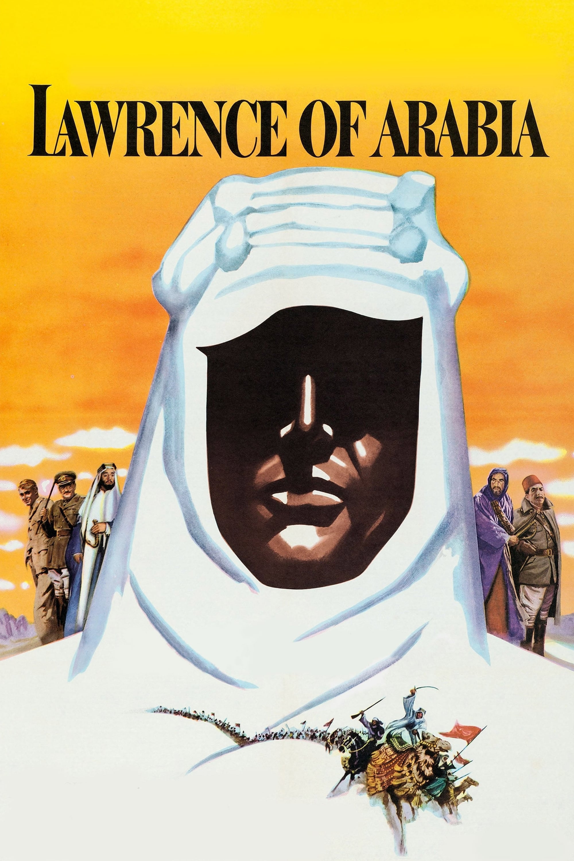
David Lean skillfully uses the wide-open desert to create balanced and symmetrical shots. By placing small figures right in the middle of these expansive landscapes, he emphasizes both their isolation and the immense power of the natural world. This balanced composition gives the film an epic feel, fitting for its grand historical story. The desert isn’t just a setting; through careful framing, it feels like a character in itself.
‘Drive’ (2011)
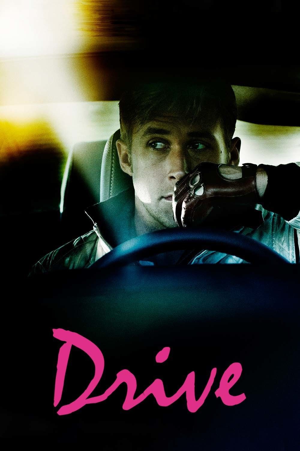
As a film fan, I’ve always been struck by how Nicolas Winding Refn visually builds the character of the Driver in his film. He frequently uses this really cool technique where he divides the screen into four sections, almost like framing the Driver and highlighting how reserved and controlled he is. What’s even more interesting is how symmetrical the shots of the car interiors are – it really emphasizes the Driver’s mastery over his vehicle. Refn also plays with mirrors and windows, splitting the frame to show the two sides of the Driver – that quiet, gentle part, and the more dangerous, violent side. It all works together – the precise visuals, the synth soundtrack, and the Driver’s cool attitude – to turn what could be a simple crime story into something much more atmospheric and captivating. It’s less about what happens, and more about how it feels.
‘Barry Lyndon’ (1975)
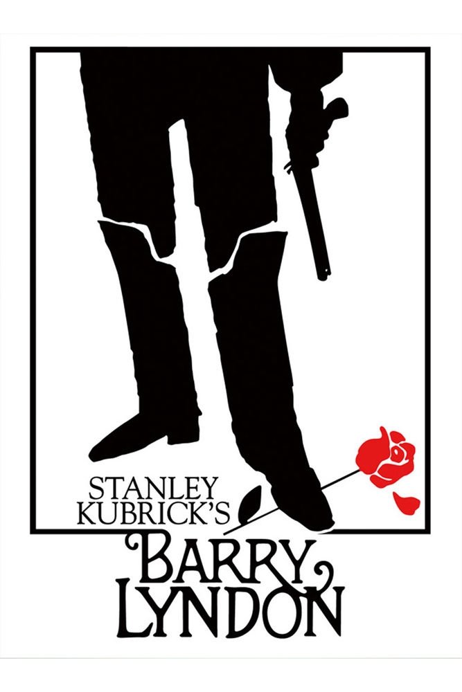
The film visually echoes the style of 18th-century paintings, particularly landscapes and portraits. Director Kubrick frequently pulls the camera back from characters to showcase the vastness around them. This, along with the film’s symmetry, highlights the strict rules and formal behaviors of the era. Characters often appear as if they’re posing for a painting, feeling constrained by their place in society. The use of natural light and carefully balanced shots creates a slow, mesmerizing pace.
‘Oldboy’ (2003)
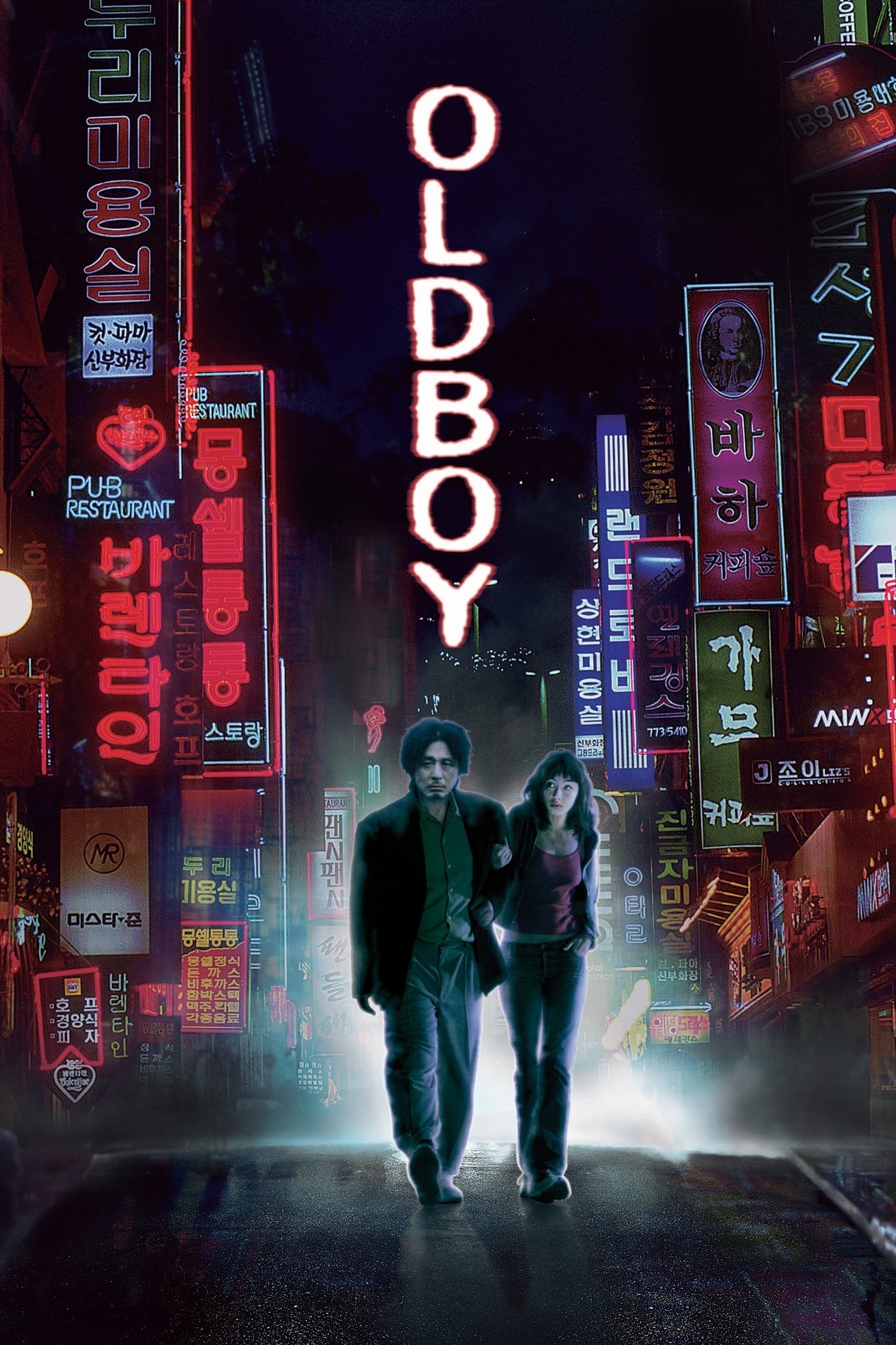
Park Chan-wook’s films use repeating shapes in backgrounds and buildings to create a disorienting feeling. The well-known hallway fight, for example, is filmed from an unusual angle that looks almost like a video game, with perfect symmetry. He often frames the main character in a way that highlights his long period of isolation. By repeating images and patterns, the film reflects the endless cycle of revenge and the lasting effects of trauma. This carefully planned visual style makes even the most violent scenes feel grand and dramatic, like an opera.
‘Fantastic Mr. Fox’ (2009)
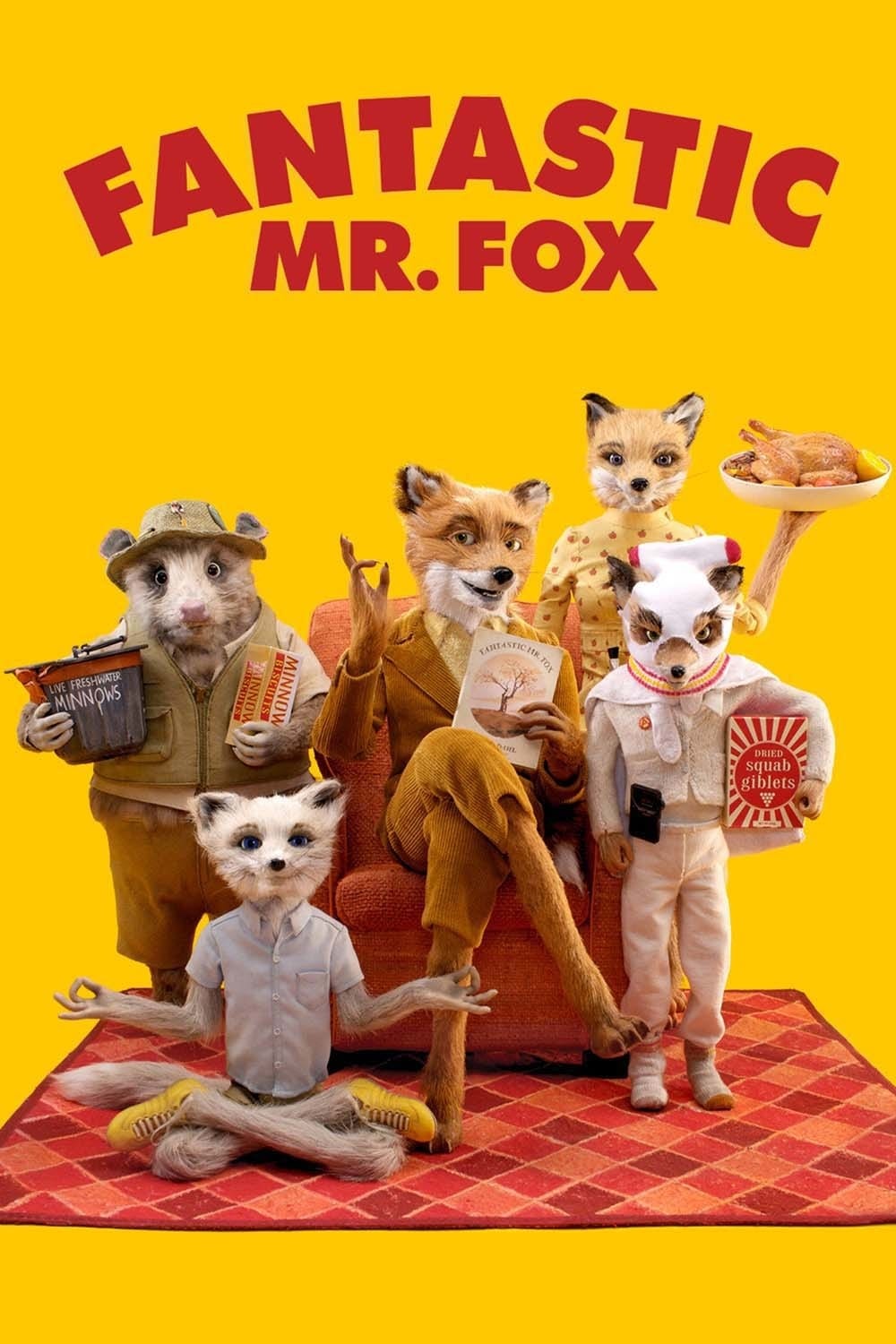
As a movie reviewer, I was immediately struck by the film’s unique visual style. The stop-motion animation isn’t just charming, it’s incredibly precise. Every frame feels perfectly balanced, and the filmmakers clearly had total control over the image. They often center the characters when they speak, which creates a surprisingly intimate connection with the audience. The way the camera smoothly tracks across the scenes isn’t accidental; it feels mathematically planned, and really helps establish the world the story takes place in. Honestly, this visual approach isn’t just eye-candy, it feels like a direct translation of the beautiful, deliberate writing of the original story. And the fact that it looks artificial? That actually adds to the overall charm of this wonderfully crafted miniature world.
‘Melancholia’ (2011)
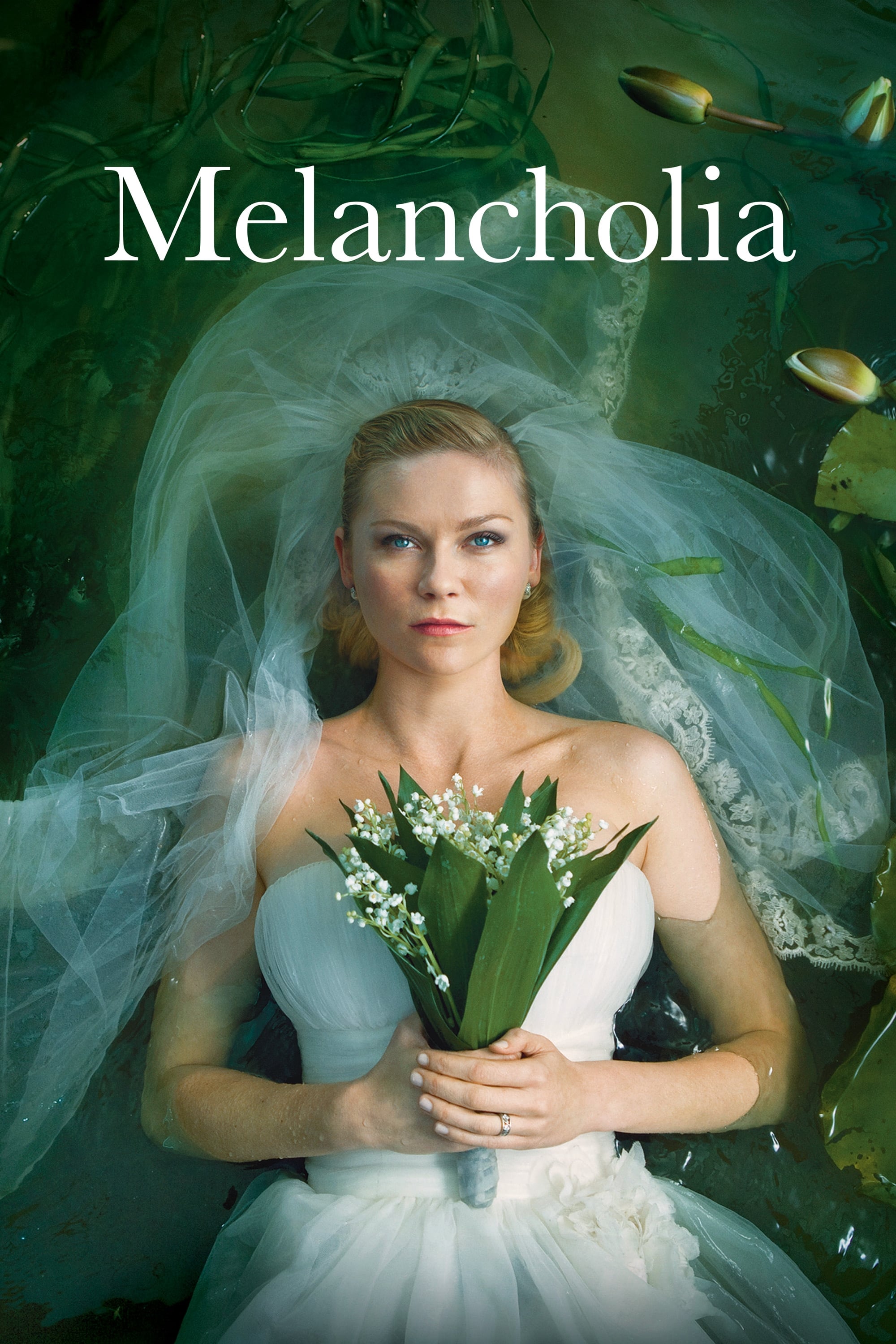
As a huge fan, I’ve always been struck by how Lars von Trier uses these incredible visuals in his films. He sets up this beautiful, almost perfectly symmetrical world – like he’s mirroring the cosmos itself – and then throws you into the main character’s really messy, internal struggles. The movie starts with these slow, gorgeous scenes that feel like living paintings. He even uses the alignment of planets as this looming, but strangely beautiful, sense of finality. He highlights how empty things like weddings and formal events can feel, and it’s all so visually stunning that even though the world is ending, it feels… peaceful, not scary. It’s a really unique approach.
‘The Fall’ (2006)
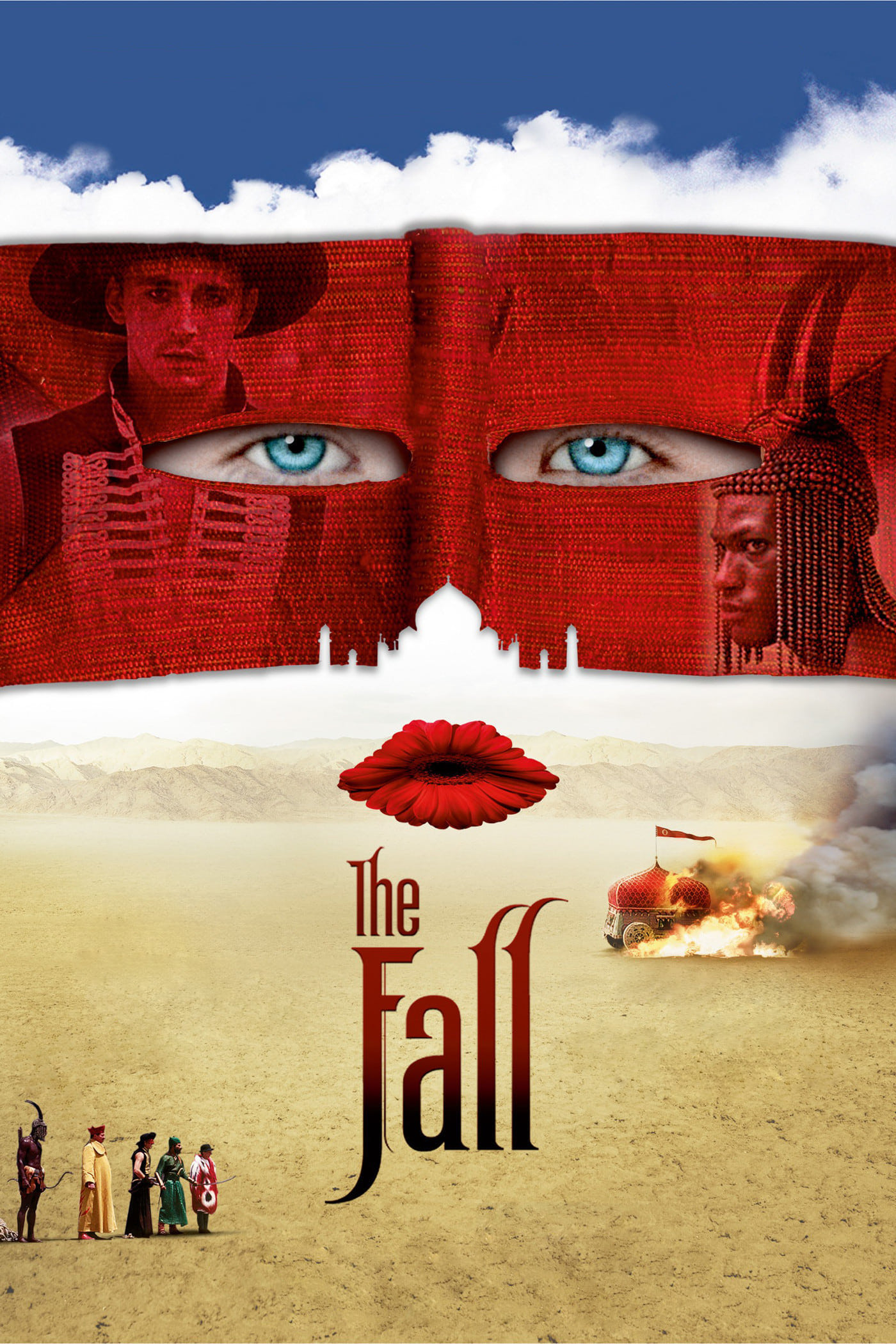
Tarsem Singh crafts fantastical settings by filming in real places that naturally have balanced and symmetrical designs. He uses bold colors and careful framing to smoothly move between the hospital scenes and the story’s imaginary world, transforming buildings and deserts into dreamlike environments. Visually, the film draws connections between the injured stuntman’s real life and the fictional world he creates. This symmetry isn’t just visual; it also reflects the protagonist’s attempt to find order and healing amidst his physical and emotional struggles.
‘Stoker’ (2013)
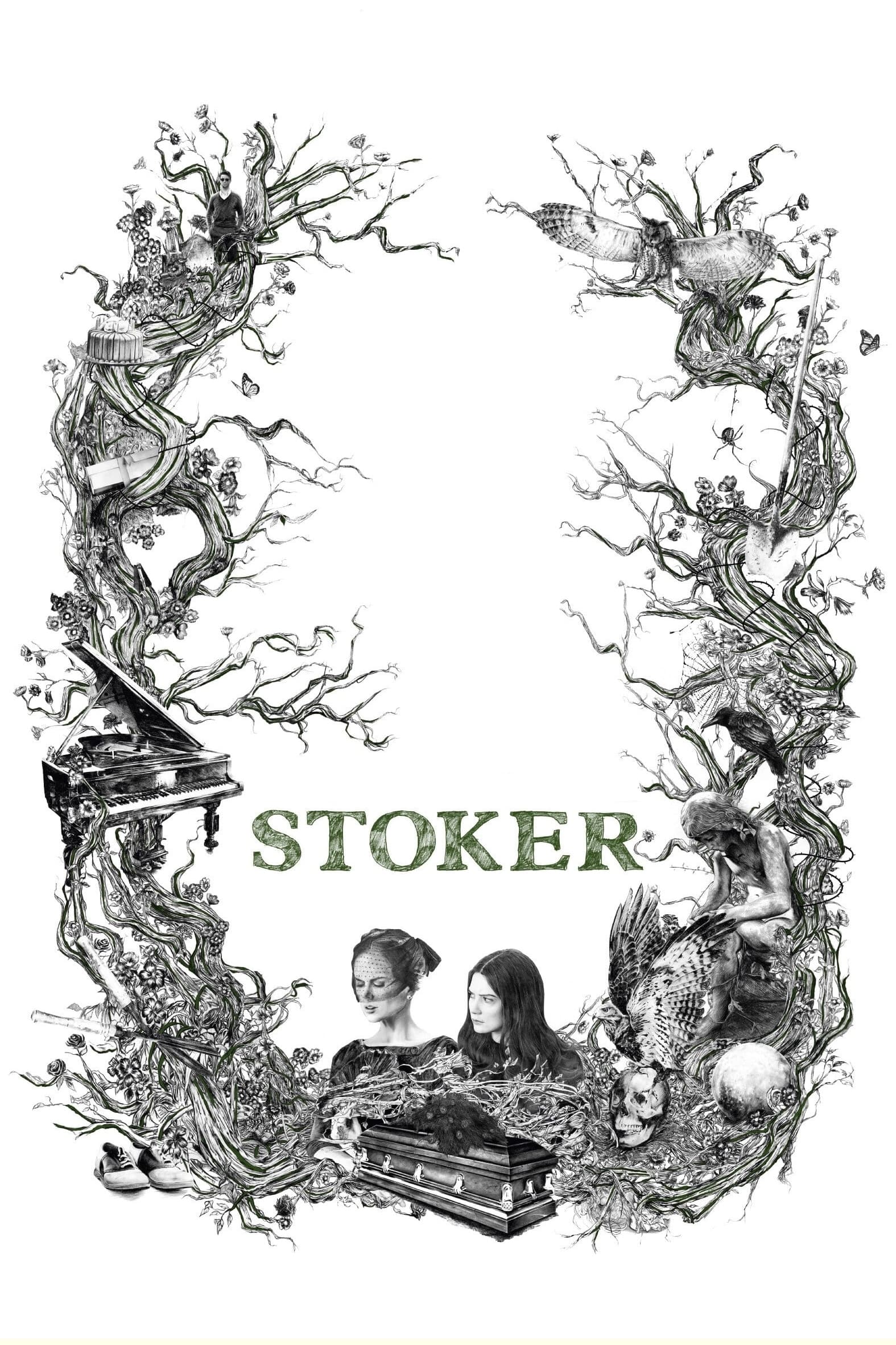
Park Chan-wook’s signature visual style shines in this suspenseful, gothic thriller centered around a secretive uncle. The film cleverly uses the house’s architecture – especially the staircase and floor plan – to visually connect the characters. Mirroring shots suggest a hidden psychic link or a shared darkness between them. This symmetry also builds a strange, unsettling tension during moments of violence and revelation. Ultimately, the camera work turns what should be a safe home into a threatening, dangerous place.
‘Tron: Legacy’ (2010)
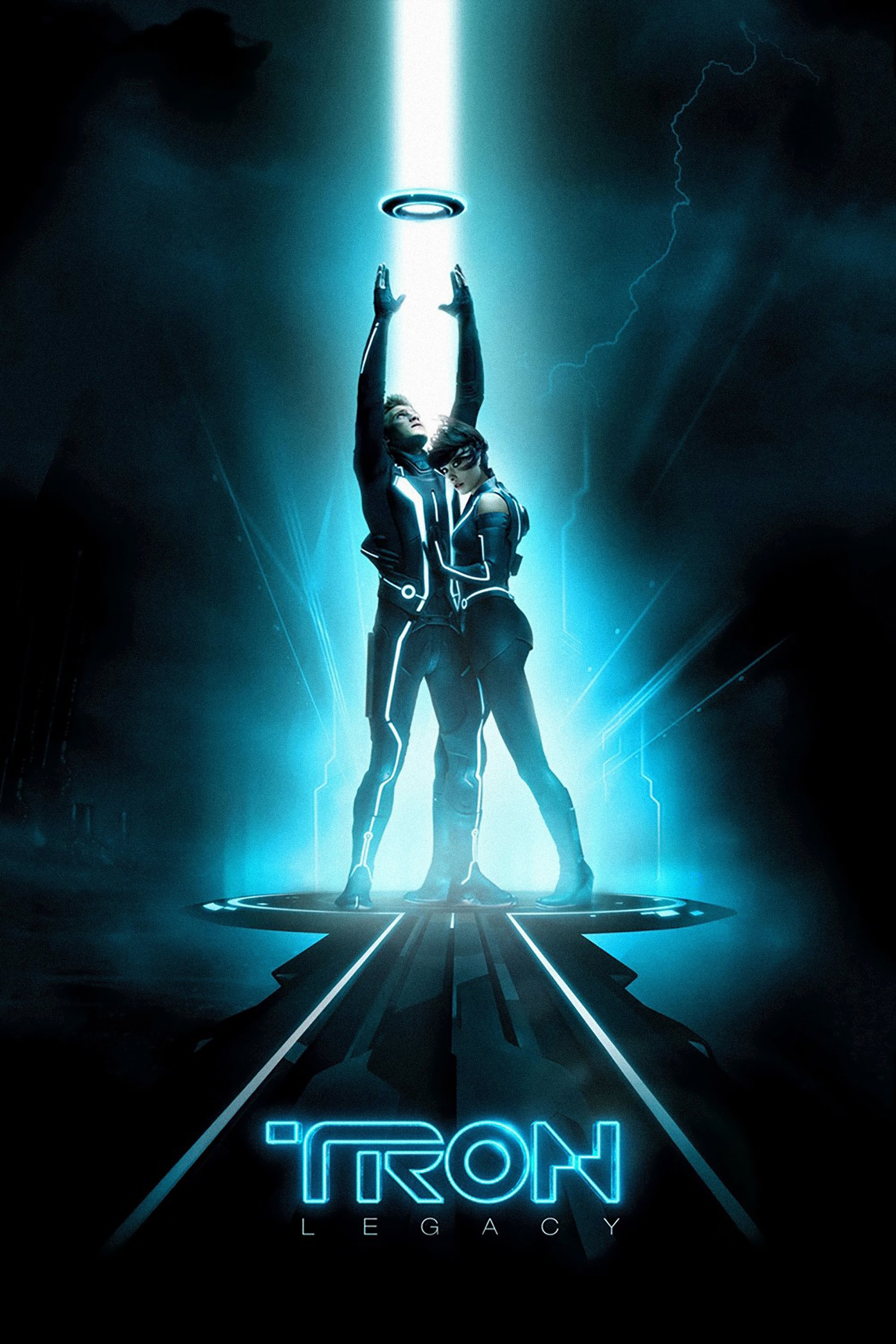
The digital world of the Grid is built on precise lines and glowing neon patterns. Its computer-generated architecture feels cold and oppressive. Characters are frequently shown against huge, symmetrical backdrops, emphasizing how powerless they are within the system. This visual style mirrors the villain’s desire for a flawless, controlled universe. The stark, clean designs stand in direct opposition to the messy, unpredictable nature of the heroes.
‘Asteroid City’ (2023)
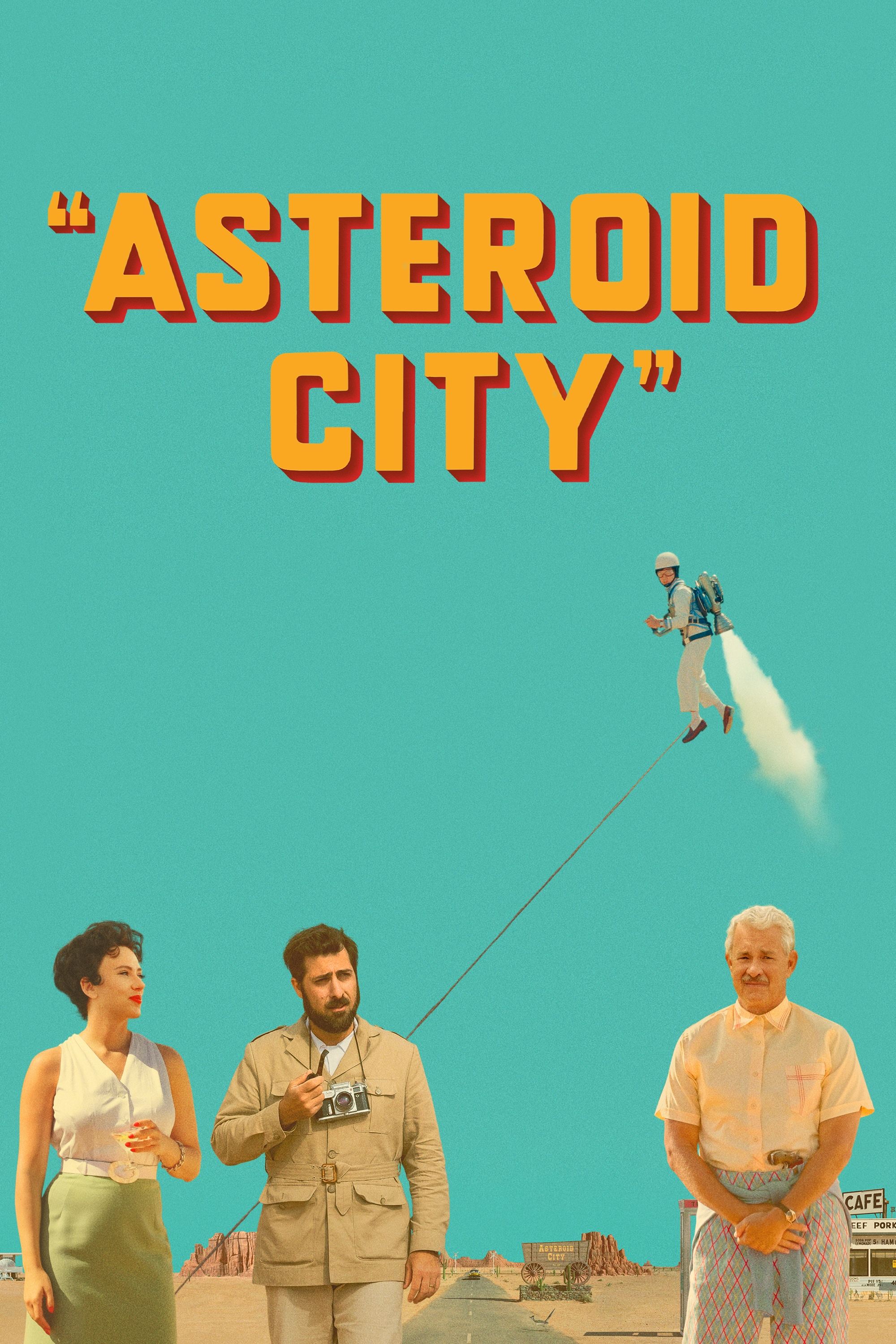
Wes Anderson turns the desert landscape into a carefully constructed movie set using precise symmetry. He emphasizes the story’s artificiality with flat backgrounds and deliberately arranged elements. This framing also underscores the characters’ isolation as they navigate a quarantine situation. The film’s pastel colors and balanced compositions give it a nostalgic, yet futuristic, feel—like a vintage postcard. Ultimately, this visual order attempts to bring clarity to the profound questions raised by the arrival of something otherworldly.
Please share your thoughts on which film utilized visual symmetry most effectively in the comments.
Read More
- Top 20 Dinosaur Movies, Ranked
- 20 Movies Where the Black Villain Was Secretly the Most Popular Character
- Celebs Who Narrowly Escaped The 9/11 Attacks
- 25 “Woke” Films That Used Black Trauma to Humanize White Leads
- The 10 Most Underrated Jim Carrey Movies, Ranked (From Least to Most Underrated)
- The Best Directors of 2025
- Transformers Under the Microscope: What Graph Neural Networks Reveal
- Every Notable ‘Star Trek: The Original Series’ Actor Who Died
- Gold Rate Forecast
- Trading on Thin Air: AI Agents Conquer Crypto Volatility
2025-12-12 17:52