As television shows continue for many seasons, their look often changes dramatically. This is because of improvements in technology and increased funding. Animation studios, in particular, often update character designs and move from traditional hand-drawn animation to digital techniques to make production easier. Sometimes, early episodes, or ‘pilots,’ look very different from the later, more refined versions. These changes in visual style can alter the overall feel of a show and even bring in new viewers. Here are some examples of television shows that have undergone the most striking visual makeovers.
‘The Simpsons’ (1989–Present)
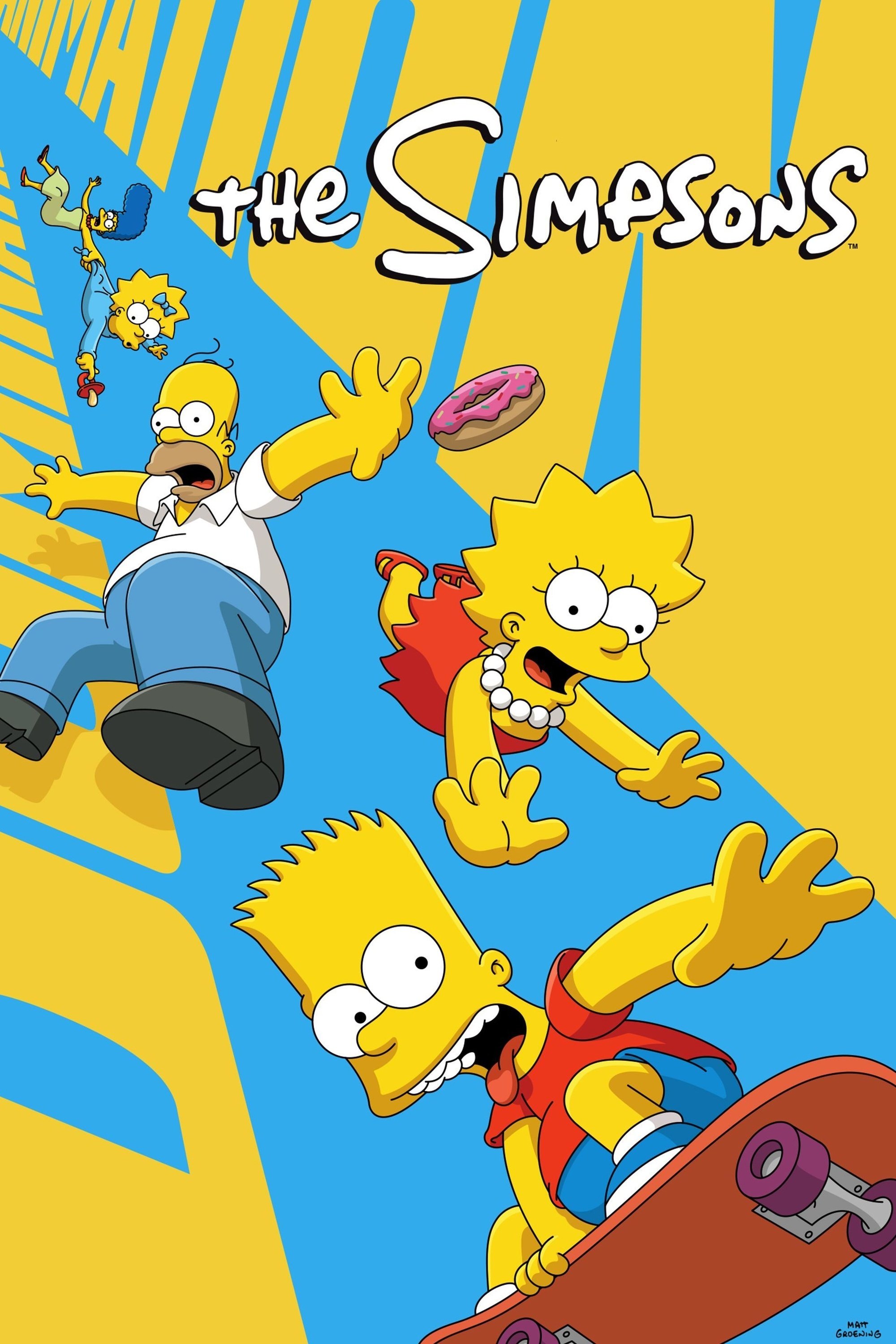
The show’s first episodes had simple, somewhat messy animation with shaky lines and unnatural movements. As the series progressed, the animation became smoother and the colors more consistent, moving away from its original, rough style. A major change happened when the show switched to high definition and began using completely digital coloring techniques. Now, the characters appear stiff, a noticeable difference from the fluid, lively animation of the earlier seasons.
‘South Park’ (1997–Present)
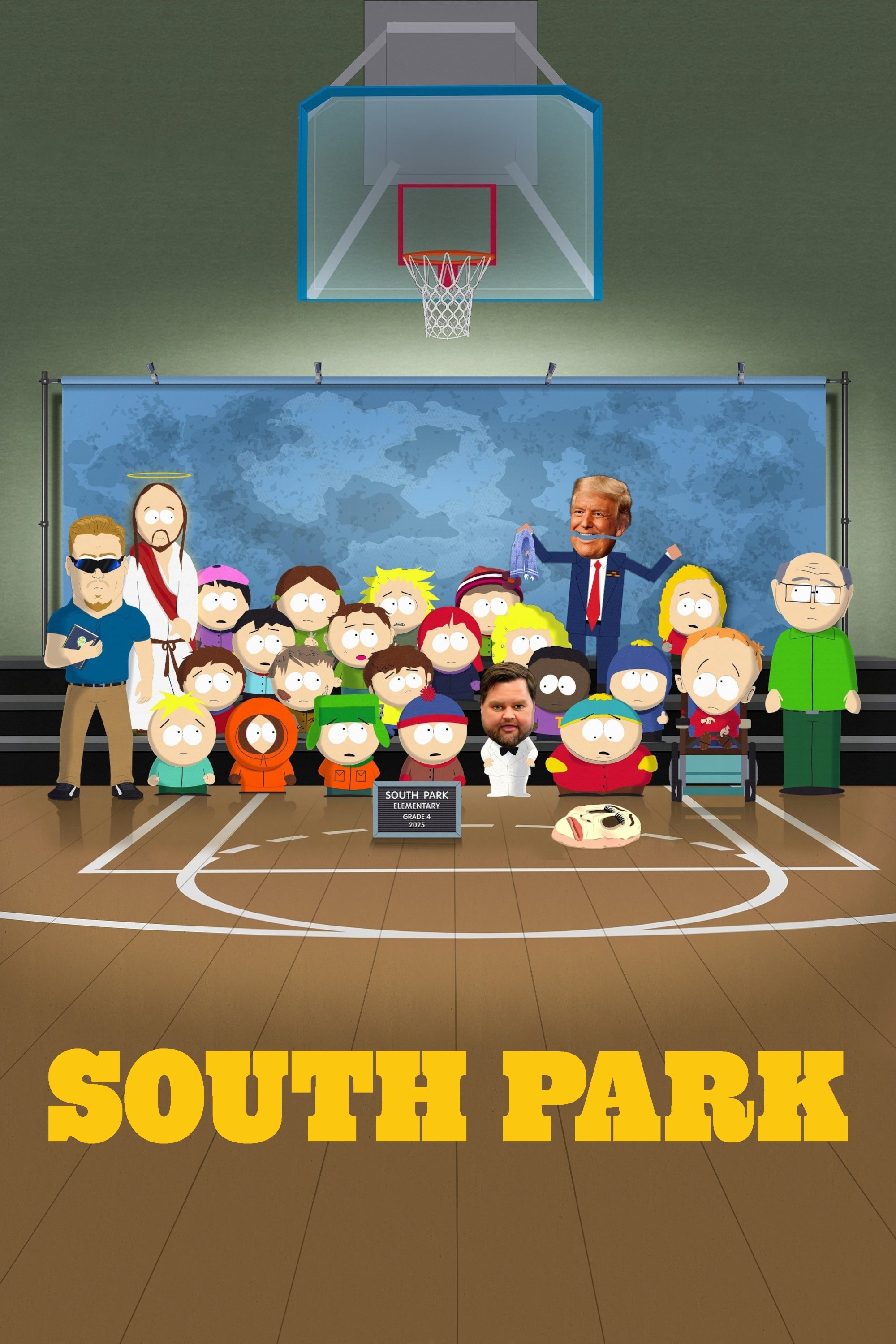
The show began with a very hands-on approach – the first episode was made entirely with cut-out paper and stop-motion animation. The creators quickly moved to computer animation to achieve the same look, but much faster. As the show developed, they added more sophisticated lighting and shadows to give the flat, paper world a greater sense of depth. Today, the show uses powerful rendering technology to create a cinematic feel, while still keeping the charm of its original low-budget style.
‘Adventure Time’ (2010–2018)
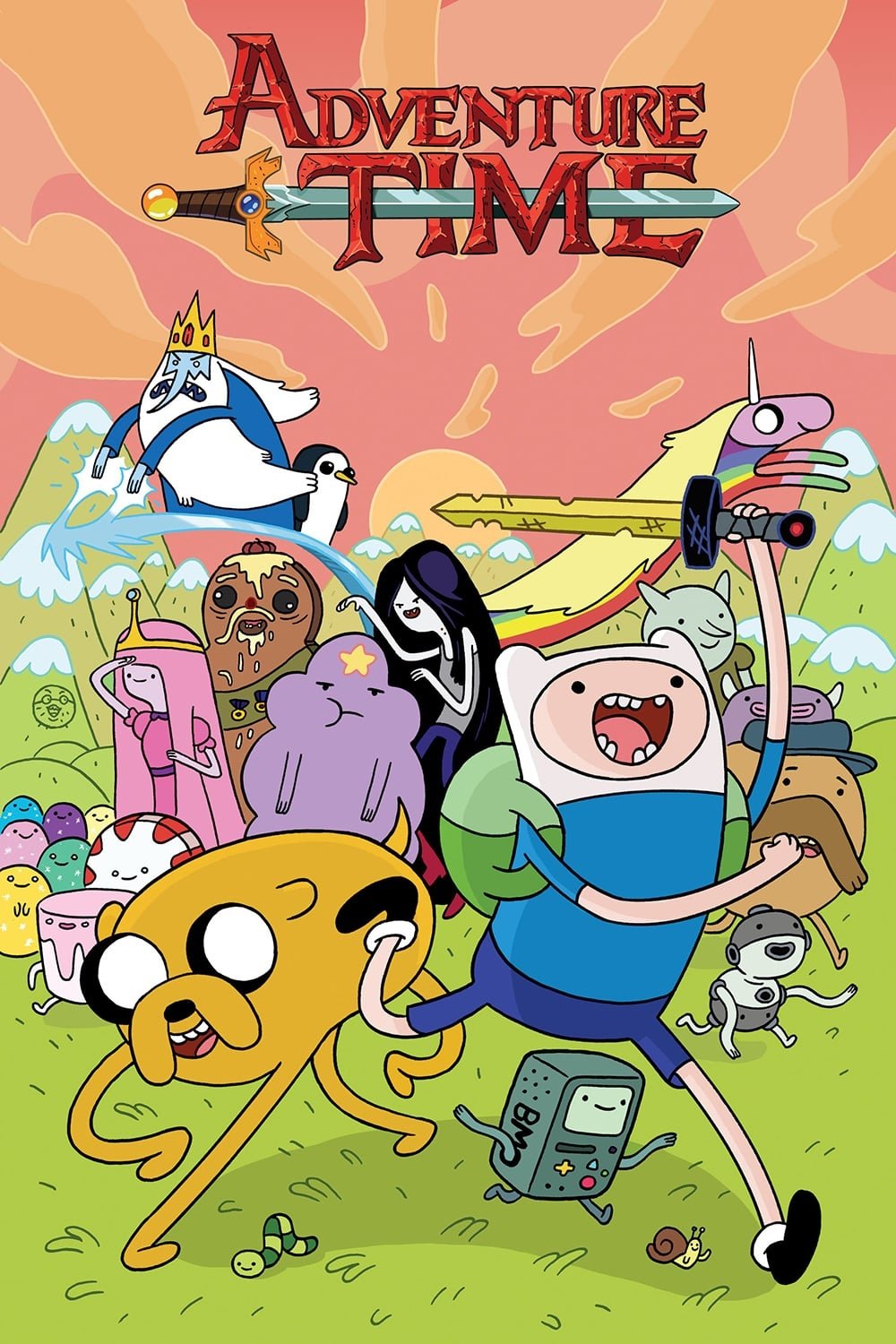
The show’s first season started with a simple, cartoonish look, featuring characters with noodle-like arms and legs and exaggerated expressions for comedic effect. As the story became more complex and serious, the art style evolved too. Backgrounds became more detailed, character designs became more consistent, and lighting was used more effectively to emphasize emotional moments and strengthen the story. This visual improvement reflected the show’s shift from a lighthearted comedy to a darker, more epic fantasy.
‘Star Wars: The Clone Wars’ (2008–2020)
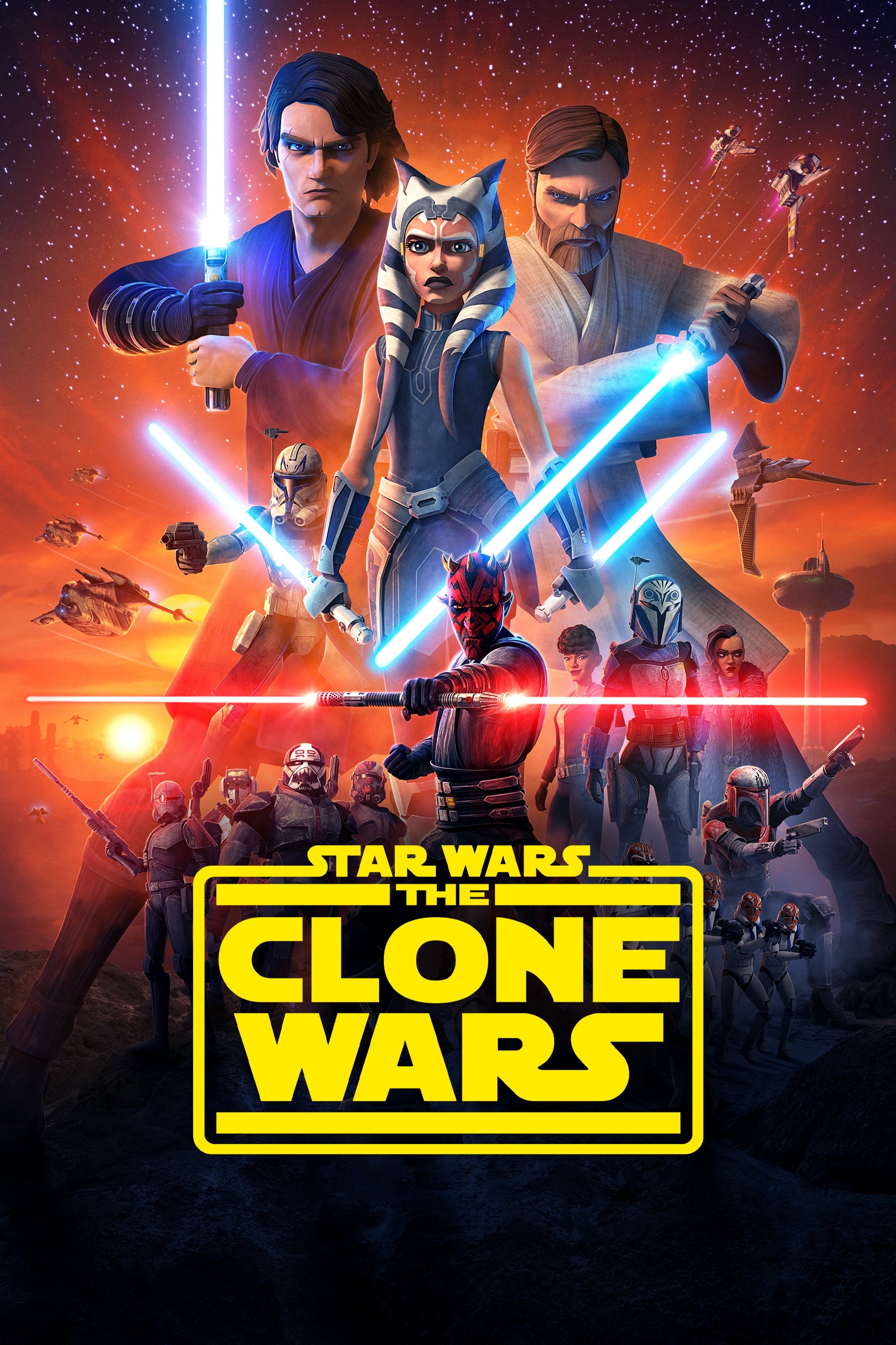
In the beginning, the show’s animation looked a bit awkward, with characters moving stiffly and appearing almost like puppets. But as the show went on and they had more money and better technology, the animation got dramatically better. Later seasons featured stunning visuals and effects that looked like a movie. The final season, streamed on Disney+, showed off the best television animation possible, with smooth action scenes and characters that really showed emotion through their faces.
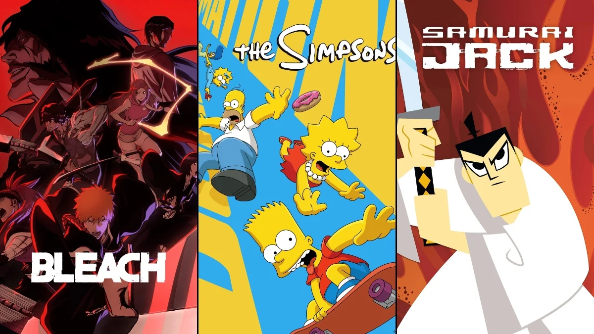
‘Samurai Jack’ (2001–2017)
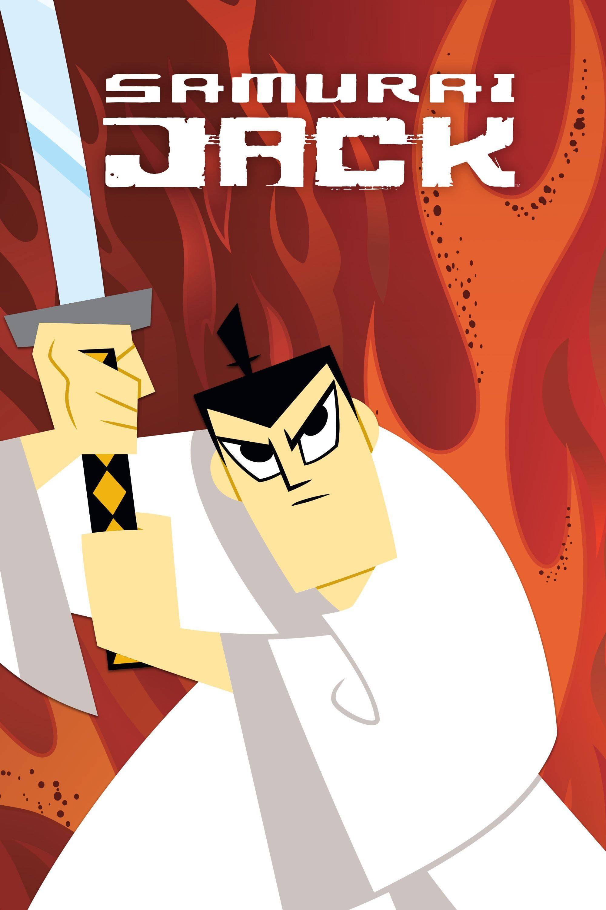
The first four seasons of the show had a simple, clean look using mostly geometric shapes. When the show was brought back, the visuals became darker and more detailed, with added effects to fit the more serious storylines. The screen also became wider, making action scenes feel more like a movie. These changes kept the original artistic style but updated it for a new audience.
‘One Piece’ (1999–Present)
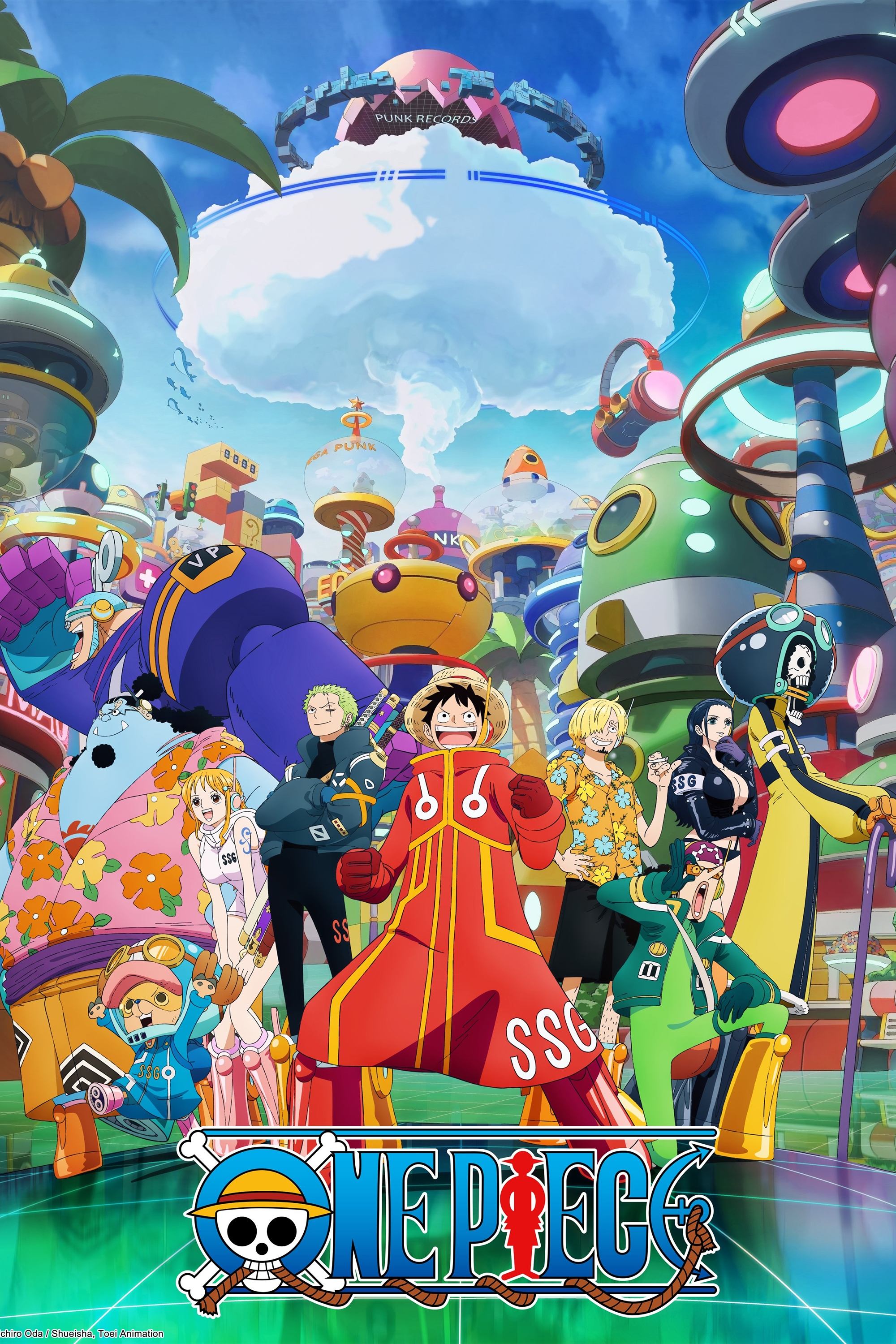
The show originally used classic hand-drawn animation with faded colors and basic character designs. Switching to digital animation made the colors more vibrant and the lines cleaner, significantly changing the series’ appearance. More recently, the Wano Country arc brought a major visual update, featuring bolder lines and a softer look inspired by traditional Japanese artwork. This new style has led to some of the most exciting and smoothly animated fight scenes the show has ever seen.
‘Family Guy’ (1999–Present)
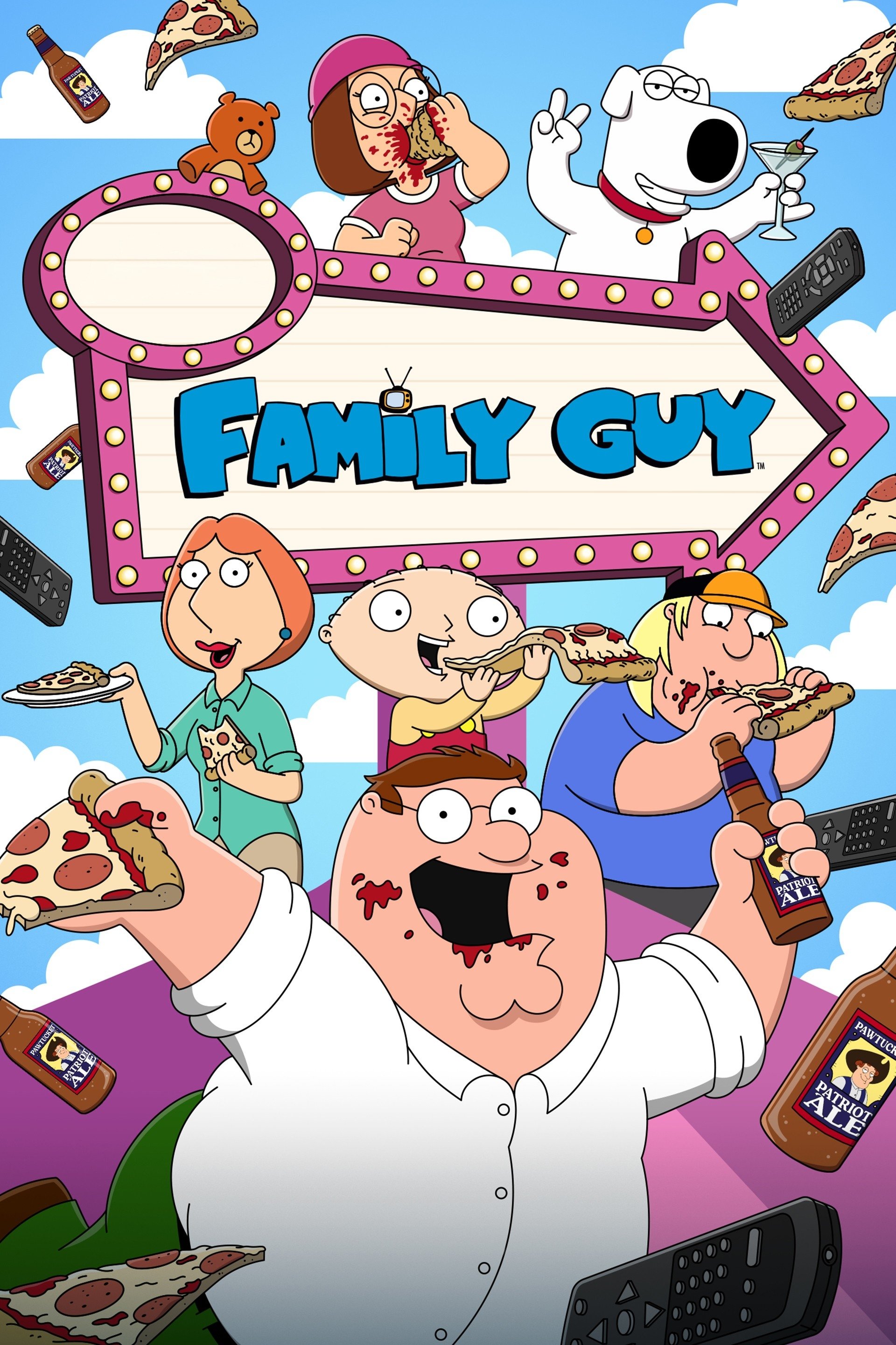
Early seasons of the show looked a bit clunky because of limited funds, resulting in simple animation and character designs. When the show was brought back, they switched to digital coloring, which made everything much clearer and more colorful. Now, the animation is smooth and polished, and they even include some 3D effects that fit in well with the 2D style. While the characters still look mostly the same, the overall visual quality has improved a lot.
‘King of the Hill’ (1997–2010)
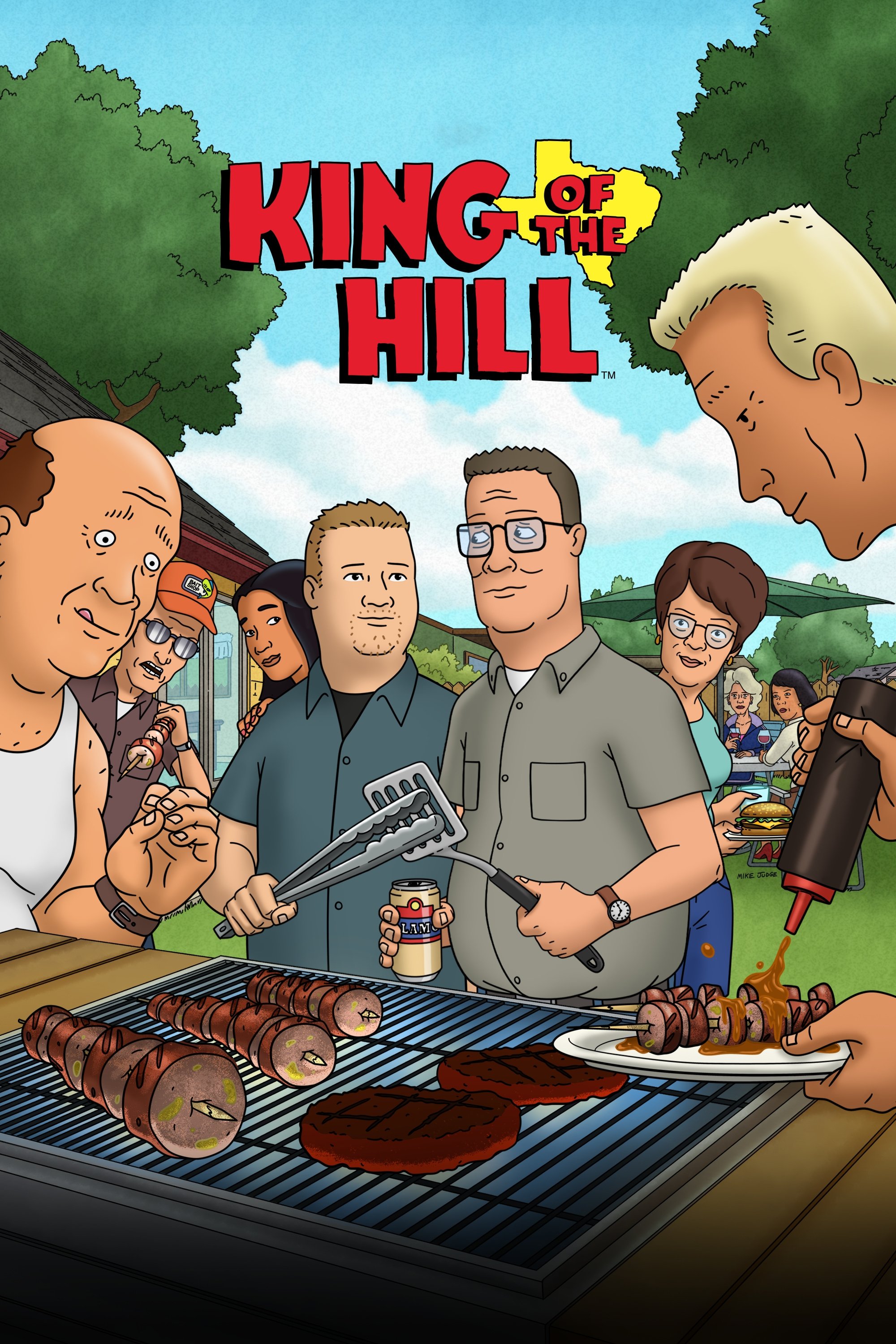
The animation style changed noticeably over the series’ run. The first season had a raw, hand-drawn look with intentionally shaky lines. Later seasons switched to digital coloring, resulting in smoother, more vibrant visuals and more fluid character animation. This cleaner art style complemented the show’s shift towards more realistic and nuanced storytelling.
‘Beavis and Butt-Head’ (1993–Present)
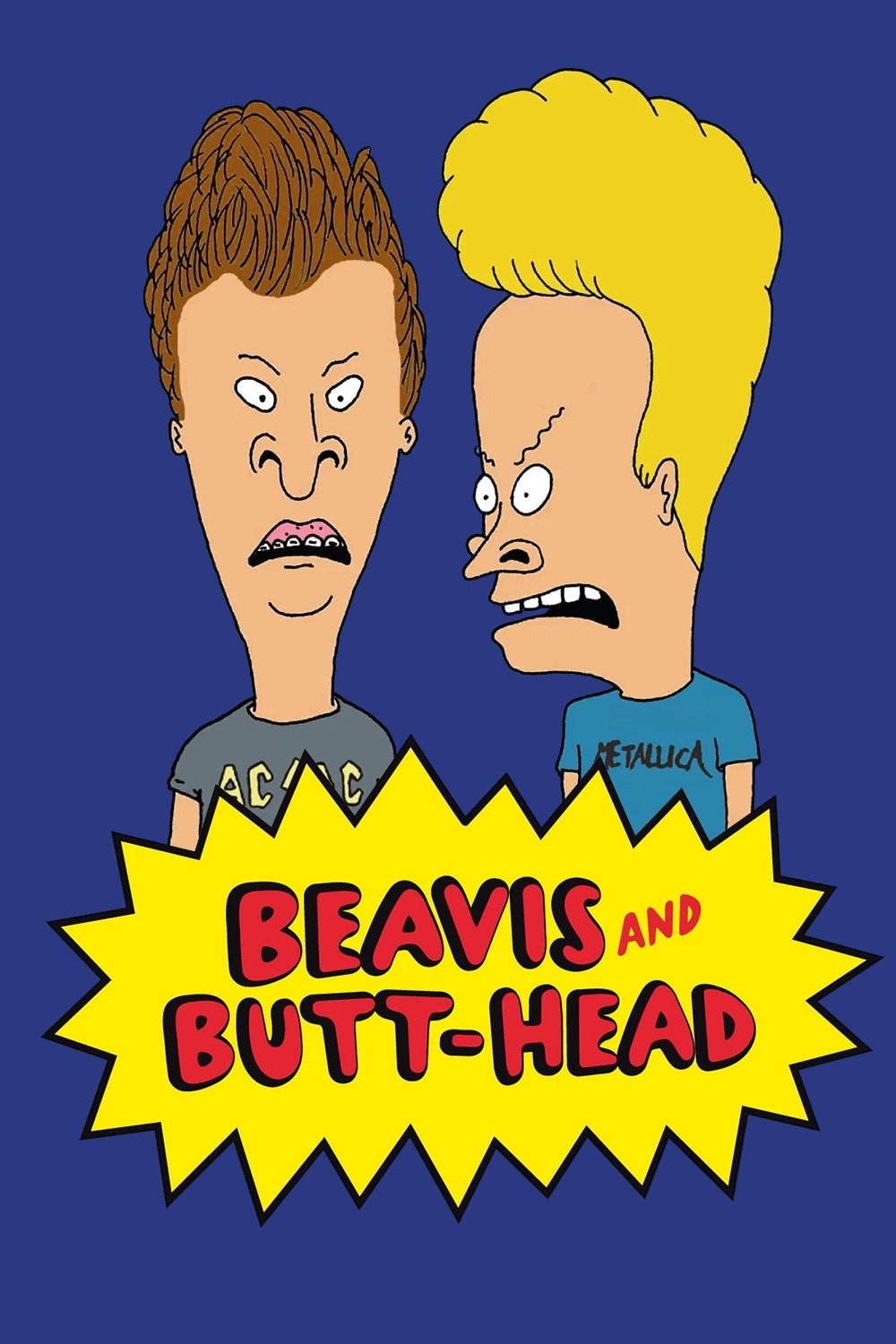
As a total animation nerd, I’ve always loved the look of this show. When it first hit MTV, it defined grunge – all scratchy, raw pencil drawings, and purposefully unpolished. They brought it back in 2011 and smoothed things out a bit, cleaning up the lines, but thankfully kept that original, delightfully messy vibe. Now, on Paramount+, it’s seriously high-definition. You can see everything – and honestly, a lot of it is pretty gross, which is perfect! It’s amazing how they’ve managed to update the art style for today’s audiences without losing that amateur, hand-drawn feel that made it so special in the first place.
‘SpongeBob SquarePants’ (1999–Present)
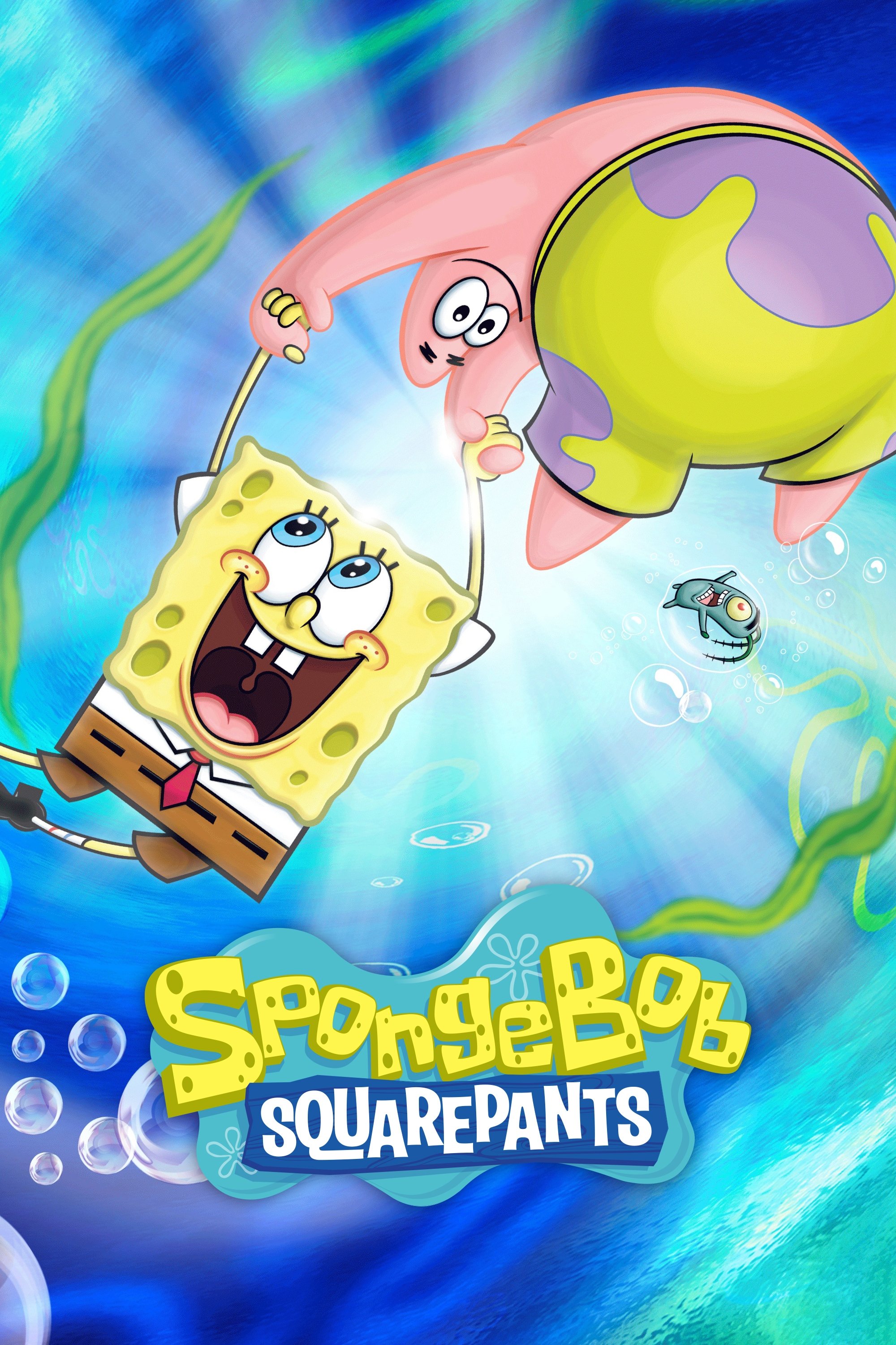
The show’s animation style has changed a lot over time. The first season looked soft and a little grainy, using traditional cel animation. Later, they switched to digital animation, which made the colors much brighter and the lines cleaner. More recently, the animators have been using very expressive faces and stretchy, bouncy movements – a big contrast to the more rigid animation in the early seasons. Overall, the show has moved from a peaceful, ocean-themed look to a much more fast-paced and energetic cartoon style.
‘ReBoot’ (1994–2001)
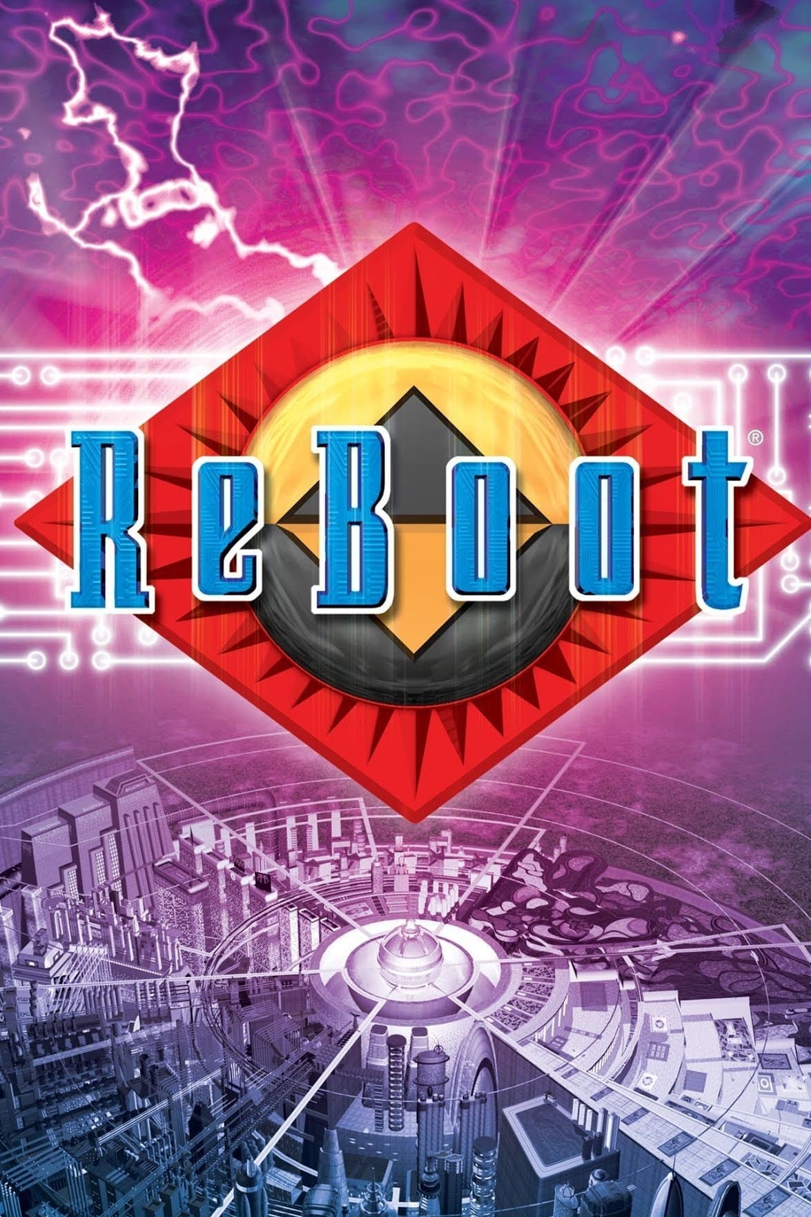
This show was one of the first to use computers to create television visuals, and looking back, the early effects seem quite primitive. As computer technology got better with each season, the visuals improved dramatically – everything from textures to lighting became more realistic. By the final season, the characters had incredibly detailed faces and the environments felt much more immersive than anything possible when the show began. Essentially, the series offers a fascinating look at how quickly CGI technology advanced during the 1990s.
‘RWBY’ (2013–2024)
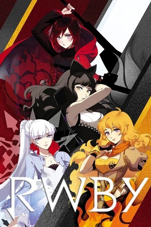
The initial episodes were made using Poser, and had a simple, flat look with shadowy figures as background characters. Starting with the fourth episode, the creators switched to Maya, which dramatically improved the lighting and how the characters and objects looked. This resulted in clearer character designs and much smoother, more natural movements. The difference between the early episodes and the final version is truly remarkable.
‘The Venture Bros.’ (2004–2018)
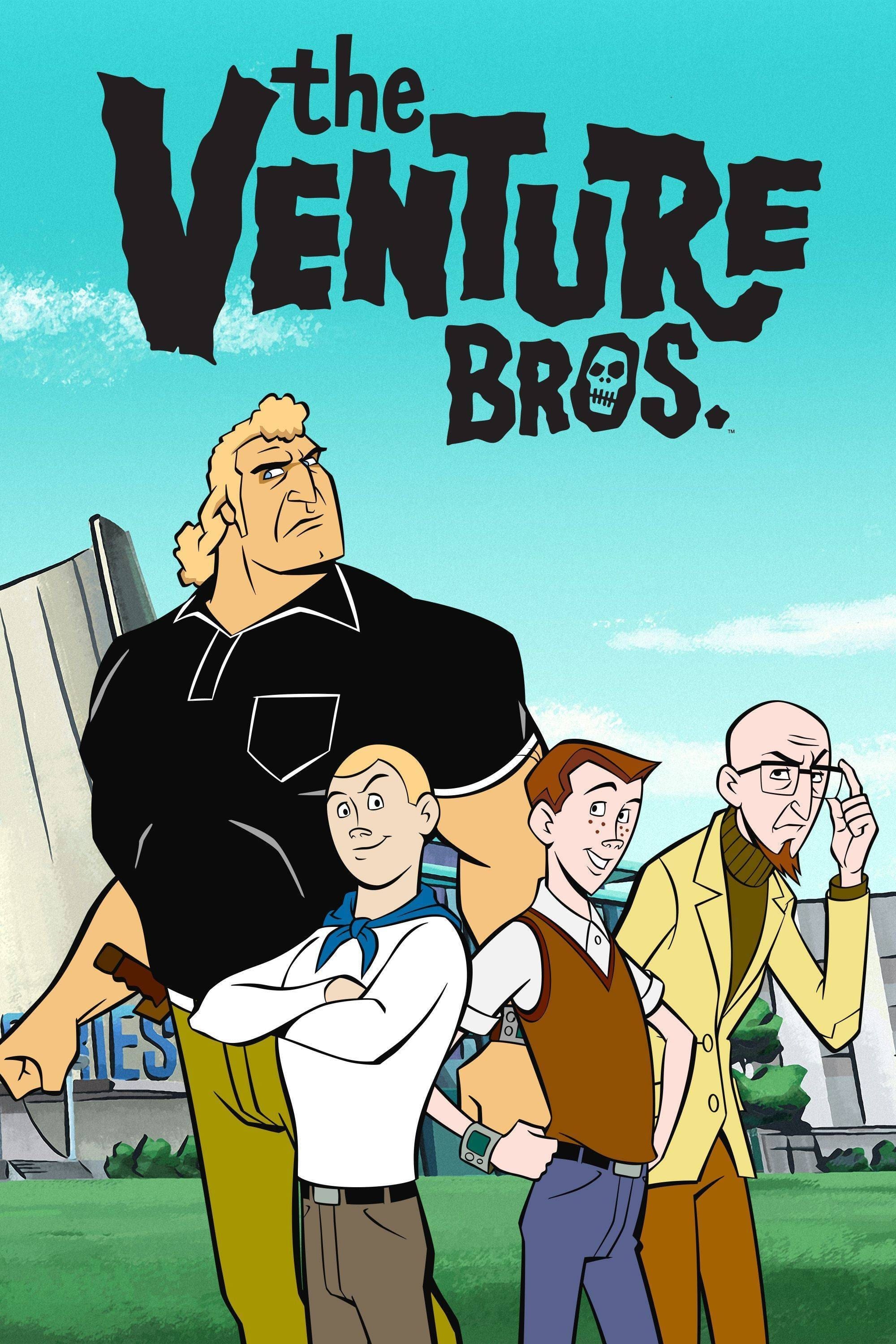
The show started with simple Flash animation due to budget constraints, which made the characters move awkwardly. Over time, the visual style improved dramatically, taking on the look of a detailed comic book with dramatic lighting and film-like framing. Eventually, the animation quality became so high it rivaled that of major animated movies. The series evolved from a cartoonish parody into a stunning, action-packed noir with a strong visual style.
‘Archer’ (2009–2023)
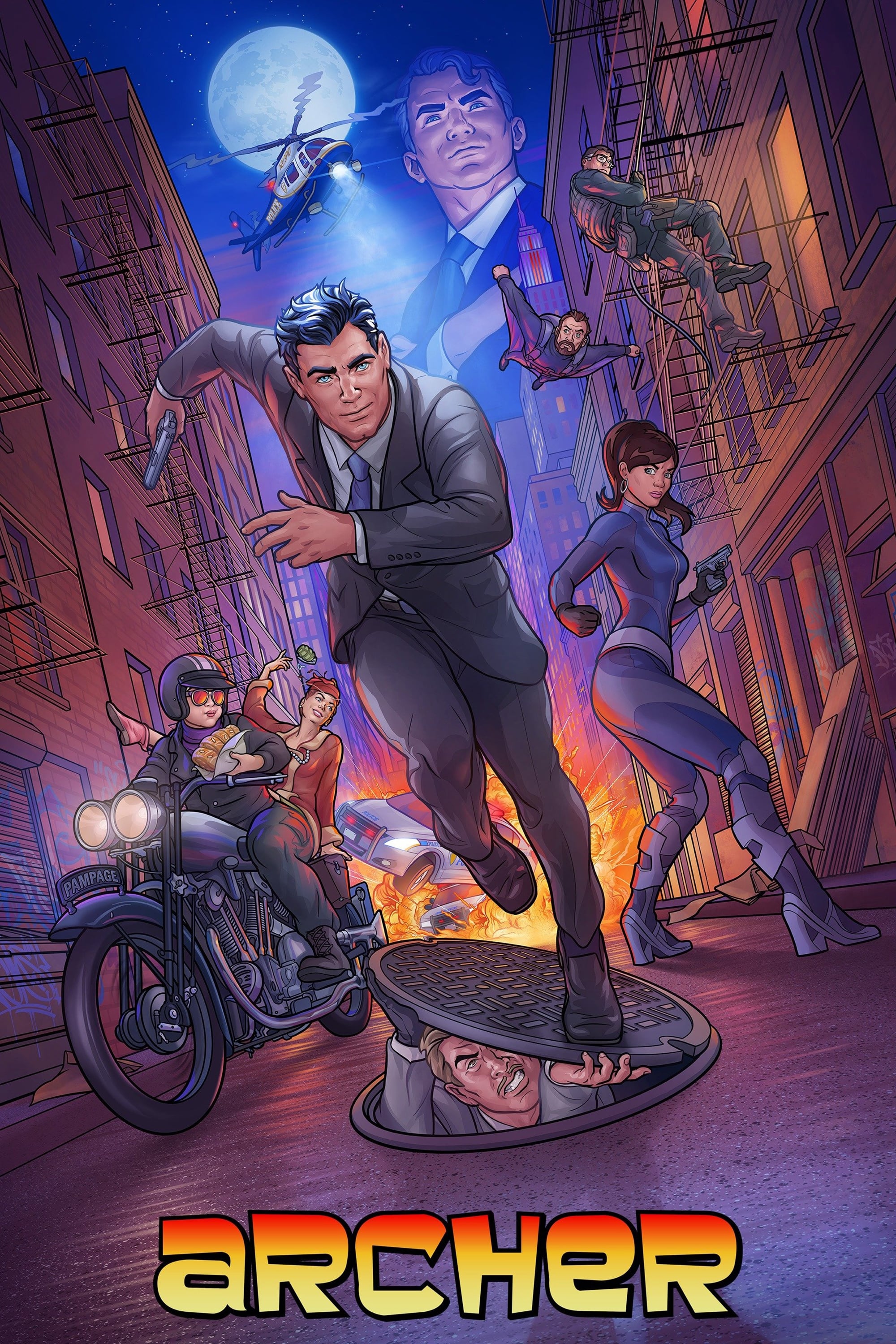
In the beginning, the show’s animation was very stiff, with characters appearing flat and backgrounds remaining still. As the animators became more comfortable with the digital animation process, the movements became smoother and more natural. Over time, they added 3D vehicles and more exciting camera work during action scenes. The characters themselves also received more detailed coloring and shading to match the show’s increasingly intense and dramatic lighting.
‘Attack on Titan’ (2013–2023)
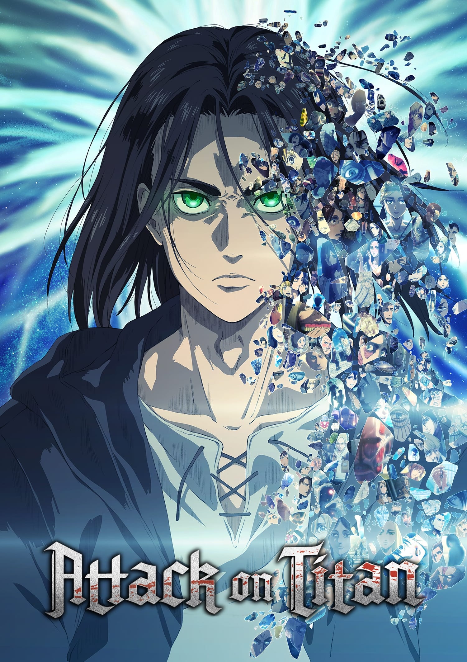
As a long-time fan, I always loved how Wit Studio handled the animation for the first three seasons – their style was so striking with those bold outlines and really vibrant colors. When MAPPA took over for the final season, it was a pretty big shift. They really aimed for a look that felt exactly like the manga, which meant tons of those detailed hatching lines. I also noticed the Titans themselves started looking more CGI-heavy, and it didn’t quite blend with the 2D backgrounds the same way. Honestly, the change in studios really highlighted how much darker the story was becoming – it felt like a visual break from what we were used to.
‘JoJo’s Bizarre Adventure’ (2012–2022)
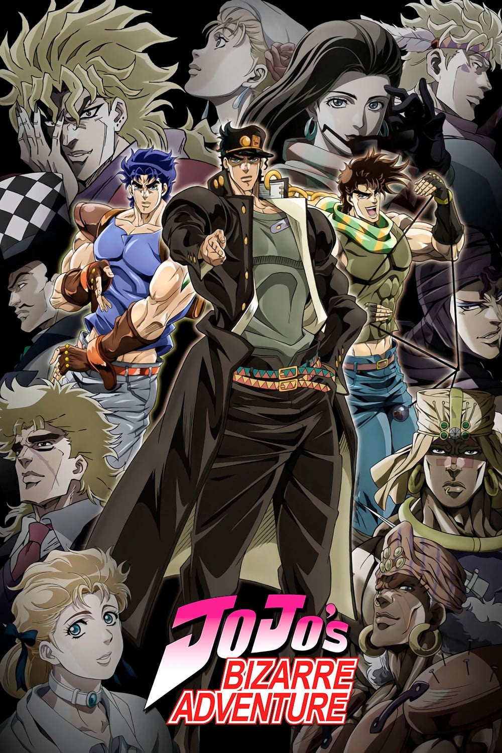
The anime’s art style evolves throughout the series, mirroring how the manga artist’s drawing skills developed over time. Early seasons had characters with a bold, muscular look and strong outlines. As the series progressed, like in ‘Golden Wind,’ the designs became sleeker, with more detailed clothing and softer shading. This continuous change in visual approach keeps the anime looking new and sets it apart from other shows.
‘Dragon Ball Z’ (1989–1996)

Early in Dragon Ball Z, during the Saiyan Saga, characters had a smoother, more rounded appearance. As the series moved into the Android and Buu arcs, the art style changed dramatically. Characters became more muscular with visible veins, and the animation sped up to showcase their increasing power. This move towards sharper, more detailed designs had a big impact on action cartoons for years to come.
‘Bleach’ (2004–2023)
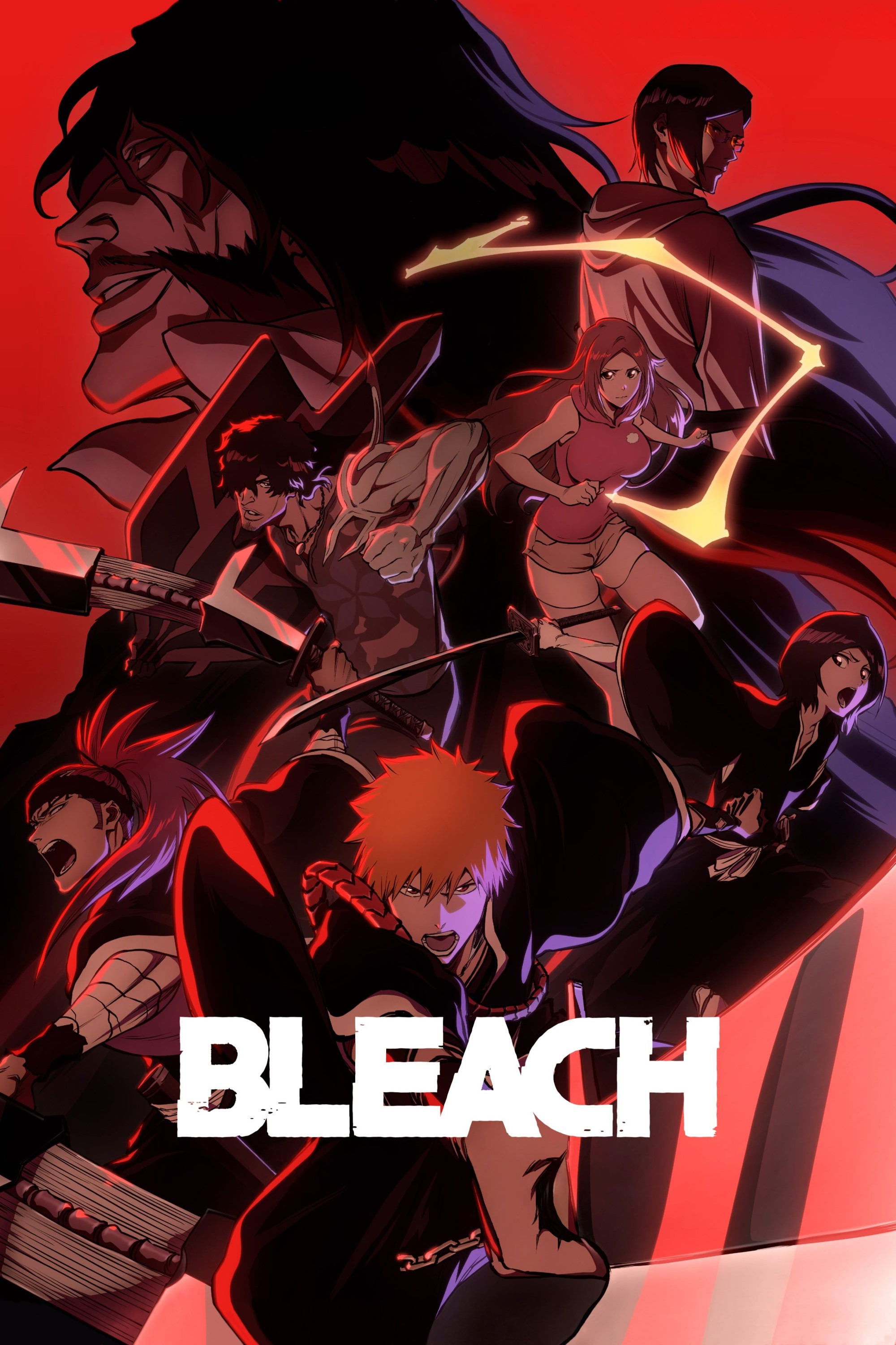
The original anime series had a typical early 2000s visual style, with a standard screen shape and basic coloring. When the series returned for the ‘Thousand-Year Blood War’ story arc, the animation quality was significantly upgraded, featuring effects and lighting comparable to a movie. This new style uses strong contrasts and bright colors, a departure from the original’s look. These visual improvements breathed new life into the series and raised the bar for action anime.
‘Pokémon’ (1997–Present)
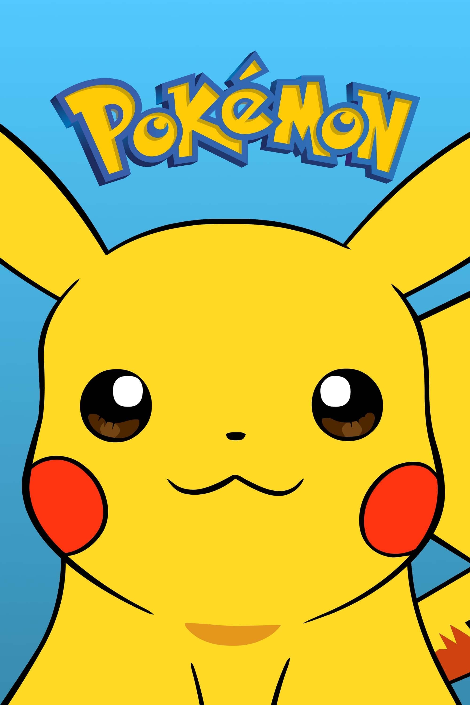
The show originally featured backgrounds painted with watercolors and traditional hand-drawn animation. Over time, the visuals were updated, but the biggest change came with the ‘Sun & Moon’ series, which introduced a much simpler art style. This new design, with its softer lines and rounded shapes, made it easier for animators to create smoother, more dynamic action scenes. While some viewers were initially surprised by the change, it ultimately helped the show maintain a consistent level of animation quality.
‘American Dad!’ (2005–Present)

The show’s first season felt a little rough around the edges, and the characters didn’t always move naturally. Switching to high definition improved the visuals, making lines clearer and backgrounds more detailed. Moving to TBS allowed for smoother action and more realistic violence than was possible with the previous network budget. Recently, the lighting has been particularly impressive, giving the show a surprisingly film-like quality for a comedy.
‘Home Movies’ (1999–2004)
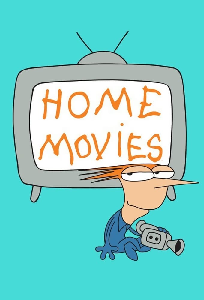
I remember when the first season came out – it had this really unique look with characters that seemed to… vibrate! It was called Squigglevision, and honestly, it took some getting used to. But the creators switched things up for season two, moving to smoother animation done in Flash. It made a huge difference! The characters could actually act better, and it was way easier on the eyes – no more shaky lines! Plus, the show was known for its improv, and I think the smoother visuals really let the naturalness of the dialogue shine through.
‘Beast Wars: Transformers’ (1996–1999)
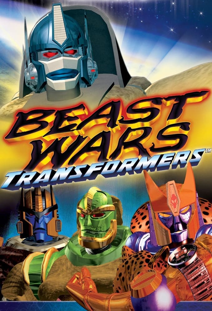
When the show first came out, its computer-generated imagery was impressive for its time, though the backgrounds were often empty and the details a bit rough. As the series continued, the characters and environments became much more detailed and vibrant. By the third season, the metallic surfaces and lighting looked significantly better. This improvement in visuals helped the show evolve into a surprisingly gritty and intense science fiction war story.
‘Star Wars Rebels’ (2014–2018)
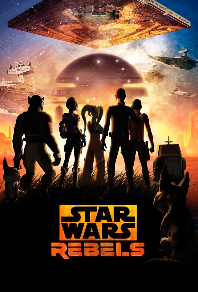
When the show first started, some viewers thought the visuals looked a little basic, with simple textures and lightsaber effects. However, the show’s creators steadily improved the lighting and character designs over the four seasons. By the final season, the visuals were much more impressive, featuring richer atmospheres and detailed settings. Ultimately, the show’s art style became popular because it consistently drew inspiration from the original concept art by Ralph McQuarrie.
‘Daria’ (1997–2002)

At first, the show had a raw, gritty look with simple animation and dull colors, reflecting its origins. As the series progressed and switched to digital art techniques, the animation became smoother, the colors more vibrant, and the backgrounds more detailed. This visual improvement paralleled the main character’s own growth and increasing emotional depth.
‘Sailor Moon’ (1992–1997)
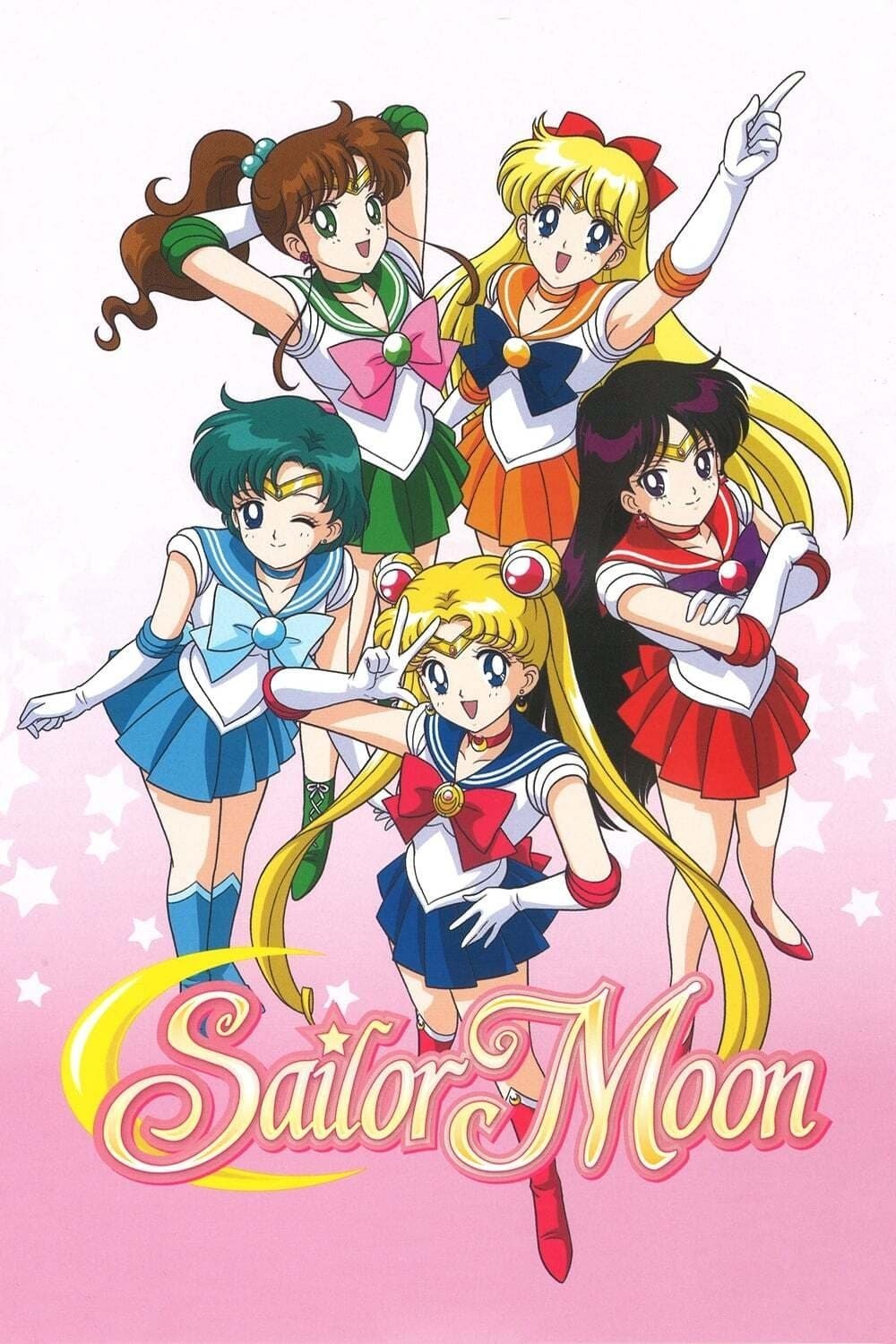
Animation styles in nineties anime varied a lot from episode to episode, as each director brought their own unique approach to drawing. You’d sometimes see characters with pointy features and elongated bodies, while other times they appeared softer and more rounded. The animation quality was consistently strong in the final season, with bright and impressive special effects. Many fans can even recognize which director worked on an episode just by looking at a single image from the show, like Sailor Guardians.
‘Steven Universe’ (2013–2020)

Early on, the character designs were a bit inconsistent in terms of size and shape. As the show developed, the art style settled into a gentle, colorful look inspired by anime. The artists created detailed, painted backgrounds to make the simple characters stand out. By the time the movie came out, this unique visual style had become one of the show’s biggest strengths.
‘Futurama’ (1999–2023)
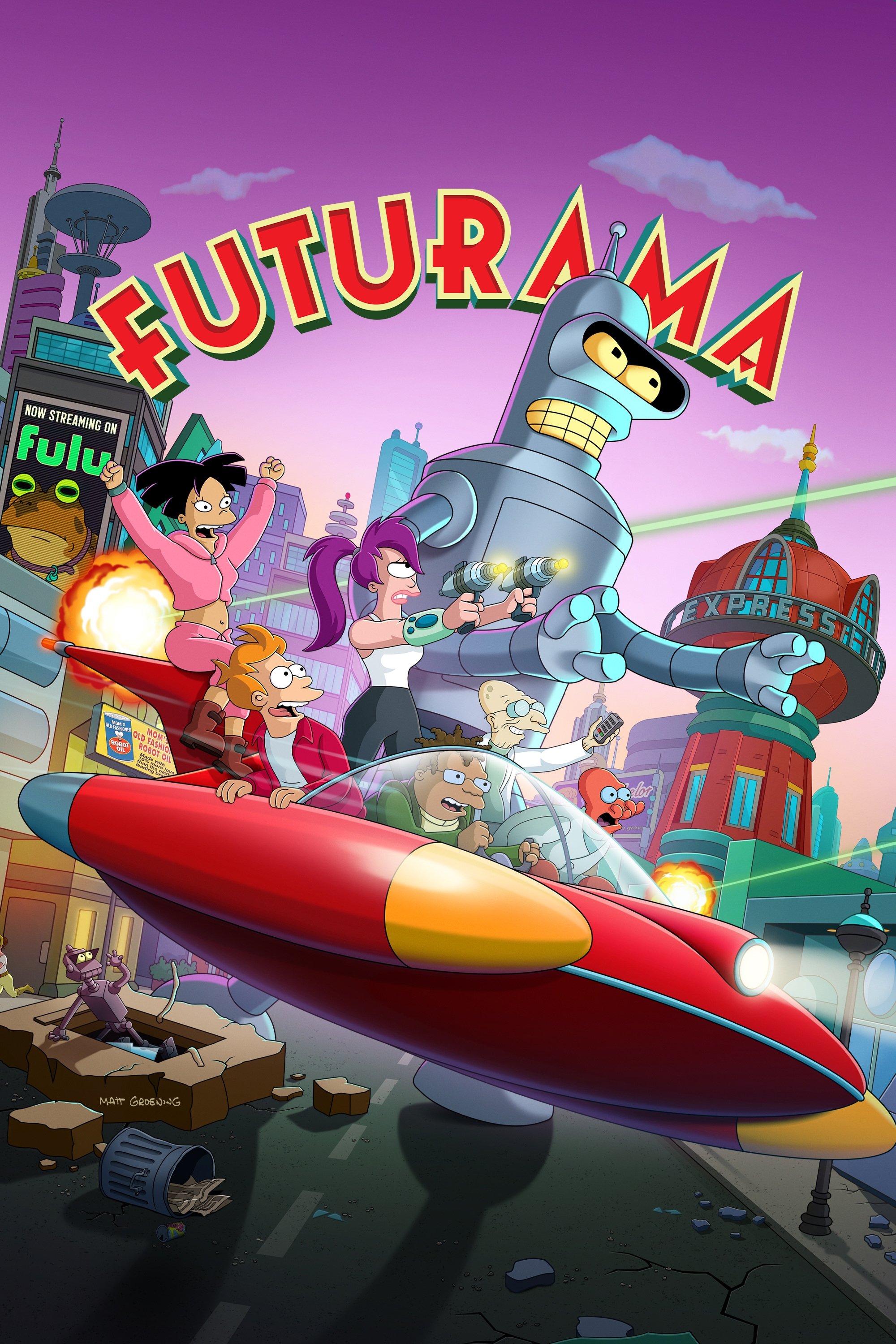
When the show first aired on Fox, it uniquely combined classic 2D animation with early 3D effects for spaceships and city backgrounds. The Comedy Central revival updated the look with high definition, widescreen visuals, and improved 3D. Now, on Hulu, the show is presented in 4K, showcasing the incredible detail in the artwork. Over time, the combination of 2D and 3D animation has become much smoother, a noticeable improvement from the original episodes.
‘Rick and Morty’ (2013–Present)
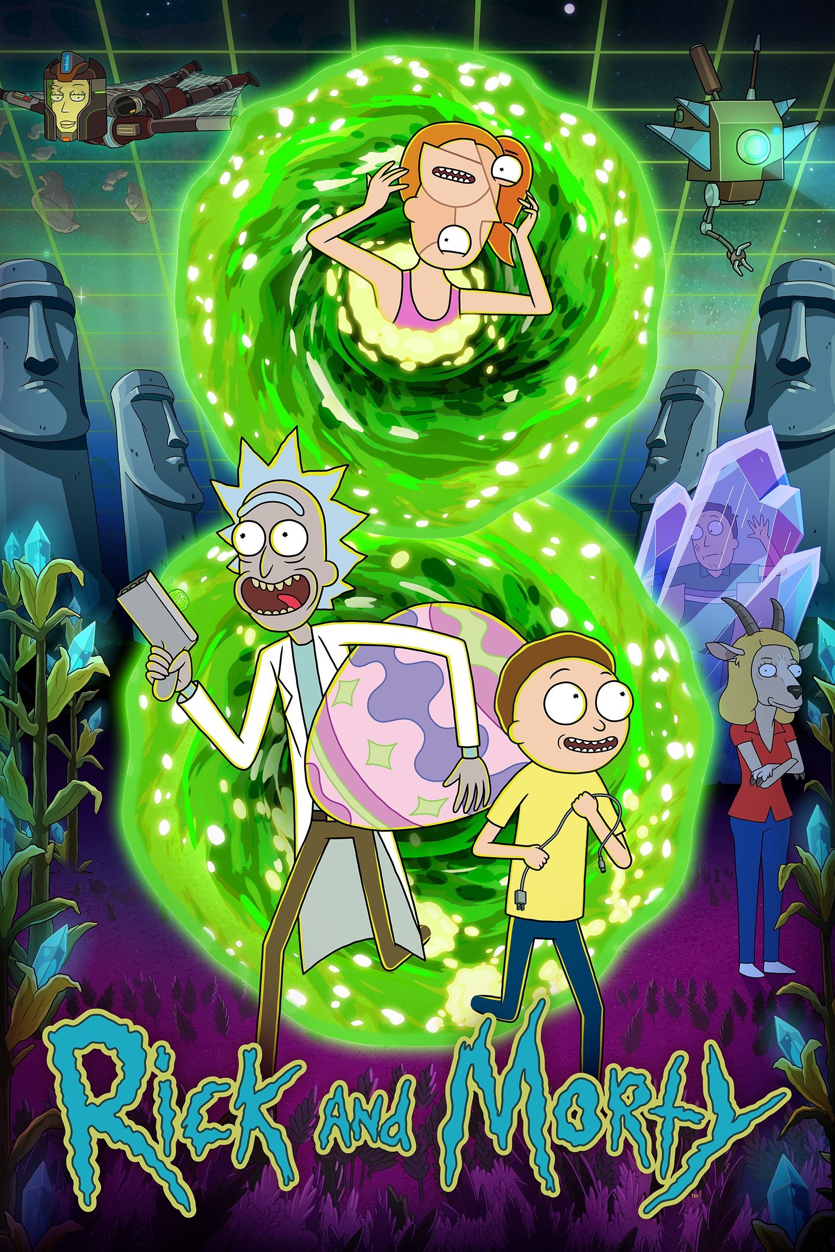
The first episode of the series had very basic, almost scribbled, animation. But the artwork quickly improved, with characters becoming more consistently drawn and the sci-fi settings gaining detail. As the show’s budget increased, even small details like character eyes became more refined. Now, later seasons boast elaborate action scenes and imaginatively designed alien environments.
‘Bob’s Burgers’ (2011–Present)
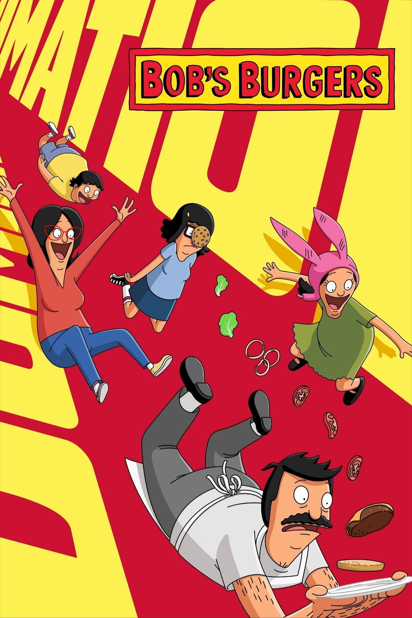
The show’s animation style has evolved over time. The first season featured bold, Flash-based animation with dynamic camera movements. Later seasons adopted a simpler, more classic look with static shots and thinner character lines. While the early animation was fairly flat, recent seasons have incorporated much more detailed lighting and shading. A consistent source of humor throughout the series has been the subtle details found in the background store signs.
‘The Dragon Prince’ (2018–Present)
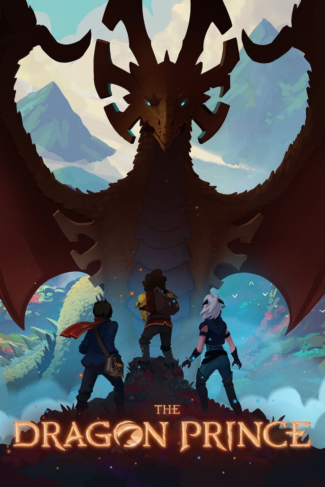
The first season of the show had a choppy look to its 3D characters due to a low frame rate, making them appear like they were in stop-motion. After hearing from viewers, the creators improved the animation in later seasons by increasing the frame rate, making the movements much smoother. They kept the lovely hand-painted backgrounds, but fixed the shaky character animation. This change helped viewers concentrate on the story instead of being bothered by the visual issues.
Please share your favorite example of a TV show changing its look in the comments.
Read More
- Gold Rate Forecast
- 22 Films Where the White Protagonist Is Canonically the Sidekick to a Black Lead
- Persona 5: The Phantom X Relativity’s Labyrinth – All coin locations and puzzle solutions
- Games That Faced Bans in Countries Over Political Themes
- Celebs Who Narrowly Escaped The 9/11 Attacks
- How to Unlock Stellar Blade’s Secret Dev Room & Ocean String Outfit
- ‘Super Mario Galaxy’ Trailer Launches: Chris Pratt, Jack Black, Anya Taylor-Joy, Charlie Day Return for 2026 Sequel
- 25 “Woke” Films That Used Black Trauma to Humanize White Leads
- Games Rewarding Exploration Over Combat Heavy Gameplay
- Here Are the Weekend Box Office Hits for This Weekend, with the Super Popular Romance on Top
2025-12-10 05:18