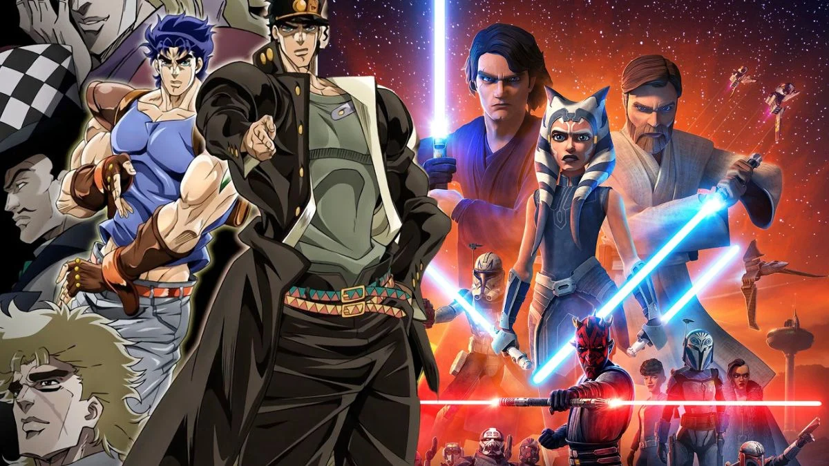
Animation is always changing, and shows that run for a long time often see shifts in both the technology used to make them and the artistic style. Sometimes studios change ownership, or the people making the show decide to update the look to fit a new story direction. While big changes to characters or animation can sometimes upset viewers, there are times when these risks really pay off. The following series are examples of shows that successfully changed their style and actually improved as a result.
‘American Dragon: Jake Long’ (2005–2007)
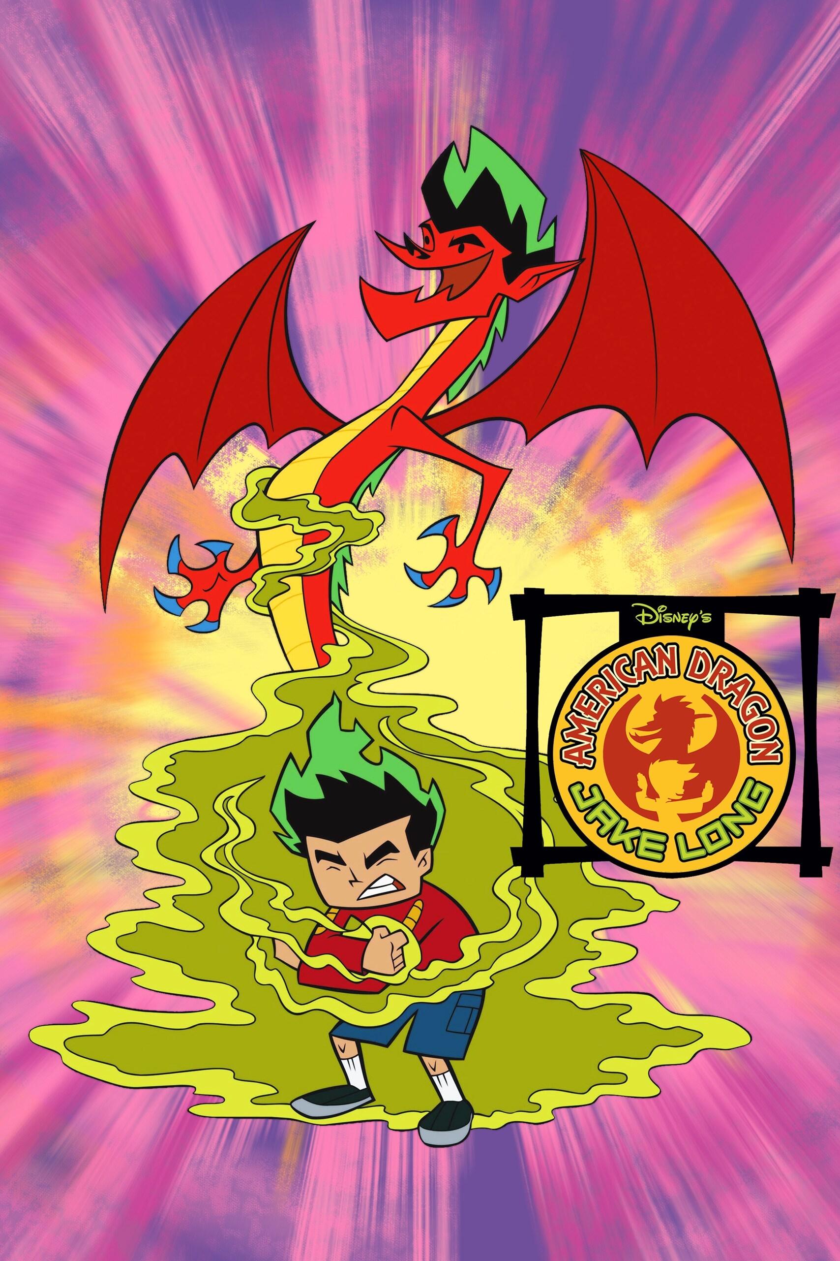
For its second season, Disney Channel gave ‘American Dragon: Jake Long’ a new look. The artists moved away from the detailed, outlined style of the first season to a flatter, more modern design. Jake and his dragon form were redrawn with sharper lines, making the action scenes and magical fights more exciting. This change gave the show a special energy and helped it stand out from other cartoons at the time.
‘One Piece’ (1999–Present)
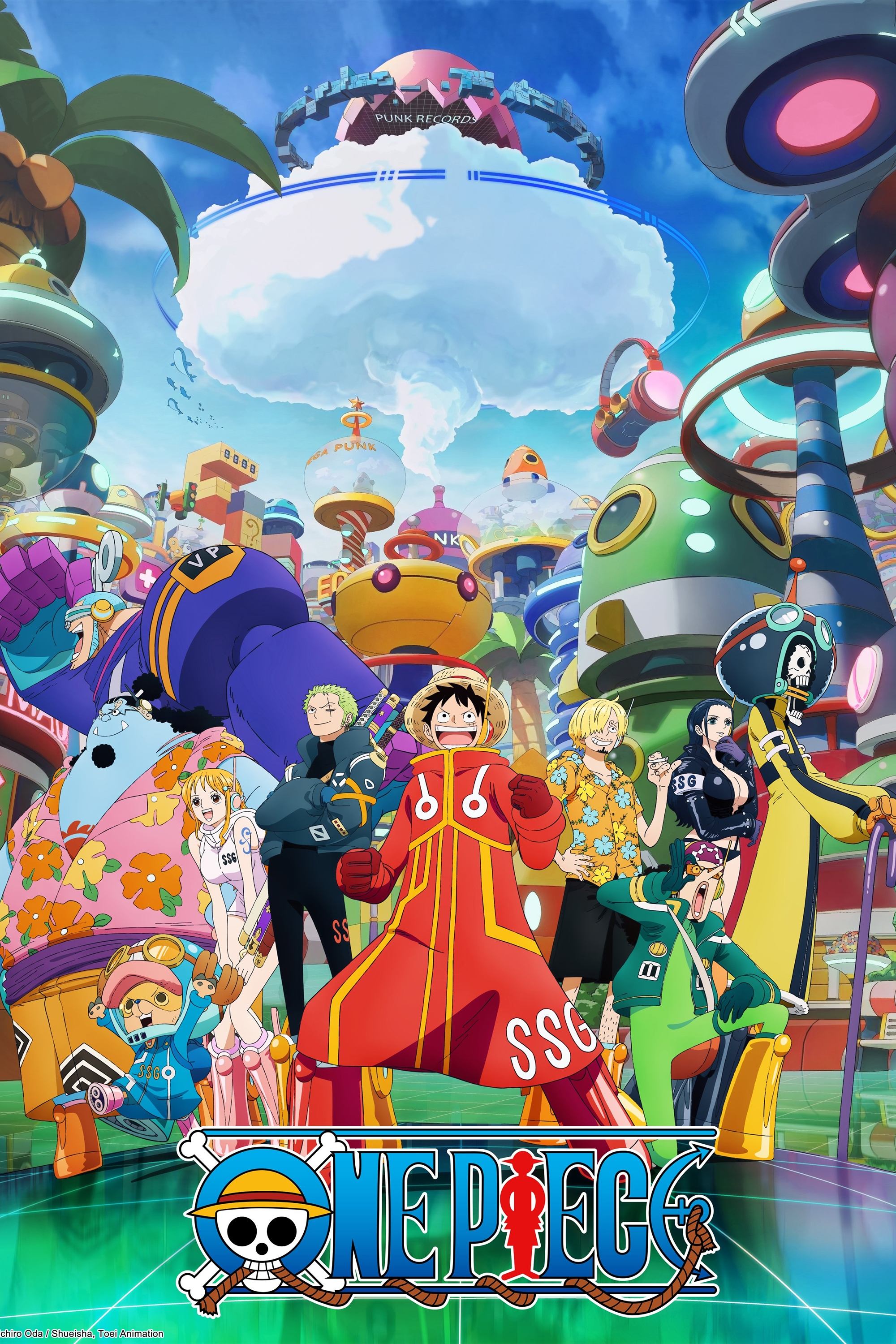
The Wano Country arc brought a fresh, new look to the series. Toei Animation used special filters and smooth animation to make it resemble classic Japanese ink wash paintings. They also boosted the colors to match the arc’s traditional, isolated setting. Fans loved the cinematic feel and bold lines, which gave the show a much-needed update after being on television for almost twenty years.
‘Attack on Titan’ (2013–2023)
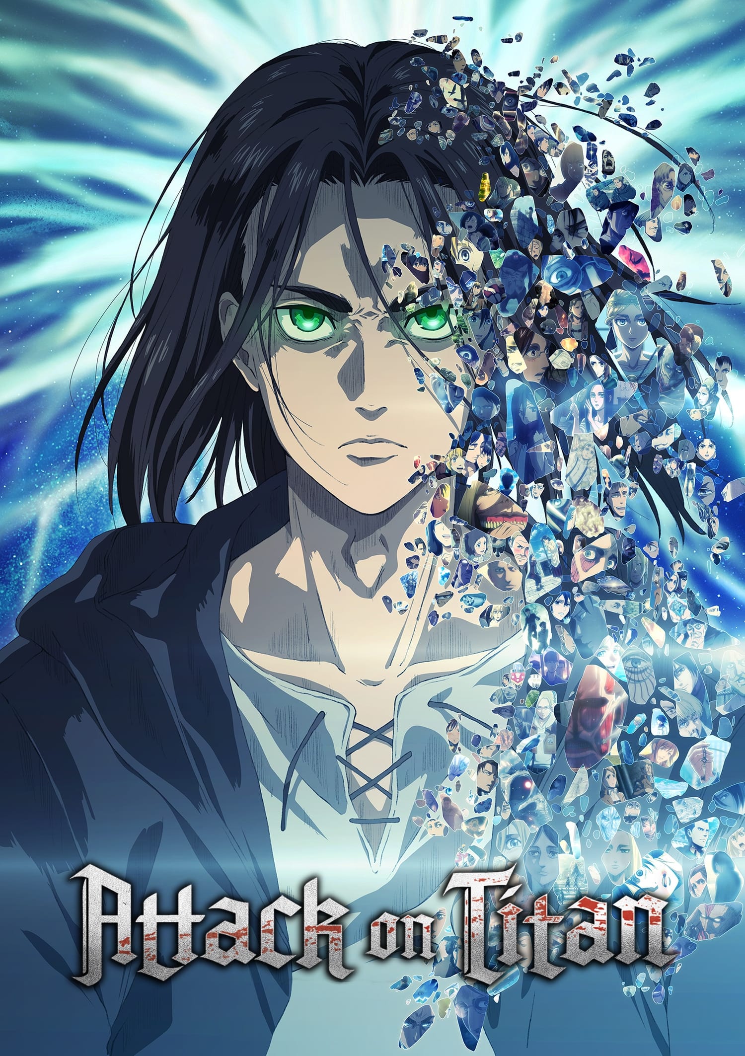
For the final season, production moved from Wit Studio to MAPPA, which led to changes in how the characters looked. The new animation used more computer-generated imagery, especially for the Titans, to better show the huge battles. The characters also appeared older and more worn down, reflecting the passage of time and the story’s increasingly serious tone. This more realistic style fit with the mature and politically focused direction the story took as it ended.
‘Pokémon’ (1997–2023)
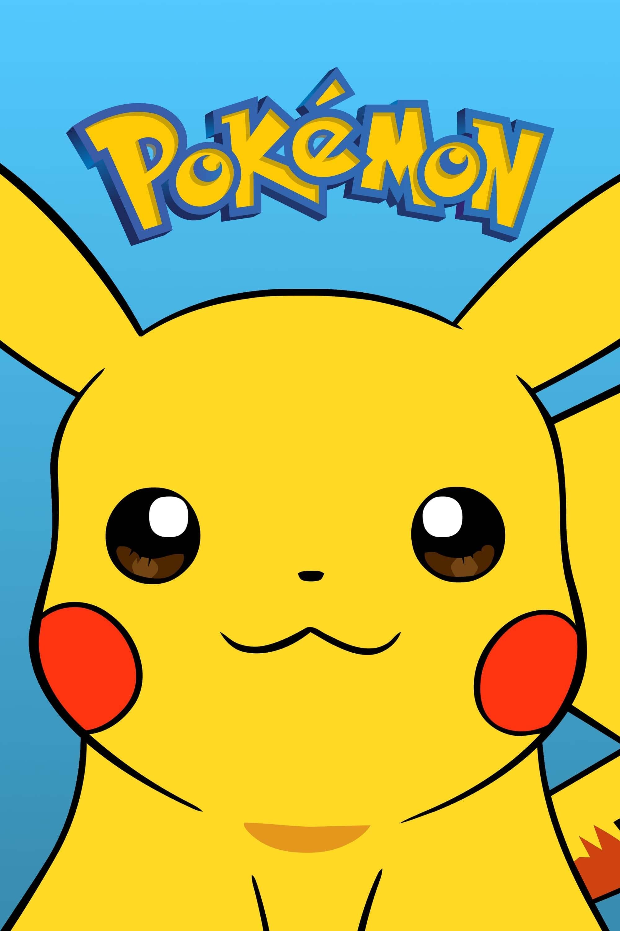
Pokémon: Sun & Moon brought a new, more lively animation style to the series, which was a surprise to many fans. Ash Ketchum’s character design was made softer and rounder, allowing for funnier and more over-the-top expressions. This freedom from strict design rules also let animators create more dynamic and flowing battle sequences. The bright, tropical setting of the series really benefited from this approach, giving the whole franchise a fresh feel.
‘JoJo’s Bizarre Adventure’ (2012–Present)
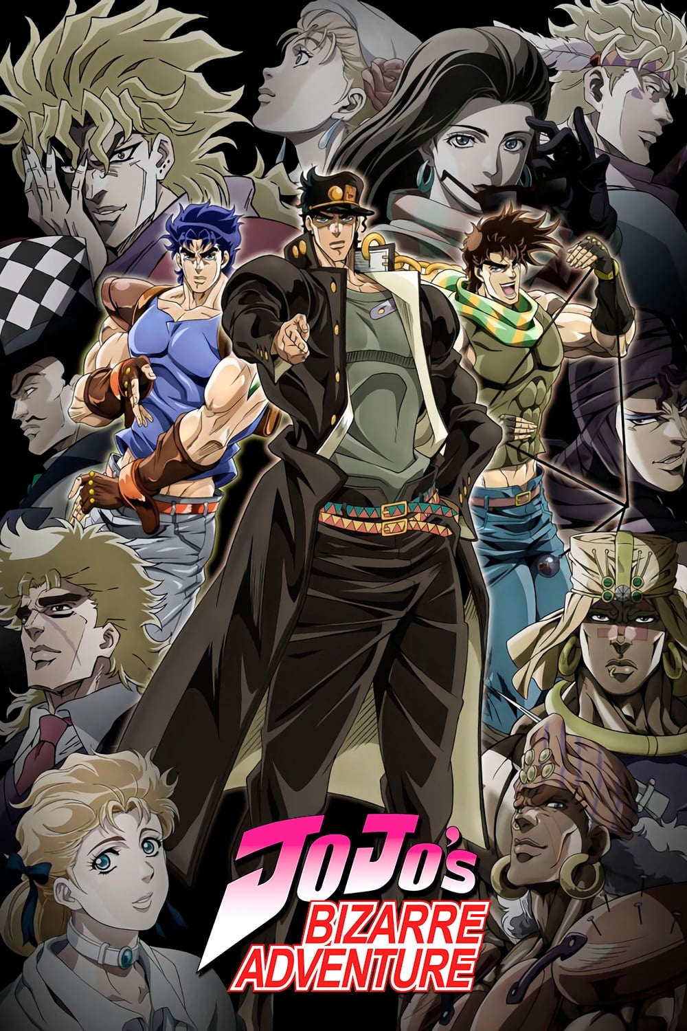
David Production consistently updates the anime’s art style with each new season to reflect how the original manga developed. When the series moved to ‘Diamond is Unbreakable,’ the visuals shifted to a vibrant, pop-art style featuring colorful skies and gentler character designs. This was a big change from the tougher, more heavily shaded look of the previous ‘Stardust Crusaders’ arc. These visual changes help make each new generation of the Joestar family feel unique and true to its time.
‘Bleach’ (2004–2012, 2022–Present)
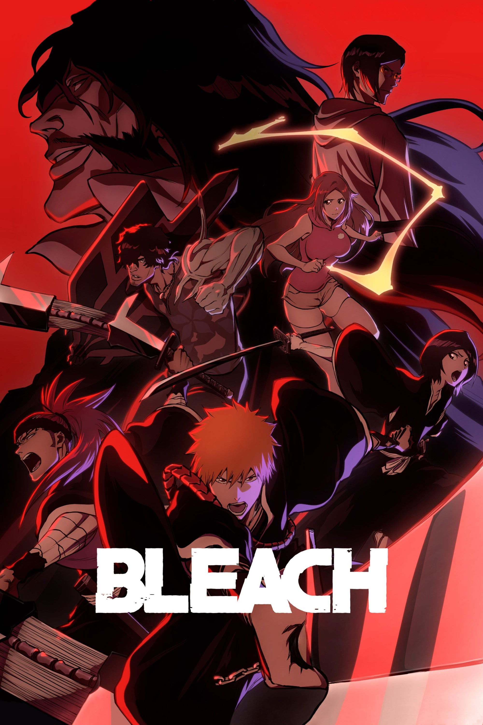
The recent return of ‘Bleach’ for the Thousand-Year Blood War arc looked significantly better than the original anime from 2004. Studio Pierrot used updated digital techniques for lighting and special effects, creating a more cinematic feel. The characters were shaded with greater detail, and the colors were richer and more dramatic. These improvements successfully updated the classic anime with modern, high-quality visuals.
‘Samurai Jack’ (2001–2017)
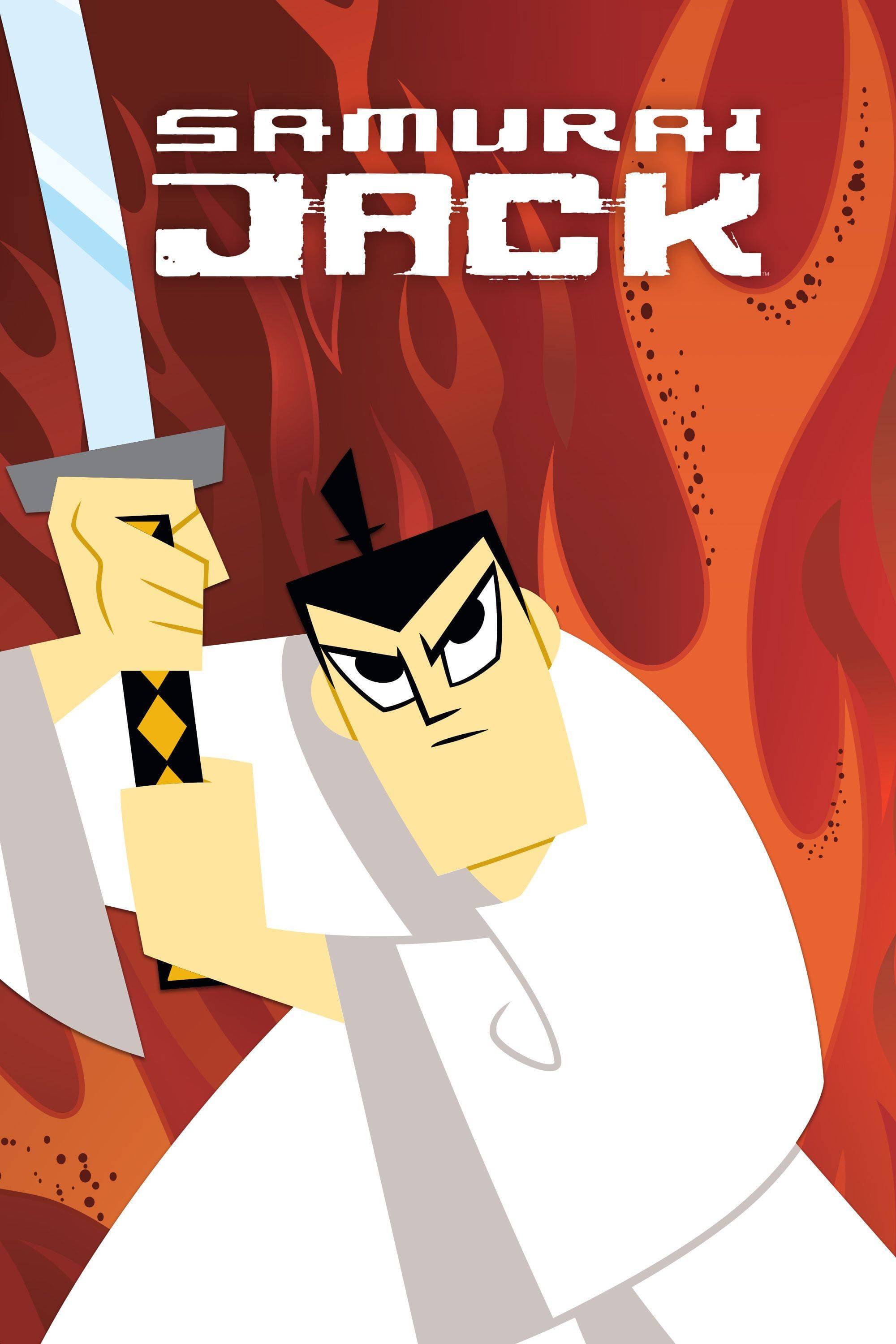
When ‘Samurai Jack’ returned for a fifth season on Adult Swim, it looked noticeably different – and more sophisticated. Creator Genndy Tartakovsky kept the show’s unique look – without outlines – but added richer details and lighting. The screen was also wider, creating a more cinematic feel that highlighted Jack’s isolation. This update stayed true to the original’s simple elegance while using new technology to tell the story more effectively.
‘ReBoot’ (1994–2001)
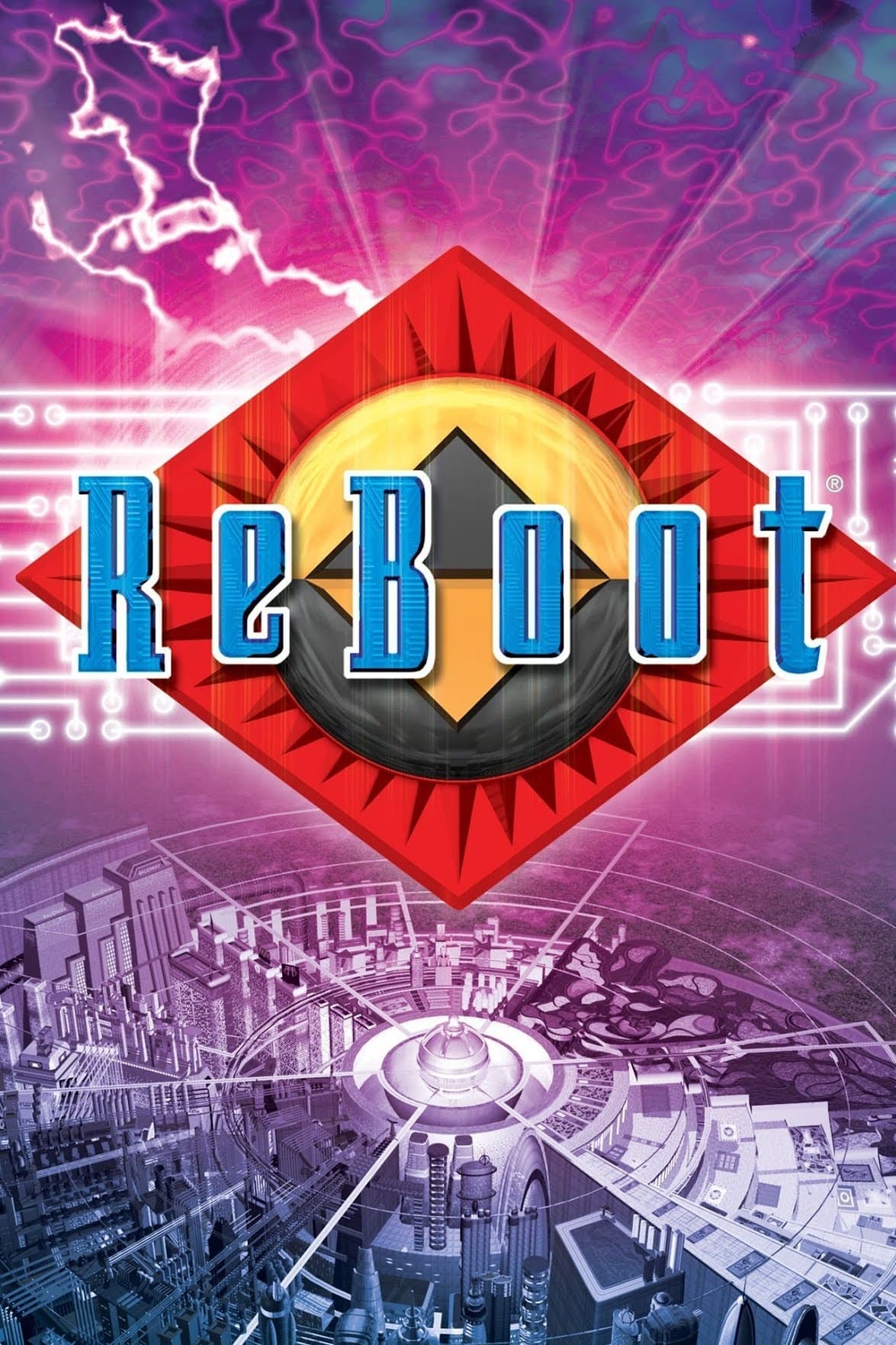
This groundbreaking computer-animated series looked much better as technology improved throughout the 1990s. By the third season, the characters were more detailed and the lighting was more realistic than in the earlier episodes. The designs for Matrix and AndrAIa were updated to reflect a more mature and darker storyline. These advancements in visual effects allowed Mainframe Entertainment to create a more complex and serious science fiction narrative.
‘The Simpsons’ (1989–Present)
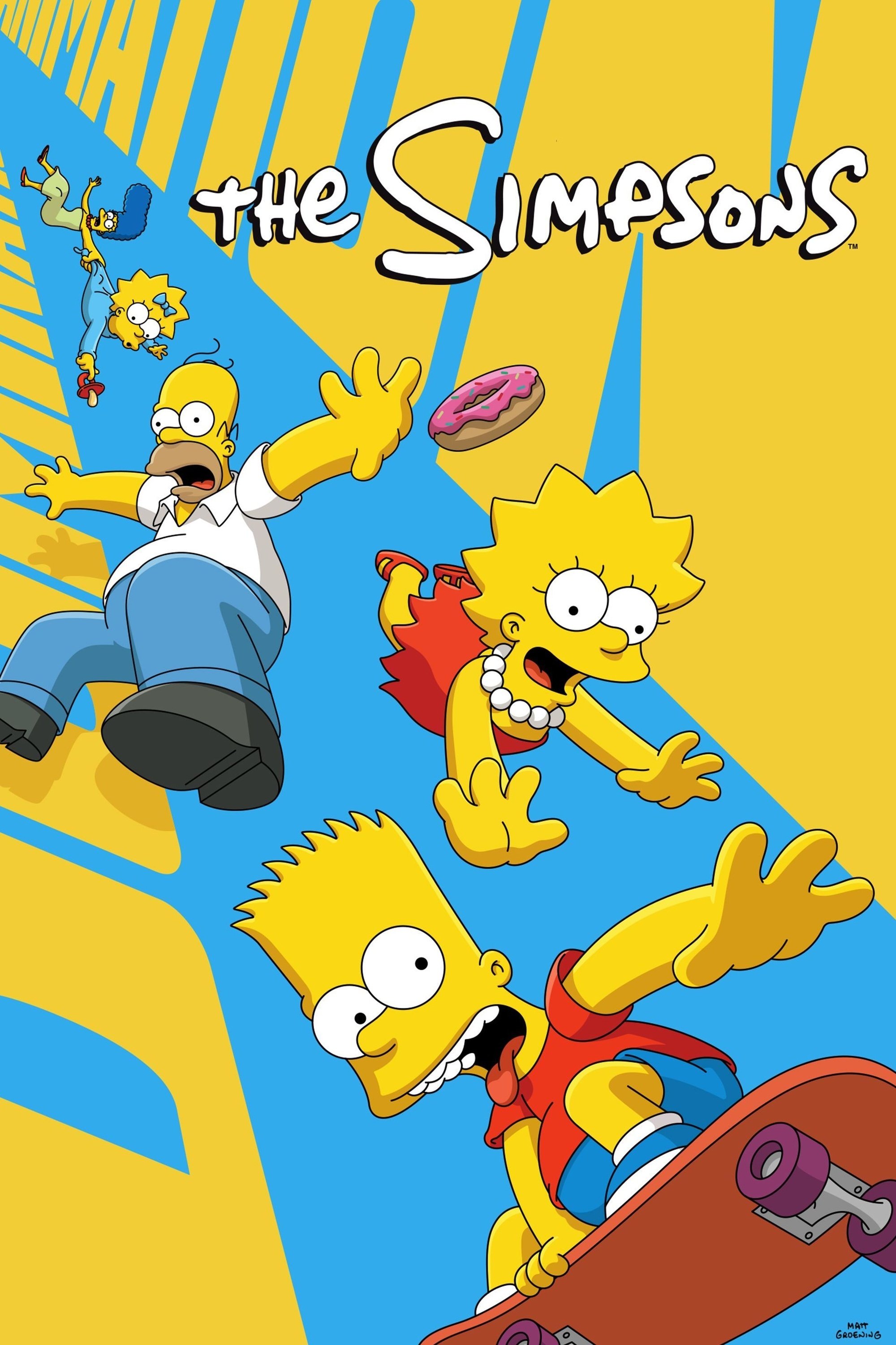
‘The Simpsons’ has dramatically changed its look over the years. It started with a simple, shaky style in the early shorts featured on ‘The Tracey Ullman Show,’ but has become much smoother and more refined. The switch to high definition in 2009 made the characters and scenery look cleaner and clearer. They moved from traditional hand-painted animation to digital techniques, allowing for brighter colors and a more consistent style. This updated look has helped the show maintain its iconic appearance for more than thirty years.
‘South Park’ (1997–Present)
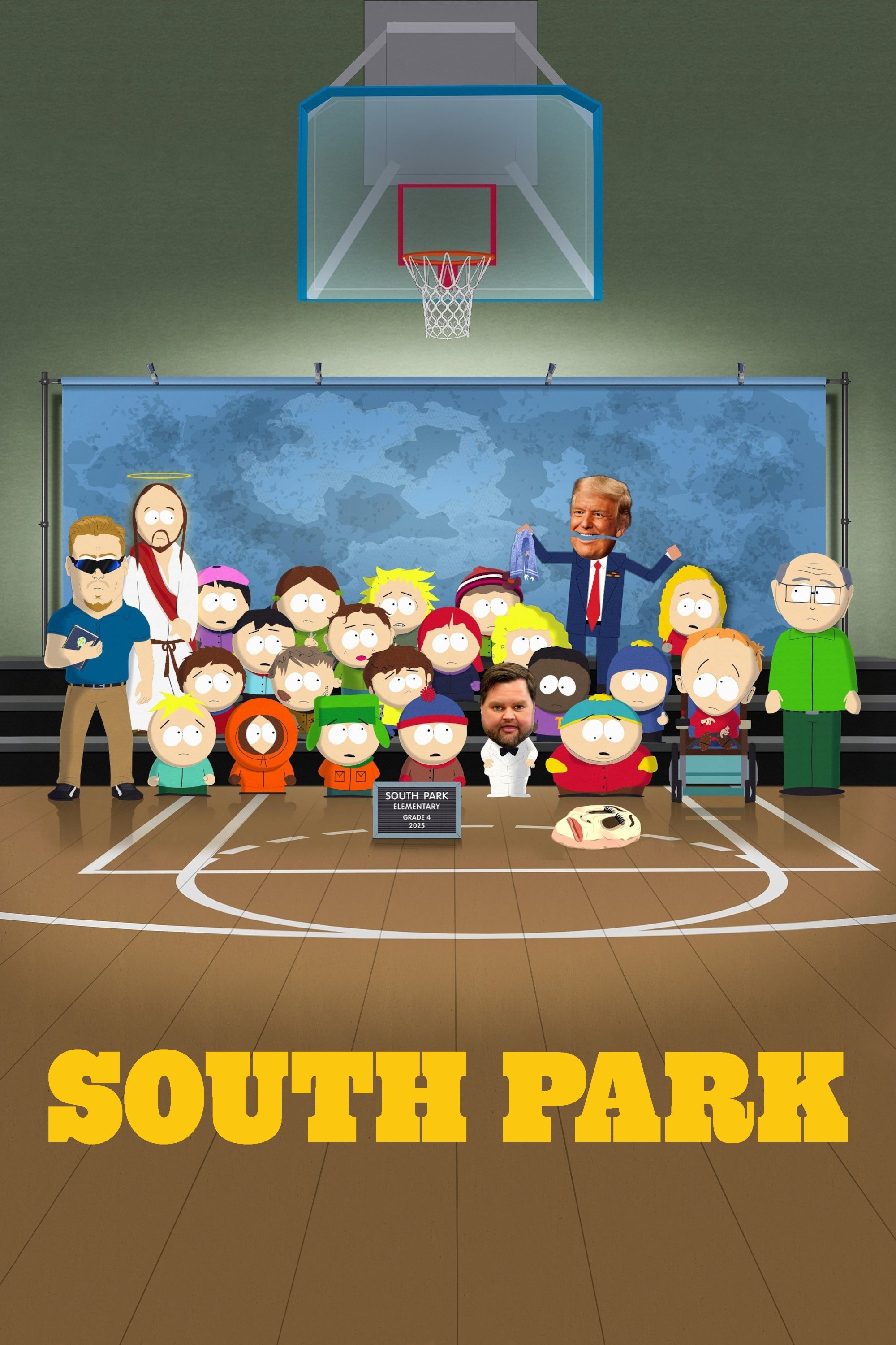
Initially, Trey Parker and Matt Stone made the first episode of their show using handmade construction paper cutouts and stop-motion animation. They quickly switched to computer animation to speed up production, but kept the same simple, handmade look. As the show continued, they added higher resolutions and more advanced effects, all while preserving that original charm. This allowed them to create episodes in just six days, keeping the show relevant and up-to-date.
‘Star Wars: The Clone Wars’ (2008–2020)
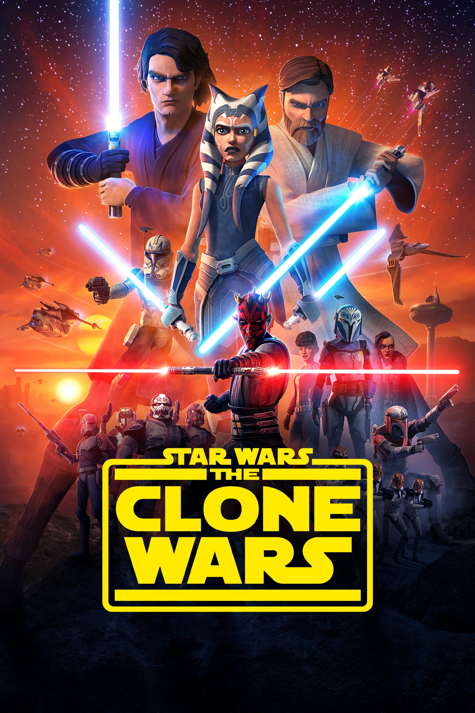
‘Star Wars: The Clone Wars’ looked much better as the series went on, especially when it returned on Disney+. They significantly upgraded the technology used to create the show, improving everything from lighting and character designs to the detail in backgrounds. The final season’s lightsaber fights were particularly impressive, using advanced motion capture to make them incredibly smooth and realistic. This ongoing improvement made ‘The Clone Wars’ one of the most visually stunning animated series ever made.
‘My Teen Romantic Comedy SNAFU’ (2013–2020)
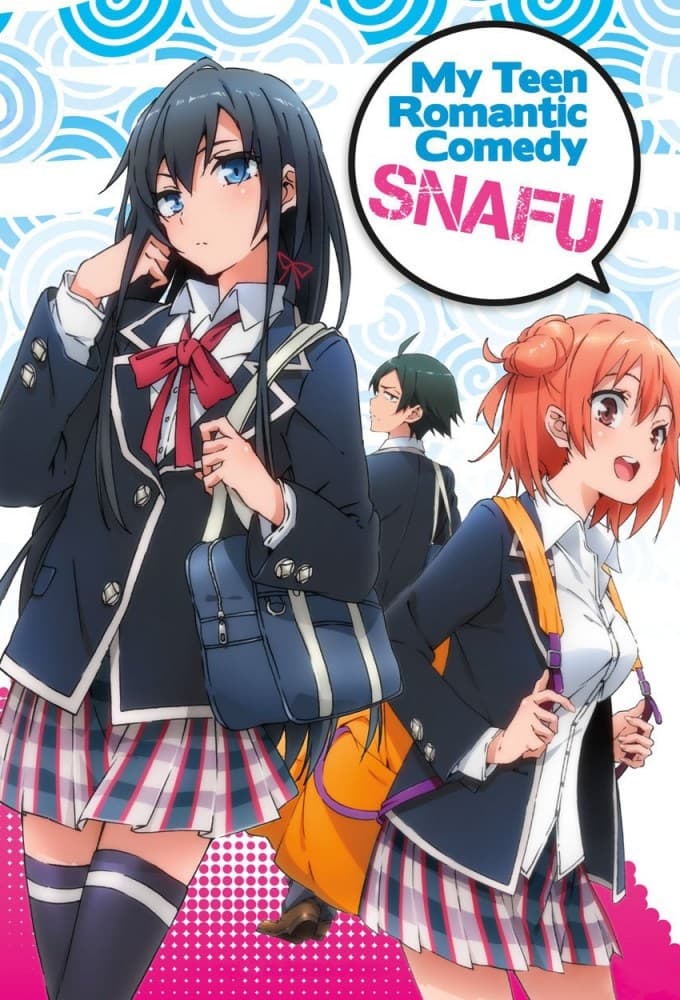
When the animation studio changed between the first and second seasons, the character designs were completely redone. The new style used smoother lines and more detailed lighting, which helped create a stronger emotional impact. Characters showed emotions in more subtle ways, reflecting the show’s shift from lighthearted comedy to more serious drama. Most fans appreciated this visual upgrade, feeling it better highlighted the complicated relationships between the characters.
‘Initial D’ (1998–2014)
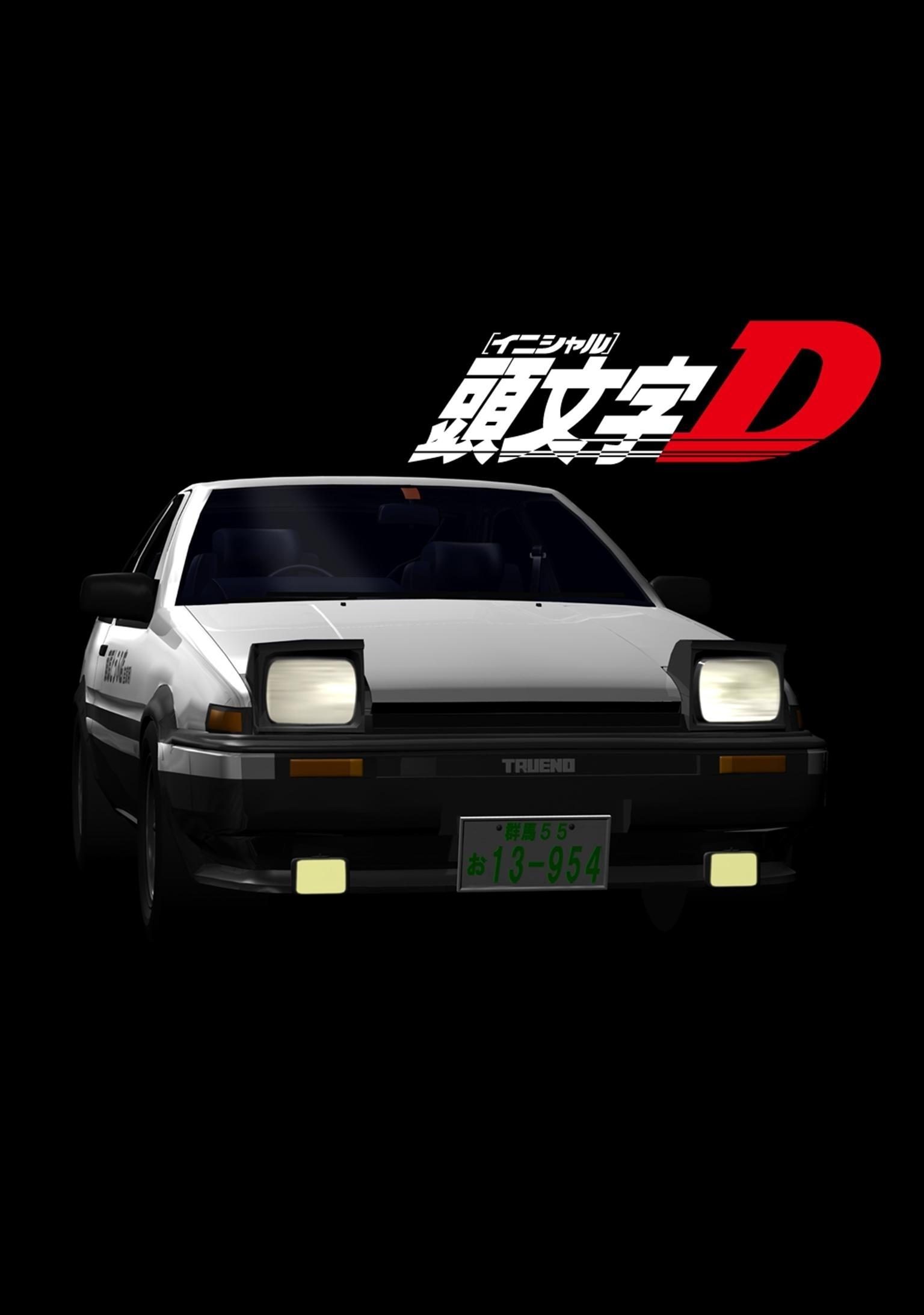
‘Initial D’ famously used computer-generated imagery (CGI) for its cars, but the visual quality changed a lot over the series. In the beginning, the cars looked blocky and didn’t quite match the style of the hand-drawn characters. However, by the final season, the 3D car models were much improved, looking realistic and fitting naturally into the scenes. This made the fast-paced mountain races feel more exciting and put viewers right in the action.
‘RWBY’ (2013–Present)
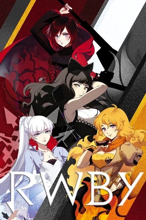
After the third season of ‘RWBY’, Rooster Teeth upgraded its animation software, moving from Poser to Autodesk Maya. This switch gave the show a new, distinct cel-shaded style, replacing the earlier, somewhat stiff and glossy character designs. The characters became more expressive, and the environments were made much larger and more detailed. This visual improvement reflected the show’s growing story and more mature production values.
‘Vinland Saga’ (2019–Present)
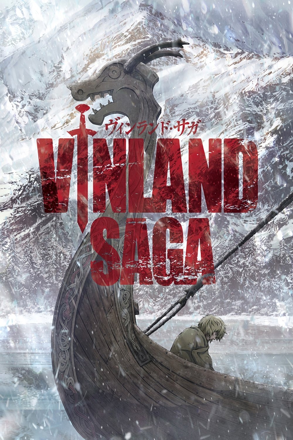
For its second season, ‘Vinland Saga’s’ animation was handled by MAPPA, resulting in a slight but noticeable change in visual style. The animation particularly highlighted the quieter, more character-focused scenes set on the farm. Though the action sequences remained intense, the new style put greater emphasis on the emotional impact of Thorfinn’s journey toward finding peace. The beautifully detailed backgrounds showcased the natural world, creating a stark contrast with the earlier, more violent scenes.
Tell us which artistic transformation you think improved the show the most in the comments.
Read More
- Gold Rate Forecast
- Invincible Season 4 Gender Swaps Tech Jacket As Fans Question Major Comic Change
- Silver Rate Forecast
- 22 Films Where the White Protagonist Is Canonically the Sidekick to a Black Lead
- Unveiling the Schwab U.S. Dividend Equity ETF: A Portent of Financial Growth
- 14 Movies Where the Black Character Refuses to Save the White Protagonist
- The Best Former NFL Players Turned Actors, Ranked
- Why Won’t It Just *Do* What You Ask? Unpacking the Quirks of AI Language
- Superman Flops Financially: $350M Budget, Still No Profit (Scoop Confirmed)
- ONE PIECE Season 2 Confirms Sanji’s OTHER Backstory in the Live-Action
2025-11-29 14:20