
Filmmakers frequently use color to subtly influence how viewers experience a story. Changes in color schemes can signal shifts in time, place, or a character’s feelings. A dramatic switch from black and white to color is a classic example of this technique. The films below effectively use color adjustments to strengthen their narratives and create a more powerful emotional connection with the audience.
‘The Wizard of Oz’ (1939)
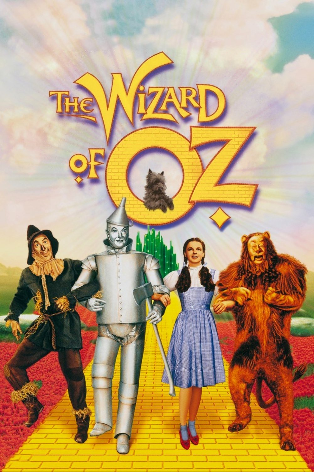
The movie starts in a gray and ordinary Kansas, showing how simple Dorothy’s life is. When she steps into Oz, the film bursts into full color, immediately signaling a move into a magical and exciting world. The return to black and white at the end emphasizes the feeling of being safe and back to reality after her incredible journey.
‘Pleasantville’ (1998)
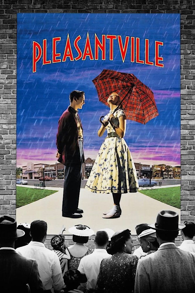
Two teenagers from today’s world suddenly find themselves stuck inside a classic, black-and-white 1950s TV show where everyone hides their true feelings. Whenever they start to feel strong emotions or act outside of the usual rules, they begin to appear in color. This spreading color symbolizes them finding their own identities and challenging the town’s strict, conformist way of life. The striking difference between the black-and-white world and the bursts of color emphasizes the conflict between the town’s order and the freedom of expressing oneself.
‘Traffic’ (2000)
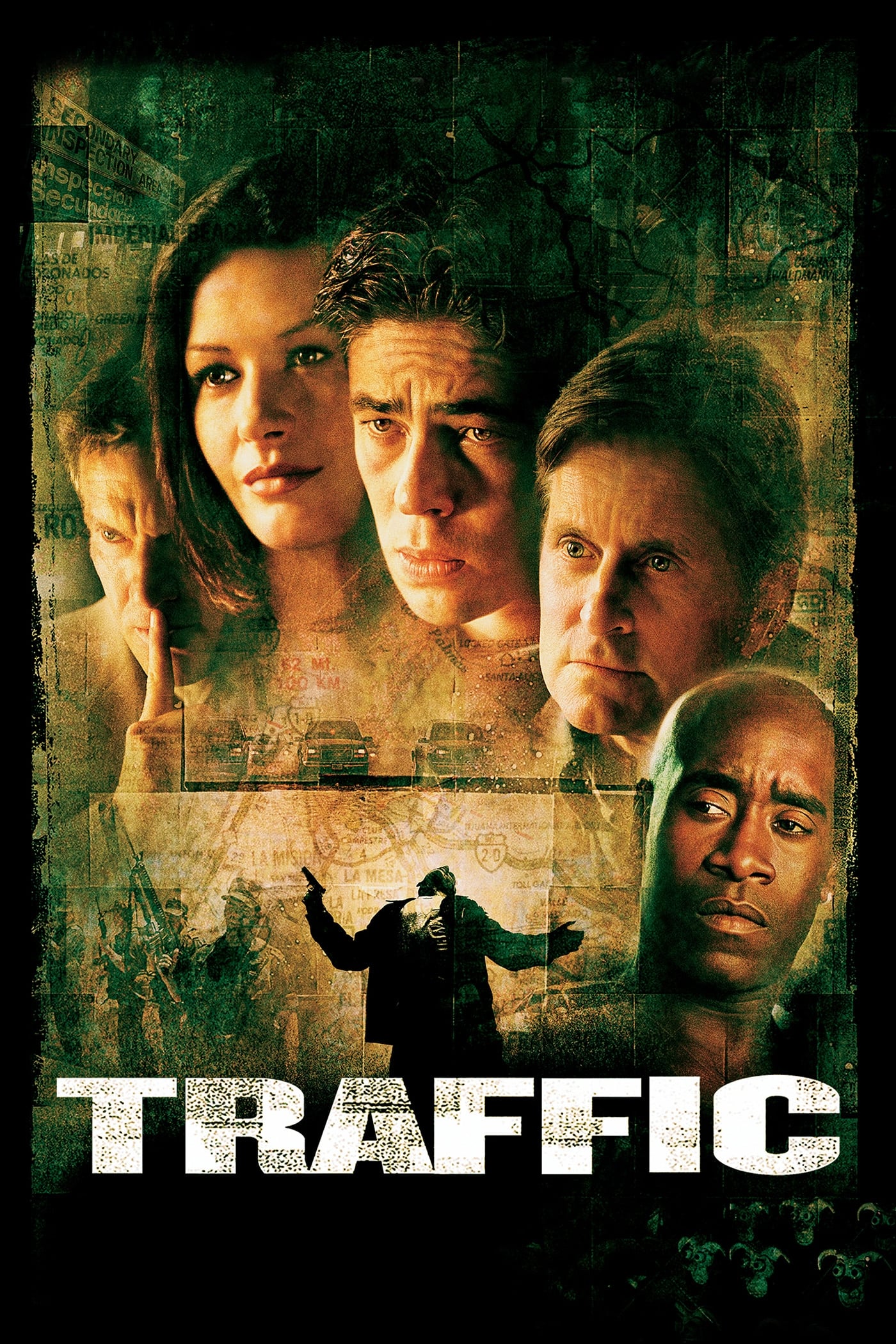
Director Steven Soderbergh uses color to clearly separate the different parts of his story about the drug trade. Scenes in Mexico have a grainy, yellow look to create a sense of heat and danger. The parts of the story set in Ohio are shown with a cold, blue filter, emphasizing the grim reality of addiction in suburban areas. Finally, scenes with government officials in Washington D.C. are filmed in realistic colors, giving the impression of unbiased observation.
‘Memento’ (2000)
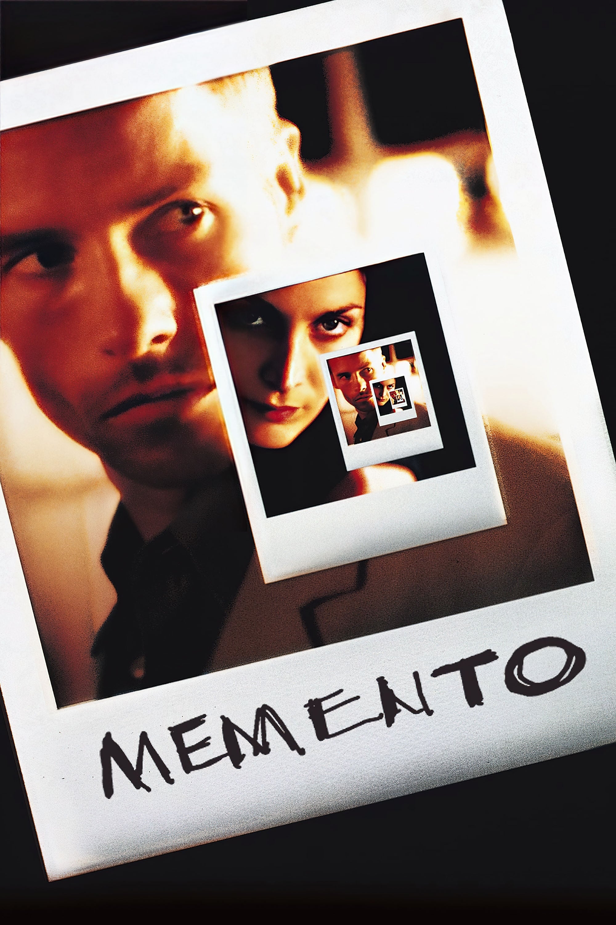
The story jumps between two different time flows to show what it’s like for the main character, who has trouble forming new memories. Scenes in black and white move forward in time, while scenes in color unfold backwards. This helps viewers understand the difference between what’s actually happening and how the character is experiencing things. Eventually, these two timelines meet, and this is visually represented when the film’s color scheme becomes consistent.
‘Hero’ (2002)

This martial arts film tells the same story multiple times, each time with a different color scheme. The colors – like red, blue, and white – represent the feelings of whoever is telling the story at that moment. For example, red scenes focus on intense emotions like love and jealousy, while blue scenes emphasize sadness and self-sacrifice. These color changes help the audience understand that the story isn’t always straightforward, and ultimately lead to the real truth being revealed.
‘The Matrix’ (1999)
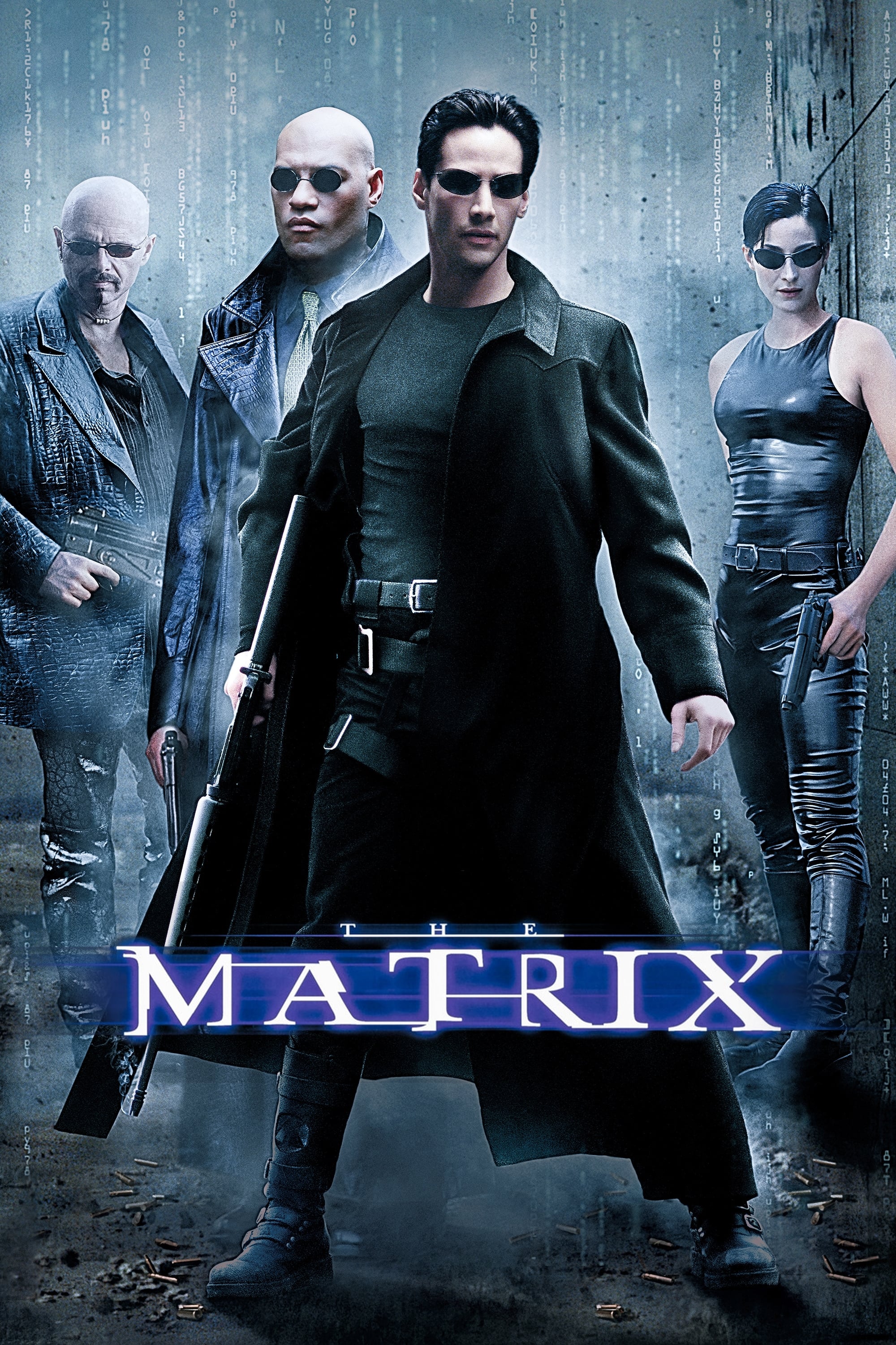
The movie uses color to clearly show the difference between the simulated world and the real world. Scenes within the computer simulation have a washed-out, greenish look, like old monochrome screens. In contrast, the real world, aboard the ship Nebuchadnezzar, is shown with cool, blue tones to emphasize its bleakness. This clever use of color helps the audience easily follow where the characters are in the story.
‘Stalker’ (1979)

As a huge fan, I’ve always been struck by how Tarkovsky shows us the world in the beginning – all washed out and depressing in these stark, sepia tones. But then, when the three men step into the Zone, it’s like everything changes! Suddenly, we’re seeing full, vibrant color. It’s more than just a visual trick, though. To me, it really highlights the shift from a barren, hopeless place to one full of possibility and wonder. The color isn’t just pretty; it feels like it represents the characters’ inner journey, their search for what they truly want.
‘A Matter of Life and Death’ (1946)
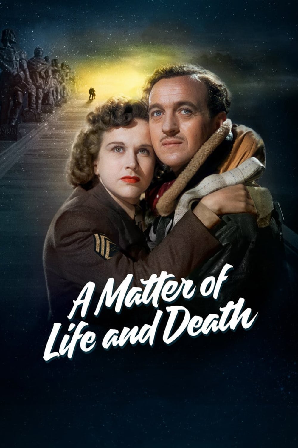
This well-known British film flips the usual idea that color represents life and black and white represents death. Scenes taking place after death are shown in black and white, suggesting a dull and highly organized existence. In contrast, events happening on Earth burst with color, highlighting the energy and chaos of being alive. This visual choice emphasizes the main character’s strong wish to stay in the lively world of the living.
‘Wings of Desire’ (1987)
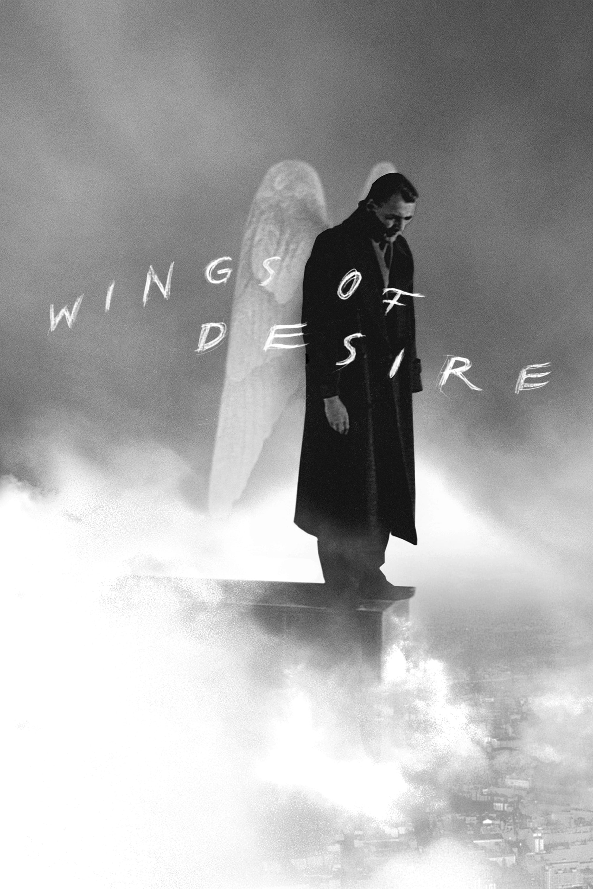
In Berlin, angels wander among humans, watching their lives unfold in shades of gray. This reflects their spiritual nature – they don’t feel physical sensations or have the limitations of humans. When an angel connects with a human or experiences something intensely, flashes of color appear. Finally, the film bursts into full color when the main character decides to become human in order to feel love.
‘Schindler’s List’ (1993)
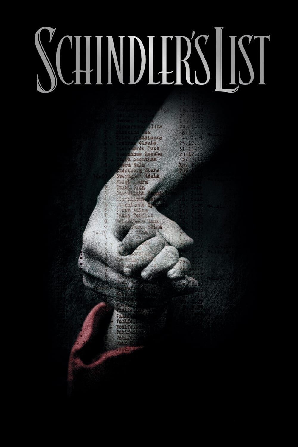
The movie is filmed mostly in black and white to emphasize the seriousness of the Holocaust. A young girl in a red coat stands out as the only color when the Krakow ghetto is being emptied. She captures the main character’s attention and inspires him to question his own values. This use of color makes the huge tragedy feel personal and shows the change happening within Schindler’s heart.
‘Oppenheimer’ (2023)
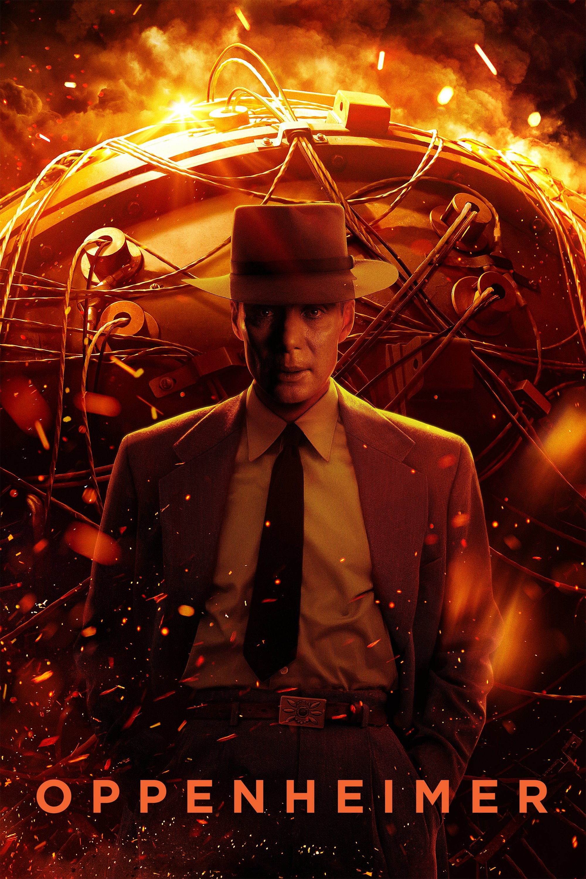
Christopher Nolan tells Oppenheimer’s story through two different timelines, distinguished by color and black-and-white film. The color scenes show Oppenheimer’s personal experience while creating the atomic bomb, while the black-and-white scenes present Lewis Strauss’s more detached perspective during hearings later on. This visual contrast makes it easier to follow the movie’s complicated, non-traditional structure.
‘Inside Out’ (2015)
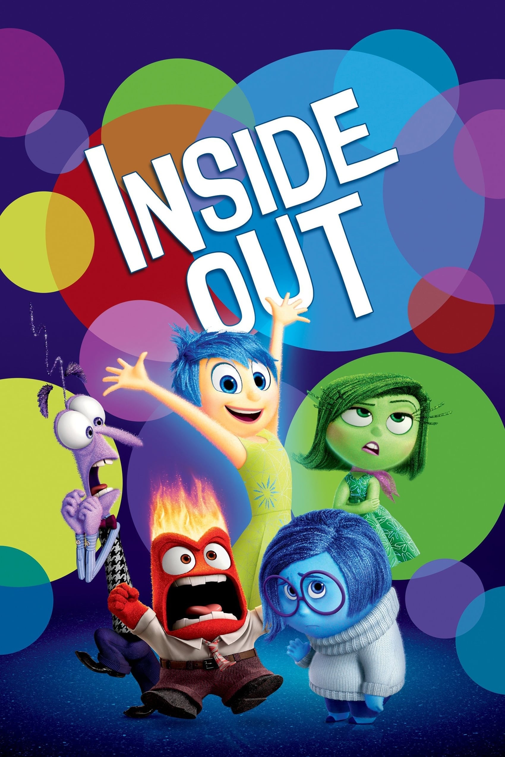
Pixar uses color to represent different emotions. When a character is feeling joyful, the screen glows yellow, sadness is shown with blue, and anger appears as red. Throughout the movie, these colors illustrate how memories start as simple, single colors and evolve into more complex blends. The way colors mix together at the end symbolizes the character growing up and learning to accept a full range of feelings.
‘The Aviator’ (2004)
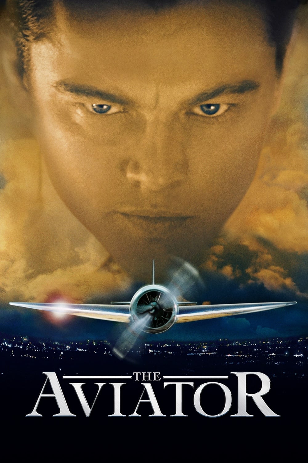
Martin Scorsese carefully recreated the visual style of filmmaking throughout the decades in his Howard Hughes biography. The early parts of the film look like movies from the 1920s, using a color scheme with strong blues and reds. As the story moves into the 1940s and 50s, the colors become richer and more vibrant, reflecting the look of that era. These visual shifts help immerse viewers in the time period and mirror Hughes’s changing life and career.
‘Vertigo’ (1958)
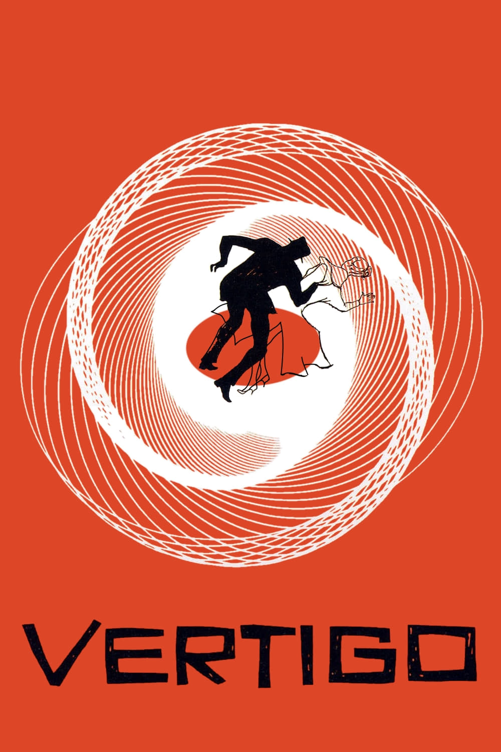
As a movie fan, I’ve always been fascinated by how Hitchcock used color. He wasn’t just picking shades randomly! I’ve noticed he often used green to create this eerie, almost ghostly feel around the woman the main character is obsessed with – it really hints at a lost love and a haunting past. Then, whenever things got dangerous or really passionate, he’d throw in these strong red flashes, which totally broke up the cooler tones and made everything feel off-kilter. It’s brilliant how he uses color to make the whole mystery feel like a dream, and to really mess with your head!
‘Moonlight’ (2016)
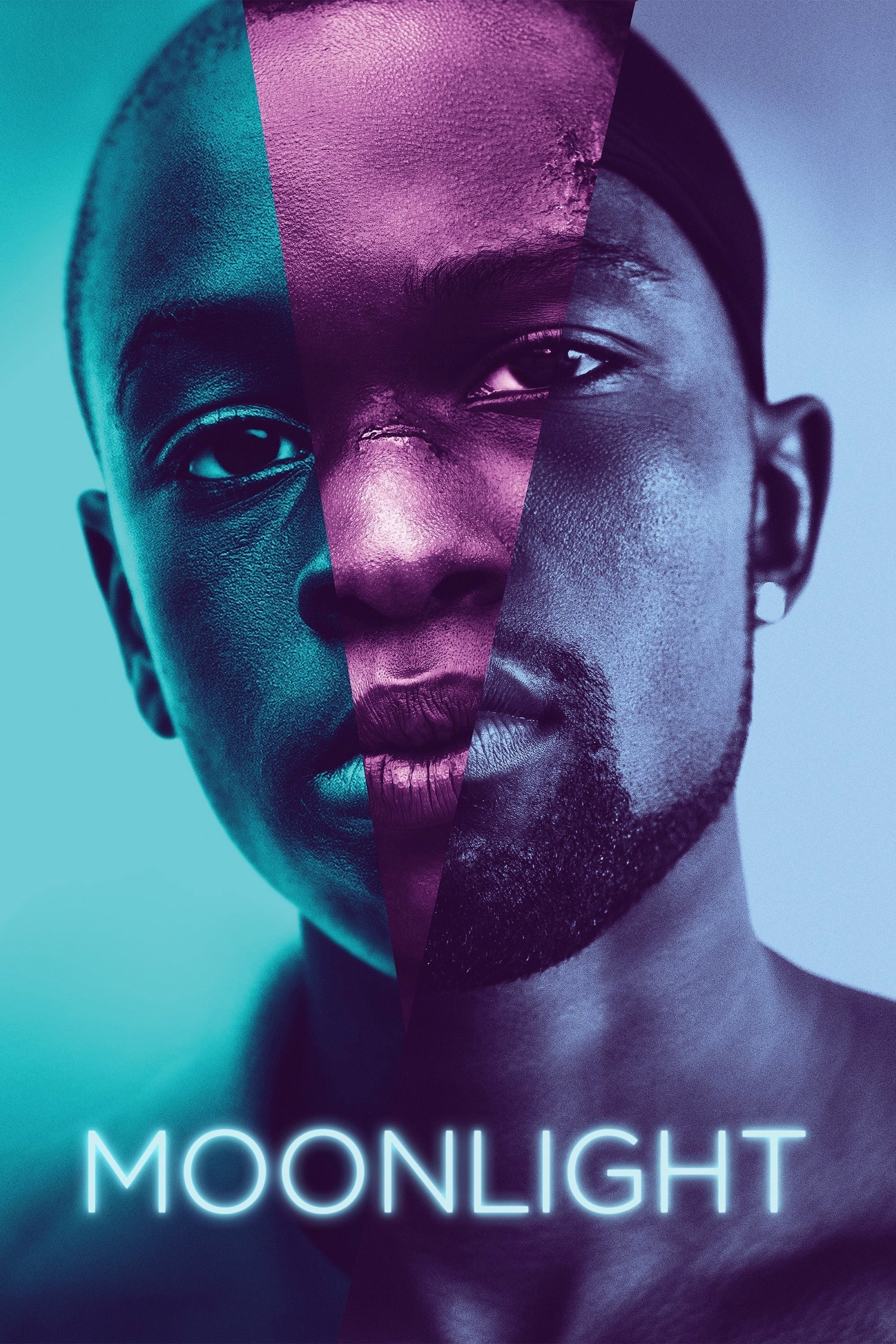
Visually, this film is really interesting. The director cleverly uses different film stocks to show us the different stages of the main character’s life. The first part feels warm and nostalgic, almost like an old photograph, thanks to the use of Fuji film. Then, as things get more complicated for the character, the film stock shifts to Agfa, giving everything a cooler, more unsettling blue and green tint. Finally, as they reach adulthood, the film switches to Kodak, creating a sleek, polished look that feels very different from the earlier sections. It’s a subtle but effective way to tell the story through visuals.
‘Blade Runner 2049’ (2017)

Each location in the game has a distinct color scheme designed to create a specific mood. The ruined city of Las Vegas is shown with a sickly orange haze, evoking a sense of radiation and decay. In contrast, Los Angeles is portrayed using cold blues and greys, highlighting the city’s bleak and controlling atmosphere. This strong difference in colors emphasizes how alone the main character feels as he moves between these different places.
‘Suspiria’ (1977)
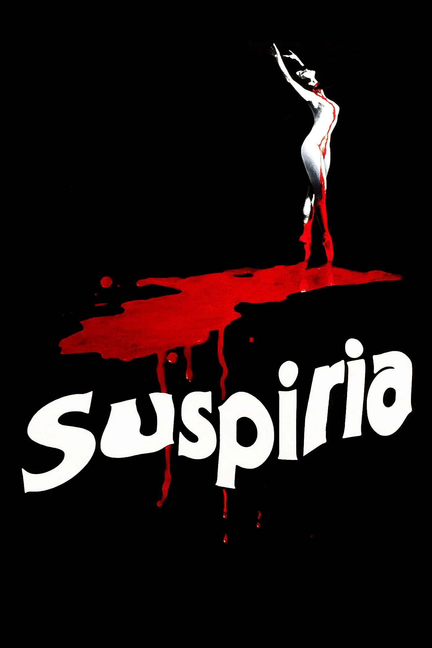
This iconic horror film deliberately avoids realistic lighting, instead using bold primary colors throughout its sets. Deep reds and blues create a dreamlike, unsettling atmosphere within the dance school. The lighting becomes even more intense and unnatural during violent scenes, amplifying the impact for the audience. Director Dario Argento employs these striking colors to hint at the presence of the supernatural and witchcraft.
‘Do the Right Thing’ (1989)
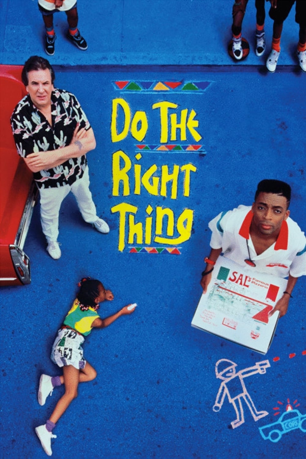
Spike Lee uses vibrant, warm colors – lots of oranges and reds – to make the audience feel the sweltering heat of a Brooklyn summer and hint at the growing racial tensions. This intense heat creates a sense of building pressure, ultimately leading to an outburst of violence. The lack of cool colors traps the viewer in this heated atmosphere, offering no visual relief.
‘The Grand Budapest Hotel’ (2014)
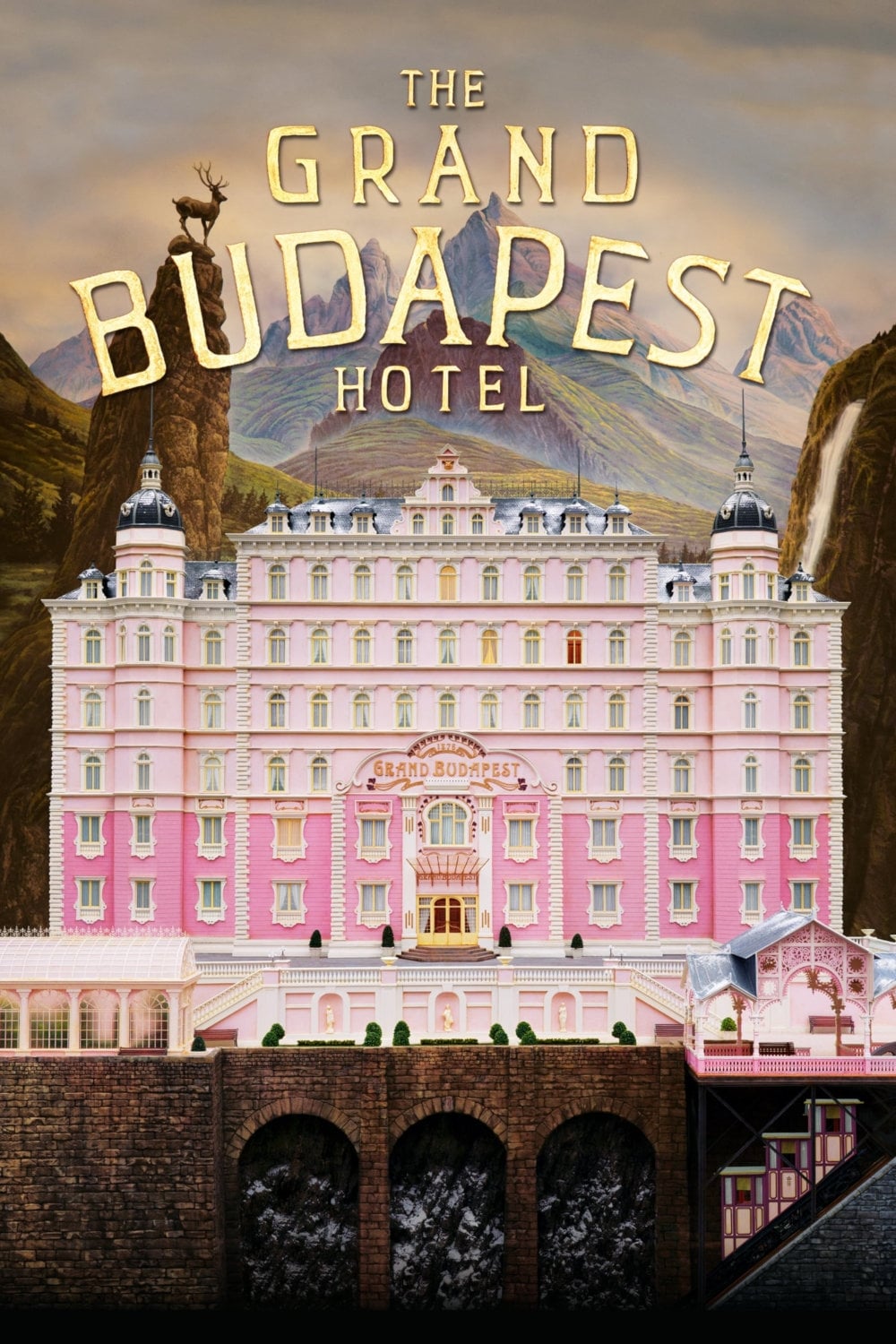
Wes Anderson visually separates the film’s three time periods using unique colors and screen shapes. Scenes set in the 1930s are filled with bright pinks and purples, evoking the hotel’s golden age. The 1960s segments use softer oranges and greens, capturing the look and feel of that era. These visual choices help viewers follow the complex, layered storytelling.
‘Poor Things’ (2023)
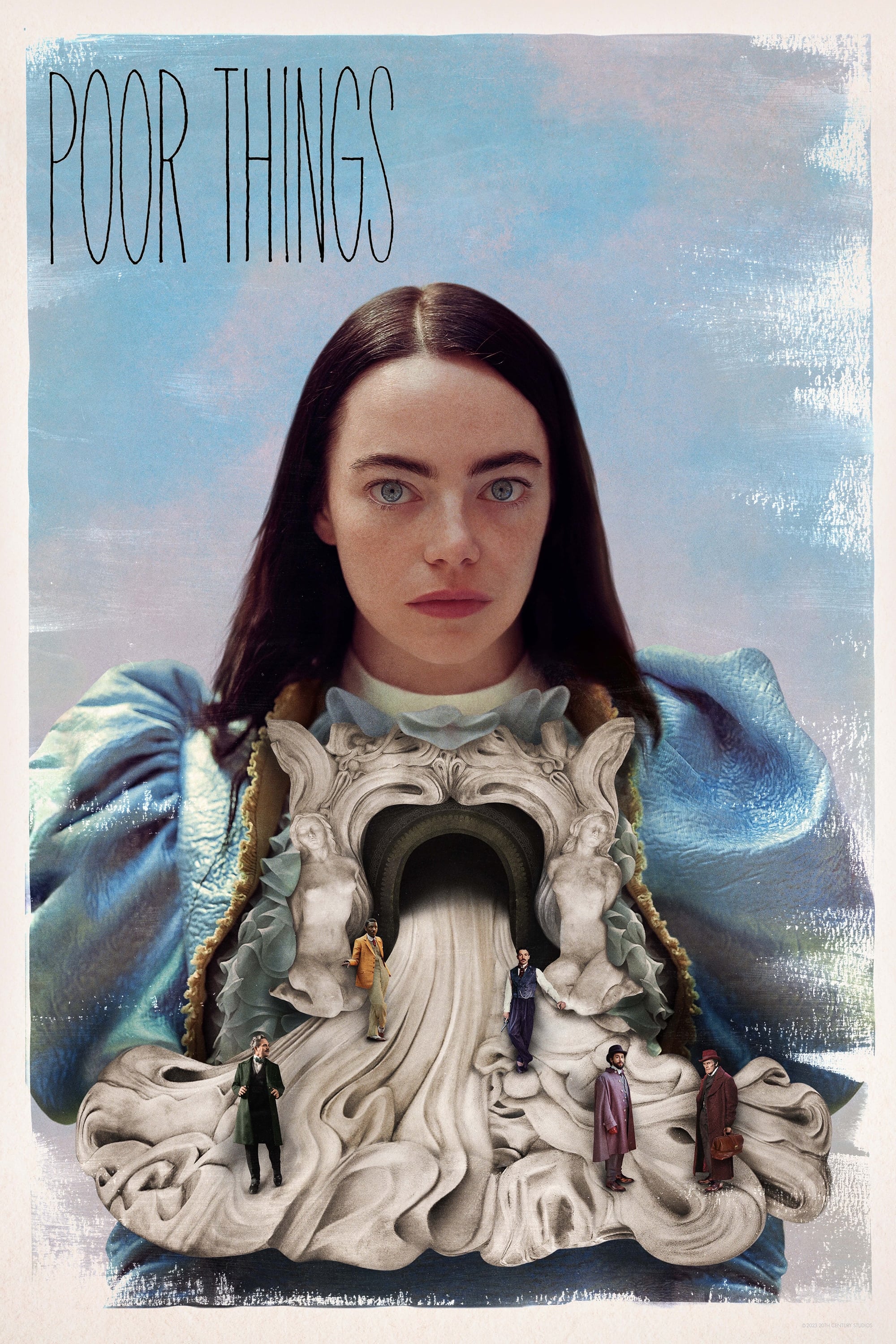
The movie opens with a striking, black-and-white depiction of a London inspired by steampunk, visually representing the narrow perspective of the main character. As Bella Baxter starts to find herself, the film bursts into vivid, colorful scenes. These increasingly bright visuals reflect her growing awareness of the world and her own desires. This change in style symbolizes her freedom – both intellectually and emotionally – from the controlled environment created by her maker.
Let us know in the comments which movie color transition you thought was the most powerful or memorable.
Read More
- Spotting the Loops in Autonomous Systems
- Seeing Through the Lies: A New Approach to Detecting Image Forgeries
- 20 Best TV Shows Featuring All-White Casts You Should See
- Julia Roberts, 58, Turns Heads With Sexy Plunging Dress at the Golden Globes
- Staying Ahead of the Fakes: A New Approach to Detecting AI-Generated Images
- The Best Directors of 2025
- The Glitch in the Machine: Spotting AI-Generated Images Beyond the Obvious
- Palantir and Tesla: A Tale of Two Stocks
- Gold Rate Forecast
- How to rank up with Tuvalkane – Soulframe
2025-11-28 05:46