
Every long-running show has a few minor flaws, and ‘One Piece’ is no different. With decades of weekly episodes, various animation studios involved, and releases around the world, some small visual errors and inconsistencies were bound to happen. Fans have noticed these quirks over the years, and they aren’t necessarily a reflection of the show’s overall quality. They simply show how tight deadlines and changing production methods can sometimes lead to small mistakes. These little details actually offer a fascinating look at how a massive, ongoing series is made.
Zoro’s Scar and Earrings Swap
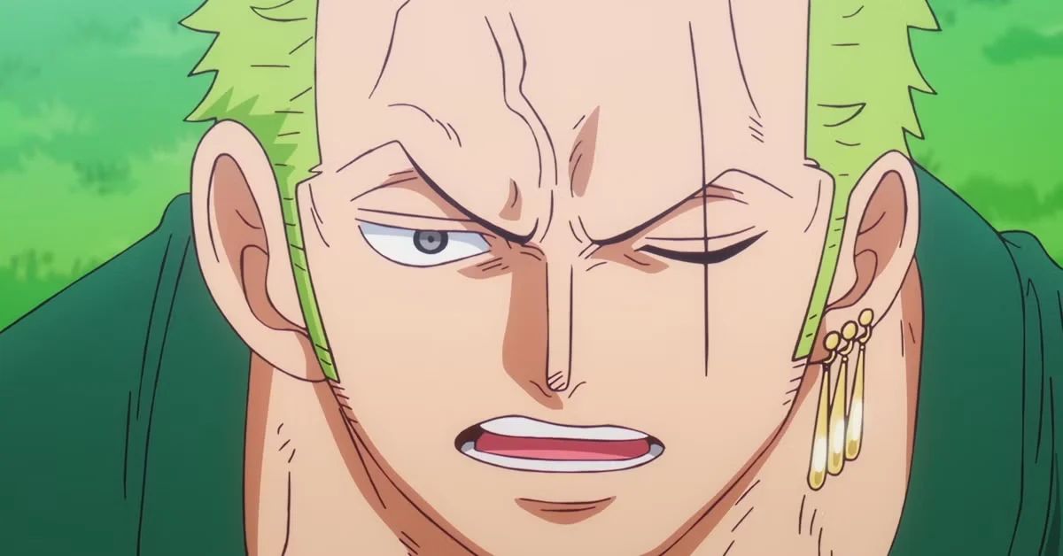
Throughout the production of the series, some of Zoro’s defining characteristics haven’t always been drawn the same way. For example, the scar over his left eye sometimes appears fainter, and the length of his chest scar has occasionally been shortened. There have also been a few instances where his earrings—which he normally wears only on his left ear—appear on both ears, likely due to errors during animation. These kinds of small inconsistencies are common in long-running anime series, especially when multiple teams of animators are working on it at the same time.
Mirrored Shots Flip Sanji’s Eyebrow
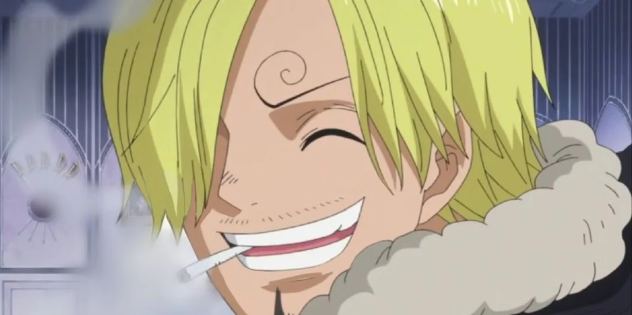
Sometimes, when the animators flip a scene to improve how it flows or maintain consistency, Sanji’s distinctive curled eyebrow can seem to change from one side to the other in a single frame. This isn’t a change to the story itself; it happens because the entire shot was mirrored during editing. This mirroring can also cause things like the position of his lighter or cigarette to appear different between shots within the same scene. While these edits help with the speed and direction of the animation, they can briefly create a visual inconsistency.
Nami’s Tattoo Variations Across Early Animation
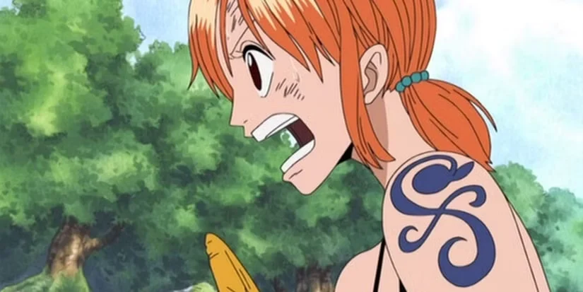
Nami’s tattoo—the pinwheel and tangerine design she got after defeating Arlong—has sometimes appeared with slightly different colors and line thickness throughout the series. This is because older and newer versions of the show have used different color adjustments and transfer methods. Occasionally, the tattoo appears simpler in faraway shots, losing some detail, but this is a common practice animators use to make sure everything is clear to viewers at different distances and zoom levels.
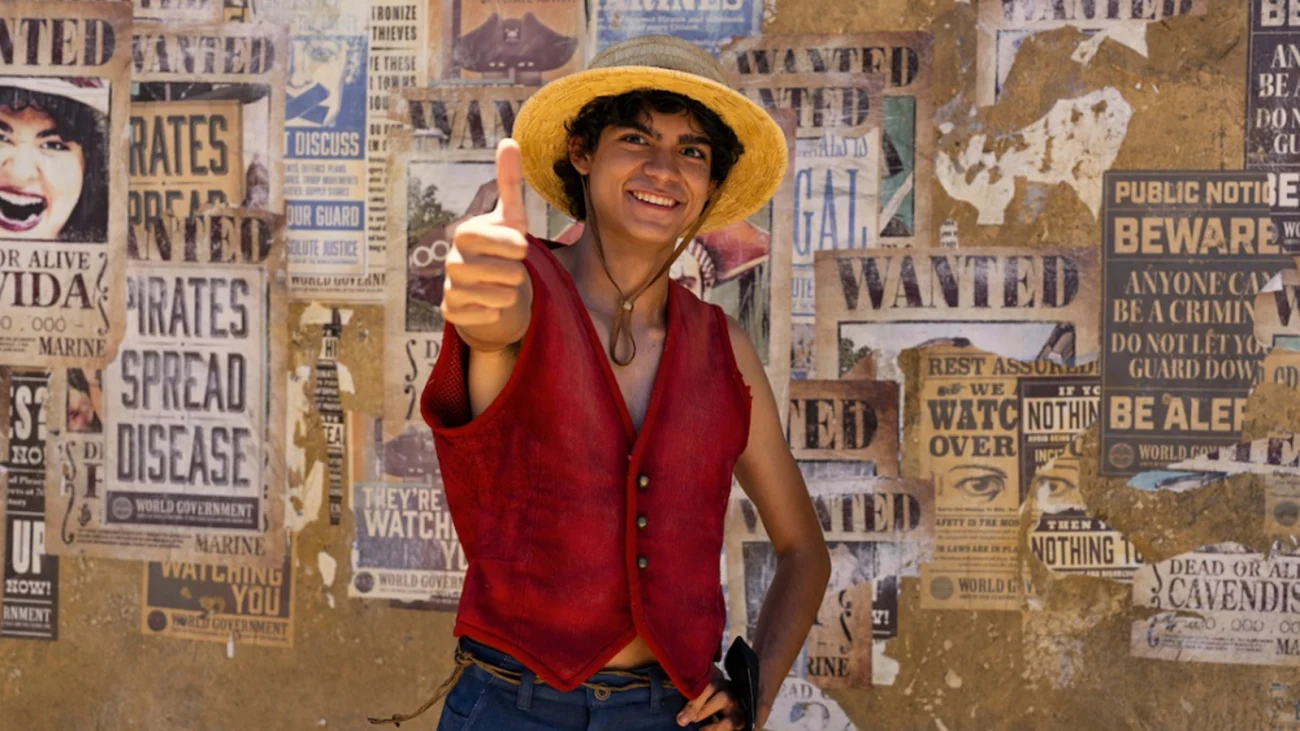
Straw Hat Band and Jolly Roger Color Swaps
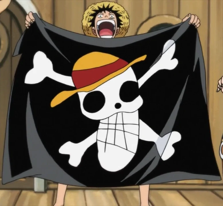
Luffy’s signature straw hat is usually red, but sometimes the color looks a little different in certain scenes or on products because of how the lighting is set up or slight variations in color during production. Similarly, the Straw Hat Pirates’ flag might have simpler details or missing stitches when it’s shown far away, like on a ship’s sails in a wide shot. These changes are common in animation to make things clear when they’re moving. Also, when special effects like fog or haze are added, the colors can shift even more.
Bounty Posters With Canon “Errors”
The story includes bounty posters with deliberate errors or old images, and these sometimes appear in official materials outside the story itself. For example, Sanji’s first bounty poster was just a sketch and listed him as only being wanted alive, which changed in later versions. Similarly, Usopp’s poster as Sogeking appears separately from his usual wanted poster. Guides and promotional items occasionally use these older designs, leading to inconsistencies with current character art. This happens because those creating merchandise and materials often pull from large collections of images spanning different eras of the series.
The Grand Line Map Shifts Between Materials

The maps of the Grand Line, Calm Belt, and islands in One Piece haven’t always been consistent across different materials like guidebooks and promotional art. This is because the maps prioritize telling the story over being perfectly accurate. Scale isn’t usually shown, and artistic map styles can change how distances and directions appear. As new islands are added to the story, older maps sometimes don’t match the newer, more detailed versions. The creators haven’t relied on one official, technically precise map, instead focusing on what best serves the narrative.
Sword Count and Placement Continuity for Zoro
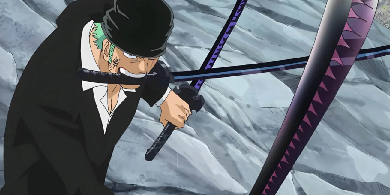
Zoro’s unique fighting style, which uses three swords, requires careful attention to detail in each scene. Occasionally, there are quick, noticeable errors – like the wrong number of swords shown or slightly incorrect positioning. While editing fast-paced action sequences, especially those with motion blur, the sword designs are sometimes simplified to make them easier to follow. These small mistakes usually only appear for a split second, but become visible when the video is paused.
Ship and Character Scale Drift Between Cuts

The size of the crew compared to the ships, the Going Merry and Thousand Sunny, sometimes changes slightly in wide shots. This happens because of how the cameras are positioned and how the backgrounds are layered. When the camera pans across the deck, features might appear bigger or smaller to make sure the characters are still easy to see. Sometimes, details like doors and railings are simplified when they’re far away, then shown with more detail up close. This is a common compromise in TV animation – making things clear and fluid is often more important than perfectly accurate sizes.
Chopper’s Hat Cross and Hue Changes
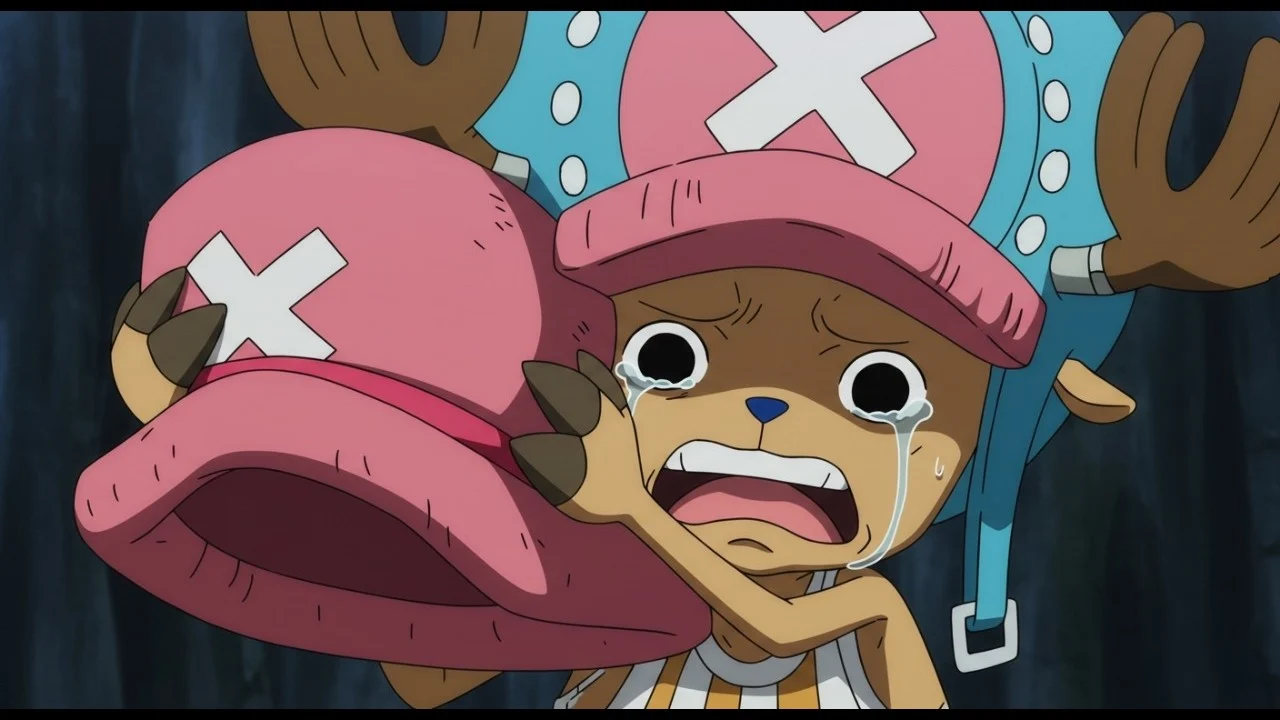
Tony Tony Chopper’s hat has a white “X” on a pink background, but the color and brightness have varied slightly in different releases of the show. To prevent a distracting flicker in quick scenes or when Chopper is far away, the lines of the “X” are sometimes made thinner or simpler. Changes in color formats during production and distribution can also affect how vibrant the colors appear. Over time, these small differences add up with each new release of the series.
Name Spellings That Differ by Release
Over time, official English versions of the series have used different spellings for character and place names. This is due to things like trademark issues and changes in how content is translated for different regions. For example, “Zoro” is sometimes spelled “Zolo,” and place names like Alabasta/Arabasta and Cacao/Cocoa Island aren’t always consistent. Different products and guides made for various countries sometimes stick to one spelling, which can lead to inconsistencies. These variations happen because of legal agreements, choices about how names are written in English, and attempts to create a consistent brand worldwide.
We’re looking for any mistakes or errors you’ve noticed in our ‘One Piece’ coverage. Let us know what we overlooked in the comments below!
Read More
- Top 20 Dinosaur Movies, Ranked
- 20 Movies Where the Black Villain Was Secretly the Most Popular Character
- Celebs Who Narrowly Escaped The 9/11 Attacks
- 25 “Woke” Films That Used Black Trauma to Humanize White Leads
- The 10 Most Underrated Jim Carrey Movies, Ranked (From Least to Most Underrated)
- Transformers Under the Microscope: What Graph Neural Networks Reveal
- The Best Directors of 2025
- Every Notable ‘Star Trek: The Original Series’ Actor Who Died
- 22 Films Where the White Protagonist Is Canonically the Sidekick to a Black Lead
- Trading on Thin Air: AI Agents Conquer Crypto Volatility
2025-10-20 02:59