Effective visual storytelling uses color and lighting to help viewers follow complicated stories. TV show creators use these methods to show different time periods without relying on a lot of on-screen text. Here’s a look at series that expertly use visual clues to indicate changes in time or what’s real.
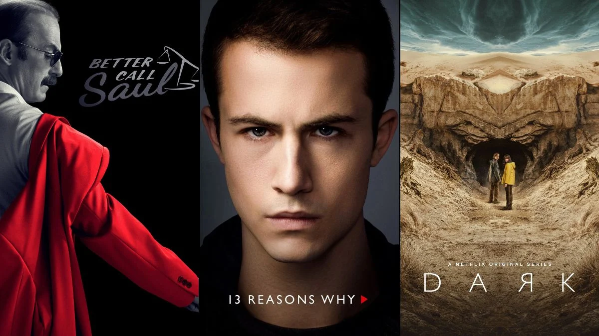
‘Better Call Saul’ (2015–2022)
This show is a prequel to ‘Breaking Bad,’ but it begins by jumping between timelines. We see glimpses of the future, after the original series ended, in stark black and white, showing a bleak and unhappy life for a man named Gene Takavic. The main story, set in the early 2000s, is full of color and follows the clever schemes of Jimmy McGill. This contrast in visuals immediately tells you what time period you’re watching and creates a distinct mood for each part of the story.
‘Dark’ (2017–2020)
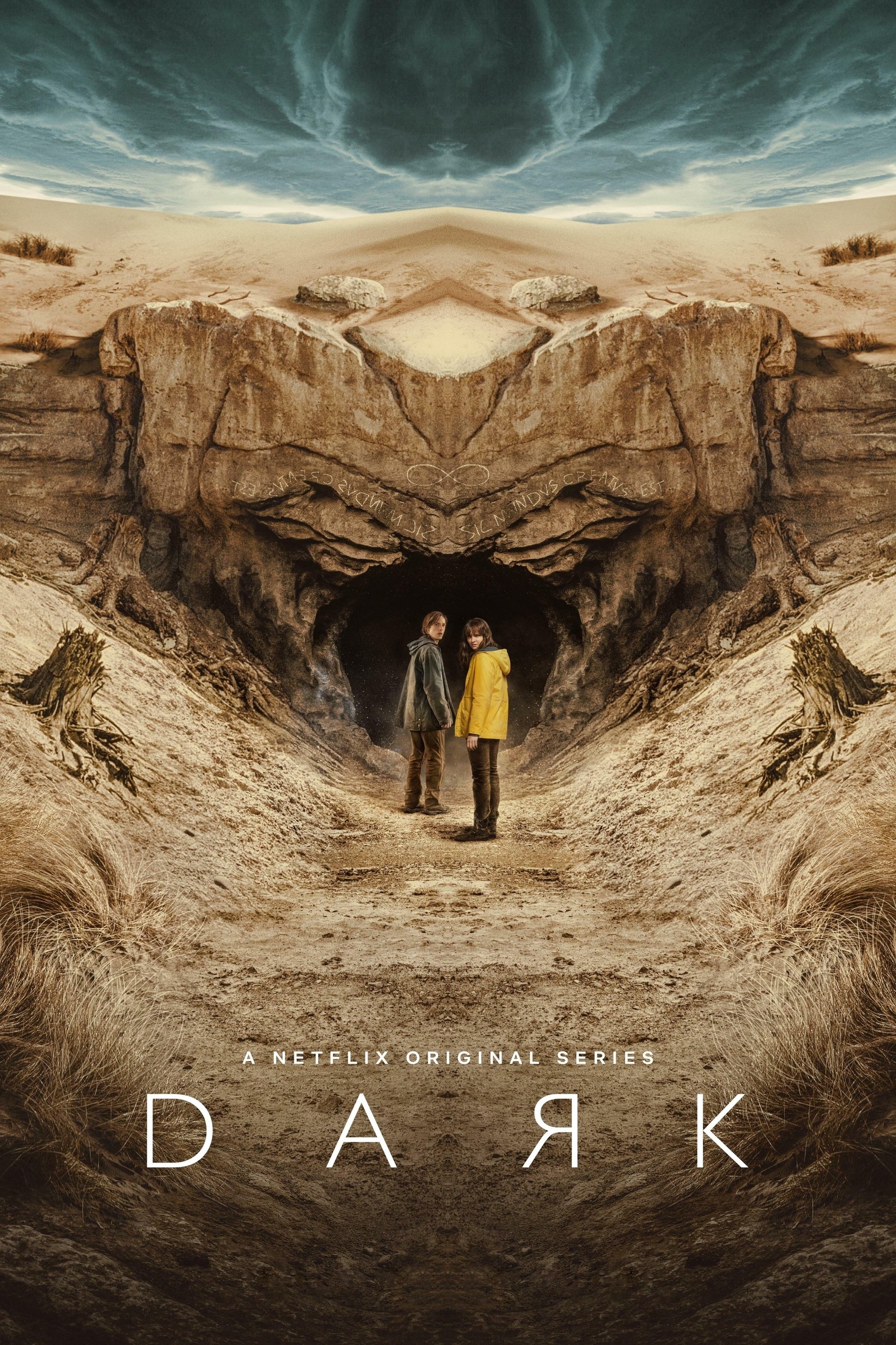
This German science fiction thriller jumps between different time periods and follows multiple families across generations. To help viewers keep track of the story, the creators used different color schemes for each era – 1953, 1986, and 2019. The scenes set in the 1980s are generally warmer and softer, while the present day has a colder, more washed-out look. These visual cues are crucial for following the characters as they move through the caves beneath the town of Winden.
‘Cruel Summer’ (2021–Present)
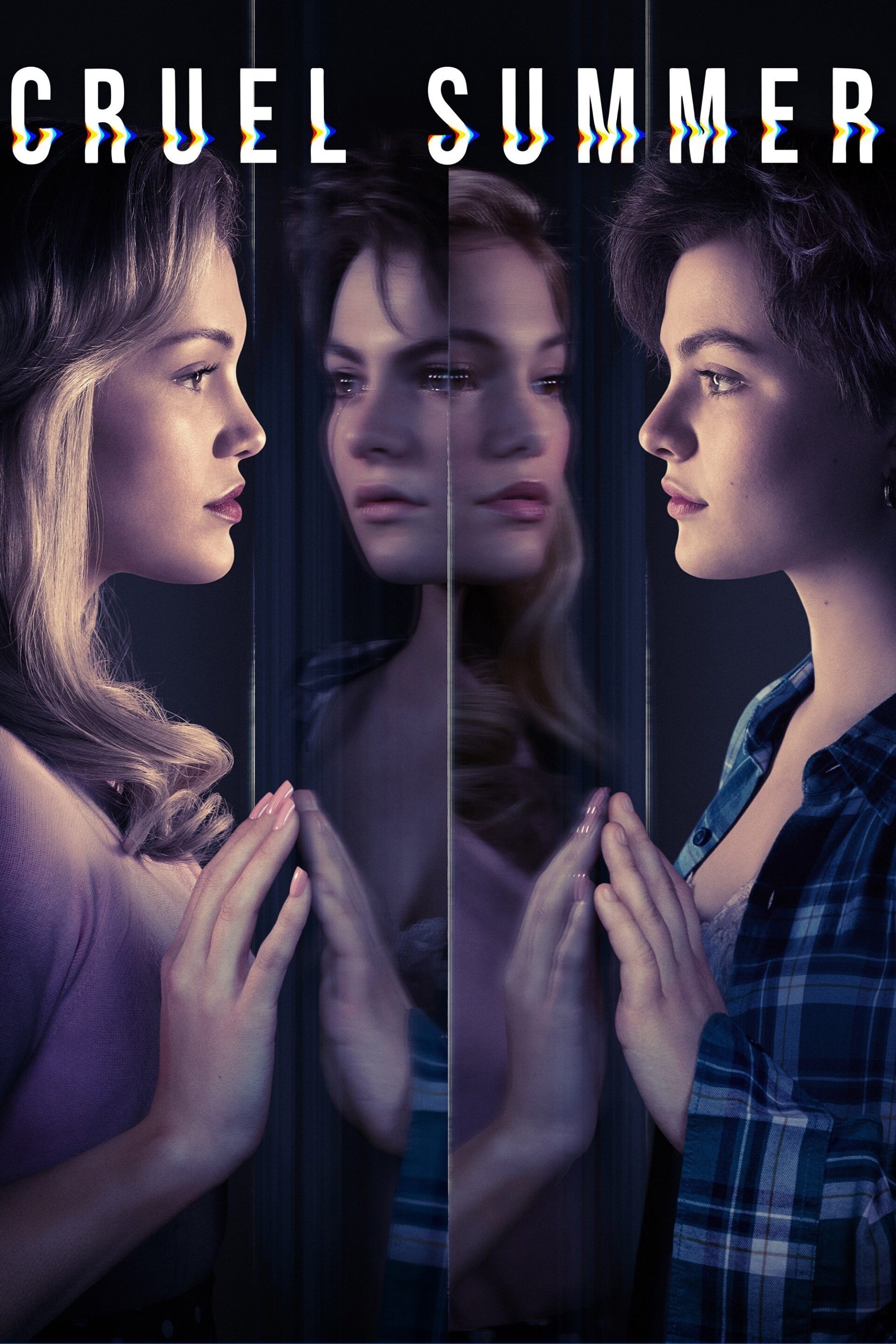
The story takes place over three summers in the 1990s, and each year has a distinct look and feel. The scenes from 1993 are bright and colorful, mirroring the characters’ hopeful outlook. In 1994, the visuals become more subdued as a central mystery casts a shadow over the town. By 1995, the atmosphere is gloomy and tinged with green, reflecting the difficult legal proceedings and emotional consequences that follow.
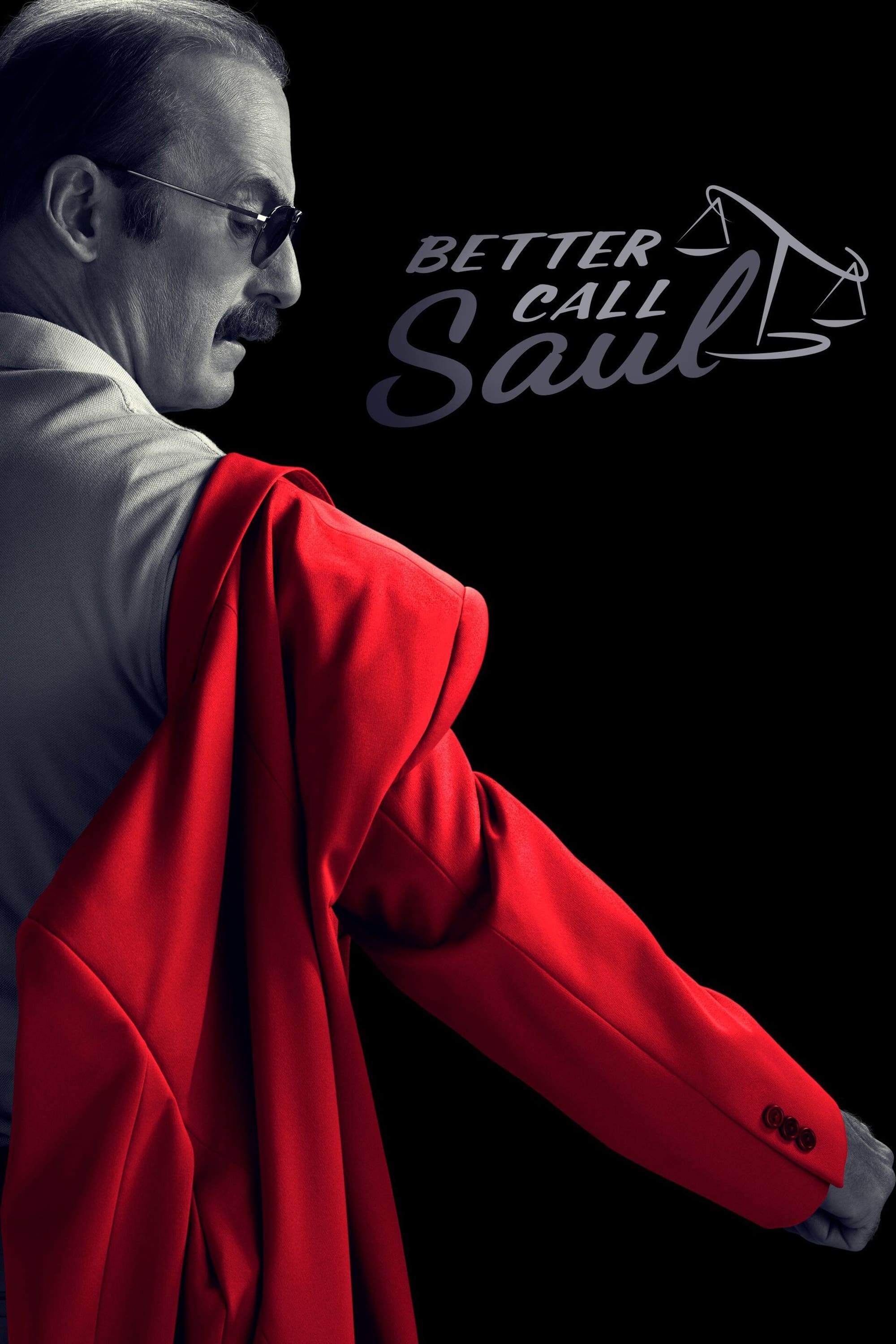
’13 Reasons Why’ (2017–2020)
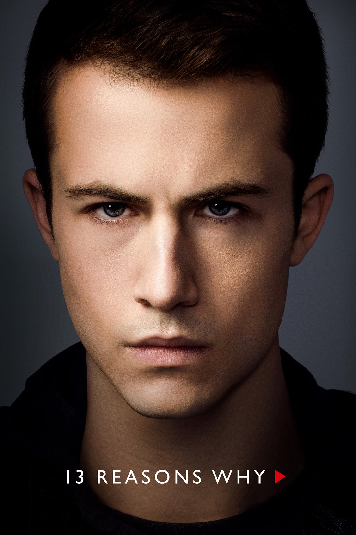
The first season jumps between the weeks before Hannah Baker’s death and what happens after. Scenes showing the past have a warm, golden look to represent the hope that existed then. The present-day scenes are filmed with a cool, blue tone to highlight the characters’ sadness and despair. This changing color scheme helps viewers easily follow the timeline.
‘Yellowjackets’ (2021–Present)
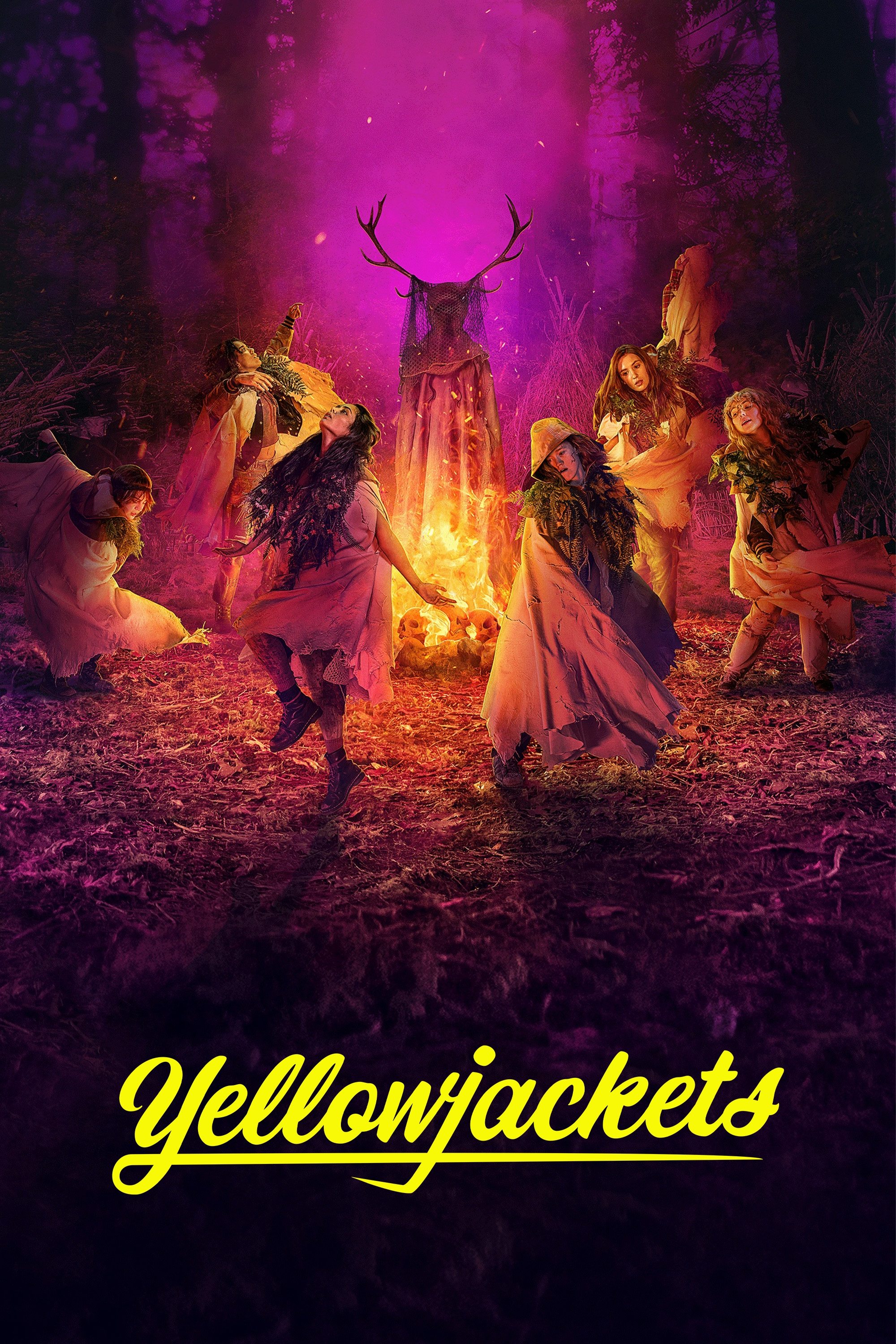
The story jumps between two timelines: a high school soccer team’s fight for survival in the wilderness in 1996, and the lives of those same people as adults today. The scenes set in the 1990s have a deliberately grainy, warmer look, reminiscent of older film. In contrast, the present-day scenes are sharp, cold, and visually suggest the hidden trauma the characters still carry. These different visual styles help the viewer easily follow the story as it moves between the harrowing events of the past and the mysterious circumstances of the present.
‘Quantico’ (2015–2018)
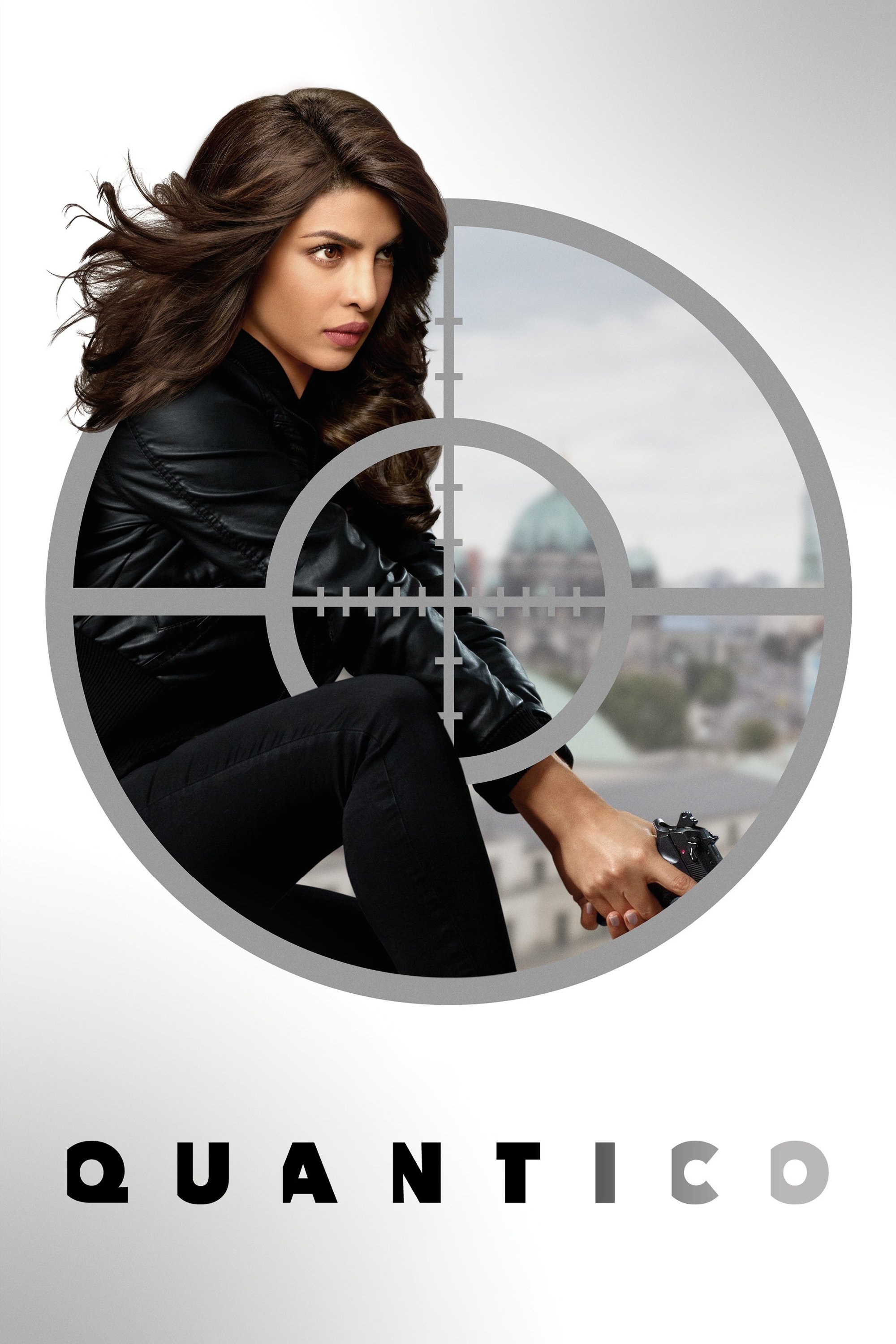
The show’s first season jumps between two time periods: the training days of FBI recruits and a future terrorist attack. The scenes set at the academy are filmed with warm, bright colors to create a sense of hope and teamwork. In contrast, the future timeline uses cool, blue tones to emphasize the danger and mistrust among the now-experienced agents. This strong use of color makes it clear to the audience which time period they’re watching and what part of the story is being revealed.
‘The Haunting of Hill House’ (2018)
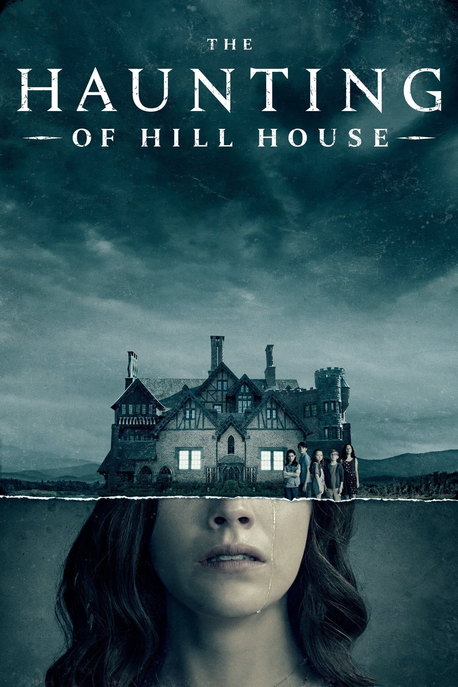
As a huge fan, I have to say Mike Flanagan really nailed the atmosphere in this show. He masterfully weaves together the characters’ childhoods with the pain they carry as adults. What’s amazing is how he uses visuals to tell the story – the scenes set in the past feel warm and nostalgic, even with the scary stuff happening. Then, when we jump to the present, everything is colder, bluer, really showing how much grief the Crain family still carries. And the way he blends those timelines? It’s done with these incredible, long shots where the lighting subtly changes, making the past and present feel like one continuous, haunting experience. It’s just brilliant.
‘Awake’ (2012)
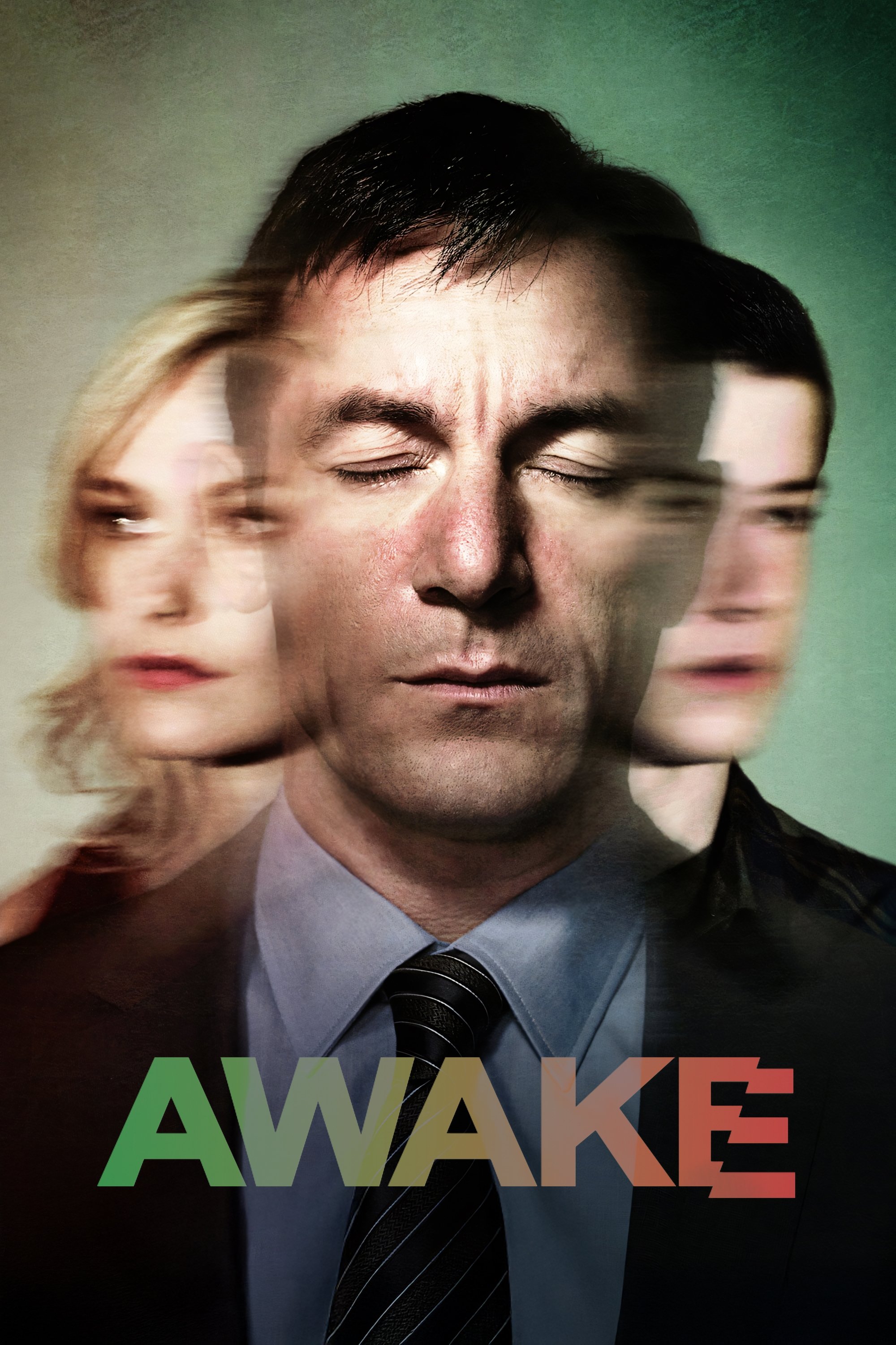
After a car accident, detective Michael Britten begins experiencing two separate realities. In one, his wife lived through the crash, and this reality is depicted with warm, yellow tones. In the other, his son survived, and that reality appears with cool, green tones. Michael uses different colored wristbands to stay oriented, but the show relies on noticeable color differences to help viewers keep track. This allows the series to quickly switch between the two realities without causing confusion.
‘WandaVision’ (2021)
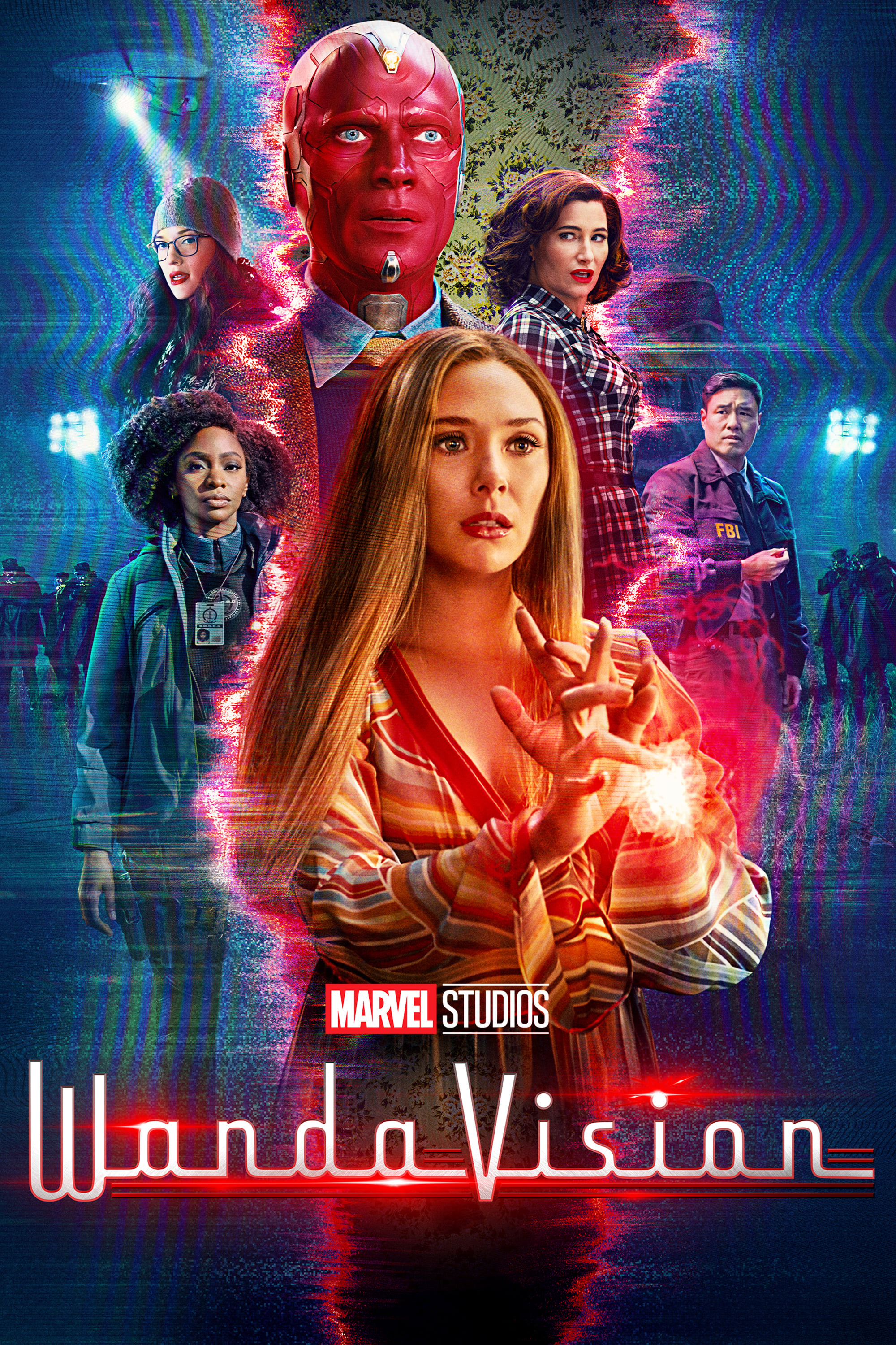
This series visually travels through the history of sitcoms, changing its look to match each decade. The early episodes are filmed in black and white with the harsh lighting common in 1950s and 60s TV shows. As the story moves forward into the 70s and beyond, it adopts color and eventually modern digital filming techniques. These shifts in style aren’t just visual – they also show how the main character is dealing with loss and moving through time.
‘Fear the Walking Dead’ (2015–2023)
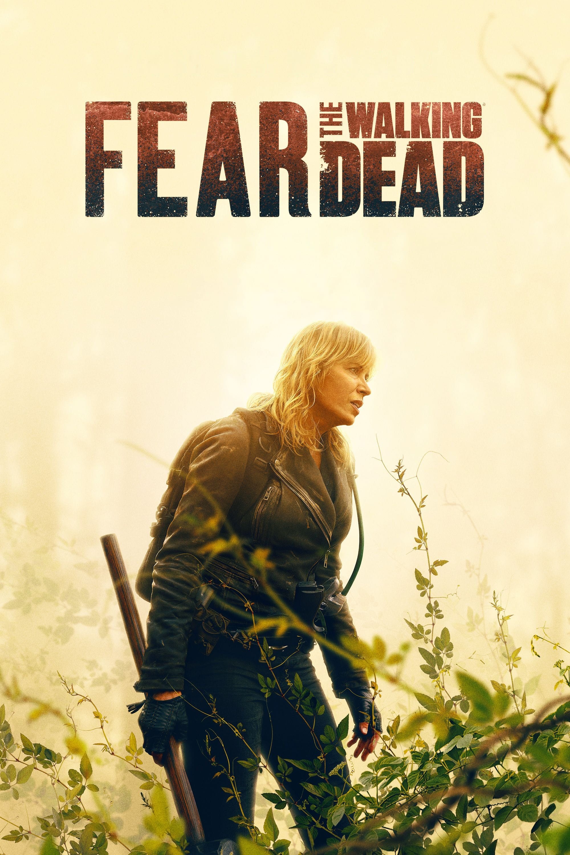
As a huge fan, I was really struck by the fourth season’s bold creative choices. They split the story into two timelines, connected by this devastating stadium collapse. Everything before the disaster was filmed with these warm, vibrant colors – it really felt hopeful and showed a strong sense of community. But after the collapse? It was like a completely different show. They drained all the color, switching to a really grey and desaturated look. It was so effective in showing the loss and hopelessness everyone felt. Honestly, the way they used color became a key part of telling the story – it wasn’t just a visual choice, it was the storytelling.
‘Arrow’ (2012–2020)
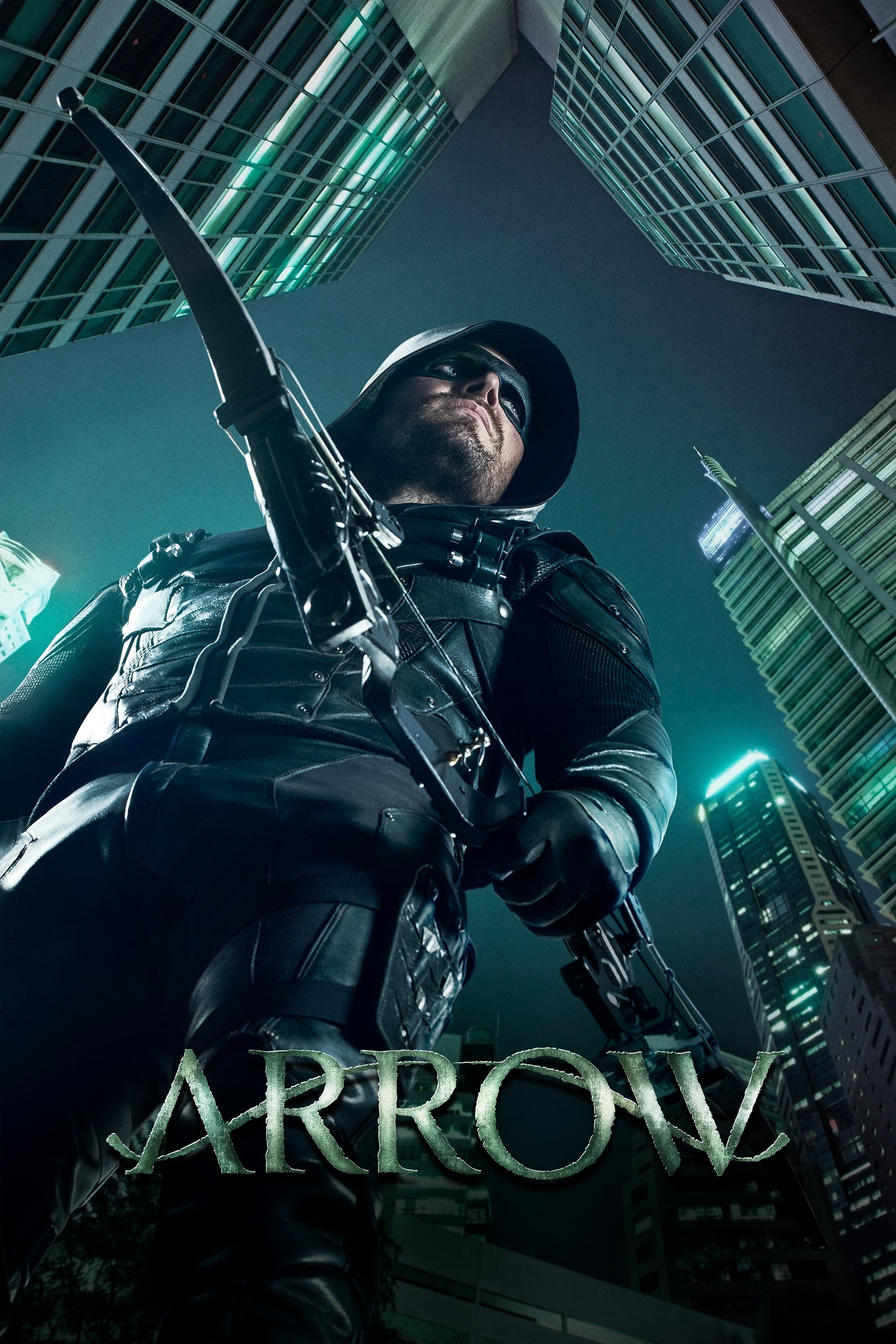
The show frequently contrasted Oliver Queen’s life as a masked vigilante with flashbacks to his five years stranded on a deserted island. The island flashbacks were filmed with a gritty, grainy look and a green color scheme to emphasize the difficult conditions he faced. Meanwhile, scenes set in the present day in Starling City were brighter and more realistic, making the superhero elements feel grounded. This use of contrasting visuals became a defining feature of the show for its first five seasons.
‘How to Get Away with Murder’ (2014–2020)
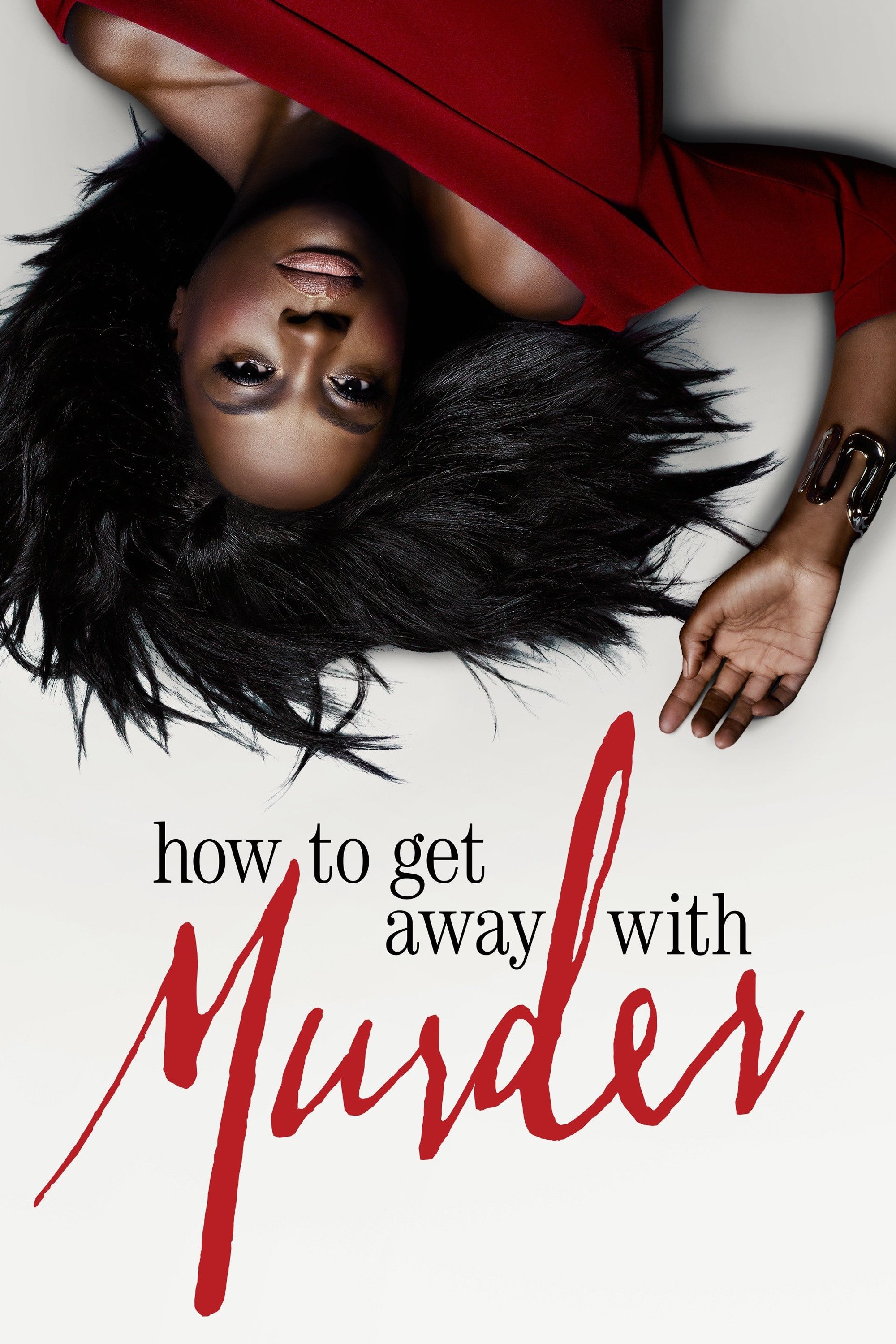
The show usually focuses on a major event, like a death or crime, revealed through glimpses into the future. Scenes leading up to this event have a warm, inviting look. However, the future scenes are filmed with a cold, blue tone to create a sense of dread and build tension. This consistent visual pattern of warm past and cool future steadily increases suspense as the two storylines move closer together.
‘Fringe’ (2008–2013)
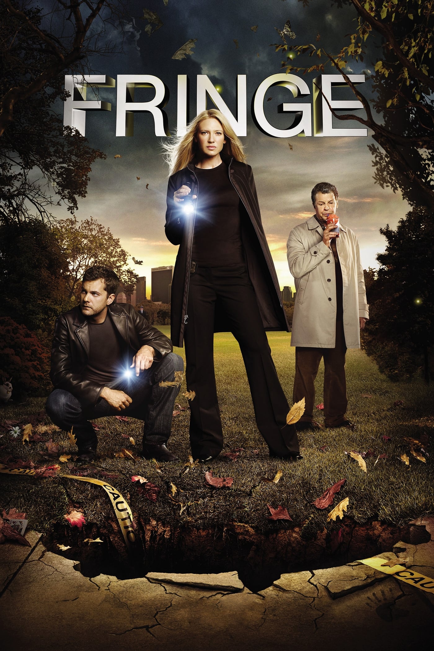
The show features two universes: a main one and a parallel alternate reality that begin to merge. The alternate universe is visually set apart with a red tint and specific lens flare effects. The main universe, in contrast, uses cooler blue tones and standard lens flares. This color scheme helped viewers easily keep track of which reality the characters were in.
‘Lost’ (2004–2010)
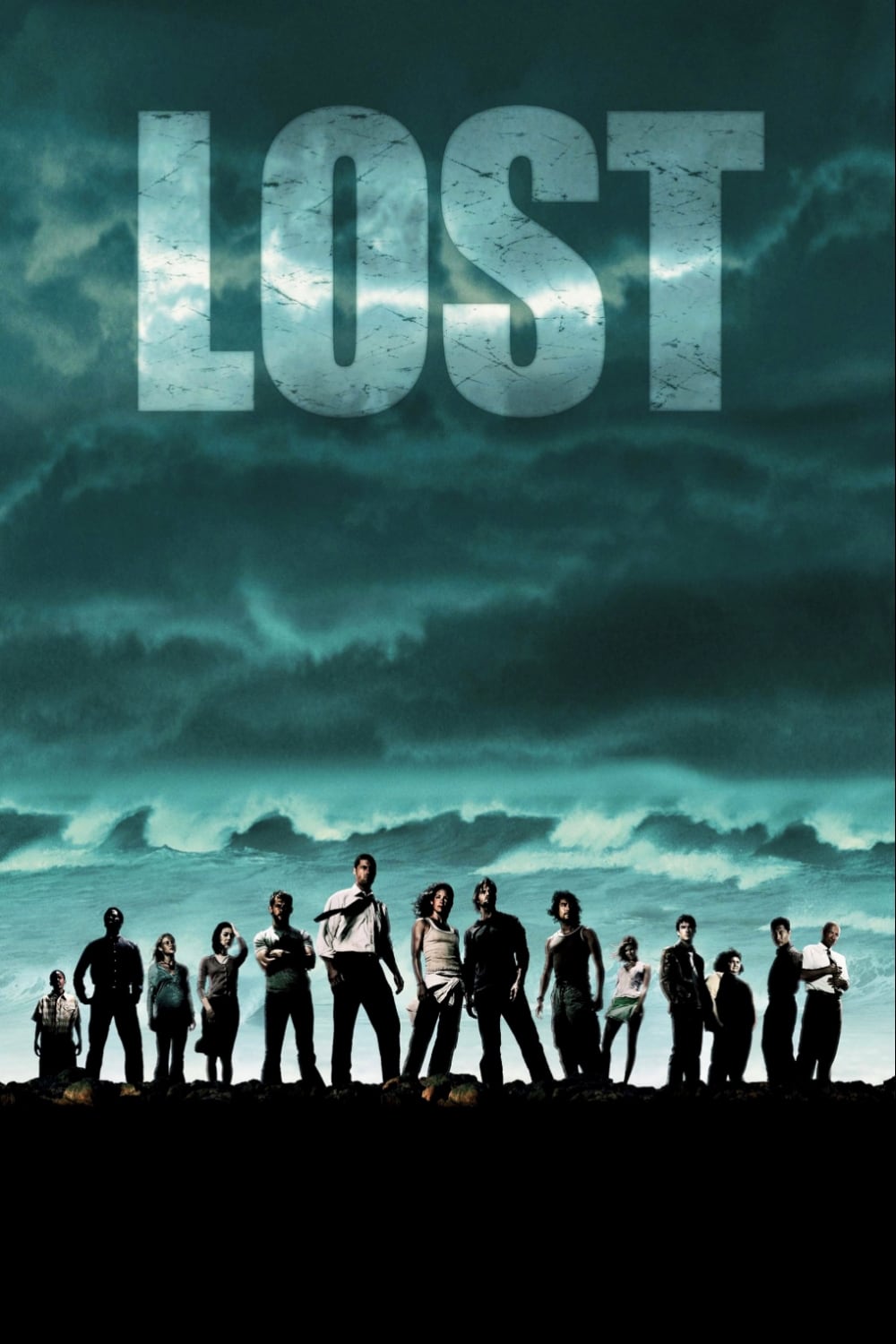
The show’s last season featured a unique storytelling element: scenes showing a sort of afterlife, a place between heaven and earth. These scenes had a dreamy, glowing look, contrasting sharply with the realistic, jungle setting of the main storyline, which continued to emphasize the characters’ struggle for survival. This difference in how things appeared subtly suggested that the alternate scenes weren’t what they seemed, before the big reveal at the end.
‘Bodies’ (2023)
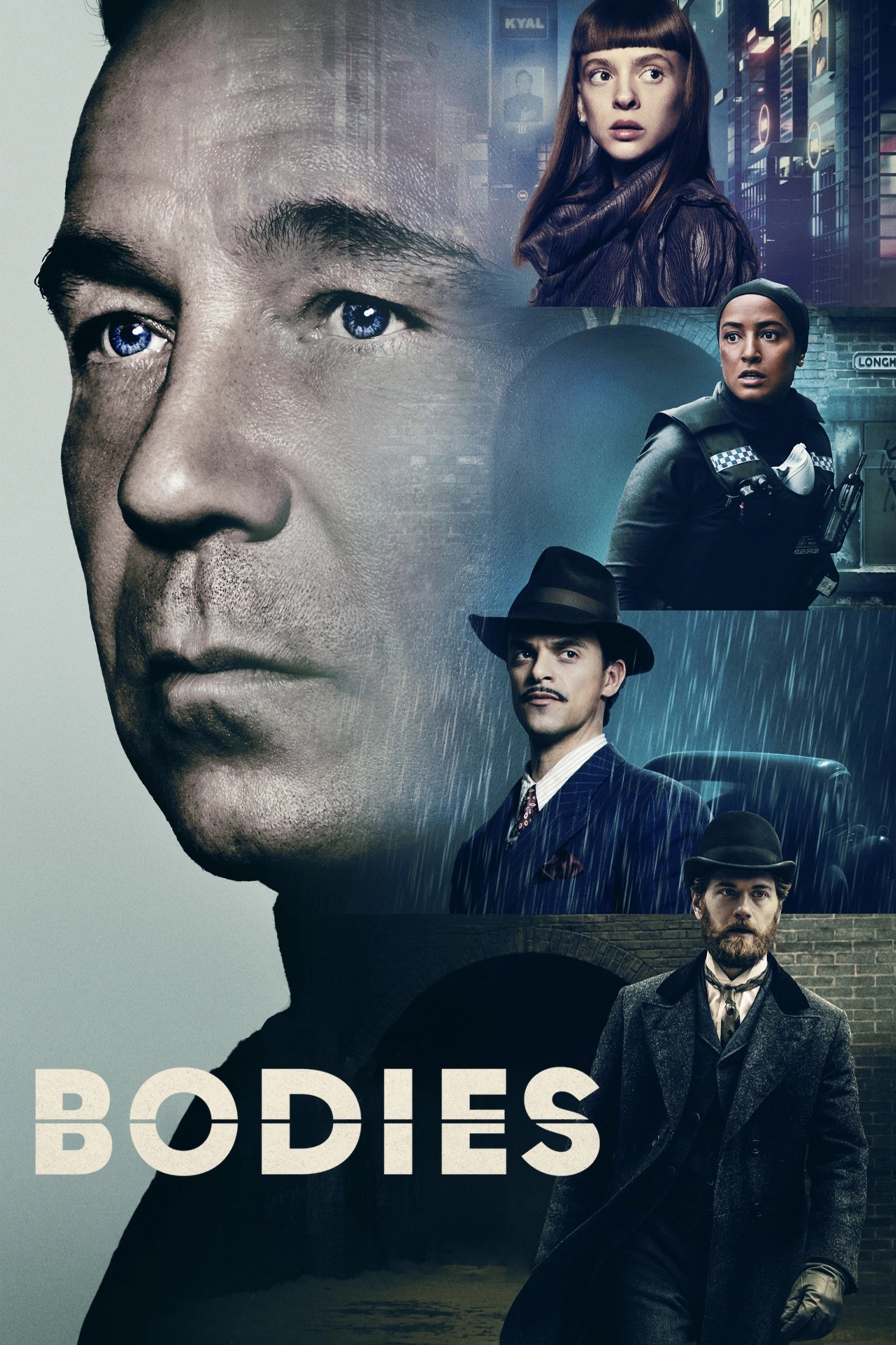
The series follows four detectives, each investigating the same murder on Longharvest Lane, but in different years. Each time period—1890, 1941, 2012, and 2053—has a unique visual style: warm gaslight for the 1890s, shadowy noir for 1941, a modern look for 2012, and a cool, futuristic blue for 2053. This distinct style helps viewers easily follow the story as it jumps between these four different time periods.
‘Westworld’ (2016–2022)
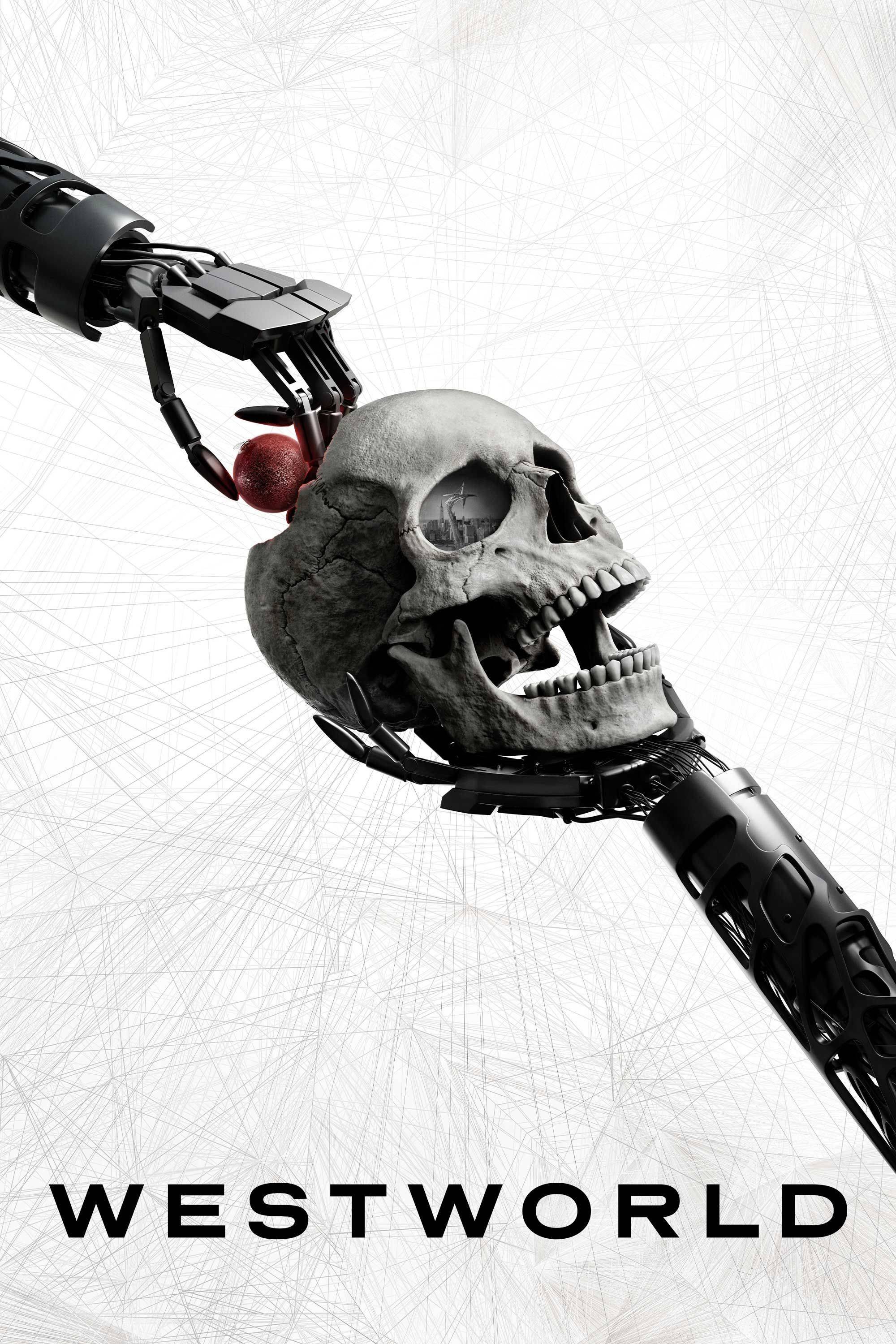
The story often plays with time, presenting events out of order when it comes to the androids. The show uses visual cues – like slight changes in the screen’s shape and the warmth of the lighting – to help viewers tell the difference between what’s happening in the virtual world and reality. Scenes taking place inside the digital world, known as the Cradle or Sublime, usually look brighter and cleaner than the gritty real world. If you pay close attention to these visual details, you can often figure out the timeline twists before they’re fully revealed.
‘The Handmaid’s Tale’ (2017–Present)
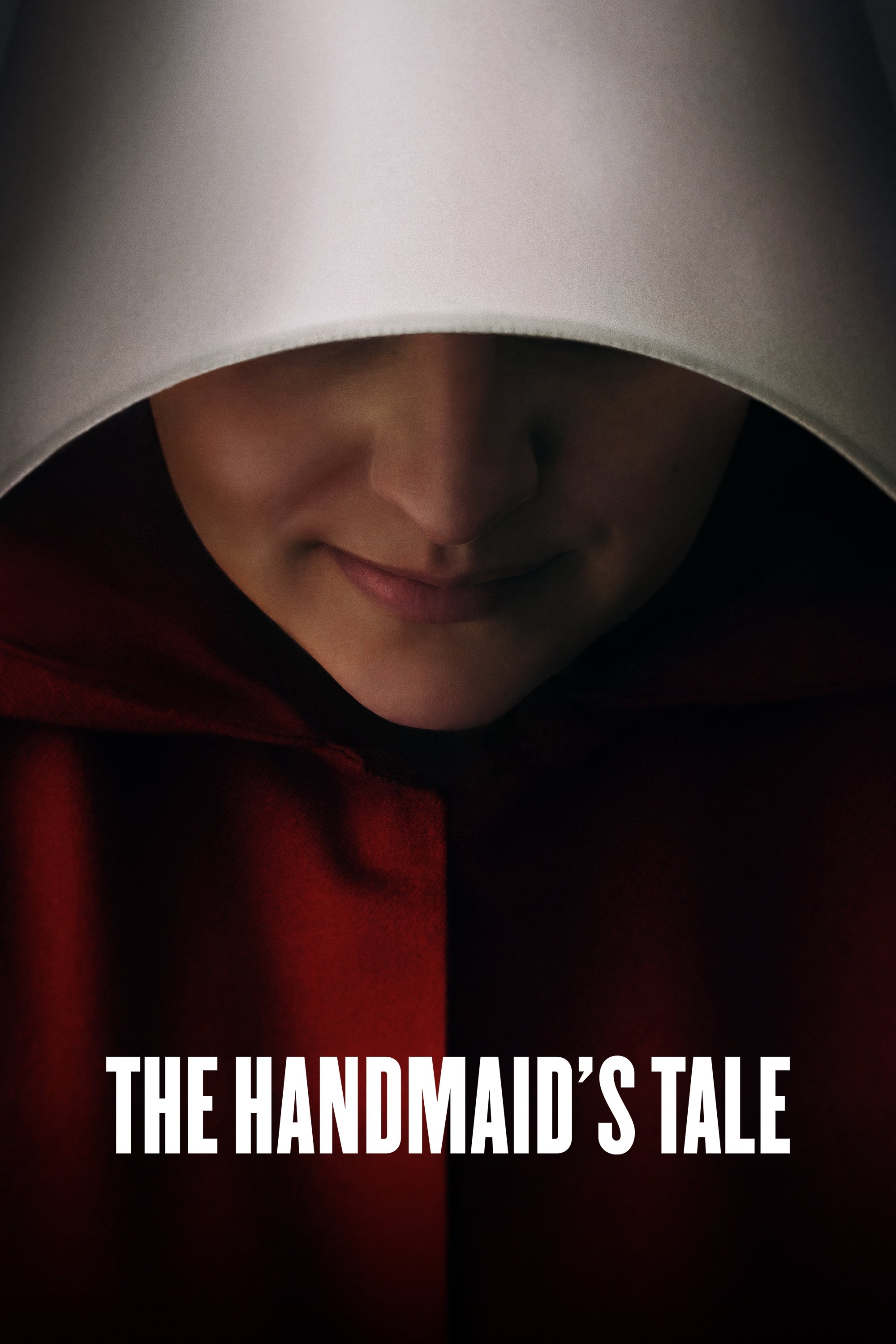
As a movie lover, one thing that really struck me about this show is how they use lighting. The world of Gilead itself feels really dark and oppressive, and the filmmakers lean into that with super high contrast and lots of shadows – it just feels bleak. But when they show flashbacks to life before Gilead, everything is brighter, warmer, and feels so natural. It’s a really powerful way to show you what’s been lost – the freedom, the simple joys – and how much worse things are for the main character now. Honestly, those lighting changes become a really strong emotional cue during the show’s toughest moments, helping you feel what the characters are going through.
‘Station Eleven’ (2021–2022)
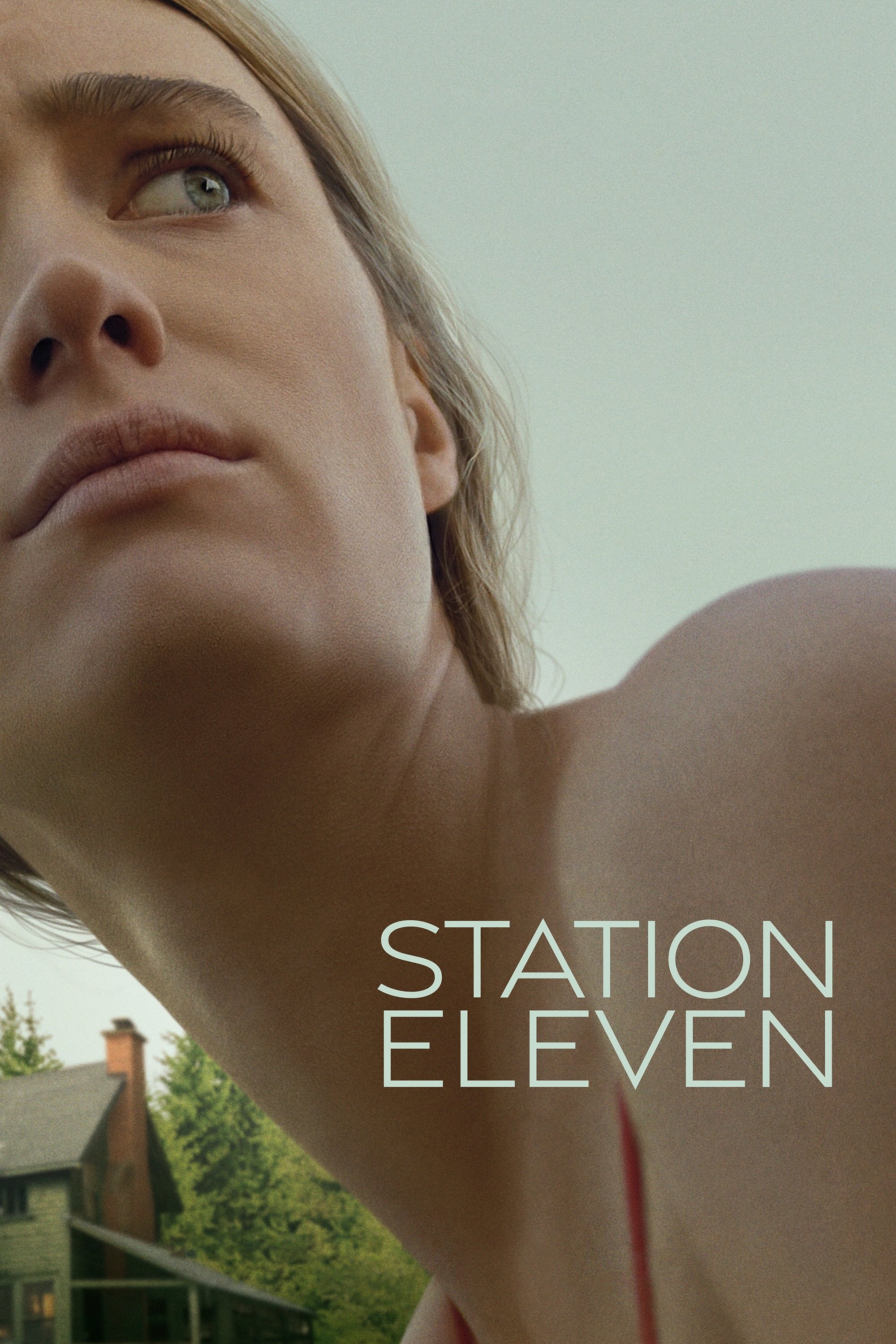
The story jumps between the beginning of a terrible flu pandemic and a world twenty years later after it’s over. Before the pandemic, everything feels artificial and cold, lit by fluorescent lights and winter darkness. The future world, however, is full of natural sunlight and vibrant greenery, showing how nature has taken over. This contrast with the usual dark look of post-apocalyptic stories emphasizes the beauty of this new world.
‘Homecoming’ (2018–2020)
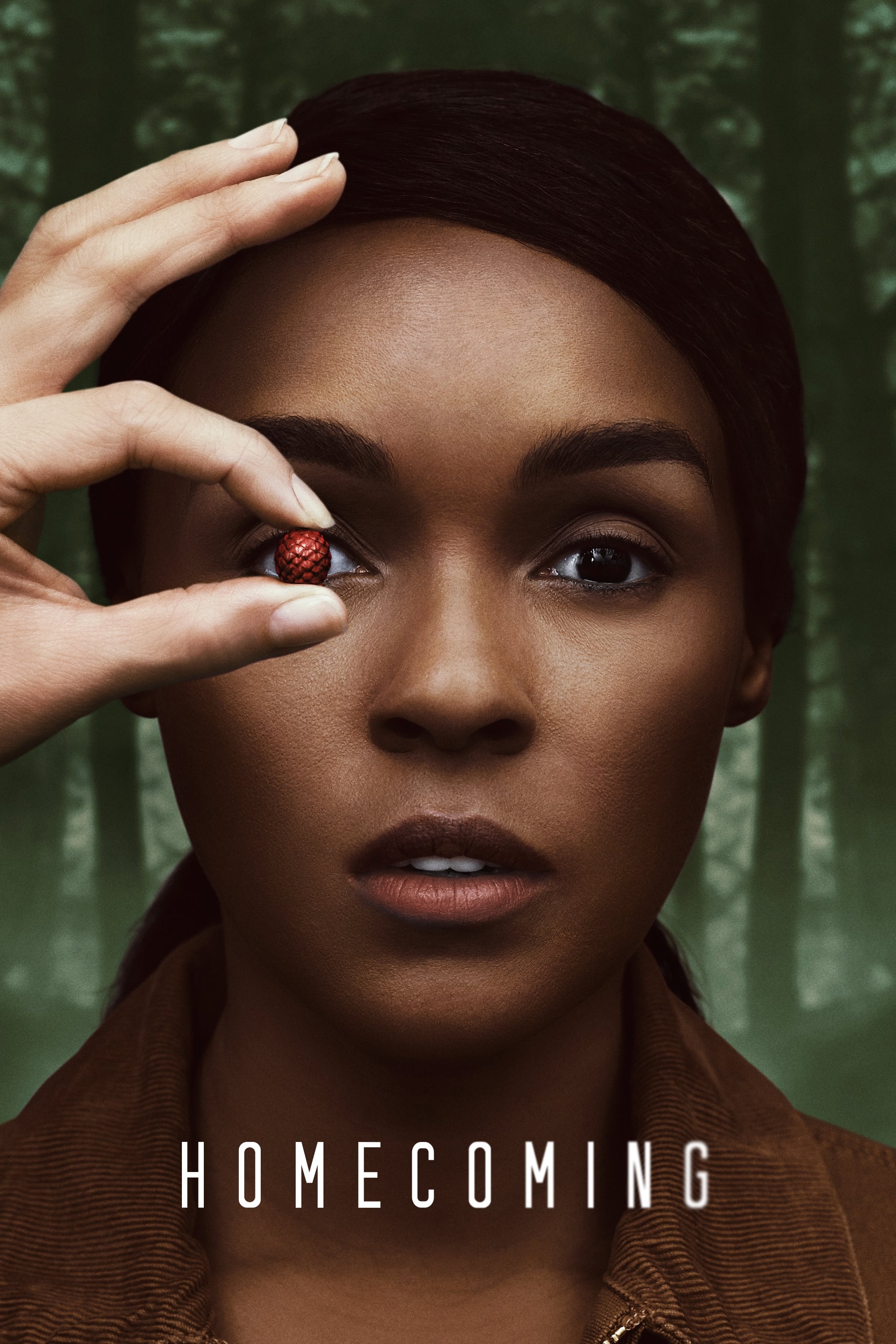
The show’s first season uses different visual styles to distinguish between the past and future. Scenes set in the past are shown in a wide, clear format, while the future appears in a square, more confined style with less vibrant lighting. This contrast visually represents the main character’s broken memories and feeling of powerlessness.
‘Watchmen’ (2019)
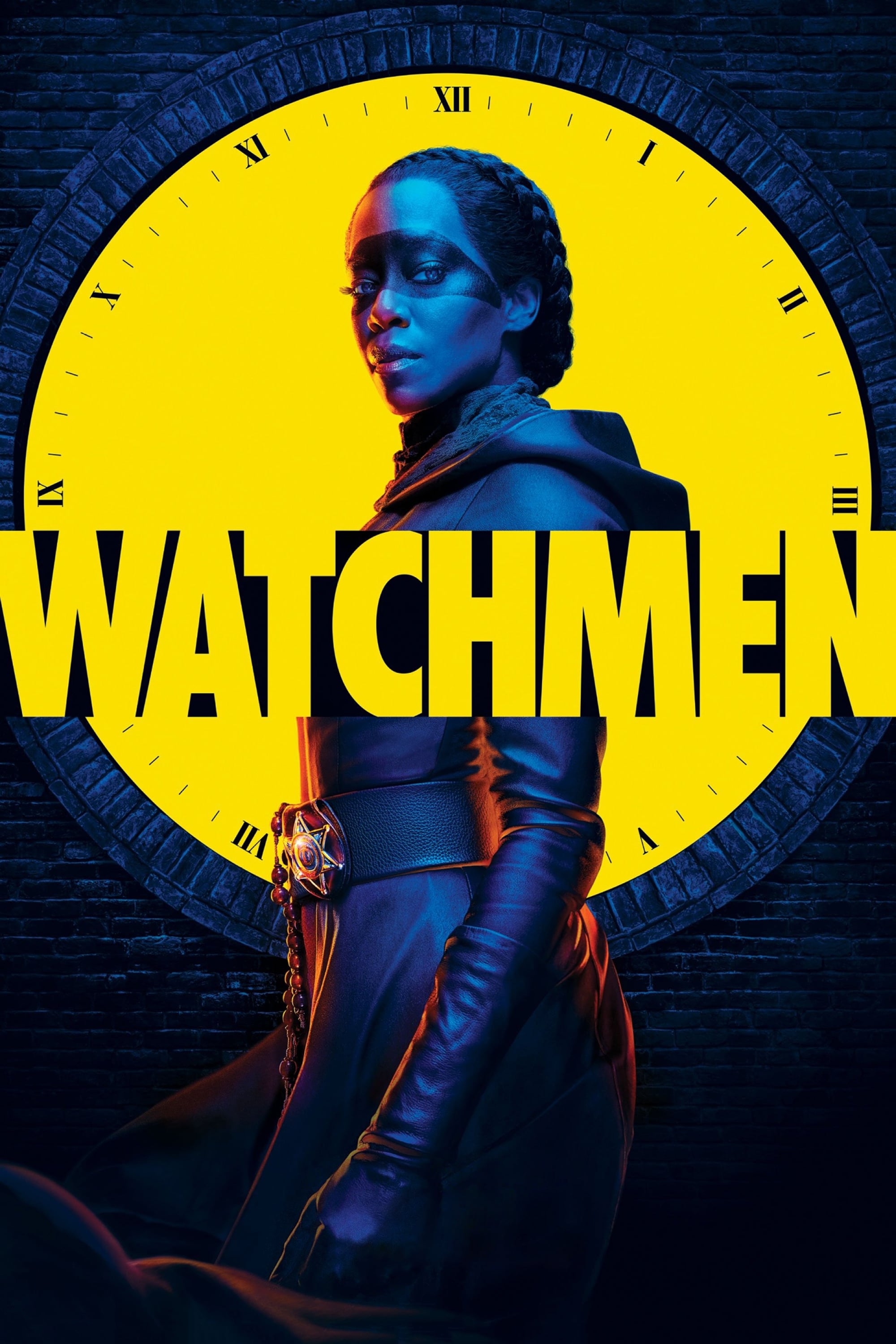
The show uses a distinct visual style for scenes showing Will Reeves’s memories. These flashbacks are in stark black and white, but with selective use of color to resemble older movies. This contrasts with the realistic and cinematic look of the present-day scenes. This approach helps viewers experience the memories as Will himself would.
‘Castle Rock’ (2018–2019)
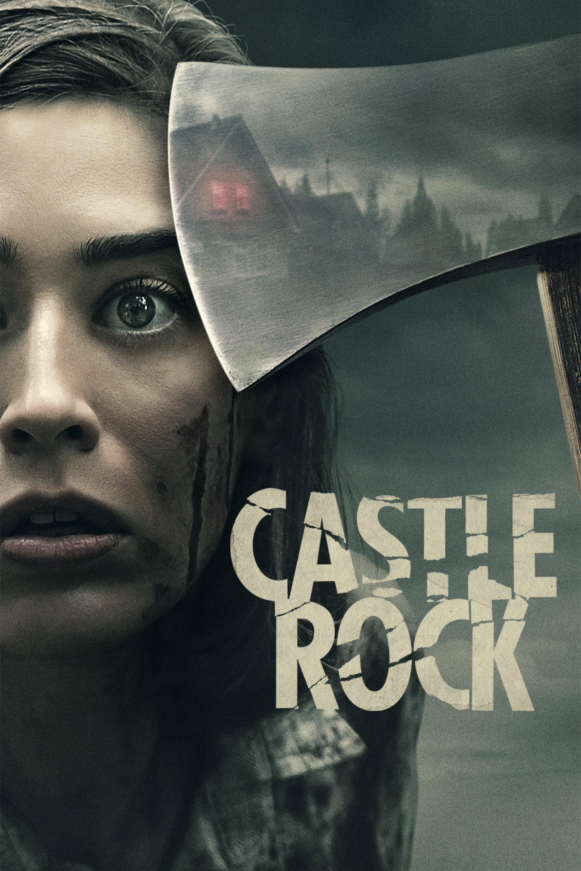
This horror series, drawing from the worlds created by Stephen King, connects different stories and characters. It uses flashbacks with a soft, dreamlike look to clearly separate them from scenes happening in the present. These flashbacks often have warmer colors, creating a misleading feeling of comfort before the frightening events begin. These visual cues help viewers understand the complicated history and secrets of the town.
‘The Affair’ (2014–2019)
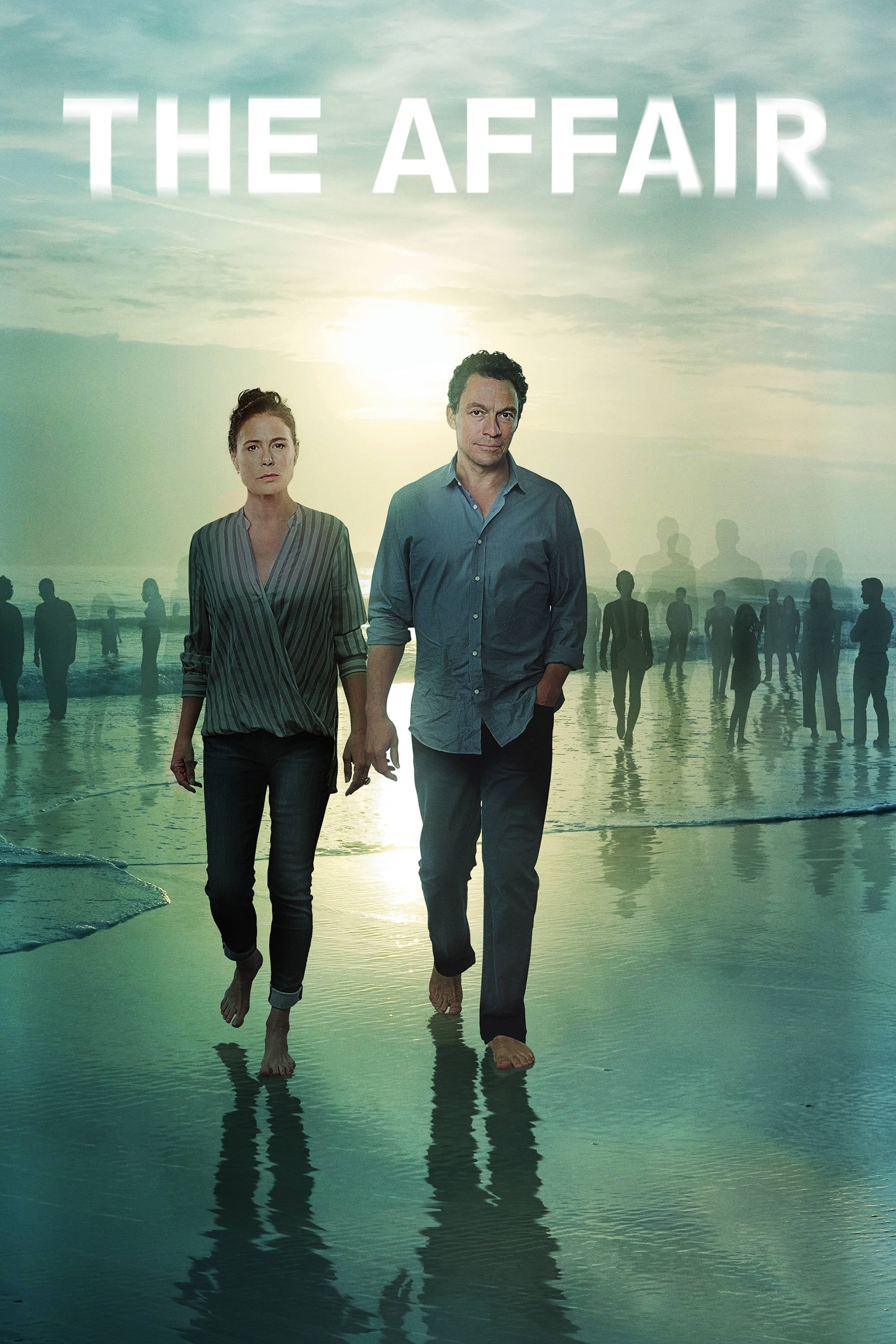
The show delves into the emotional impact of an affair, showing events through the eyes of different characters and at different times. To highlight how each person sees things differently, the show uses changes in lighting and clothing colors. For example, Noah’s memories often look bright and happy, while Alison’s scenes are darker and more somber. These subtle visual cues emphasize that memories aren’t always accurate and that everyone has their own version of the truth.
‘Damages’ (2007–2012)
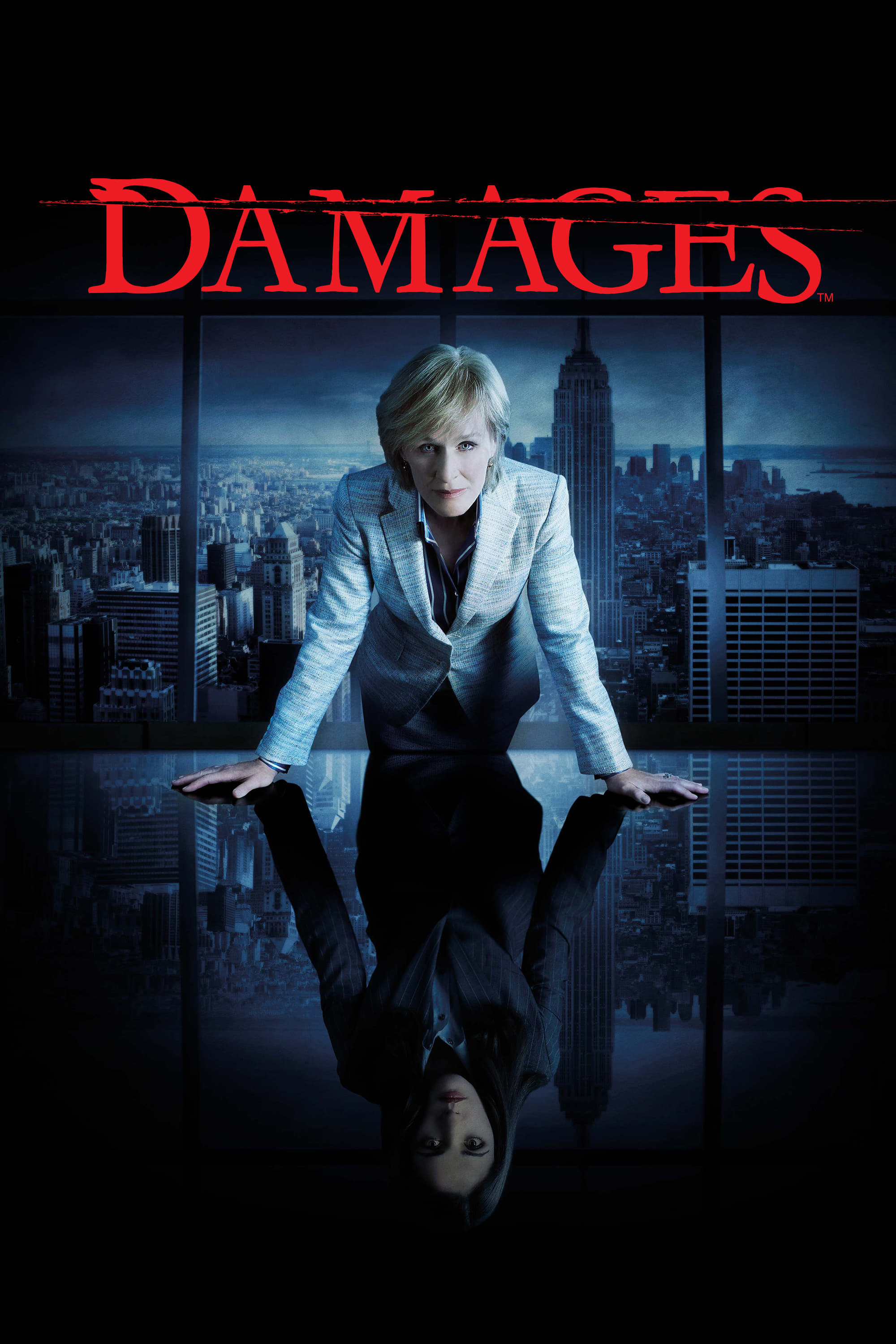
This legal thriller uses a unique storytelling approach, jumping ahead to show a shocking and violent outcome. The main story unfolds in a straightforward way, with realistic lighting that feels like a typical corporate drama. However, the glimpses of the future are visually striking – highly contrasted and colorful – to build intense suspense. This bold visual style creates a constant feeling of unease that underlies the show’s more procedural aspects.
‘Archive 81’ (2022)
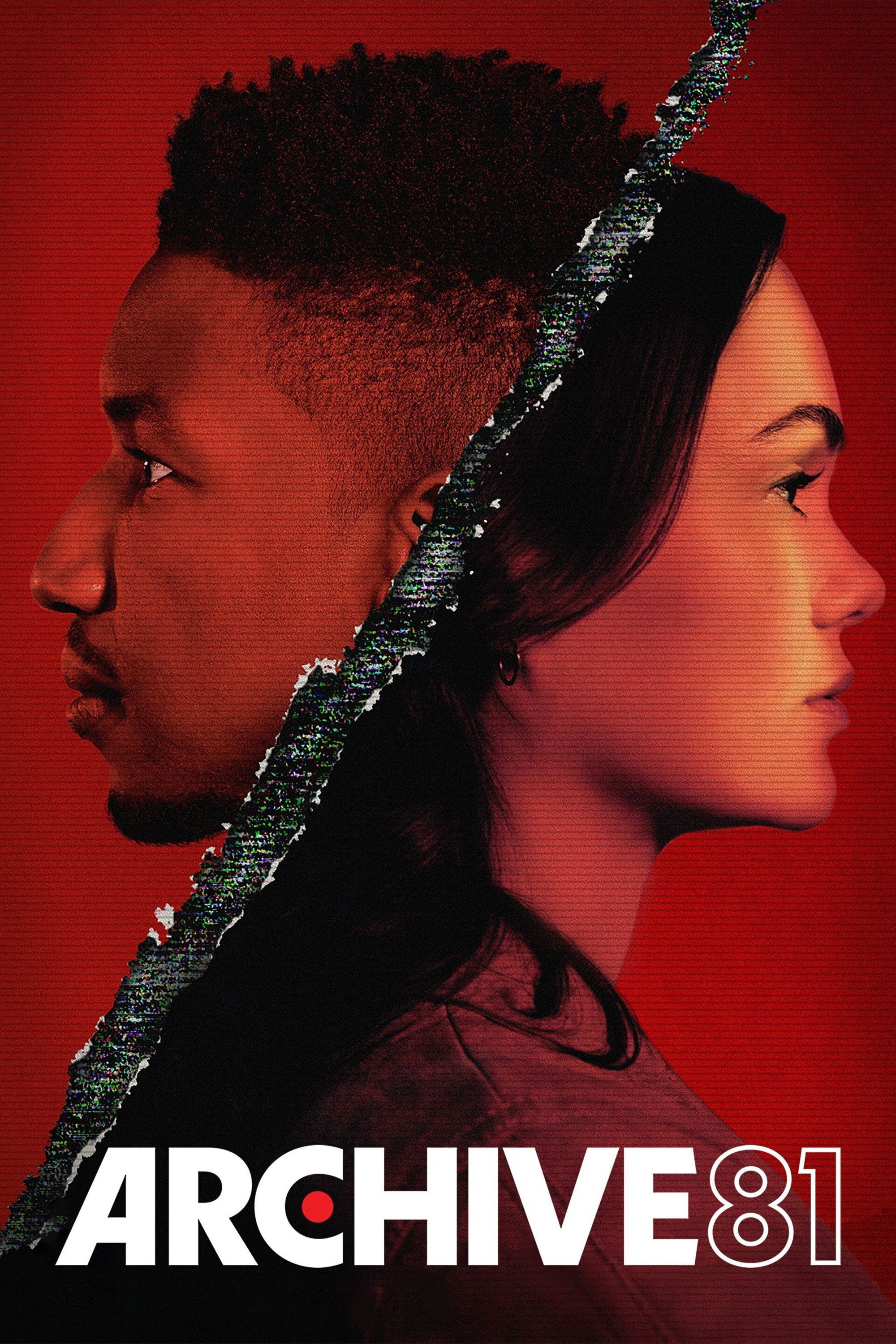
This horror series is incredibly atmospheric, presented as a collection of restored videotapes from the 1990s. We follow Dan as he watches these tapes from a secluded research facility. The tapes showing Melody in her apartment building have a unique, warm, and grainy quality typical of older analog recordings. The contrast between the modern digital world and the past captured on these tapes is central to the supernatural connection between the characters.
‘True Detective’ (2014–Present)
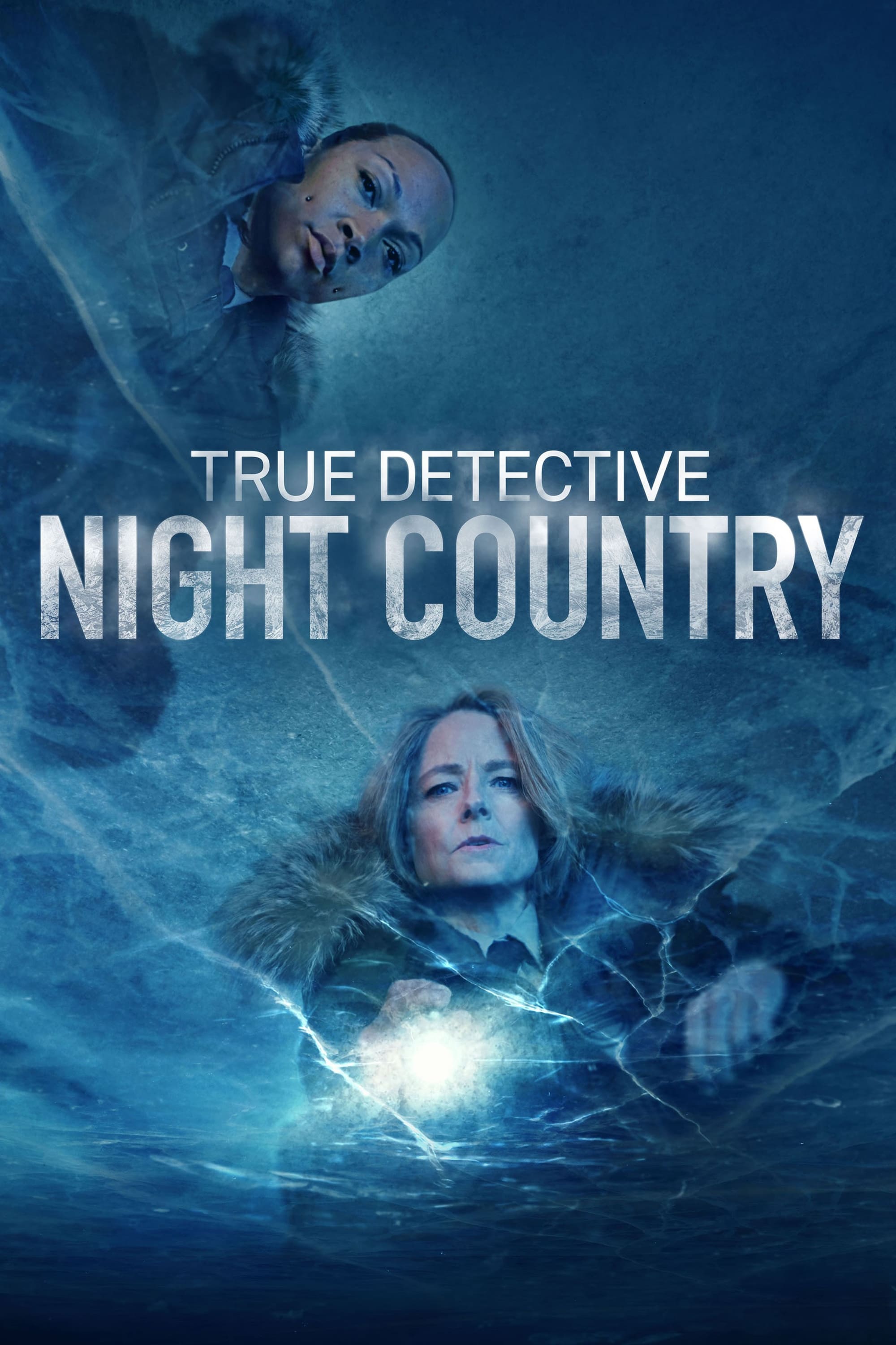
As a viewer, I really noticed how the show jumped across almost two decades, and they used makeup and lighting to show us how the detectives and the world around them changed. The scenes set in 1995 felt really warm and hazy, almost like the Louisiana heat was coming through the screen. But when we saw the interviews from 2012, everything was cold and stark – it really showed how worn down and cynical the characters had become over the years. It wasn’t just about the story; the way everything looked was key to understanding how much these people had changed.
Please share your thoughts on which series utilized these lighting techniques best in the comments.
Read More
- 20 Movies Where the Black Villain Was Secretly the Most Popular Character
- Top 20 Dinosaur Movies, Ranked
- 25 “Woke” Films That Used Black Trauma to Humanize White Leads
- Gold Rate Forecast
- Silver Rate Forecast
- Spotting the Loops in Autonomous Systems
- 22 Films Where the White Protagonist Is Canonically the Sidekick to a Black Lead
- Celebs Who Narrowly Escaped The 9/11 Attacks
- Top 10 Coolest Things About Invincible (Mark Grayson)
- Can AI Lie with a Picture? Detecting Deception in Multimodal Models
2025-12-11 14:47