Set decorators and production designers play a huge role in bringing TV stories to life, but their work often goes unseen. They create detailed backgrounds that make fictional worlds feel real and immersive. Sometimes, they even hide special objects or items related to the characters for attentive viewers to discover. These thoughtful visual details help shape the show’s overall style and the personalities of those on screen. Here are some series that showcase particularly impressive examples of how set decoration boosts the storytelling.
‘Friends’ (1994–2004)
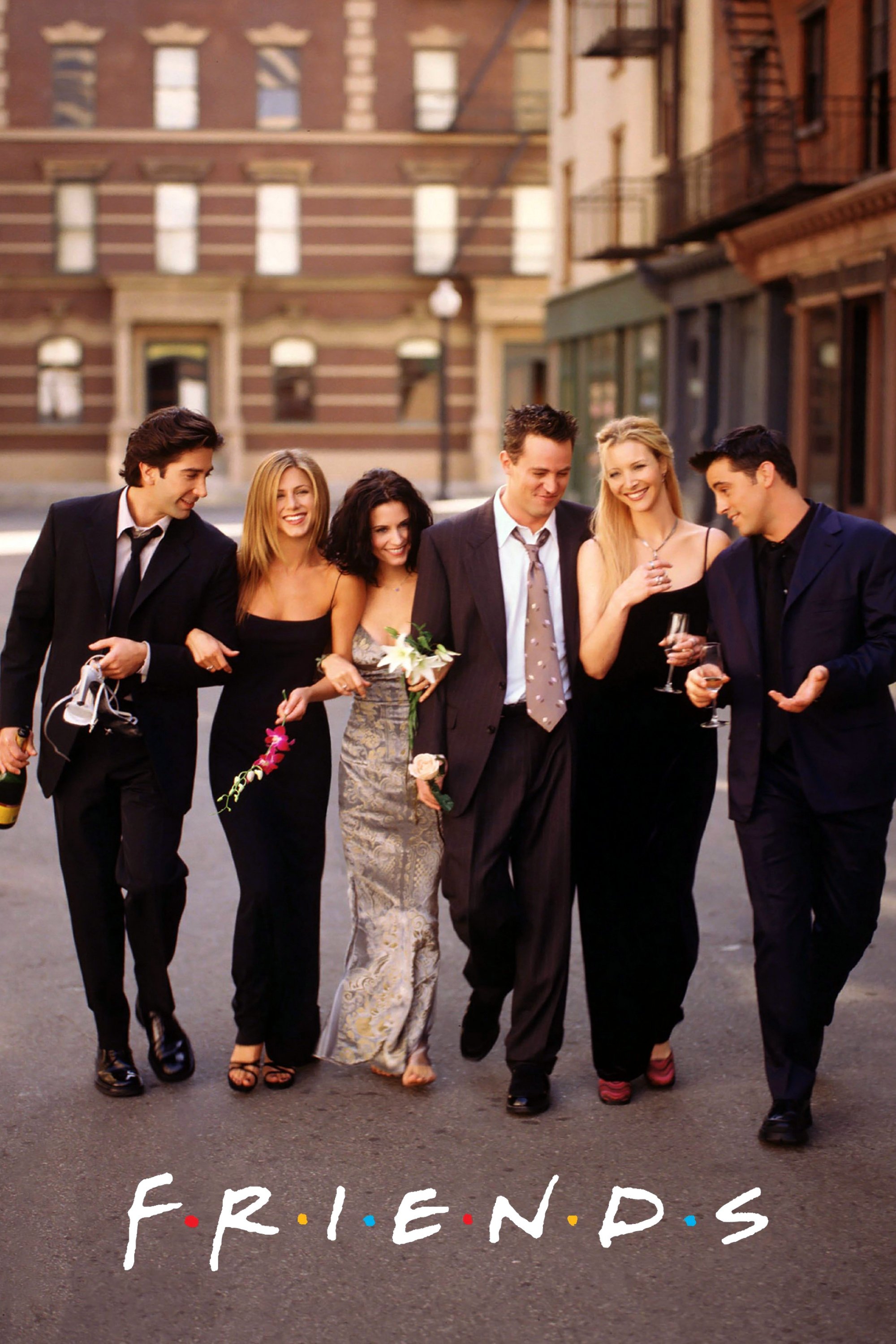
Monica and Rachel’s apartment is instantly recognizable thanks to its unique and colorful furniture and decorations. A fun detail was the Magna Doodle on the back of the door, which the set decorator, Greg Grande, used to display changing messages and drawings. It became a running gag throughout the show, filled with inside jokes and hints about the plot. The apartment’s bright purple walls also made the show stand out and quickly caught viewers’ attention. Fans often paused the episodes just to see the latest drawing added by the crew.
‘The Office’ (2005–2013)
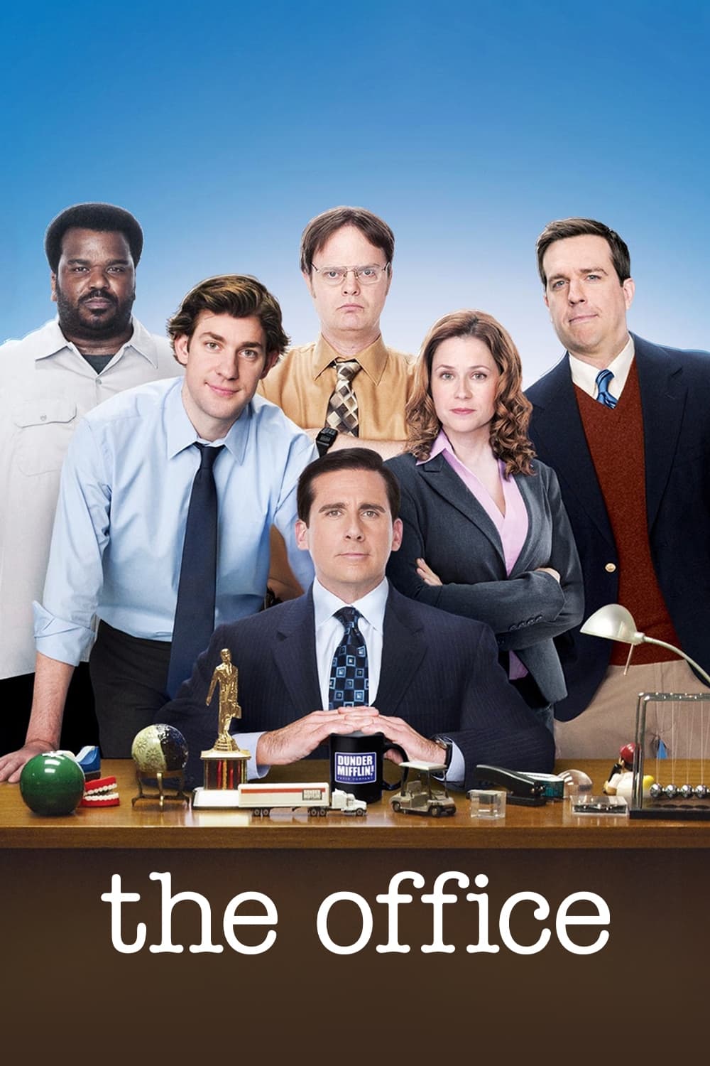
The show’s realistic, documentary-like style meant the office had to look ordinary but still feel unique. Michael Scott’s office decorations revealed his need for validation and his poor judgment. For example, he proudly displays a fake watch certificate with a misspelled brand name – it says ‘Seyko’ instead of Seiko. He also has a framed certificate with a noticeably uneven cut edge. These small details brilliantly show how clueless and ineffective the branch manager really is.
‘Breaking Bad’ (2008–2013)
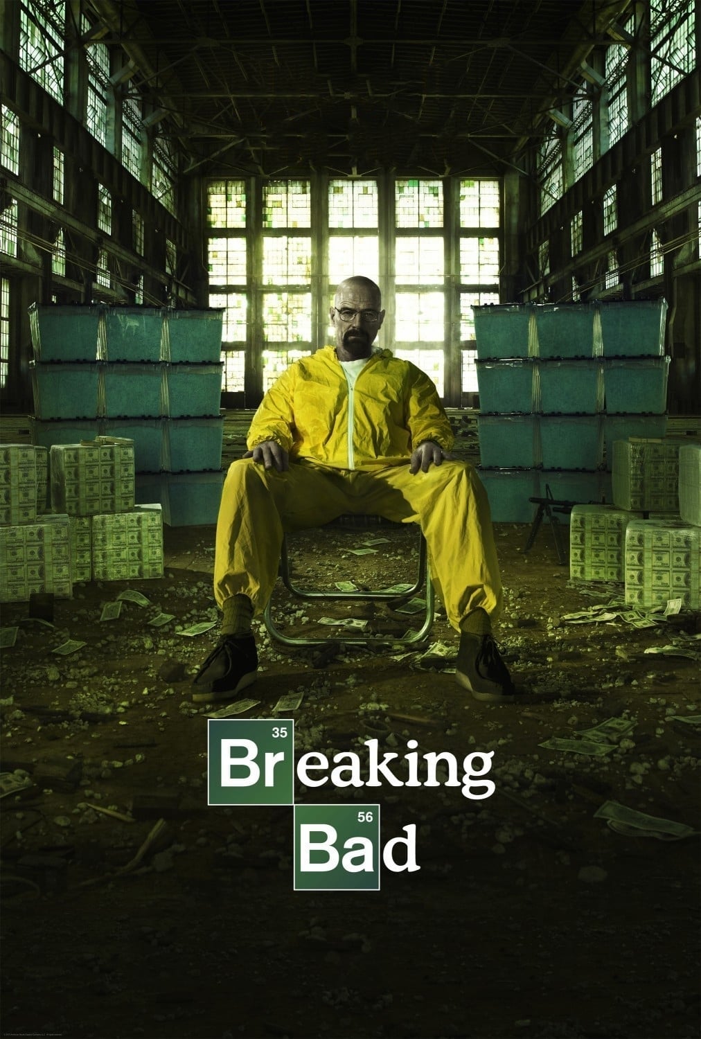
Vince Gilligan and his team carefully used color to show how characters changed and their morals declined throughout the show. They paid close attention to the colors of costumes and objects, assigning specific palettes to each character. For example, Walter White is often seen with green as he becomes more involved in crime. The bright pink teddy bear falling into the pool stands out sharply against the otherwise dull scenery. Everything you see in the background was deliberately chosen to hint at what’s coming or represent what a character is feeling inside.
‘Psych’ (2006–2014)
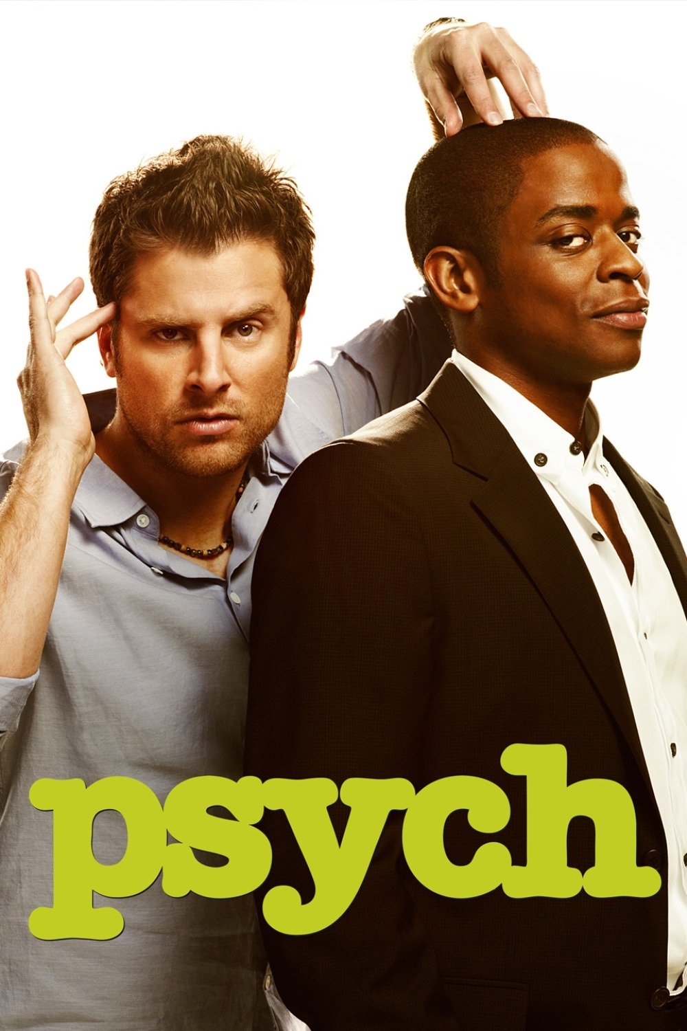
The team behind this detective comedy accidentally created a running joke that lasted the entire series. An actor, James Roday Rodriguez, playfully grabbed a pineapple during filming, and the crew decided to include it in almost every episode – hidden in the background or used as a prop. Fans quickly started enjoying the challenge of spotting the pineapple in each scene, and the set designers happily came up with more and more inventive ways to feature it.
‘Community’ (2009–2015)

This show is famous for its incredibly detailed sets at Greendale Community College, packed with jokes that would sometimes take years to notice. One well-known example is the character Beetlejuice, who would subtly appear in the background after his name was said a few times over three seasons. The study room was also filled with chalkboards covered in funny and relevant notes. These visual jokes were hidden in the scenes to give viewers a reason to watch again and again, and this attention to detail is a big reason why the show became so popular with comedy fans.
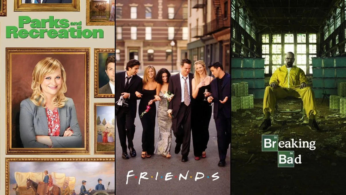
‘Parks and Recreation’ (2009–2015)
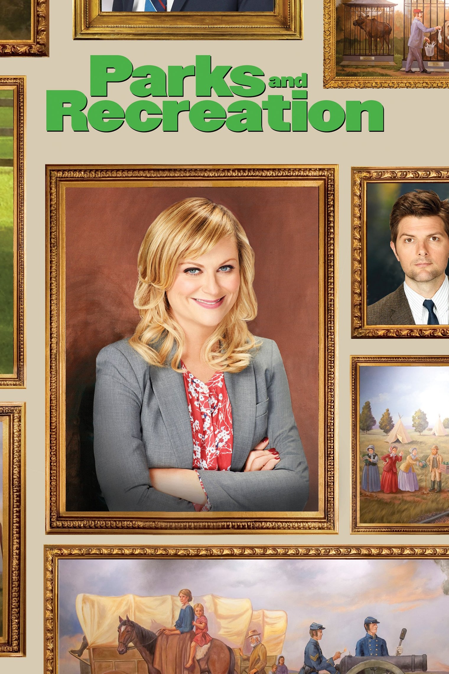
The Pawnee City Hall building was intentionally designed to showcase the town’s strange and sometimes troubling past. Designers included a series of murals, many of which depicted disturbing historical events. These paintings were done in a bright, cheerful style, creating a jarring contrast with the serious subject matter. The abundance of these murals added a strong element of satire to the otherwise ordinary government offices, constantly reminding viewers of the ridiculous situations the characters found themselves in.
‘How I Met Your Mother’ (2005–2014)
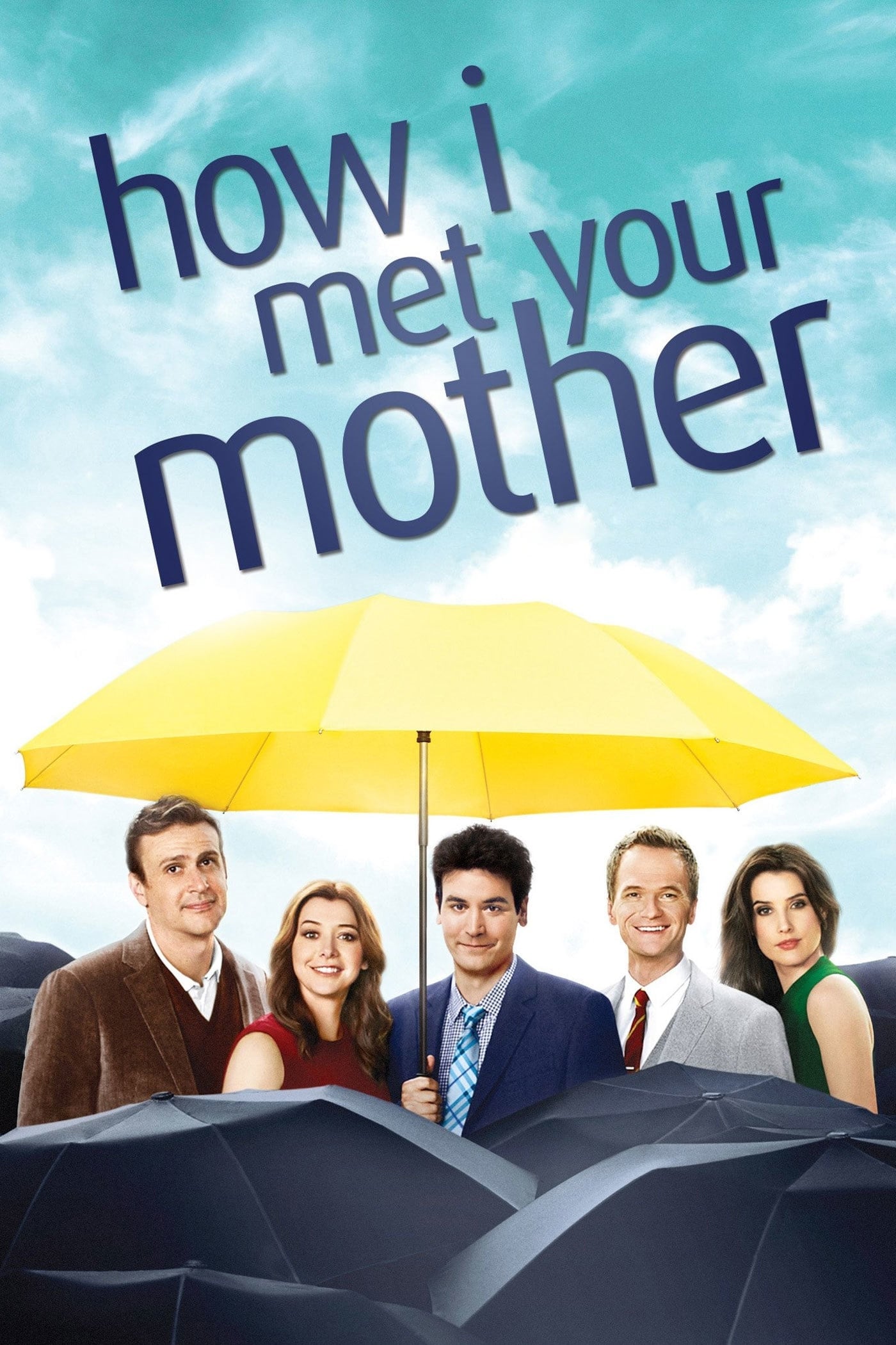
The set designers on this sitcom were clever at hinting at future events. For example, in one episode, they included a hidden countdown from fifty to one—displayed on things like ketchup bottles and flyers—leading up to a sad moment. This subtle detail built tension without viewers necessarily realizing it, and ultimately foreshadowed the death of a main character’s father. It’s a great illustration of how a show’s set design can be used to tell a story.
‘The Big Bang Theory’ (2007–2019)
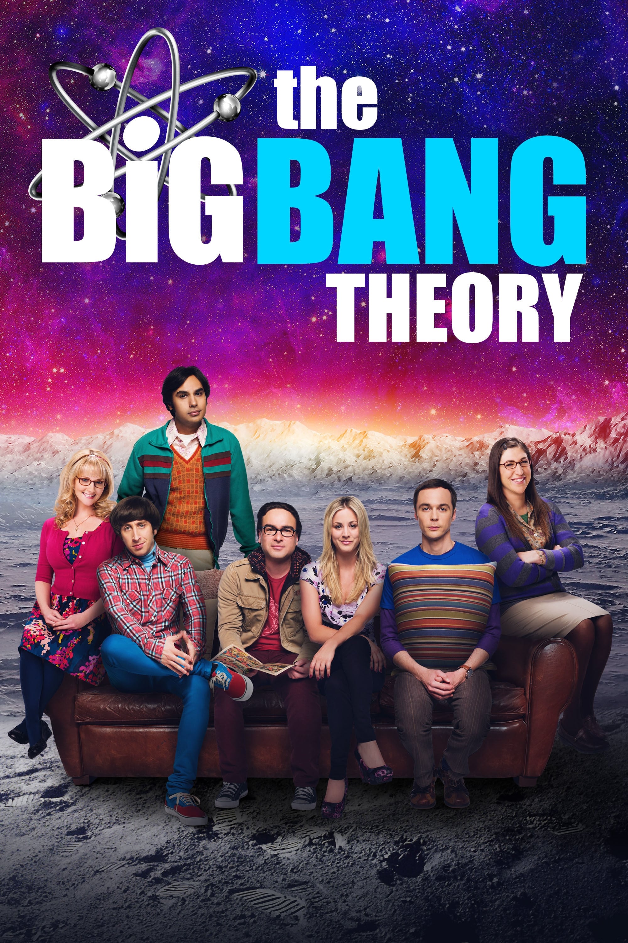
Leonard and Sheldon’s apartment was packed with science equipment and collectibles from pop culture. The people designing the set even worked with a physicist to make sure the equations written on the whiteboards were correct and up-to-date with current science. These equations were changed often to match the timeline of the show and what the characters were doing. The shelves were filled with genuine, old comic books and action figures that real collectors would appreciate. This attention to detail made the show’s quirky characters feel more realistic.
‘Arrested Development’ (2003–2019)
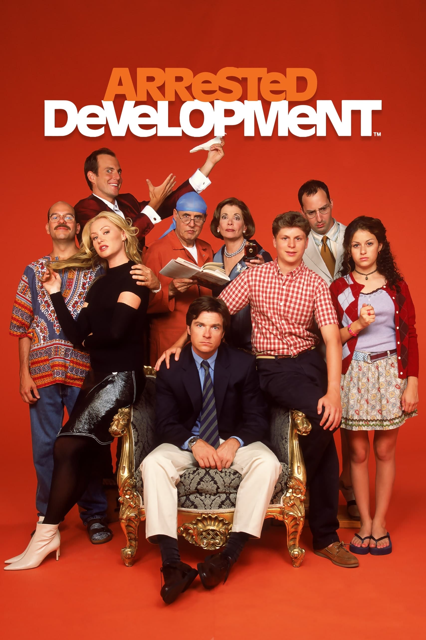
The Bluth family’s model home was packed with subtle hints and references to past jokes. For example, handprints on the walls foreshadow Buster’s later hand injury. The house’s poor quality was a running gag, mirroring the family’s failing business. The show’s creators carefully used these visual details to emphasize the characters’ flaws and dishonesty, building a rich and complex comedic style.
‘Stranger Things’ (2016–2025)
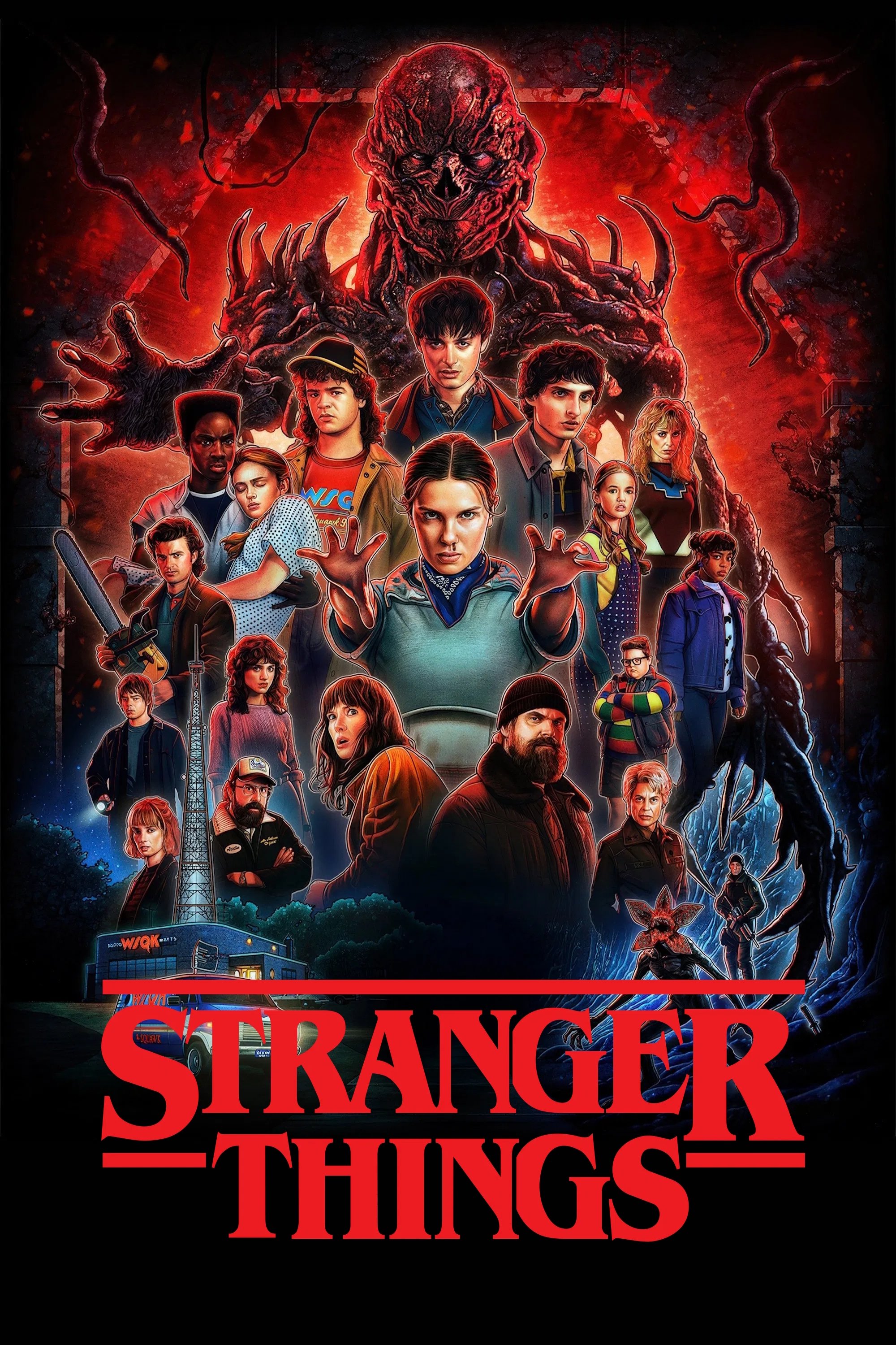
The creators of the show wanted to perfectly recreate the 1980s to give viewers a strong sense of nostalgia. They carefully selected vintage toys and furniture for the characters’ bedrooms. The impressive Christmas light wall from the first season quickly became a memorable pop culture symbol. Everything, from posters to everyday objects, was checked to make sure it was accurate for the time period. This attention to detail was crucial for making the show’s supernatural events believable.
‘Mad Men’ (2007–2015)
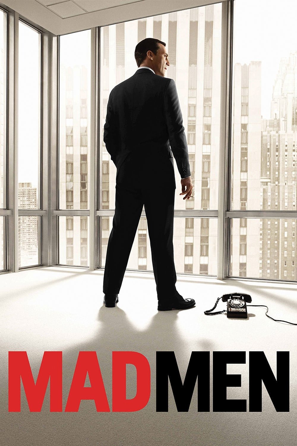
The period drama was praised for its incredibly detailed and realistic sets. The designers went to great lengths to ensure everything – from kitchen drawers to the bottoms of chairs – accurately reflected the 1960s. They used authentic vintage packaging for food and cleaning supplies, and updated the office décor each season to match the changing styles and social trends of the decade. This commitment to detail fully immersed viewers in the world of advertising in 1960s Madison Avenue.
‘The Good Place’ (2016–2020)
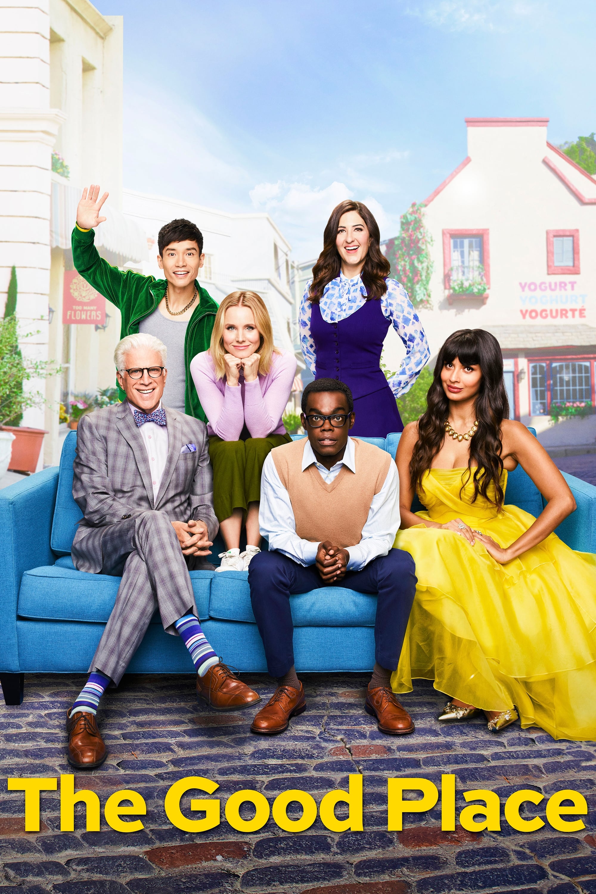
The afterlife was depicted as a vibrant, colorful place, but it was also full of clever jokes and hidden wordplay. The town seemed perfect at first, but the restaurant and store names were full of puns that subtly hinted at the truth about this world. For example, you might see a restaurant called ‘The Pesto’s Yet to Come’ or a store named ‘Knish from a Rose.’ These playful details created a quirky atmosphere that fit the show’s strange and unusual tone, and the bright, cheerful appearance masked a darker reality that the characters would eventually discover.
‘New Girl’ (2011–2018)
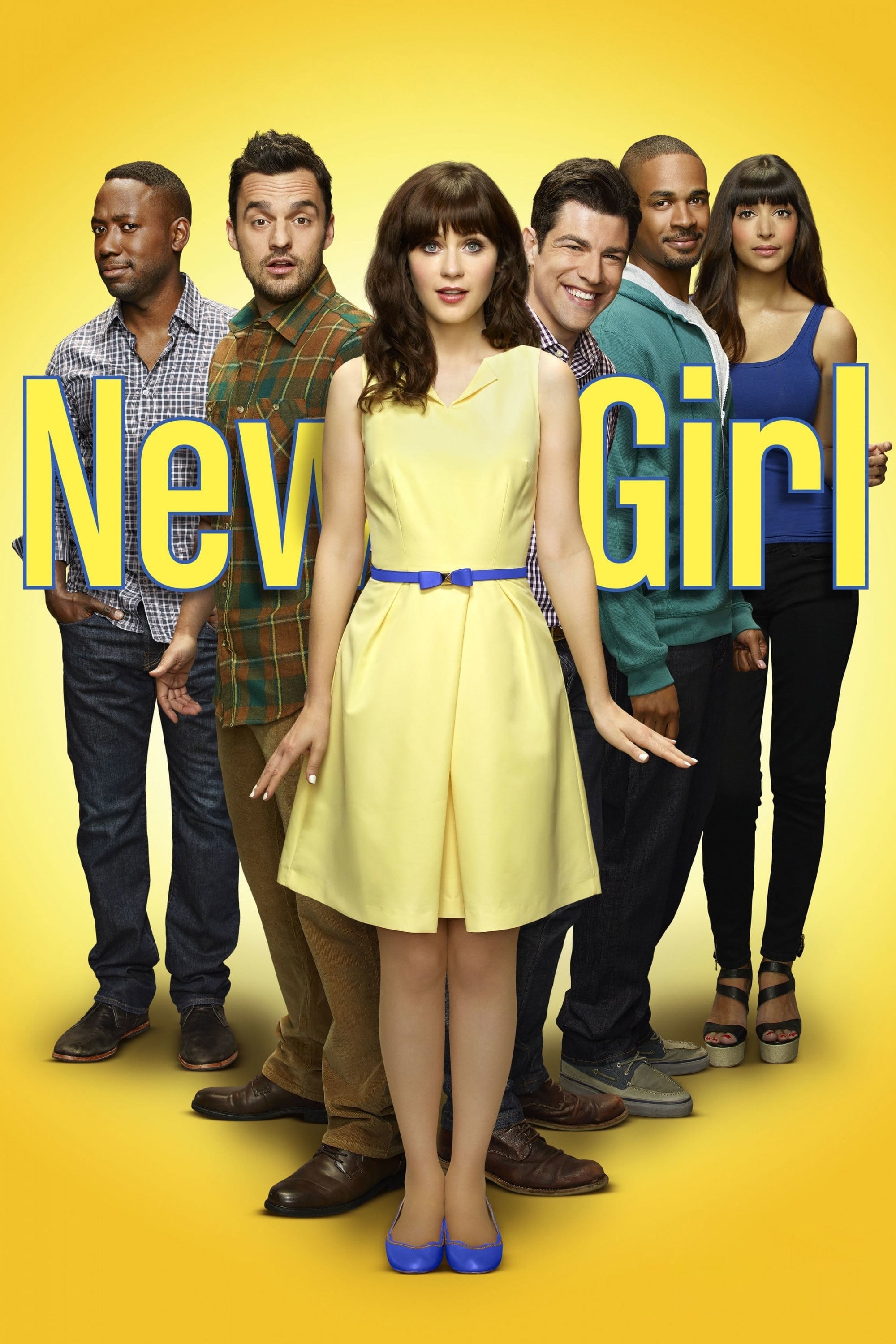
The apartment in this show felt comfortably lived-in, really showing the personalities of the four friends who shared it. A funny prop called the ‘Douchebag Jar’ became a running joke and important part of their group. With things like a strange melon painting and mismatched furniture, the place had a cool, artistic vibe. It wasn’t perfect – it was often messy and full of random stuff – but that made the big, industrial space feel like a real home for young people. All these little details made the characters’ crazy adventures feel more believable.
‘Sherlock’ (2010–2017)
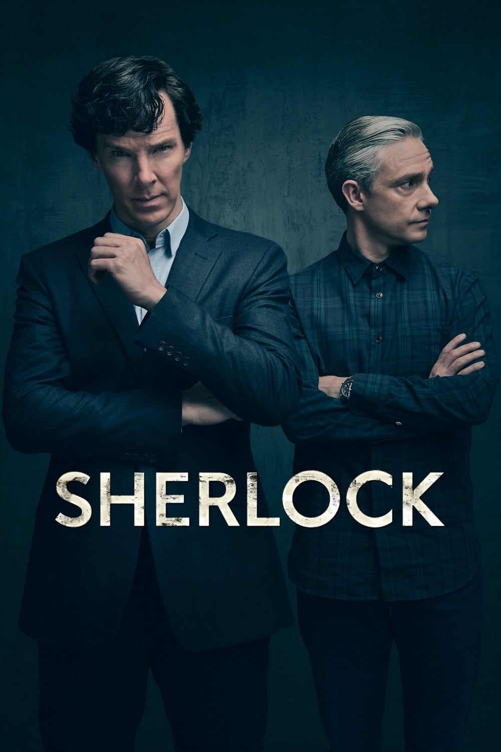
The iconic 221B Baker Street flat was redesigned to feel current while still capturing the atmosphere of the original Sherlock Holmes stories. The set was deliberately filled with a messy, lived-in feel to reflect the detective’s brilliant but chaotic mind. Distinctive touches like a skull on the fireplace and striking wallpaper helped define the show’s look. To illustrate Sherlock’s thought process, the show also used projections of text and diagrams directly onto the set. This creative blend of set design and visual effects offered a fresh take on the beloved character.
‘Gilmore Girls’ (2000–2007)
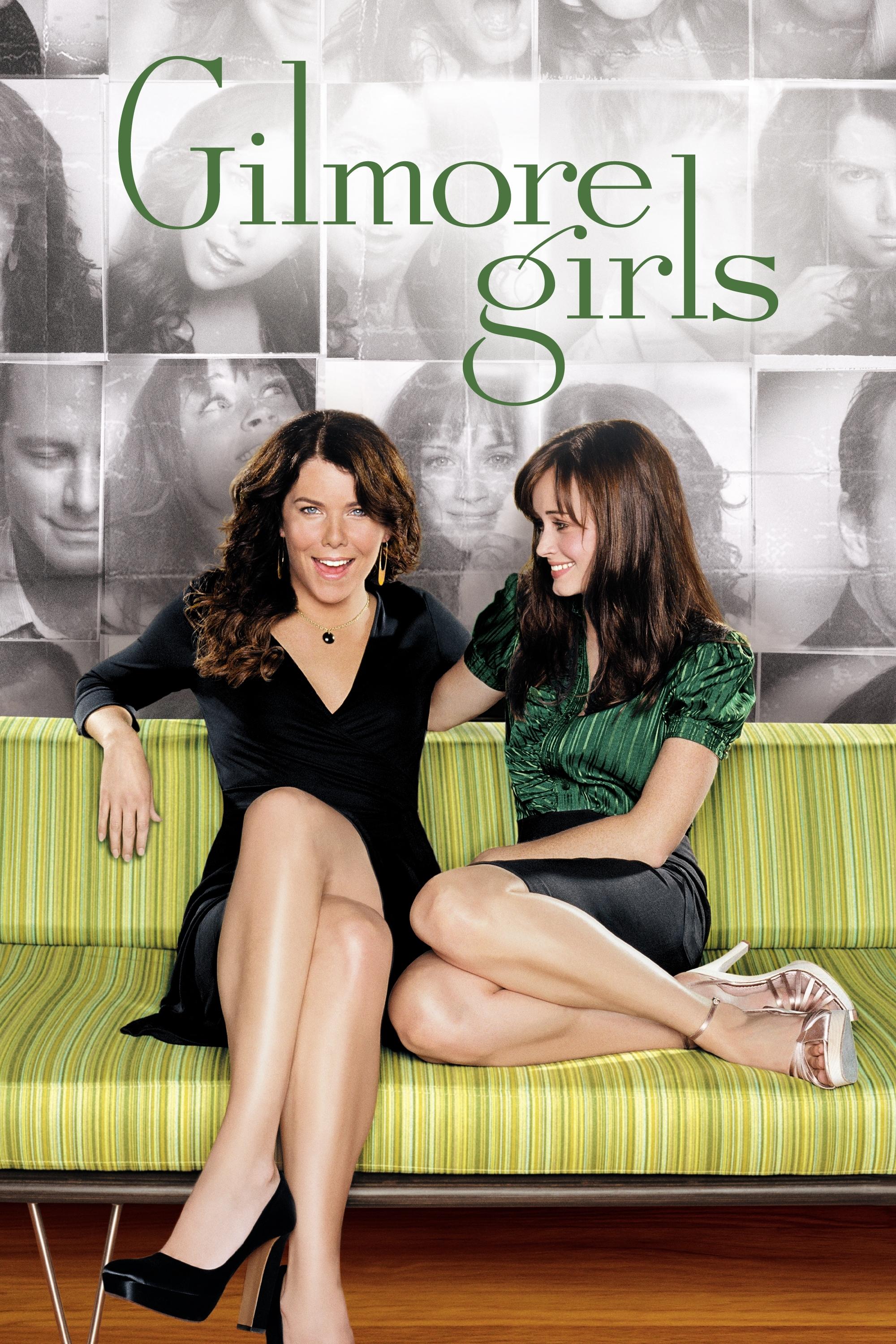
Stars Hollow was intentionally created to look like a classic, cozy New England town. The Gilmore’s house was filled with unique, vintage items to show how close Lorelai and Rory were. Kim’s Antiques was also packed with details, overflowing with old treasures. This warm, cluttered style became a key part of the show’s comforting atmosphere. These choices made Stars Hollow feel like a living, breathing character.
‘Game of Thrones’ (2011–2019)

Creating the look for this fantasy story meant giving each region and noble family a unique visual style. Set designers included family symbols in the buildings and weapons to show who controlled each area. The iconic Iron Throne was made to appear as if it was forged from hundreds of melted swords. Even small touches, like the items on tables and in bedrooms, revealed the wealth and traditions of each family. These detailed sets were essential for helping viewers understand the vast world of Westeros.
‘Modern Family’ (2009–2020)
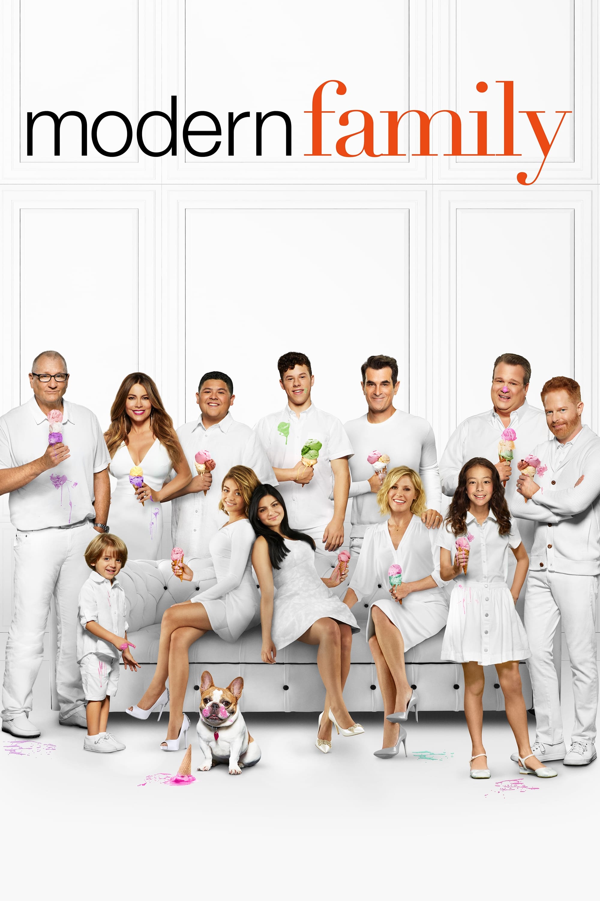
This comedy series used three different family homes to show how each family lived and what they liked. The Dunphy’s house was known for its broken stair, which Phil always meant to repair – it was a funny way of showing how lively and loving they were, even if things were a bit messy. Mitch and Cam’s house had a more creative and dramatic style, reflecting their personalities. These unique sets helped viewers easily follow each family’s story, while still feeling like they were all part of one bigger picture.
‘Twin Peaks’ (1990–1991)
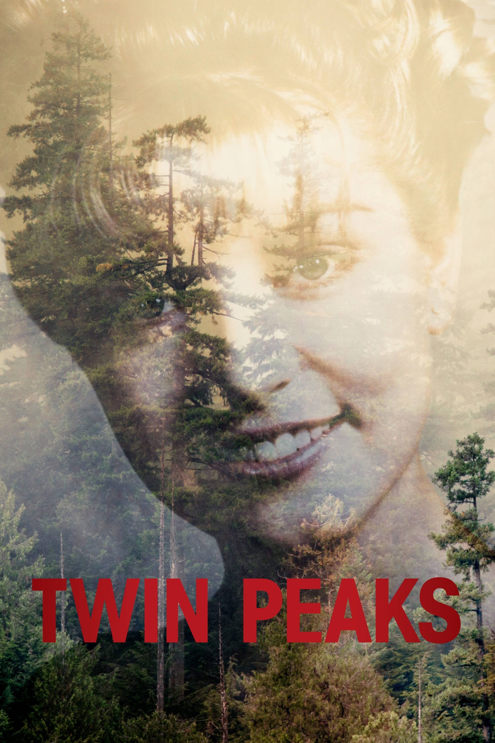
David Lynch masterfully used the show’s sets to build a strange and disturbing mood that became its trademark. The Red Room, famous for its zigzag floor and thick velvet curtains, is one of the most iconic sets ever created for television. Even ordinary items like fans and traffic lights were used to create a sense of fear and intrigue. The show’s powerful impact came in part from the contrast between the comforting look of a small town and frightening, dreamlike images. The unique visual style created in the original series continues to inspire supernatural shows today.
‘BoJack Horseman’ (2014–2020)
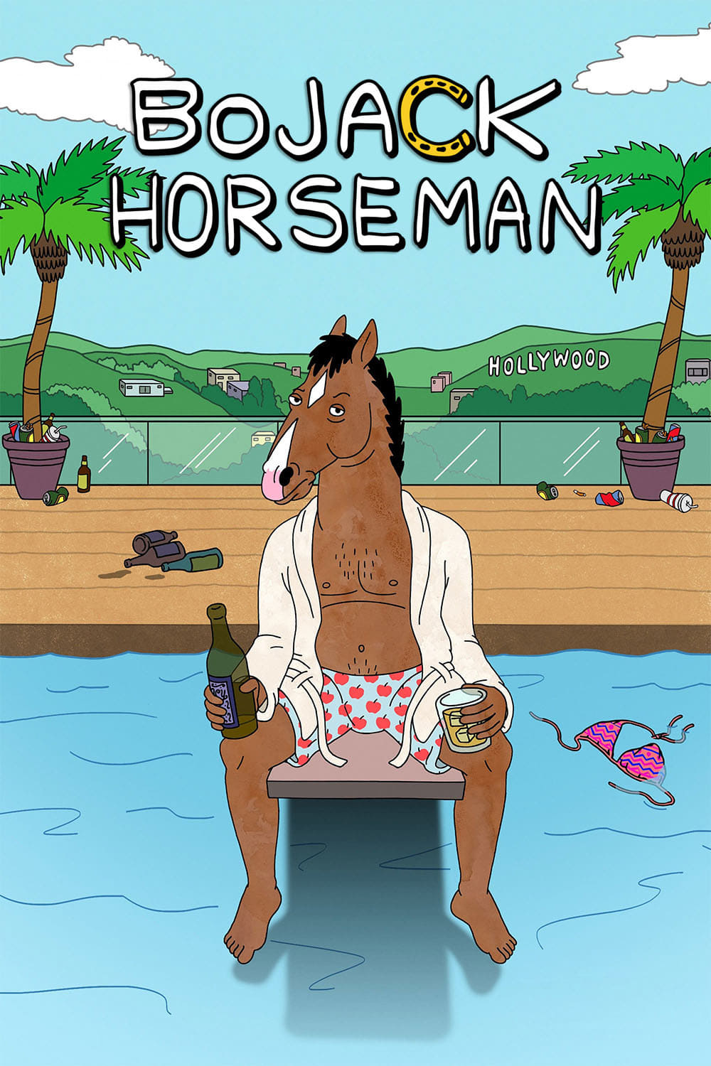
The artists working on this show cleverly filled the backgrounds with jokes based on animals and references to famous artwork. They’d recreate well-known paintings using animals instead of people, fitting the show’s unique world. Sharp-eyed viewers could also find funny headlines and book titles that commented on what was happening in each episode. The background art itself would often change to show what the main character was feeling or how much time had passed. These subtle visual gags were a treat for dedicated fans who really paid attention.
Please share your favorite background details from these shows in the comments.
Read More
- Invincible Season 4 Gender Swaps Tech Jacket As Fans Question Major Comic Change
- Building Agents That Learn and Improve Themselves
- Gold Rate Forecast
- Superman Flops Financially: $350M Budget, Still No Profit (Scoop Confirmed)
- Silver Rate Forecast
- Games That Faced Bans in Countries Over Political Themes
- 15 Films That Were Shot Entirely on Phones
- Trading Crypto with AI: A New Approach to Portfolio Management
- Unveiling the Schwab U.S. Dividend Equity ETF: A Portent of Financial Growth
- 22 Films Where the White Protagonist Is Canonically the Sidekick to a Black Lead
2025-12-13 20:20